<!DOCTYPE html PUBLIC"-//W3C//DTD XHTML 1.0 Transitional//EN" "https://www.w3.org/TR/xhtml1/DTD/xhtml1-transitional.dtd">
<html xmlns="https://www.w3.org/1999/xhtml">
<head>
<meta http-equiv="Content-Type" content="text/html; charset=UTF-8" />
<meta name="viewport" content="width=device-width, initial-scale=1.0" />
<meta name="x-apple-disable-message-reformatting" />
<!--[if !mso]><!-->
<style type="text/css">
@font-face {
font-family: 'DIN Next';
src: local('DIN Next'), local('DIN Next'), url('https://www.lowescdn.com/scaffold/1.4.4/fonts/din/din-next.woff') format('woff');
}
@font-face {
font-family: 'DIN Next Bold';
src: local('DIN Next Bold'), local('DIN Next Bold'), url('https://www.lowescdn.com/scaffold/1.2.0/fonts/din/din-next-bold.woff') format('woff');
}
@font-face {
font-family: 'DIN Next Black';
src: local('DIN Next Black'), local('DIN Next Black'), url('https://www.lowescdn.com/scaffold/1.2.0/fonts/din/din-next-black.woff') format('woff');
}
</style>
<!--<![endif]-->
<style type="text/css">
.ReadMsgBody{
width: 100%;
}
/* Forces Hotmail to display emails at full width */
.ExternalClass {
width: 100%;
}
/*Hotmail table centering fix*/
.ExternalClass, .ExternalClass p, .ExternalClass span, .ExternalClass font, .ExternalClass td, .ExternalClass div {
line-height: 100%;
}
/* Forces Hotmail to display normal line spacing*/
.ExternalClass * {
line-height: 100%}
p {
margin: 1em 0;
}
/*Yahoo paragraph fix*/
table td {
border-collapse: collapse;
}
/*This resolves the Outlook 07, 10, and Gmail td padding issue fix*/
/*This resolves the issue when iphone puts links on dates, etc.*/
a[x-apple-data-detectors] {
color: inherit !important;
text-decoration: none !important;
font-size: inherit !important;
font-family: inherit !important;
font-weight: inherit !important;
line-height: inherit !important;
}
a.mobileshow, .mobilehide {
display: none;
color: #fff;
/*for Gmail */
}
</style>
<style type="text/css">
@media screen and (min-width: 375px) and (max-width: 600px) and (-webkit-min-device-pixel-ratio:0) {
.mobile-hidden {
display: none !important;
}
.no-padding {
padding: 0px !important;
}
.mobile-only {
display: block !important;
max-height: none !important;
}
.container {
width: 100% !important;
}
.navcontainer tbody{
width: 100% !important;
display: table !important;
}
.drop {
width: 100% !important;
display: block !important;
}
.drop-center {
width: 100% !important;
display: block !important;
text-align: center !important;
}
.photo {
width: 100% !important;
height: auto !important;
}
}
</style>
<style type="text/css">
/* Media query triggers alternate styles when the file is displayed on a device with a maximum width lower than the assigned pixel dimension. The default max width setting for max-width should be 480px to trigger on mobile devices. */
@media only screen and (max-width: 480px) {
html,body {
width: 100% !important;
min-width:100% !important;
max-width: 480px !important;
overflow-x: hidden !important;
margin:0 auto !important;
}
.mobile-hidden, .tablet-hidden {
display:none !important;
}
.mobile-photo {
width:100% !important;
max-width: 450px !important;
height:auto !important;
}
.no-padding {
padding:0px !important;
}
.mobile-only {
display: block !important;
max-height: none !important;
}
.container {
width:100% !important;
max-width:480px !important;
}
.photo {
width:100% !important;
max-width:480px !important;
height:auto !important;
}
.managesubs {
width:83% !important;
height:auto !important;
}
.photo390 {
display: block !important;
height: auto !important;
max-width: 390px !important;
width: 100% !important;
}
body[data-outlook-cycle] .oa {
width: 100% !important;
max-width: 480px !important;
text-align: center !important;
overflow-x: hidden !important;
display:block !important;
}
.drop {
width: 100% !important;
max-width: 480px !important;
display: block !important;
}
.drop-social {
width:100% !important;
max-width: 480px !important;
display:block !important;
text-align:center !important;
padding:0px !important;
}
.center {
text-align:center !important;
}
.center50 {
width:50% !important;
padding-right:10px !important;
padding-left:10px !important;
}
.drop-center {
width:100% !important;
max-width: 480px !important;
display:block !important;
text-align:center !important;
}
.Full100 {
width:100% !important;
max-width: 480px !important;
height:auto!important;
line-height:normal!important;
}
.pad10 {
padding-left:10px !important;
padding-right: 10px !important;
}
.sub_nav {
border-bottom:2px solid #ffffff;
display: table-cell !important;
width: auto !important;
height: auto !important;
float: none !important;
overflow: auto !important;
line-height:normal !important;
font-size:15px !important;
background-color: #15b5e5 !important;
}
.sub_nav_bottom {
border-bottom:2px solid #ffffff;
display: table-cell !important;
width: auto !important;
height: auto !important;
float: none !important;
overflow: auto !important;
line-height:normal !important;
font-size:15px !important;
}
.sub_nav_top {
display: table-cell !important;
width: auto !important;
height: auto !important;
float: none !important;
overflow: auto !important;
font-size:18px !important;
line-height:30px !important;
}
.tablet-only {
display: block !important;
max-height: none !important;
}
.Width70 {
width: 60% !important;
text-align: center !important;
}
.Width90 {
width: 90% !important;
text-align: center !important;
}
.container1 {
width: 100% !important;
max-width: 316px !important;
}
.mobile-only1 {
display: inline-block !important;
}
.mobile-left-image {
width: 67px !important;
max-width: 67px !important;
padding-left: 0px !important;
}
.mobile-middle-table {
width: 316px !important;
}
}
</style>
<style type="text/css">
@media only screen and (max-width: 619px) {
.tablet-only {
display: block !important;
max-height: none !important;
}
}
</style>
<style type="text/css">
@media only screen and (max-width: 414px) {
.mobile-hidden, .tablet-hidden {
display:none !important;
}
.mobile-photo {
width:100% !important;
max-width: 414px !important;
height:auto !important;
}
.no-padding {
padding:0px !important;
}
.mobile-only {
display: block !important;
max-height: none !important;
}
.container {
width:100% !important;
max-width:414px !important;
}
.photo {
width:100% !important;
max-width:414px !important;
height:auto !important;
}
.managesubs {
width:83% !important;
height:auto !important;
}
.photo390 {
display: block !important;
height: auto !important;
max-width: 390px !important;
width: 100% !important;
}
body[data-outlook-cycle] .oa {
width: 100% !important;
max-width: 414px !important;
text-align: center !important;
overflow-x: hidden !important;
display:block !important;
}
.drop {
width: 100% !important;
max-width: 414px !important;
display: block !important;
}
.drop-center {
width:100% !important;
max-width: 414px !important;
display:block !important;
text-align:center !important;
}
.Width70 {
width: 60% !important;
max-width: 380px !important;
text-align: center !important;
}
.Width90 {
width: 90% !important;
max-width: 400px !important;
text-align: center !important;
}
.container1 {
width: 100% !important;
max-width: 286px !important;
}
.mobile-left-image {
width: 64px !important;
padding-left: 0px !important;
}
.mobile-middle-table {
width: 286px !important;
}
.mobile-only1 {
display: inline-block !important;
}
}
</style>
<style type="text/css">
@media only screen and (max-width: 375px) {
.mobile-hidden {
display:none !important;
}
.mobile-photo {
width:100% !important;
max-width: 375px !important;
height:auto !important;
}
.no-padding {
padding:0px !important;
}
.mobile-only {
display: block !important;
max-height: none !important;
}
.container {
width:100% !important;
max-width:375px !important;
}
.photo {
width:100% !important;
max-width:375px !important;
height:auto !important;
}
.managesubs {
width:83% !important;
height:auto !important;
}
.photo390 {
display: block !important;
height: auto !important;
max-width: 390px !important;
width: 100% !important;
}
body[data-outlook-cycle] .oa {
width: 100% !important;
max-width: 375px !important;
text-align: center !important;
overflow-x: hidden !important;
display:block !important;
}
.drop {
width: 100% !important;
max-width: 375px !important;
display: block !important;
}
.drop-center {
width:100% !important;
max-width: 375px !important;
display:block !important;
text-align:center !important;
}
.Width70 {
width: 60% !important;
max-width: 300px !important;
text-align: center !important;
}
.Width90 {
width: 90% !important;
max-width: 320px !important;
text-align: center !important;
}
.container1 {
width: 100% !important;
max-width: 247px !important;
}
.mobile-left-image {
width: 56px !important;
max-width: 56px !important;
padding-left: 3px !important;
}
.mobile-middle-table {
width: 265px !important;
}
.mobile-only1 {
display: inline-block !important;
}
}
}
</style>
<style type="text/css">
/*Liveclicker responsive video styles*/
/*Android devices*/
@media only screen and (max-device-width: 480px) {
div.lc-video{
width:100%;
height:auto;
}
}
/* iPhone 5 - Portrait */
@media only screen and (device-width: 320px) {
div.lc-video {
width: 320px;
min-width: 320px;
height: 180px;
}
}
/* iPhone 6 - Portrait */
@media only screen and (device-width: 375px) {
div.lc-video {
width: 375px;
min-width: 375px;
height: 211px;
}
}
/* iPhone 6+ - Portrait */
@media only screen and (device-width: 414px) {
div.lc-video {
width: 414px;
min-width: 414px;
height: 233px;
}
}
/* iPhone 5 - Landscape */
@media only screen and (width: 568px) {
div.lc-video {
width: 568px;
min-width: 586px;
height: 320px;
}
}
/* iPhone 6 - Landscape */
@media only screen and (width: 667px) {
div.lc-video {
width: 600px;
min-width: 600px;
height: 338px;
}
}
/* iPhone 6+ - Landscape */
@media only screen and (width: 736px) {
div.lc-video {
width: 600px;
min-width: 600px;
height: 338px;
}
}
</style>
<title>Lowe's Email
</title>
<script type="application/ld+json">
[{
"@context": "https://schema.org/",
"@type": "Organization",
"name": "Lowe’s",
"logo": "https://i.imgur.com/AkY0dT7.jpg"
},{
"@context": "https://schema.org/",
"@type": "DiscountOffer",
"description": "",
"availabilityStarts": "",
"availabilityEnds": ""
},{
"@context": "https://schema.org/",
"@type": "PromotionCard",
"image": ""
}]
</script>
</head>
<body bgcolor="#ffffff" style="margin: 0; padding:0; -ms-text-size-adjust: none; mso-line-height-rule: exactly;" yahoo="fix">
<div class="oa" align="center">
<!-- Table used to center email -->
<table border="0" cellpadding="0" cellspacing="0" width="100%" class="container">
<tr>
<td>
<!-- Table used to set width of email -->
<table width="600" class="container" border="0" align="center" cellpadding="0" cellspacing="0" style="font-family:Arial, Helvetica, sans-serif">
<tr>
<td>
<table cellpadding="0" cellspacing="0" width="100%" role="presentation" style="min-width: 100%; " class="stylingblock-content-wrapper"><tr><td class="stylingblock-content-wrapper camarker-inner"><table border="0" cellpadding="0" cellspacing="0" class="container" width="100%">
<tr>
<td align="left" bgcolor="#ffffff" style="font-family:Arial, Helvetica, sans-serif; font-size:12px; color:#666666; padding-top:10px; padding-bottom:10px; padding-left:10px;" valign="top">
<table align="left" border="0" cellpadding="0" cellspacing="0" class="Width90" width="100%">
<tr>
<td align="left" bgcolor="#ffffff" class="drop no-padding" style="font-family:Arial, Helvetica, sans-serif; font-size:12px; color:#666666; padding-left:10px; padding-top:10px; padding-bottom:10px;" valign="top">
<!--Preheader Link Starts here--><a href="https://click.e.lowes.com/?qs=58444f26663f6d813d9c6058fc61664079344ac5f8858d6b09c2467d244164df2a9172d998c31726a1d1d22a2307f730b2f9c4864a7906cceaf26087a6216f1f" style="color:#666666; text-decoration:none;" target="_blank"><span style="color:#666666; text-decoration:none;" title="Get a head start on holiday decorating with décor for any budget.">Get a head start on holiday decorating with décor for any budget.</span></a> <!--Preheader Link Ends here--></td><td align="right" bgcolor="#ffffff" class="mobile-hidden" style="font-family:Helvetica, Arial, sans-serif; font-size:12px; color:#999999; padding-right:10px; padding-left:0px; padding-top:10px; padding-bottom:10px;" valign="top" width="175">
<!---->View email as a <a href="https://view.e.lowes.com/?qs=77af60368a3fbafc6f443876eb0a1dc5736bd4913e4982a6317e6799be1b4e97b39612d7545d890a8a03d41ced790d4f5e452f43bae584d0ff9a0693da25187a74b4a79e450ffef0b11663358f8becb4" style=" text-decoration:none; color:#012169; font-weight:bold;" target="_blank" title="webpage">webpage</a>.<!----></td></tr></table></td></tr><tr>
<td align="center" height="5" style="padding-top:10px; padding-bottom: 10px;">
</td></tr><tr>
<td align="center" style="padding-bottom: 22px;" valign="bottom">
<a href="https://click.e.lowes.com/?qs=58444f26663f6d818813b5ef7228d84098c5e513f7fd345372c54fe9794d57efdd88ca4a97e2382e3c7e68ef2459f1fa311aa7a8957b6cbb704a72c7340eb8b1" target="_blank" title="Lowe's"><img alt="Lowe's" border="0" src="https://image.e.lowes.com/lib/fe9515707364027471/m/59/14f6b444-13d4-4f6b-a52a-df9473ac4be2.png" style="display:block; margin-left: auto; margin-right: auto" width="141"></a></td></tr><tr>
<td align="right" style="padding-bottom: 10px; padding-right: 10px;">
<a href="https://click.e.lowes.com/?qs=58444f26663f6d8143ddbf15a1a2969542603874f319ec0cb77d4c802d7cba95a2b34128cbd1a961d9ce9eda7fb0ecf774cf91be22af4469101015f2e56aa894" target="_blank" title="MyLowe's Login"><img alt="MyLowe's Login" border="0" src="https://image.e.lowes.com/lib/fe9515707364027471/m/59/e5a53d36-76a9-46cf-b45e-90482ed1b8b9.png" style="display:block;" width="110"></a></td></tr><tr>
<td align="center" height="1" style="font-size: 0px;">
<table bgcolor="#012169" border="0" cellpadding="0" cellspacing="0" class="container" width="100%">
<tr>
<td height="7" style="font-size: 0px;" valign="top">
<img alt="" border="0" class="photo" height="7" src="https://image.e.lowes.com/lib/fe9515707364027471/m/59/c301e24e-201b-46f9-8172-27b5acdcbf99.jpg" style="display:block;" width="100%"></td></tr></table></td></tr><tr>
<td>
<table bgcolor="#ffffff" border="0" cellpadding="0" cellspacing="0" class="mobile-hidden" width="100%">
<tr>
<th align="center" class="drop-center" height="20" valign="middle" width="1%">
</th><th align="center" class="drop-center" height="40" valign="middle" width="25%">
<!--NAV1001 Link Starts here--><a href="https://click.e.lowes.com/?qs=58444f26663f6d817cacea946b734c8dd3226678f103ad546fc42d3a22d5dcfb7837a046562764ca8627c9087974d11998cadb022ed457d2198f5d9f7019d1f2" style="color: #012169; text-decoration: none; font-family: Helvetica, Arial, sans-serif; font-size: 14px;" target="_blank" title="BATHROOM"><strong>BATHROOM</strong></a> <!--NAV1001 Link Ends here--></th><th align="center" class="drop-center" height="40" valign="middle" width="25%">
<!--NAV1002 Link Starts here--><a href="https://click.e.lowes.com/?qs=58444f26663f6d81e77f65ad42c976ab2c8df80673d50c9e2e4175aa7581e1742787d78927218333f0bd2066277550139c3fa44da960811fe5c5c2f782692b61" style="color: #012169; text-decoration: none; font-family: Helvetica, Arial, sans-serif; font-size: 14px;" target="_blank" title="SALE"><strong>SALE</strong></a> <!--NAV1002 Link Ends here--></th><th align="center" class="drop-center" height="40" valign="middle" width="25%">
<!--NAV1003 Link Starts here--><a href="https://click.e.lowes.com/?qs=58444f26663f6d81e7bd411f9a7e1f8788a0cc0a60ef96a073773d6bbf05de4c4123a0436a0df5ae8e093ce2c3dc23724a948583db29effcba3a647718df5c8a" style="color: #012169; text-decoration: none; font-family: Helvetica, Arial, sans-serif; font-size: 14px;" target="_blank" title="DAILY DEAL"><strong>DAILY DEAL</strong></a> <!--NAV1003 Link Ends here--></th><th align="center" class="drop-center" height="40" valign="middle" width="25%">
<!--NAV1004 Link Starts here--><a href="https://click.e.lowes.com/?qs=58444f26663f6d81a8571530eba3949f187c769a0286c7e061de906d611a11c882542565dbadce1e752efeec51b308e5a3b674857c94540ea664860f043a7f7f" style="color: #012169; text-decoration: none; font-family: Helvetica, Arial, sans-serif; font-size: 14px;" target="_blank" title="APPLIANCES"><strong>APPLIANCES</strong></a> <!--NAV1004 Link Ends here--></th></tr></table></td></tr></table></td></tr></table>
<table cellpadding="0" cellspacing="0" width="100%" role="presentation" style="min-width: 100%; " class="stylingblock-content-wrapper"><tr><td class="stylingblock-content-wrapper camarker-inner"><table border="0" cellpadding="0" cellspacing="0" class="container" width="100%">
<tr>
<td>
<a data-linkto="https://" href="https://click.e.lowes.com/?qs=58444f26663f6d81ed513072caef42aa52f54a0f1701db9a9597a041086d98195f5698b78679c07850ed9fa0aebfb7210d3adfdc2c71fabb197887921793cb1f" target="_blank" title=""><img alt="Get updates on procedures in response to Covid-19." data-assetid="32219" src="https://image.e.lowes.com/lib/fe9515707364027471/m/61/5544222b-afa0-43ab-867c-841441c17a5a.jpg" style="display: block; width: 100%; padding: 0px; text-align: center; height: auto;" width="600"></a></td></tr></table></td></tr></table>
<table cellpadding="0" cellspacing="0" width="100%" role="presentation" style="min-width: 100%; " class="stylingblock-content-wrapper"><tr><td class="stylingblock-content-wrapper camarker-inner"><table align="center" border="0" cellpadding="0" cellspacing="0" class="container" width="600">
<tr>
<td>
<a data-linkto="https://" href="https://click.e.lowes.com/?qs=58444f26663f6d81487bc73fb5ee3aebc6d3211585845232c7f5c2123fc69cb150d7d9221fba4ad78cdab2e03b093317532e13c0160d5b673742641707d14f47" target="_blank" title=""><img alt="More time to celebrate the season. Get a head start and save on holiday décor." data-assetid="40053" src="https://image.e.lowes.com/lib/fe9515707364027471/m/64/983b07d7-dad9-4f77-b26a-edf30379bc2c.jpg" style="display: block; width: 100%; padding: 0px; text-align: center; height: auto;" width="600"></a></td></tr></table></td></tr></table>
<table cellpadding="0" cellspacing="0" width="100%" role="presentation" style="min-width: 100%; " class="stylingblock-content-wrapper"><tr><td class="stylingblock-content-wrapper camarker-inner"><table align="center" border="0" cellpadding="0" cellspacing="0" class="container" width="600">
<tr>
<td>
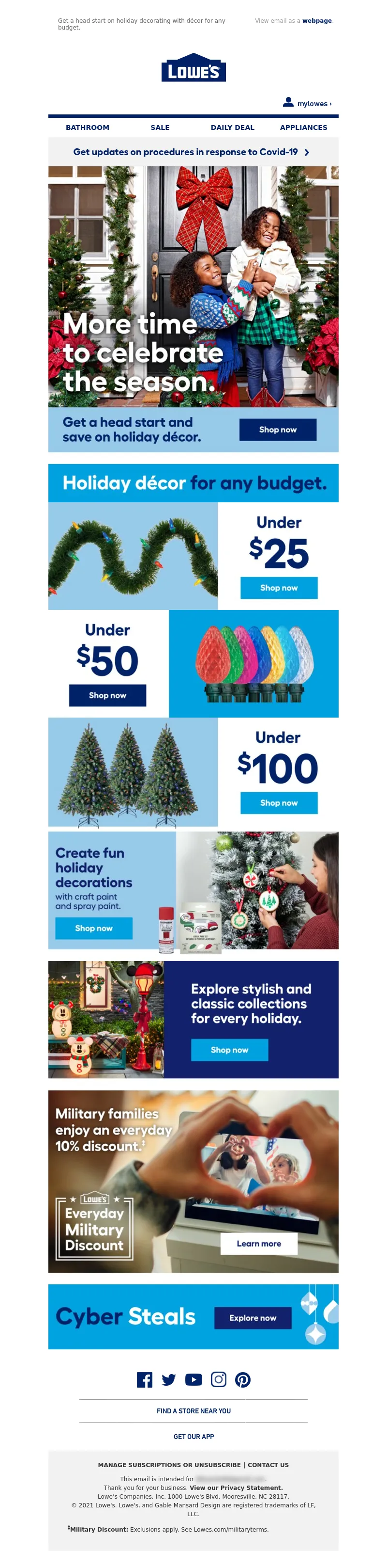
<a data-linkto="https://" href="https://click.e.lowes.com/?qs=58444f26663f6d813668023964f4adc03620cb953874fa294a6ea0079b3a3e790a5eae85d76ceb2c58d3c4f1708689c2813ad95a9fdef2313dbdba3eca2459db" target="_blank" title=""><img alt="Holiday décor for any budget." data-assetid="40044" src="https://image.e.lowes.com/lib/fe9515707364027471/m/64/722e4ec8-315e-41d8-a874-930482b2941e.jpg" style="display: block; width: 100%; padding: 0px; text-align: center; height: auto;" width="600"></a></td></tr></table></td></tr></table>
<table cellpadding="0" cellspacing="0" width="100%" role="presentation" style="min-width: 100%; " class="stylingblock-content-wrapper"><tr><td class="stylingblock-content-wrapper camarker-inner"><table align="center" border="0" cellpadding="0" cellspacing="0" class="container" width="600">
<tr>
<td>
<a data-linkto="https://" href="https://click.e.lowes.com/?qs=58444f26663f6d817bc3a347ae3715e8ae1b7bee7cb0f4c9a6406acbf1dc52d9ef2222fdcc99a83c4f704b832da96f8aab5b0410ba91d605361cf7c8c7e4ab30" target="_blank" title=""><img alt="Under $25." data-assetid="40048" src="https://image.e.lowes.com/lib/fe9515707364027471/m/64/91d263f5-e0db-469c-85a6-2ec4101cf8f1.jpg" style="display: block; width: 100%; padding: 0px; text-align: center; height: auto;" width="600"></a></td></tr></table></td></tr></table>
<table cellpadding="0" cellspacing="0" width="100%" role="presentation" style="min-width: 100%; " class="stylingblock-content-wrapper"><tr><td class="stylingblock-content-wrapper camarker-inner"><table align="center" border="0" cellpadding="0" cellspacing="0" class="container" width="600">
<tr>
<td>
<a data-linkto="https://" href="https://click.e.lowes.com/?qs=58444f26663f6d8143e44c8d423f8833e75ba8f1806129e9a020caf1a12cf1832515c8dc5792bdab2687b31176dc2ba522eb6a86bb91c0d60363c25aa875825e" target="_blank" title=""><img alt="Under $50." data-assetid="40047" src="https://image.e.lowes.com/lib/fe9515707364027471/m/64/b5a8472a-8d43-454a-b608-9d55f1024a62.jpg" style="display: block; width: 100%; padding: 0px; text-align: center; height: auto;" width="600"></a></td></tr></table></td></tr></table>
<table cellpadding="0" cellspacing="0" width="100%" role="presentation" style="min-width: 100%; " class="stylingblock-content-wrapper"><tr><td class="stylingblock-content-wrapper camarker-inner"><table align="center" border="0" cellpadding="0" cellspacing="0" class="container" width="600">
<tr>
<td>
<a data-linkto="https://" href="https://click.e.lowes.com/?qs=58444f26663f6d8150abe4cbc9e4cebf6e9db078bd8cccbd023b6e52f9be00a1eee840d09021614fc9465d39584e0fc811445f76d126a693f3b6fe5a8692a71f" target="_blank" title=""><img alt="Under $100." data-assetid="40046" src="https://image.e.lowes.com/lib/fe9515707364027471/m/64/aaa6ec31-6172-4994-9ea8-b53010c3ec3d.jpg" style="display: block; width: 100%; padding: 0px; text-align: center; height: auto;" width="600"></a></td></tr></table></td></tr></table><table cellpadding="0" cellspacing="0" width="100%" role="presentation" style="min-width: 100%; " class="stylingblock-content-wrapper"><tr><td class="stylingblock-content-wrapper camarker-inner"><table align="center" border="0" cellpadding="0" cellspacing="0" class="container" width="600">
<tr>
<td>
<a data-linkto="https://" href="https://click.e.lowes.com/?qs=58444f26663f6d81eef0d14a347806dab1d75ebdd7efbe629b7c57bb1cc02ca9f963f54bcd1824c55524eb4f4fd5809b360e1db9866e1369c11a42d77d0dc21c" target="_blank" title=""><img alt="Create fun holiday decorations with crafty paint and spray paint." data-assetid="40051" src="https://image.e.lowes.com/lib/fe9515707364027471/m/64/1d2fe4d8-4452-4fc8-8380-30969e138510.jpg" style="display: block; width: 100%; padding: 0px; text-align: center; height: auto;" width="600"></a></td></tr></table></td></tr></table><table cellpadding="0" cellspacing="0" width="100%" role="presentation" style="min-width: 100%; " class="stylingblock-content-wrapper"><tr><td class="stylingblock-content-wrapper camarker-inner"><table align="center" border="0" cellpadding="0" cellspacing="0" class="container" width="600">
<tr>
<td>
<a data-linkto="https://" href="https://click.e.lowes.com/?qs=58444f26663f6d818165faad94dd04a3237bca7be41a2e49769810a3493737b48d6d3c025430ec12547e00e3df2a5c1f973e3b50da9a68db5fe3ac0d0be296f3" target="_blank" title=""><img alt="Explore stylish and classic collections for every holiday." data-assetid="40052" src="https://image.e.lowes.com/lib/fe9515707364027471/m/64/dac0af97-a0eb-47cc-9f53-3702d81fb1a2.jpg" style="display: block; width: 100%; padding: 0px; text-align: center; height: auto;" width="600"></a></td></tr></table></td></tr></table><table cellpadding="0" cellspacing="0" width="100%" role="presentation" style="min-width: 100%; " class="stylingblock-content-wrapper"><tr><td class="stylingblock-content-wrapper camarker-inner"><table align="center" border="0" cellpadding="0" cellspacing="0" class="container" width="600">
<tr>
<td>
<a data-linkto="https://" href="https://click.e.lowes.com/?qs=58444f26663f6d8168bb88c6eae4ff2fbe6cc1740795f3843a89ab8a252bf1fce945b96a4940f9859e771f59be583b9fd58e07802257229cc0ad6bbb49435dd3" target="_blank" title=""><img alt="Military families enjoy an everyday 10% discount." data-assetid="40049" src="https://image.e.lowes.com/lib/fe9515707364027471/m/64/aa71c03e-f162-47ed-8f8d-9cc810cf282d.jpg" style="display: block; width: 100%; padding: 0px; text-align: center; height: auto;" width="600"></a></td></tr></table></td></tr></table><table cellpadding="0" cellspacing="0" width="100%" role="presentation" style="min-width: 100%; " class="stylingblock-content-wrapper"><tr><td class="stylingblock-content-wrapper camarker-inner"><table align="center" border="0" cellpadding="0" cellspacing="0" class="container" width="600">
<tr>
<td>
<a data-linkto="https://" href="https://click.e.lowes.com/?qs=58444f26663f6d811ccef5891dd8a2b901f8461e07461bb2da0e0652213ddc04dde06f6f1e6454ce669ef364f4985204308eb34ea3587ebc290642ae19378eab" target="_blank" title=""><img alt="Cyber Steals." data-assetid="40054" src="https://image.e.lowes.com/lib/fe9515707364027471/m/64/17114a8d-5ccc-4d5b-82f7-e43a75e70192.jpg" style="display: block; width: 100%; padding: 0px; text-align: center; height: auto;" width="600"></a></td></tr></table></td></tr></table>
<table cellpadding="0" cellspacing="0" width="100%" role="presentation" style="min-width: 100%; " class="stylingblock-content-wrapper"><tr><td class="stylingblock-content-wrapper camarker-inner"><table border="0" cellpadding="0" cellspacing="0" width="100%">
<tr>
<td style="font-size:0%;">
<img alt="" border="0" height="30" src="https://image.e.lowes.com/lib/fe9515707364027471/m/32/20131010_promo_spacer.gif" style="display:block" width="1"></td></tr></table></td></tr></table>
<table cellpadding="0" cellspacing="0" width="100%" role="presentation" style="min-width: 100%; " class="stylingblock-content-wrapper"><tr><td class="stylingblock-content-wrapper camarker-inner"><!----><table align="center" border="0" cellpadding="0" cellspacing="0" class="container" width="100%">
<tr>
<td align="center" bgcolor="#ffffff" style="font-family:Arial, Helvetica, sans-serif; font-size:12px; color:#666666; padding-top:10px;" valign="top">
<!---->
<!--[if !mso]><!-- --><table align="center" bgcolor="#ffffff" border="0" cellpadding="0" cellspacing="0" class="mobile-only container" style="display: none;" width="100%">
<tr>
<td align="center" style="font-size: 0px; line-height: 1px; mso-line-height-rule: exactly;" valign="top">
<img alt="" border="0" class="photo" height="1" src="https://image.e.lowes.com/lib/fe9515707364027471/m/56/bb6af455-49ee-4acd-a650-0ef4929ac4a7.jpg" style="display:block; width: 100%; height: 1px;" width="100%"></td></tr><tr>
<td align="center" height="40" valign="middle">
<!--NAV1001 Link Starts here--><a href="https://click.e.lowes.com/?qs=58444f26663f6d817cacea946b734c8dd3226678f103ad546fc42d3a22d5dcfb7837a046562764ca8627c9087974d11998cadb022ed457d2198f5d9f7019d1f2" style="color: #012169; text-decoration: none; font-family: Helvetica, Arial, sans-serif; font-size: 14px;" target="_blank" title="BATHROOM"><strong>BATHROOM</strong></a> <!--NAV1001 Link Ends here--></td></tr><tr>
<td align="center" height="40" style="border-top: 1px solid #a1a1a1;" valign="middle">
<!--NAV1002 Link Starts here--><a href="https://click.e.lowes.com/?qs=58444f26663f6d81e77f65ad42c976ab2c8df80673d50c9e2e4175aa7581e1742787d78927218333f0bd2066277550139c3fa44da960811fe5c5c2f782692b61" style="color: #012169; text-decoration: none; font-family: Helvetica, Arial, sans-serif; font-size: 14px;" target="_blank" title="SALE"><strong>SALE</strong></a> <!--NAV1002 Link Ends here--></td></tr><tr>
<td align="center" height="40" style="border-top: 1px solid #a1a1a1;" valign="middle">
<!--NAV1003 Link Starts here--><a href="https://click.e.lowes.com/?qs=58444f26663f6d81e7bd411f9a7e1f8788a0cc0a60ef96a073773d6bbf05de4c4123a0436a0df5ae8e093ce2c3dc23724a948583db29effcba3a647718df5c8a" style="color: #012169; text-decoration: none; font-family: Helvetica, Arial, sans-serif; font-size: 14px;" target="_blank" title="DAILY DEAL"><strong>DAILY DEAL</strong></a> <!--NAV1003 Link Ends here--></td></tr><tr>
<td align="center" height="40" style="border-top: 1px solid #a1a1a1;" valign="middle">
<!--NAV1004 Link Starts here--><a href="https://click.e.lowes.com/?qs=58444f26663f6d81a8571530eba3949f187c769a0286c7e061de906d611a11c882542565dbadce1e752efeec51b308e5a3b674857c94540ea664860f043a7f7f" style="color: #012169; text-decoration: none; font-family: Helvetica, Arial, sans-serif; font-size: 14px;" target="_blank" title="APPLIANCES"><strong>APPLIANCES</strong></a> <!--NAV1004 Link Ends here--></td></tr></table><!--<![endif]--><!----><table align="center" border="0" cellpadding="0" cellspacing="0" class="mobile-hidden container" width="100%">
<tr>
</tr><tr>
<td align="center" style="padding-bottom: 14px;">
<table border="0" cellpadding="0" cellspacing="0">
<tr>
<td>
<a href="https://click.e.lowes.com/?qs=58444f26663f6d8187714de5c8650d2cee05ff369d17808f64ad0998ed0aabbdca509df3ca147cfec19b75f281f04008936675992a3f13d5" target="_blank" title="Facebook"><img alt="Facebook" border="0" height="49" src="https://image.e.lowes.com/lib/fe9515707364027471/m/59/c6808656-b0d8-442d-a586-6160d7fbd761.png" style="display:block;" width="49"></a></td><td>
<a href="https://click.e.lowes.com/?qs=58444f26663f6d813ce290f950585cb586c8aa9559bd4aa2596098a1581bbb07e2964424dddd309e897b78c566c3300159671f7d542a3f36" target="_blank" title="Twitter"><img alt="Twitter" border="0" height="49" src="https://image.e.lowes.com/lib/fe9515707364027471/m/59/b315cf6b-d65a-4b3a-a7c1-5d40c83787b6.png" style="display:block;" width="47"></a></td><td>
<a href="https://click.e.lowes.com/?qs=58444f26663f6d81fe620fd0d4a6968aa1a47b0264da0dcee62f7fad9a3dc6df9643de16b7a37c5386f63c4296eefb44c3fff15db08be4fd" target="_blank" title="YouTube"><img alt="YouTube" border="0" height="49" src="https://image.e.lowes.com/lib/fe9515707364027471/m/59/f4bc112b-d366-4497-a878-0f2ce36c4d31.png" style="display:block;" width="55"></a></td><td>
<a href="https://click.e.lowes.com/?qs=58444f26663f6d81c025c5e89c396202107552f800313da5f2fa44b6f28dade6b63d79de1449a04a86dc748515aa040b4e6fe6549412a49c" target="_blank" title="Instagram"><img alt="Instagram" border="0" height="49" src="https://image.e.lowes.com/lib/fe9515707364027471/m/59/4c4871cd-eb9a-416f-b91f-1b659c50d18d.png" style="display:block;" width="48"></a></td><td>
<a href="https://click.e.lowes.com/?qs=58444f26663f6d8128e39b1c6b47f338c4d8b896c6cdf192bad6aeefa2f38cd5e6119f420ffeb8255552627e9b81b17065f768edc86fe0cb" target="_blank" title="Pinterest"><img alt="Pinterest" border="0" height="49" src="https://image.e.lowes.com/lib/fe9515707364027471/m/59/c3a70af5-4e26-408f-98ca-32c55030b8b0.png" style="display:block;" width="48"></a></td></tr></table></td></tr></table><table align="center" border="0" cellpadding="0" cellspacing="0" class="container" width="473">
<tr>
<td align="center" style="padding-bottom: 12px; font-size: 0px; line-height: 1px; mso-line-height-rule: exactly;" valign="top">
<img alt="" border="0" class="photo" height="1" src="https://image.e.lowes.com/lib/fe9515707364027471/m/56/bb6af455-49ee-4acd-a650-0ef4929ac4a7.jpg" style="display:block; width: 100%; height: 1px;" width="100%"></td></tr><tr>
<td align="center" style="font-size: 14px; line-height: 22px; mso-line-height-rule: exactly;" valign="middle">
<a href="https://click.e.lowes.com/?qs=58444f26663f6d81cf21e37c29d0ac60f003d3f4c63ab8a4148c1651150ca9fe042435ef98143861684a241f2176fb20b436c36080cd38444042149dcc7c1a6b" style="color: #012169; font-family: 'DIN Next', Arial, Helvetica, sans-serif; font-size: 14px; line-height: 22px; font-weight: bold; text-decoration: none;" target="_blank" title="FIND A STORE NEAR YOU">FIND A STORE NEAR YOU</a></td></tr><tr>
<td align="center" style="padding-top: 12px; padding-bottom: 18px; font-size: 0px; line-height: 1px; mso-line-height-rule: exactly;" valign="top">
<img alt="" border="0" class="photo" height="1" src="https://image.e.lowes.com/lib/fe9515707364027471/m/56/bb6af455-49ee-4acd-a650-0ef4929ac4a7.jpg" style="display:block; width: 100%; height: 1px;" width="100%"></td></tr><tr>
<td align="center" style="font-size: 14px; line-height: 22px; mso-line-height-rule: exactly; padding-bottom: 18px;" valign="top">
<a href="https://click.e.lowes.com/?qs=58444f26663f6d812b20658b000899b58ff91f4bbb6d169e377cd85cad96023f8a05fd41226162b6963bc66c8b38ab2a9723d2d2c126833df81bd7c03629da08" style="color: #012169; font-family: 'DIN Next', Arial, Helvetica, sans-serif; font-size: 14px; line-height: 22px; font-weight: bold; text-decoration: none;" target="_blank" title="GET OUR APP">GET OUR APP</a></td></tr></table><!--[if !mso]><!-- --><table align="center" border="0" cellpadding="0" cellspacing="0" class="mobile-only center" style="display: none; text-align: center;" width="250">
<tr>
<td align="center" style="padding-bottom: 14px; text-align: center;">
<table align="center" border="0" cellpadding="0" cellspacing="0" style="display: inline-block; text-align: center;" width="250">
<tr>
<td>
<a href="https://click.e.lowes.com/?qs=58444f26663f6d8187714de5c8650d2cee05ff369d17808f64ad0998ed0aabbdca509df3ca147cfec19b75f281f04008936675992a3f13d5" target="_blank" title="Facebook"><img alt="Facebook" border="0" height="49" src="https://image.e.lowes.com/lib/fe9515707364027471/m/59/c6808656-b0d8-442d-a586-6160d7fbd761.png" width="49"></a></td><td>
<a href="https://click.e.lowes.com/?qs=58444f26663f6d813ce290f950585cb586c8aa9559bd4aa2596098a1581bbb07e2964424dddd309e897b78c566c3300159671f7d542a3f36" target="_blank" title="Twitter"><img alt="Twitter" border="0" height="49" src="https://image.e.lowes.com/lib/fe9515707364027471/m/59/b315cf6b-d65a-4b3a-a7c1-5d40c83787b6.png" width="47"></a></td><td>
<a href="https://click.e.lowes.com/?qs=58444f26663f6d81fe620fd0d4a6968aa1a47b0264da0dcee62f7fad9a3dc6df9643de16b7a37c5386f63c4296eefb44c3fff15db08be4fd" target="_blank" title="YouTube"><img alt="YouTube" border="0" height="49" src="https://image.e.lowes.com/lib/fe9515707364027471/m/59/f4bc112b-d366-4497-a878-0f2ce36c4d31.png" width="55"></a></td><td>
<a href="https://click.e.lowes.com/?qs=58444f26663f6d81c025c5e89c396202107552f800313da5f2fa44b6f28dade6b63d79de1449a04a86dc748515aa040b4e6fe6549412a49c" target="_blank" title="Instagram"><img alt="Instagram" border="0" height="49" src="https://image.e.lowes.com/lib/fe9515707364027471/m/59/4c4871cd-eb9a-416f-b91f-1b659c50d18d.png" width="48"></a></td><td>
<a href="https://click.e.lowes.com/?qs=58444f26663f6d8128e39b1c6b47f338c4d8b896c6cdf192bad6aeefa2f38cd5e6119f420ffeb8255552627e9b81b17065f768edc86fe0cb" target="_blank" title="Pinterest"><img alt="Pinterest" border="0" height="49" src="https://image.e.lowes.com/lib/fe9515707364027471/m/59/c3a70af5-4e26-408f-98ca-32c55030b8b0.png" width="48"></a></td></tr></table></td></tr></table><!--<![endif]--><table align="center" bgcolor="#f2f2f2" border="0" cellpadding="0" cellspacing="0" class="container" width="100%">
<tr>
<td align="center" style="padding-top:10px;padding-bottom:10px;">
<table align="center" bgcolor="#f2f2f2" border="0" cellpadding="0" cellspacing="0" class="container" width="90%">
<tr>
<td align="center" style="padding-top:10px;padding-bottom:10px;">
<table align="center" bgcolor="#f2f2f2" border="0" cellpadding="0" cellspacing="0" class="Width90">
<tr>
<!----><th align="center" bgcolor="#f2f2f2" class="drop-center" style="font-family: Arial, Helvetica, sans-serif; font-size: 12px; line-height: 20px;" valign="middle">
<a href="https://click.e.lowes.com/?qs=58444f26663f6d8192ad699e18b30a6bbf42b2a19fca620b00ee4772c774255ff1e7b260458cec9a8bf897cdc6f2faa92ac7a694448d62a23fc51076d770e370" style="text-decoration: none; color: #333333; font-weight: bold;" target="_blank" title=">MANAGE SUBSCRIPTIONS OR UNSUBSCRIBE">MANAGE SUBSCRIPTIONS OR UNSUBSCRIBE</a></th><!----><th align="center" bgcolor="#f2f2f2" class="mobile-hidden" style="color: #333333; font-size:12px; padding-left:5px; padding-right:5px; line-height: 20px;" valign="middle">
|</th><th align="center" bgcolor="#f2f2f2" class="drop-center" style="font-family: Arial, Helvetica, sans-serif; font-size: 12px; line-height: 20px;" valign="middle">
<a href="https://click.e.lowes.com/?qs=58444f26663f6d81ee1ea41c1007134b6fc91f3eb1d8fa3e98f99c1507e2d4518ed600bcb9f6d8898e19f5138ffdb7f41cdeb7af83145651007f05dcd33cbf0d" style="text-decoration: none; color: #333333; font-weight: bold;" target="_blank" title="CONTACT US">CONTACT US</a></th></tr></table></td></tr><tr>
<td align="center" style="-webkit-text-size-adjust:none; vertical-align:top; font-family:Helvetica, Arial, sans-serif; font-size:12px; color: #333333; text-decoration: none; line-height: 18px; font-weight:normal; padding-left: 10px; padding-right: 10px;">
This email is intended for <a href="#" style="color:#333333; text-decoration:none;">james.bond007@mi6.co.uk</a>.<br>
Thank you for your business. <a href="https://click.e.lowes.com/?qs=58444f26663f6d81002639da22ab646fcbd9c68eeb9781e7ee07be556651b3511217e5852736930001fa8d3f04efd50df023aad8e848bff6cf6d337cb46b37df" style="font-weight: bold; color: #333333; text-decoration: none;" target="_blank" title="View our Privacy Statement.">View our Privacy Statement.</a><br>
Lowe’s Companies, Inc. 1000 Lowe's Blvd. Mooresville, NC 28117.<br>
© 2021 Lowe's. Lowe's, and Gable Mansard Design are registered trademarks of LF, LLC.</td></tr><!----><tr>
<td align="left" style="-webkit-text-size-adjust:none; vertical-align:top; font-family:Helvetica, Arial, sans-serif; font-size:12px; color: #333333; text-decoration: none; line-height: 18px; font-weight:normal; padding: 10px;">
<b><sup>‡</sup>Military Discount:</b> Exclusions apply. See Lowes.com/militaryterms.</td></tr><!----><tr>
<td style="-webkit-text-size-adjust:none; vertical-align:top; font-family:Helvetica, Arial, sans-serif; font-size:12px; color: #333333; text-decoration: none; text-align: left; line-height: 18px; font-weight:normal; padding-top: 5px; padding-bottom: 10px;">
</td></tr></table></td></tr></table></td></tr></table></td></tr></table>
</td>
</tr>
</table>
</td>
</tr>
</table>
<img src="https://pixel.inbox.exacttarget.com/pixel.gif?r=3cee957cf4045be5bdd97f3d45b56bc1d2d850ec" width="1" height="1" />
<img src="https://beacon.krxd.net/1x1_usermatch.gif?partner=LYMUCbth_sfmc_1060694_sha256&partner_uid=ed288a60fef0d429a6e67d2d71af1392792076007be48ca2ecc94afc5c372498" width=0 height=0 style="display:none" />
<img src="https://beacon.krxd.net/1x1_usermatch.gif?partner=LYMUCbth_sfmc_1060694_subid&partner_uid=129182386" width=0 height=0 style="display:none" />
<img src="https://beacon.krxd.net/1x1_ad_impression.gif?confid=r3dodf9im&advertiserid=1060694&campaignid=20211112_DIY_Enterprise_1SL4" width=0 height=0 style="display:none;" />
<img src="https://click.e.lowes.com/open.aspx?ffcb10-febf177172620375-fe201770776d0c747d1272-fe9515707364027471-ff991773-fe2715727c650c7f761c76-ff2d1073766c&d=40118&bmt=0" width="1" height="1" alt="">
</div>
</body>
</html>