<!DOCTYPE html PUBLIC"-//W3C//DTD XHTML 1.0 Transitional//EN" "https://www.w3.org/TR/xhtml1/DTD/xhtml1-transitional.dtd">
<html xmlns="https://www.w3.org/1999/xhtml">
<head>
<meta http-equiv="Content-Type" content="text/html; charset=UTF-8" />
<meta name="viewport" content="width=device-width, initial-scale=1.0" />
<meta name="x-apple-disable-message-reformatting" />
<!--[if !mso]><!-->
<style type="text/css">
@font-face {
font-family: 'DIN Next';
src: local('DIN Next'), local('DIN Next'), url('https://www.lowescdn.com/scaffold/1.4.4/fonts/din/din-next.woff') format('woff');
}
@font-face {
font-family: 'DIN Next Bold';
src: local('DIN Next Bold'), local('DIN Next Bold'), url('https://www.lowescdn.com/scaffold/1.2.0/fonts/din/din-next-bold.woff') format('woff');
}
@font-face {
font-family: 'DIN Next Black';
src: local('DIN Next Black'), local('DIN Next Black'), url('https://www.lowescdn.com/scaffold/1.2.0/fonts/din/din-next-black.woff') format('woff');
}
</style>
<!--<![endif]-->
<style type="text/css">
.ReadMsgBody{
width: 100%;
}
/* Forces Hotmail to display emails at full width */
.ExternalClass {
width: 100%;
}
/*Hotmail table centering fix*/
.ExternalClass, .ExternalClass p, .ExternalClass span, .ExternalClass font, .ExternalClass td, .ExternalClass div {
line-height: 100%;
}
/* Forces Hotmail to display normal line spacing*/
.ExternalClass * {
line-height: 100%}
p {
margin: 1em 0;
}
/*Yahoo paragraph fix*/
table td {
border-collapse: collapse;
}
/*This resolves the Outlook 07, 10, and Gmail td padding issue fix*/
/*This resolves the issue when iphone puts links on dates, etc.*/
a[x-apple-data-detectors] {
color: inherit !important;
text-decoration: none !important;
font-size: inherit !important;
font-family: inherit !important;
font-weight: inherit !important;
line-height: inherit !important;
}
a.mobileshow, .mobilehide {
display: none;
color: #fff;
/*for Gmail */
}
</style>
<style type="text/css">
@media screen and (min-width: 375px) and (max-width: 600px) and (-webkit-min-device-pixel-ratio:0) {
.mobile-hidden {
display: none !important;
}
.no-padding {
padding: 0px !important;
}
.mobile-only {
display: block !important;
max-height: none !important;
}
.container {
width: 100% !important;
}
.navcontainer tbody{
width: 100% !important;
display: table !important;
}
.drop {
width: 100% !important;
display: block !important;
}
.drop-center {
width: 100% !important;
display: block !important;
text-align: center !important;
}
.photo {
width: 100% !important;
height: auto !important;
}
}
</style>
<style type="text/css">
/* Media query triggers alternate styles when the file is displayed on a device with a maximum width lower than the assigned pixel dimension. The default max width setting for max-width should be 480px to trigger on mobile devices. */
@media only screen and (max-width: 480px) {
html,body {
width: 100% !important;
min-width:100% !important;
max-width: 480px !important;
overflow-x: hidden !important;
margin:0 auto !important;
}
.mobile-hidden, .tablet-hidden {
display:none !important;
}
.mobile-photo {
width:100% !important;
max-width: 450px !important;
height:auto !important;
}
.no-padding {
padding:0px !important;
}
.mobile-only {
display: block !important;
max-height: none !important;
}
.container {
width:100% !important;
max-width:480px !important;
}
.photo {
width:100% !important;
max-width:480px !important;
height:auto !important;
}
.managesubs {
width:83% !important;
height:auto !important;
}
.photo390 {
display: block !important;
height: auto !important;
max-width: 390px !important;
width: 100% !important;
}
body[data-outlook-cycle] .oa {
width: 100% !important;
max-width: 480px !important;
text-align: center !important;
overflow-x: hidden !important;
display:block !important;
}
.drop {
width: 100% !important;
max-width: 480px !important;
display: block !important;
}
.drop-social {
width:100% !important;
max-width: 480px !important;
display:block !important;
text-align:center !important;
padding:0px !important;
}
.center {
text-align:center !important;
}
.center50 {
width:50% !important;
padding-right:10px !important;
padding-left:10px !important;
}
.drop-center {
width:100% !important;
max-width: 480px !important;
display:block !important;
text-align:center !important;
}
.Full100 {
width:100% !important;
max-width: 480px !important;
height:auto!important;
line-height:normal!important;
}
.pad10 {
padding-left:10px !important;
padding-right: 10px !important;
}
.sub_nav {
border-bottom:2px solid #ffffff;
display: table-cell !important;
width: auto !important;
height: auto !important;
float: none !important;
overflow: auto !important;
line-height:normal !important;
font-size:15px !important;
background-color: #15b5e5 !important;
}
.sub_nav_bottom {
border-bottom:2px solid #ffffff;
display: table-cell !important;
width: auto !important;
height: auto !important;
float: none !important;
overflow: auto !important;
line-height:normal !important;
font-size:15px !important;
}
.sub_nav_top {
display: table-cell !important;
width: auto !important;
height: auto !important;
float: none !important;
overflow: auto !important;
font-size:18px !important;
line-height:30px !important;
}
.tablet-only {
display: block !important;
max-height: none !important;
}
.Width70 {
width: 60% !important;
text-align: center !important;
}
.Width90 {
width: 90% !important;
text-align: center !important;
}
.container1 {
width: 100% !important;
max-width: 316px !important;
}
.mobile-only1 {
display: inline-block !important;
}
.mobile-left-image {
width: 67px !important;
max-width: 67px !important;
padding-left: 0px !important;
}
.mobile-middle-table {
width: 316px !important;
}
}
</style>
<style type="text/css">
@media only screen and (max-width: 619px) {
.tablet-only {
display: block !important;
max-height: none !important;
}
}
</style>
<style type="text/css">
@media only screen and (max-width: 414px) {
.mobile-hidden, .tablet-hidden {
display:none !important;
}
.mobile-photo {
width:100% !important;
max-width: 414px !important;
height:auto !important;
}
.no-padding {
padding:0px !important;
}
.mobile-only {
display: block !important;
max-height: none !important;
}
.container {
width:100% !important;
max-width:414px !important;
}
.photo {
width:100% !important;
max-width:414px !important;
height:auto !important;
}
.managesubs {
width:83% !important;
height:auto !important;
}
.photo390 {
display: block !important;
height: auto !important;
max-width: 390px !important;
width: 100% !important;
}
body[data-outlook-cycle] .oa {
width: 100% !important;
max-width: 414px !important;
text-align: center !important;
overflow-x: hidden !important;
display:block !important;
}
.drop {
width: 100% !important;
max-width: 414px !important;
display: block !important;
}
.drop-center {
width:100% !important;
max-width: 414px !important;
display:block !important;
text-align:center !important;
}
.Width70 {
width: 60% !important;
max-width: 380px !important;
text-align: center !important;
}
.Width90 {
width: 90% !important;
max-width: 400px !important;
text-align: center !important;
}
.container1 {
width: 100% !important;
max-width: 286px !important;
}
.mobile-left-image {
width: 64px !important;
padding-left: 0px !important;
}
.mobile-middle-table {
width: 286px !important;
}
.mobile-only1 {
display: inline-block !important;
}
}
</style>
<style type="text/css">
@media only screen and (max-width: 375px) {
.mobile-hidden {
display:none !important;
}
.mobile-photo {
width:100% !important;
max-width: 375px !important;
height:auto !important;
}
.no-padding {
padding:0px !important;
}
.mobile-only {
display: block !important;
max-height: none !important;
}
.container {
width:100% !important;
max-width:375px !important;
}
.photo {
width:100% !important;
max-width:375px !important;
height:auto !important;
}
.managesubs {
width:83% !important;
height:auto !important;
}
.photo390 {
display: block !important;
height: auto !important;
max-width: 390px !important;
width: 100% !important;
}
body[data-outlook-cycle] .oa {
width: 100% !important;
max-width: 375px !important;
text-align: center !important;
overflow-x: hidden !important;
display:block !important;
}
.drop {
width: 100% !important;
max-width: 375px !important;
display: block !important;
}
.drop-center {
width:100% !important;
max-width: 375px !important;
display:block !important;
text-align:center !important;
}
.Width70 {
width: 60% !important;
max-width: 300px !important;
text-align: center !important;
}
.Width90 {
width: 90% !important;
max-width: 320px !important;
text-align: center !important;
}
.container1 {
width: 100% !important;
max-width: 247px !important;
}
.mobile-left-image {
width: 56px !important;
max-width: 56px !important;
padding-left: 3px !important;
}
.mobile-middle-table {
width: 265px !important;
}
.mobile-only1 {
display: inline-block !important;
}
}
}
</style>
<style type="text/css">
/*Liveclicker responsive video styles*/
/*Android devices*/
@media only screen and (max-device-width: 480px) {
div.lc-video{
width:100%;
height:auto;
}
}
/* iPhone 5 - Portrait */
@media only screen and (device-width: 320px) {
div.lc-video {
width: 320px;
min-width: 320px;
height: 180px;
}
}
/* iPhone 6 - Portrait */
@media only screen and (device-width: 375px) {
div.lc-video {
width: 375px;
min-width: 375px;
height: 211px;
}
}
/* iPhone 6+ - Portrait */
@media only screen and (device-width: 414px) {
div.lc-video {
width: 414px;
min-width: 414px;
height: 233px;
}
}
/* iPhone 5 - Landscape */
@media only screen and (width: 568px) {
div.lc-video {
width: 568px;
min-width: 586px;
height: 320px;
}
}
/* iPhone 6 - Landscape */
@media only screen and (width: 667px) {
div.lc-video {
width: 600px;
min-width: 600px;
height: 338px;
}
}
/* iPhone 6+ - Landscape */
@media only screen and (width: 736px) {
div.lc-video {
width: 600px;
min-width: 600px;
height: 338px;
}
}
</style>
<title>Lowe's Email
</title>
<script type="application/ld+json">
[{
"@context": "https://schema.org/",
"@type": "Organization",
"name": "Lowe’s",
"logo": "https://i.imgur.com/AkY0dT7.jpg"
},{
"@context": "https://schema.org/",
"@type": "DiscountOffer",
"description": "",
"availabilityStarts": "",
"availabilityEnds": ""
},{
"@context": "https://schema.org/",
"@type": "PromotionCard",
"image": ""
}]
</script>
</head>
<body bgcolor="#ffffff" style="margin: 0; padding:0; -ms-text-size-adjust: none; mso-line-height-rule: exactly;" yahoo="fix">
<div class="oa" align="center">
<!-- Table used to center email -->
<table border="0" cellpadding="0" cellspacing="0" width="100%" class="container">
<tr>
<td>
<!-- Table used to set width of email -->
<table width="600" class="container" border="0" align="center" cellpadding="0" cellspacing="0" style="font-family:Arial, Helvetica, sans-serif">
<tr>
<td>
<table cellpadding="0" cellspacing="0" width="100%" role="presentation" style="min-width: 100%; " class="stylingblock-content-wrapper"><tr><td class="stylingblock-content-wrapper camarker-inner"><table border="0" cellpadding="0" cellspacing="0" class="container" width="100%">
<tr>
<td align="left" bgcolor="#ffffff" style="font-family:Arial, Helvetica, sans-serif; font-size:12px; color:#666666; padding-top:10px; padding-bottom:10px; padding-left:10px;" valign="top">
<table align="left" border="0" cellpadding="0" cellspacing="0" class="Width90" width="100%">
<tr>
<td align="left" bgcolor="#ffffff" class="drop no-padding" style="font-family:Arial, Helvetica, sans-serif; font-size:12px; color:#666666; padding-left:10px; padding-top:10px; padding-bottom:10px;" valign="top">
<!--Preheader Link Starts here--><a href="https://click.e.lowes.com/?qs=6d9edd4e028946bc8b180420e847eb340daffc8a1ee3e31c9f92b8d777bea3e702ed6836003963cd5fa068b701faaec6d27aba87ca728fe55a08b6f62ef0eabb" style="color:#666666; text-decoration:none;" target="_blank"><span style="color:#666666; text-decoration:none;" title="Hurry and save with 1 day only savings now.">Hurry and save with 1 day only savings now.</span></a> <!--Preheader Link Ends here--></td><td align="right" bgcolor="#ffffff" class="mobile-hidden" style="font-family:Helvetica, Arial, sans-serif; font-size:12px; color:#999999; padding-right:10px; padding-left:0px; padding-top:10px; padding-bottom:10px;" valign="top" width="175">
<!---->View email as a <a href="https://view.e.lowes.com/?qs=4527475fc5cde0e49bf946f3b75c69176b52178e7ce73a73d3631ad618f582cdd6f529a243859b0240b159ea721a28a444c1fa00ab7af0e8901b3726e750bcaa076fecba97bc43bc3872ea443b93f1cc" style=" text-decoration:none; color:#012169; font-weight:bold;" target="_blank" title="webpage">webpage</a>.<!----></td></tr></table></td></tr><tr>
<td align="center" height="5" style="padding-top:10px; padding-bottom: 10px;">
</td></tr><tr>
<td align="center" style="padding-bottom: 22px;" valign="bottom">
<a href="https://click.e.lowes.com/?qs=13ca9c66001f5a939d7d4f4f7de1bac4b8ccce381d2e333023d7ba101220dfd646d4ac5f367f73c77ee497f41a8bfbabf17ba97eeb1563ef552012b5a98c0ef6" target="_blank" title="Lowe's"><img alt="Lowe's" border="0" src="https://image.e.lowes.com/lib/fe9515707364027471/m/59/14f6b444-13d4-4f6b-a52a-df9473ac4be2.png" style="display:block; margin-left: auto; margin-right: auto" width="141"></a></td></tr><tr>
<td align="right" style="padding-bottom: 10px; padding-right: 10px;">
<a href="https://click.e.lowes.com/?qs=13ca9c66001f5a93efeb179f376129706286fd6d98fc8a3e9ed7ea353f0e73bbbeaef74ee280d6feec56829bd41d5eee7931b2ddce579b34e66c15eba22bc7d6" target="_blank" title="MyLowe's Login"><img alt="MyLowe's Login" border="0" src="https://image.e.lowes.com/lib/fe9515707364027471/m/59/e5a53d36-76a9-46cf-b45e-90482ed1b8b9.png" style="display:block;" width="110"></a></td></tr><tr>
<td align="center" height="1" style="font-size: 0px;">
<table bgcolor="#012169" border="0" cellpadding="0" cellspacing="0" class="container" width="100%">
<tr>
<td height="7" style="font-size: 0px;" valign="top">
<img alt="" border="0" class="photo" height="7" src="https://image.e.lowes.com/lib/fe9515707364027471/m/59/c301e24e-201b-46f9-8172-27b5acdcbf99.jpg" style="display:block;" width="100%"></td></tr></table></td></tr><tr>
<td>
<table bgcolor="#ffffff" border="0" cellpadding="0" cellspacing="0" class="mobile-hidden" width="100%">
<tr>
<th align="center" class="drop-center" height="20" valign="middle" width="1%">
</th><th align="center" class="drop-center" height="40" valign="middle" width="25%">
<!--NAV1001 Link Starts here--><a href="https://click.e.lowes.com/?qs=6d9edd4e028946bc8b732eb84b32375dbe64b2dc11805208862898a7305c7d082d43a2e4751281a515132d507a85968daff5a56ba3075f7df9bc50cc792144de" style="color: #012169; text-decoration: none; font-family: Helvetica, Arial, sans-serif; font-size: 14px;" target="_blank" title="BATHROOM"><strong>BATHROOM</strong></a> <!--NAV1001 Link Ends here--></th><th align="center" class="drop-center" height="40" valign="middle" width="25%">
<!--NAV1002 Link Starts here--><a href="https://click.e.lowes.com/?qs=6d9edd4e028946bcc8be05255757ea7a8fa3fc8c2c86e57ada664d34cf57066755c771174123e010e0d70aa1f7db19fca576747f4e54ed628c2de66a8c5d4a4a" style="color: #012169; text-decoration: none; font-family: Helvetica, Arial, sans-serif; font-size: 14px;" target="_blank" title="SALE"><strong>SALE</strong></a> <!--NAV1002 Link Ends here--></th><th align="center" class="drop-center" height="40" valign="middle" width="25%">
<!--NAV1003 Link Starts here--><a href="https://click.e.lowes.com/?qs=6d9edd4e028946bc2a560b24a6f327541ec0a2ddcce40a92139d44640e5df921514bd1e8e15594f02d9170d384961116d90370e2758b24156695242ff1d8b2b4" style="color: #012169; text-decoration: none; font-family: Helvetica, Arial, sans-serif; font-size: 14px;" target="_blank" title="DAILY DEAL"><strong>DAILY DEAL</strong></a> <!--NAV1003 Link Ends here--></th><th align="center" class="drop-center" height="40" valign="middle" width="25%">
<!--NAV1004 Link Starts here--><a href="https://click.e.lowes.com/?qs=6d9edd4e028946bc3bc0f70eee803a1602692ac9d09853e28055305de8cd318d7ae88246c1dccecb7efc2ea7d159a052f6fd7f8be41f1f0d916b7b71cb218249" style="color: #012169; text-decoration: none; font-family: Helvetica, Arial, sans-serif; font-size: 14px;" target="_blank" title="APPLIANCES"><strong>APPLIANCES</strong></a> <!--NAV1004 Link Ends here--></th></tr></table></td></tr></table></td></tr></table>
<table cellpadding="0" cellspacing="0" width="100%" role="presentation" style="min-width: 100%; " class="stylingblock-content-wrapper"><tr><td class="stylingblock-content-wrapper camarker-inner"><table border="0" cellpadding="0" cellspacing="0" class="container" width="100%">
<tr>
<td>
<a data-linkto="https://" href="https://click.e.lowes.com/?qs=13ca9c66001f5a939456f82754bbe6d306df5a9e4ccb89ec2685511957c0462f7b02cafb56f2be257c2f287dc26df2e8e950c8f7adf191a3f675d78546328f2f" target="_blank" title=""><img alt="Get updates on procedures in response to Covid-19." data-assetid="32219" src="https://image.e.lowes.com/lib/fe9515707364027471/m/61/5544222b-afa0-43ab-867c-841441c17a5a.jpg" style="display: block; width: 100%; padding: 0px; text-align: center; height: auto;" width="600"></a></td></tr></table></td></tr></table>
<table cellpadding="0" cellspacing="0" width="100%" role="presentation" style="min-width: 100%; " class="stylingblock-content-wrapper"><tr><td class="stylingblock-content-wrapper camarker-inner"><table align="center" border="0" cellpadding="0" cellspacing="0" class="container" width="600">
<tr>
<td>
<a data-linkto="https://" href="https://click.e.lowes.com/?qs=13ca9c66001f5a935ca7a7707555c8e577f4e7d950739938ff202108b8981352588e8f258973607d489a75117d57eb9fee81e532f0713b00fc52a80e042ca17d" target="_blank" title=""><img alt="1 day - online only Cyber Steals." data-assetid="40071" src="https://image.e.lowes.com/lib/fe9515707364027471/m/64/b38e4f41-936e-42a0-ab3f-47c77c1626c9.jpg" style="display: block; width: 100%; padding: 0px; text-align: center; height: auto;" width="600"></a></td></tr></table></td></tr></table>
<table cellpadding="0" cellspacing="0" width="100%" role="presentation" style="min-width: 100%; " class="stylingblock-content-wrapper"><tr><td class="stylingblock-content-wrapper camarker-inner"><table align="center" border="0" cellpadding="0" cellspacing="0" class="container" width="600">
<tr>
<td>
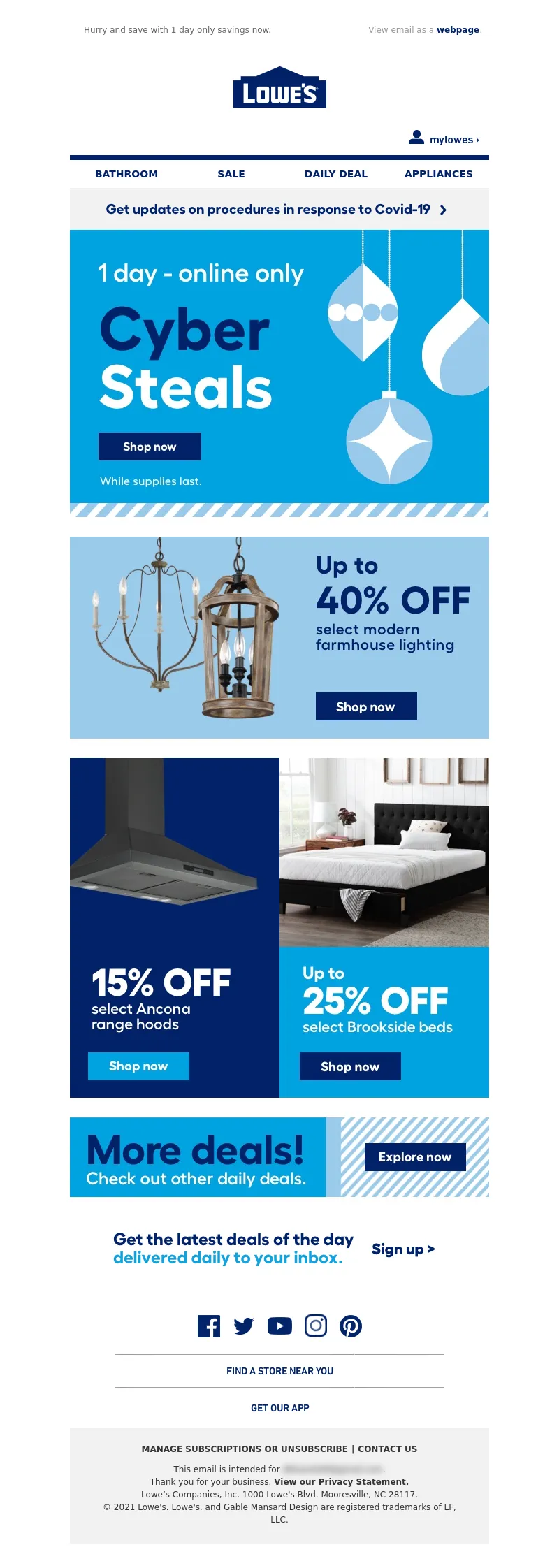
<a data-linkto="https://" href="https://click.e.lowes.com/?qs=13ca9c66001f5a93920b3f14c6bc42bb6171ce04608d925134e4017fb448e672dd9056281b5c9c8d567571260cce57fa8126825aac7ea469c80fa672be50f296" target="_blank" title=""><img alt="Up to 40% off select modern farmhouse lighting." data-assetid="40069" src="https://image.e.lowes.com/lib/fe9515707364027471/m/64/dc32a89b-976a-4216-8d02-4b01a87342d2.jpg" style="display: block; width: 100%; padding: 0px; text-align: center; height: auto;" width="600"></a></td></tr></table></td></tr></table>
<table cellpadding="0" cellspacing="0" width="100%" role="presentation" style="min-width: 100%; " class="stylingblock-content-wrapper"><tr><td class="stylingblock-content-wrapper camarker-inner"><table align="center" border="0" cellpadding="0" cellspacing="0" class="container" width="600">
<tr>
<td valign="top">
<table border="0" cellpadding="0" cellspacing="0" width="100%">
<tr>
<td align="left" style="padding-right: 0px;" valign="top">
<a data-linkto="https://" href="https://click.e.lowes.com/?qs=13ca9c66001f5a93a33c2f20c1b27fee18f81247ff60a0f5d5b38c27a2b90533e86bd88772754b81a9f8bc4ba60ed6409da7159e8f2e1bdcab52ca80a04f0569" target="_blank" title=""><img alt="15% off select Ancona range hoods." data-assetid="40068" src="https://image.e.lowes.com/lib/fe9515707364027471/m/64/81b0969e-a586-4f07-82a2-795853ef4a32.jpg" style="display: block; width: 100%; padding: 0px; text-align: center; height: auto;" width="100%"></a></td><td align="right" style="padding-left: 0px;" valign="top">
<a data-linkto="https://" href="https://click.e.lowes.com/?qs=6d9edd4e028946bc5b9cfdfafd3ee5a6d10c72b7cd8af65b2a2c0c528798346279793ab4f5439650d90a55b7a1640764f662c6e6e853115b6669d954221bf76d" target="_blank" title=""><img alt="Up to 25% off select Brookside beds." data-assetid="40070" src="https://image.e.lowes.com/lib/fe9515707364027471/m/64/c11ee849-43f9-4a83-a66b-0e3adad9025c.jpg" style="display: block; width: 100%; padding: 0px; text-align: center; height: auto;" width="100%"></a></td></tr></table></td></tr></table></td></tr></table>
<table cellpadding="0" cellspacing="0" width="100%" role="presentation" style="min-width: 100%; " class="stylingblock-content-wrapper"><tr><td class="stylingblock-content-wrapper camarker-inner"><table align="center" border="0" cellpadding="0" cellspacing="0" class="container" width="600">
<tr>
<td>
<a data-linkto="https://" href="https://click.e.lowes.com/?qs=6d9edd4e028946bc15a42ed19669d133733bdfdc3c752385b09a7da6505b6c6e57bb5f84f64c239172c2a4896838a243cf9c99340bc304b4d9e35c8c3c479b33" target="_blank" title=""><img alt="More deals! Check out other daily deals." data-assetid="40067" src="https://image.e.lowes.com/lib/fe9515707364027471/m/64/72823138-d1d4-43e8-bc53-8fdf525c447f.jpg" style="display: block; width: 100%; padding: 0px; text-align: center; height: auto;" width="600"></a></td></tr></table></td></tr></table><table align="center" border="0" cellpadding="0" cellspacing="0" class="container" width="600">
<tr>
<td><a href="https://click.e.lowes.com/?qs=6d9edd4e028946bc04a5a0c9c2ae7c2d171343abb9cbd704157a552fd049aee898a5d79fa32bd5c6500762601998c3fd229dab919c9db989bba459e8a62d8347" target="_blank" title="Get the latest deals of the day delivered daily to your inbox. Sign up >">
<img alt="Get the latest deals of the day delivered daily to your inbox. Sign up >" src="https://image.e.lowes.com/lib/fe9515707364027471/m/62/9271c0c8-9f13-4bda-9dc9-a8fe395bee96.jpg" style="display: block;" width="600" border="0" class="photo" /></a></td>
</tr>
</table>
<table cellpadding="0" cellspacing="0" width="100%" role="presentation" style="min-width: 100%; " class="stylingblock-content-wrapper"><tr><td class="stylingblock-content-wrapper camarker-inner"><table border="0" cellpadding="0" cellspacing="0" width="100%">
<tr>
<td style="font-size:0%;">
<img alt="" border="0" height="30" src="https://image.e.lowes.com/lib/fe9515707364027471/m/32/20131010_promo_spacer.gif" style="display:block" width="1"></td></tr></table></td></tr></table>
<table cellpadding="0" cellspacing="0" width="100%" role="presentation" style="min-width: 100%; " class="stylingblock-content-wrapper"><tr><td class="stylingblock-content-wrapper camarker-inner"><!----><table align="center" border="0" cellpadding="0" cellspacing="0" class="container" width="100%">
<tr>
<td align="center" bgcolor="#ffffff" style="font-family:Arial, Helvetica, sans-serif; font-size:12px; color:#666666; padding-top:10px;" valign="top">
<!---->
<!--[if !mso]><!-- --><table align="center" bgcolor="#ffffff" border="0" cellpadding="0" cellspacing="0" class="mobile-only container" style="display: none;" width="100%">
<tr>
<td align="center" style="font-size: 0px; line-height: 1px; mso-line-height-rule: exactly;" valign="top">
<img alt="" border="0" class="photo" height="1" src="https://image.e.lowes.com/lib/fe9515707364027471/m/56/bb6af455-49ee-4acd-a650-0ef4929ac4a7.jpg" style="display:block; width: 100%; height: 1px;" width="100%"></td></tr><tr>
<td align="center" height="40" valign="middle">
<!--NAV1001 Link Starts here--><a href="https://click.e.lowes.com/?qs=6d9edd4e028946bc8b732eb84b32375dbe64b2dc11805208862898a7305c7d082d43a2e4751281a515132d507a85968daff5a56ba3075f7df9bc50cc792144de" style="color: #012169; text-decoration: none; font-family: Helvetica, Arial, sans-serif; font-size: 14px;" target="_blank" title="BATHROOM"><strong>BATHROOM</strong></a> <!--NAV1001 Link Ends here--></td></tr><tr>
<td align="center" height="40" style="border-top: 1px solid #a1a1a1;" valign="middle">
<!--NAV1002 Link Starts here--><a href="https://click.e.lowes.com/?qs=6d9edd4e028946bcc8be05255757ea7a8fa3fc8c2c86e57ada664d34cf57066755c771174123e010e0d70aa1f7db19fca576747f4e54ed628c2de66a8c5d4a4a" style="color: #012169; text-decoration: none; font-family: Helvetica, Arial, sans-serif; font-size: 14px;" target="_blank" title="SALE"><strong>SALE</strong></a> <!--NAV1002 Link Ends here--></td></tr><tr>
<td align="center" height="40" style="border-top: 1px solid #a1a1a1;" valign="middle">
<!--NAV1003 Link Starts here--><a href="https://click.e.lowes.com/?qs=6d9edd4e028946bc2a560b24a6f327541ec0a2ddcce40a92139d44640e5df921514bd1e8e15594f02d9170d384961116d90370e2758b24156695242ff1d8b2b4" style="color: #012169; text-decoration: none; font-family: Helvetica, Arial, sans-serif; font-size: 14px;" target="_blank" title="DAILY DEAL"><strong>DAILY DEAL</strong></a> <!--NAV1003 Link Ends here--></td></tr><tr>
<td align="center" height="40" style="border-top: 1px solid #a1a1a1;" valign="middle">
<!--NAV1004 Link Starts here--><a href="https://click.e.lowes.com/?qs=6d9edd4e028946bc3bc0f70eee803a1602692ac9d09853e28055305de8cd318d7ae88246c1dccecb7efc2ea7d159a052f6fd7f8be41f1f0d916b7b71cb218249" style="color: #012169; text-decoration: none; font-family: Helvetica, Arial, sans-serif; font-size: 14px;" target="_blank" title="APPLIANCES"><strong>APPLIANCES</strong></a> <!--NAV1004 Link Ends here--></td></tr></table><!--<![endif]--><!----><table align="center" border="0" cellpadding="0" cellspacing="0" class="mobile-hidden container" width="100%">
<tr>
</tr><tr>
<td align="center" style="padding-bottom: 14px;">
<table border="0" cellpadding="0" cellspacing="0">
<tr>
<td>
<a href="https://click.e.lowes.com/?qs=6d9edd4e028946bc477114ec0fb7ea1056bf72f447bd2ff192674b395c94e36773618cb8efd7148407ab02a3c4f3f481eb61828a3d1818c9" target="_blank" title="Facebook"><img alt="Facebook" border="0" height="49" src="https://image.e.lowes.com/lib/fe9515707364027471/m/59/c6808656-b0d8-442d-a586-6160d7fbd761.png" style="display:block;" width="49"></a></td><td>
<a href="https://click.e.lowes.com/?qs=6d9edd4e028946bcd11e706a946450db340a3820478eec8f3bd4cded964d7b4f9d2fe59734fb82b1857d7517393d80fe66c882e7380572aa" target="_blank" title="Twitter"><img alt="Twitter" border="0" height="49" src="https://image.e.lowes.com/lib/fe9515707364027471/m/59/b315cf6b-d65a-4b3a-a7c1-5d40c83787b6.png" style="display:block;" width="47"></a></td><td>
<a href="https://click.e.lowes.com/?qs=6d9edd4e028946bcb92ef127867fc4e9756e959df859529bb1d4fb374437a16a21d99a6afae33c0d558234bb26484b8981046878bb4f997d" target="_blank" title="YouTube"><img alt="YouTube" border="0" height="49" src="https://image.e.lowes.com/lib/fe9515707364027471/m/59/f4bc112b-d366-4497-a878-0f2ce36c4d31.png" style="display:block;" width="55"></a></td><td>
<a href="https://click.e.lowes.com/?qs=6d9edd4e028946bcbf594121936daefde3cdaaf584801ccae33e78fe07cd8209c05bade0c35bdfdcd7defdb6ba85711968ab30ff61b80c90" target="_blank" title="Instagram"><img alt="Instagram" border="0" height="49" src="https://image.e.lowes.com/lib/fe9515707364027471/m/59/4c4871cd-eb9a-416f-b91f-1b659c50d18d.png" style="display:block;" width="48"></a></td><td>
<a href="https://click.e.lowes.com/?qs=6d9edd4e028946bc1bbf43ac5d225ea114a62ef4e6d0ea6a2df9f3de3b72c33297d57ff86170356371c7086cbc29b91ed7dd4b26e6327ec9" target="_blank" title="Pinterest"><img alt="Pinterest" border="0" height="49" src="https://image.e.lowes.com/lib/fe9515707364027471/m/59/c3a70af5-4e26-408f-98ca-32c55030b8b0.png" style="display:block;" width="48"></a></td></tr></table></td></tr></table><table align="center" border="0" cellpadding="0" cellspacing="0" class="container" width="473">
<tr>
<td align="center" style="padding-bottom: 12px; font-size: 0px; line-height: 1px; mso-line-height-rule: exactly;" valign="top">
<img alt="" border="0" class="photo" height="1" src="https://image.e.lowes.com/lib/fe9515707364027471/m/56/bb6af455-49ee-4acd-a650-0ef4929ac4a7.jpg" style="display:block; width: 100%; height: 1px;" width="100%"></td></tr><tr>
<td align="center" style="font-size: 14px; line-height: 22px; mso-line-height-rule: exactly;" valign="middle">
<a href="https://click.e.lowes.com/?qs=6d9edd4e028946bc397c4660a119d48bc9837686997d0143e0985f35e8fb682da7450c702298dcc4da0eb0d2d3693a3281771b2d08bc2abc58a4ae830bbeff18" style="color: #012169; font-family: 'DIN Next', Arial, Helvetica, sans-serif; font-size: 14px; line-height: 22px; font-weight: bold; text-decoration: none;" target="_blank" title="FIND A STORE NEAR YOU">FIND A STORE NEAR YOU</a></td></tr><tr>
<td align="center" style="padding-top: 12px; padding-bottom: 18px; font-size: 0px; line-height: 1px; mso-line-height-rule: exactly;" valign="top">
<img alt="" border="0" class="photo" height="1" src="https://image.e.lowes.com/lib/fe9515707364027471/m/56/bb6af455-49ee-4acd-a650-0ef4929ac4a7.jpg" style="display:block; width: 100%; height: 1px;" width="100%"></td></tr><tr>
<td align="center" style="font-size: 14px; line-height: 22px; mso-line-height-rule: exactly; padding-bottom: 18px;" valign="top">
<a href="https://click.e.lowes.com/?qs=6d9edd4e028946bc561cb843897174651a8a0322c01bd892e81d5acc53153b6e7fb31608e9330bd75a651ec1403739eaf45ccdcf778859f87f1e8cccddf75724" style="color: #012169; font-family: 'DIN Next', Arial, Helvetica, sans-serif; font-size: 14px; line-height: 22px; font-weight: bold; text-decoration: none;" target="_blank" title="GET OUR APP">GET OUR APP</a></td></tr></table><!--[if !mso]><!-- --><table align="center" border="0" cellpadding="0" cellspacing="0" class="mobile-only center" style="display: none; text-align: center;" width="250">
<tr>
<td align="center" style="padding-bottom: 14px; text-align: center;">
<table align="center" border="0" cellpadding="0" cellspacing="0" style="display: inline-block; text-align: center;" width="250">
<tr>
<td>
<a href="https://click.e.lowes.com/?qs=6d9edd4e028946bc477114ec0fb7ea1056bf72f447bd2ff192674b395c94e36773618cb8efd7148407ab02a3c4f3f481eb61828a3d1818c9" target="_blank" title="Facebook"><img alt="Facebook" border="0" height="49" src="https://image.e.lowes.com/lib/fe9515707364027471/m/59/c6808656-b0d8-442d-a586-6160d7fbd761.png" width="49"></a></td><td>
<a href="https://click.e.lowes.com/?qs=6d9edd4e028946bcd11e706a946450db340a3820478eec8f3bd4cded964d7b4f9d2fe59734fb82b1857d7517393d80fe66c882e7380572aa" target="_blank" title="Twitter"><img alt="Twitter" border="0" height="49" src="https://image.e.lowes.com/lib/fe9515707364027471/m/59/b315cf6b-d65a-4b3a-a7c1-5d40c83787b6.png" width="47"></a></td><td>
<a href="https://click.e.lowes.com/?qs=6d9edd4e028946bcb92ef127867fc4e9756e959df859529bb1d4fb374437a16a21d99a6afae33c0d558234bb26484b8981046878bb4f997d" target="_blank" title="YouTube"><img alt="YouTube" border="0" height="49" src="https://image.e.lowes.com/lib/fe9515707364027471/m/59/f4bc112b-d366-4497-a878-0f2ce36c4d31.png" width="55"></a></td><td>
<a href="https://click.e.lowes.com/?qs=6d9edd4e028946bcbf594121936daefde3cdaaf584801ccae33e78fe07cd8209c05bade0c35bdfdcd7defdb6ba85711968ab30ff61b80c90" target="_blank" title="Instagram"><img alt="Instagram" border="0" height="49" src="https://image.e.lowes.com/lib/fe9515707364027471/m/59/4c4871cd-eb9a-416f-b91f-1b659c50d18d.png" width="48"></a></td><td>
<a href="https://click.e.lowes.com/?qs=6d9edd4e028946bc1bbf43ac5d225ea114a62ef4e6d0ea6a2df9f3de3b72c33297d57ff86170356371c7086cbc29b91ed7dd4b26e6327ec9" target="_blank" title="Pinterest"><img alt="Pinterest" border="0" height="49" src="https://image.e.lowes.com/lib/fe9515707364027471/m/59/c3a70af5-4e26-408f-98ca-32c55030b8b0.png" width="48"></a></td></tr></table></td></tr></table><!--<![endif]--><table align="center" bgcolor="#f2f2f2" border="0" cellpadding="0" cellspacing="0" class="container" width="100%">
<tr>
<td align="center" style="padding-top:10px;padding-bottom:10px;">
<table align="center" bgcolor="#f2f2f2" border="0" cellpadding="0" cellspacing="0" class="container" width="90%">
<tr>
<td align="center" style="padding-top:10px;padding-bottom:10px;">
<table align="center" bgcolor="#f2f2f2" border="0" cellpadding="0" cellspacing="0" class="Width90">
<tr>
<!----><th align="center" bgcolor="#f2f2f2" class="drop-center" style="font-family: Arial, Helvetica, sans-serif; font-size: 12px; line-height: 20px;" valign="middle">
<a href="https://click.e.lowes.com/?qs=6d9edd4e028946bc646dd20c8a62932e837631ef430b3613897240120d9618a5952090c9b2e8c378b552d4252c2aeb8b195bbea56690188982fe5a2870804702" style="text-decoration: none; color: #333333; font-weight: bold;" target="_blank" title=">MANAGE SUBSCRIPTIONS OR UNSUBSCRIBE">MANAGE SUBSCRIPTIONS OR UNSUBSCRIBE</a></th><!----><th align="center" bgcolor="#f2f2f2" class="mobile-hidden" style="color: #333333; font-size:12px; padding-left:5px; padding-right:5px; line-height: 20px;" valign="middle">
|</th><th align="center" bgcolor="#f2f2f2" class="drop-center" style="font-family: Arial, Helvetica, sans-serif; font-size: 12px; line-height: 20px;" valign="middle">
<a href="https://click.e.lowes.com/?qs=6d9edd4e028946bc2613d33e0acfe4048f3f85e2309541c3e3f0540b34a3fe3840f509e13c4ca0e13e8e0d854cc46b5bcccc582f13a8fb9dddd4209a45716732" style="text-decoration: none; color: #333333; font-weight: bold;" target="_blank" title="CONTACT US">CONTACT US</a></th></tr></table></td></tr><tr>
<td align="center" style="-webkit-text-size-adjust:none; vertical-align:top; font-family:Helvetica, Arial, sans-serif; font-size:12px; color: #333333; text-decoration: none; line-height: 18px; font-weight:normal; padding-left: 10px; padding-right: 10px;">
This email is intended for <a href="#" style="color:#333333; text-decoration:none;">james.bond007@mi6.co.uk</a>.<br>
Thank you for your business. <a href="https://click.e.lowes.com/?qs=6d9edd4e028946bcd6fd7a7ca646024764dbc10ee50168d4dc3de63c66684975752916eeecd644377e3ef1f66941f54f48eb373a3cf4fc02f72ee924bd1d61c0" style="font-weight: bold; color: #333333; text-decoration: none;" target="_blank" title="View our Privacy Statement.">View our Privacy Statement.</a><br>
Lowe’s Companies, Inc. 1000 Lowe's Blvd. Mooresville, NC 28117.<br>
© 2021 Lowe's. Lowe's, and Gable Mansard Design are registered trademarks of LF, LLC.</td></tr><!----><tr>
<td style="-webkit-text-size-adjust:none; vertical-align:top; font-family:Helvetica, Arial, sans-serif; font-size:12px; color: #333333; text-decoration: none; text-align: left; line-height: 18px; font-weight:normal; padding-top: 5px; padding-bottom: 10px;">
</td></tr></table></td></tr></table></td></tr></table></td></tr></table>
</td>
</tr>
</table>
</td>
</tr>
</table>
<img src="https://pixel.inbox.exacttarget.com/pixel.gif?r=3cee957cf4045be5bdd97f3d45b56bc1d2d850ec" width="1" height="1" />
<img src="https://beacon.krxd.net/1x1_usermatch.gif?partner=LYMUCbth_sfmc_1060694_sha256&partner_uid=ed288a60fef0d429a6e67d2d71af1392792076007be48ca2ecc94afc5c372498" width=0 height=0 style="display:none" />
<img src="https://beacon.krxd.net/1x1_usermatch.gif?partner=LYMUCbth_sfmc_1060694_subid&partner_uid=129182386" width=0 height=0 style="display:none" />
<img src="https://beacon.krxd.net/1x1_ad_impression.gif?confid=r3dodf9im&advertiserid=1060694&campaignid=20211113_DIY_Enterprise_1SL1" width=0 height=0 style="display:none;" />
<img src="https://click.e.lowes.com/open.aspx?ffcb10-fec7177172630578-fe201770776d0c747d1272-fe9515707364027471-ff991773-fe2715727c650c7f761c76-ff031572766006&d=40118&bmt=0" width="1" height="1" alt="">
</div>
</body>
</html>