<!DOCTYPE html PUBLIC"-//W3C//DTD XHTML 1.0 Transitional//EN" "https://www.w3.org/TR/xhtml1/DTD/xhtml1-transitional.dtd">
<html xmlns="https://www.w3.org/1999/xhtml">
<head>
<meta http-equiv="Content-Type" content="text/html; charset=UTF-8" />
<meta name="viewport" content="width=device-width, initial-scale=1.0" />
<meta name="x-apple-disable-message-reformatting" />
<!--[if !mso]><!-->
<style type="text/css">
@font-face{
font-family:'DIN Next';
src:local('DIN Next'), local('DIN Next'), url('https://www.lowescdn.com/scaffold/1.4.4/fonts/din/din-next.woff') format('woff');
}
@font-face{
font-family:'DIN Next Bold';
src:local('DIN Next Bold'), local('DIN Next Bold'), url('https://www.lowescdn.com/scaffold/1.2.0/fonts/din/din-next-bold.woff') format('woff');
}
@font-face{
font-family:'DIN Next Black';
src:local('DIN Next Black'), local('DIN Next Black'), url('https://www.lowescdn.com/scaffold/1.2.0/fonts/din/din-next-black.woff') format('woff');
}
</style>
<!--<![endif]-->
<style type="text/css">
.ReadMsgBody{ width: 100%;} /* Forces Hotmail to display emails at full width */
.ExternalClass { width: 100%;} /*Hotmail table centering fix*/
.ExternalClass, .ExternalClass p, .ExternalClass span, .ExternalClass font, .ExternalClass td, .ExternalClass div {line-height: 100%;} /* Forces Hotmail to display normal line spacing*/
.ExternalClass * {line-height: 100%}
p { margin: 1em 0;} /*Yahoo paragraph fix*/
table td { border-collapse: collapse;} /*This resolves the Outlook 07, 10, and Gmail td padding issue fix*/
/*This resolves the issue when iphone puts links on dates, etc.*/
a[x-apple-data-detectors] {
color: inherit !important;
text-decoration: none !important;
font-size: inherit !important;
font-family: inherit !important;
font-weight: inherit !important;
line-height: inherit !important;
}
a.mobileshow, .mobilehide {
display: none;
color: #fff; /*for Gmail */
}
</style>
<style type="text/css">
@media screen and (min-width: 375px) and (max-width: 600px) and (-webkit-min-device-pixel-ratio:0) {
.mobile-hidden {
display: none !important;
}
.no-padding {
padding: 0px !important;
}
.mobile-only {
display: block !important;
max-height: none !important;
}
.container {
width: 100% !important;
}
.navcontainer tbody{
width: 100% !important;
display: table !important;
}
.drop {
width: 100% !important;
display: block !important;
}
.drop-center {
width: 100% !important;
display: block !important;
text-align: center !important;
}
.photo {
width: 100% !important;
height: auto !important;
}
}
</style>
<style type="text/css">
/* Media query triggers alternate styles when the file is displayed on a device with a maximum width lower than the assigned pixel dimension. The default max width setting for max-width should be 480px to trigger on mobile devices. */
@media only screen and (max-width: 375px) {
.mobile-hidden {
display: none !important;
}
.mobile-photo {
width: 100% !important;
max-width: 375px !important;
height: auto !important;
}
.no-padding {
padding: 0px !important;
}
.mobile-only {
display: block !important;
max-height: none !important;
}
.container {
width: 100% !important;
max-width: 375px !important;
}
.photo {
width: 100% !important;
max-width: 375px !important;
height: auto !important;
}
.managesubs {
width: 83% !important;
height: auto !important;
}
.photo390 {
display: block !important;
height: auto !important;
max-width: 390px !important;
width: 100% !important;
}
.yahoo-mobile-only {
display: block;
}
body[data-outlook-cycle] .oa {
width: 100% !important;
max-width: 375px !important;
text-align: center !important;
overflow-x: hidden !important;
display: block !important;
}
.drop {
width: 100% !important;
max-width: 375px !important;
display: block !important;
}
.drop-center {
width: 100% !important;
max-width: 375px !important;
display: block !important;
text-align: center !important;
}
}
</style>
<style type="text/css">
@media only screen and (max-width: 414px) {
.mobile-hidden, .tablet-hidden {
display: none !important;
}
.mobile-photo {
width: 100% !important;
max-width: 414px !important;
height: auto !important;
}
.no-padding {
padding: 0px !important;
}
.mobile-only {
display: block !important;
max-height: none !important;
}
.container {
width: 100% !important;
max-width: 414px !important;
}
.photo {
width: 100% !important;
max-width: 414px !important;
height: auto !important;
}
.managesubs {
width: 83% !important;
height: auto !important;
}
.photo390 {
display: block !important;
height: auto !important;
max-width: 390px !important;
width: 100% !important;
}
.yahoo-mobile-only {
display: block;
}
body[data-outlook-cycle] .oa {
width: 100% !important;
max-width: 414px !important;
text-align: center !important;
overflow-x: hidden !important;
display: block !important;
}
.drop {
width: 100% !important;
max-width: 414px !important;
display: block !important;
}
.drop-center {
width: 100% !important;
max-width: 414px !important;
display: block !important;
text-align: center !important;
}
}
</style>
<style type="text/css">
@media only screen and (max-width: 480px) {
html, body {
width: 100% !important;
min-width: 100% !important;
max-width: 480px !important;
overflow-x: visible !important;
margin: 0 auto !important;
}
.mobile-hidden, .tablet-hidden {
display: none !important;
}
.mobile-photo {
width: 100% !important;
max-width: 450px !important;
height: auto !important;
}
.no-padding {
padding: 0px !important;
}
.mobile-only {
display: block !important;
max-height: none !important;
}
.container {
width: 100% !important;
max-width: 480px !important;
}
.photo {
width: 100% !important;
max-width: 480px !important;
height: auto !important;
}
.managesubs {
width: 83% !important;
height: auto !important;
}
.photo390 {
display: block !important;
height: auto !important;
max-width: 390px !important;
width: 100% !important;
}
.yahoo-mobile-only {
display: block;
}
body[data-outlook-cycle] .oa {
width: 100% !important;
max-width: 480px !important;
text-align: center !important;
overflow-x: hidden !important;
display: block !important;
}
.drop {
width: 100% !important;
max-width: 480px !important;
display: block !important;
}
.drop-social {
width: 100% !important;
max-width: 480px !important;
display: block !important;
text-align: center !important;
padding: 0px !important;
}
.center {
text-align: center !important;
}
.center50 {
width: 50% !important;
padding-right: 10px !important;
padding-left: 10px !important;
}
.drop-center {
width: 100% !important;
max-width: 480px !important;
display: block !important;
text-align: center !important;
}
.Full100 {
width: 100% !important;
max-width: 480px !important;
height: auto!important;
line-height: normal!important;
}
.pad10 {
padding-left: 10px !important;
padding-right: 10px !important;
}
.sub_nav {
border-bottom: 2px solid #ffffff;
display: table-cell !important;
width: auto !important;
height: auto !important;
float: none !important;
overflow: auto !important;
line-height: normal !important;
font-size: 15px !important;
background-color: #15b5e5 !important;
}
.sub_nav_bottom {
border-bottom: 2px solid #ffffff;
display: table-cell !important;
width: auto !important;
height: auto !important;
float: none !important;
overflow: auto !important;
line-height: normal !important;
font-size: 15px !important;
}
.sub_nav_top {
display: table-cell !important;
width: auto !important;
height: auto !important;
float: none !important;
overflow: auto !important;
font-size: 18px !important;
line-height: 30px !important;
}
.tablet-only {
display: block !important;
max-height: none !important;
}
}
</style>
<style type="text/css">
@media only screen and (max-width: 599px) {
.tablet-only {
display: block !important;
max-height: none !important;
}
}
</style>
<style type="text/css">
/*Liveclicker responsive video styles*/
/*Android devices*/
@media only screen and (max-device-width: 480px) { div.lc-video{ width:100%; height:auto;} }
/* iPhone 5 - Portrait */
@media only screen and (device-width: 320px) { div.lc-video { width: 320px; min-width: 320px; height: 180px; } }
/* iPhone 6 - Portrait */
@media only screen and (device-width: 375px) { div.lc-video { width: 375px; min-width: 375px; height: 211px; } }
/* iPhone 6+ - Portrait */
@media only screen and (device-width: 414px) { div.lc-video { width: 414px; min-width: 414px; height: 233px; } }
/* iPhone 5 - Landscape */
@media only screen and (width: 568px) { div.lc-video { width: 568px; min-width: 586px; height: 320px; } }
/* iPhone 6 - Landscape */
@media only screen and (width: 667px) { div.lc-video { width: 600px; min-width: 600px; height: 338px; } }
/* iPhone 6+ - Landscape */
@media only screen and (width: 736px) { div.lc-video { width: 600px; min-width: 600px; height: 338px; } }
@media screen and (max-width: 480px) {
u ~ div {
min-width: 100vw;
}
}
</style>
<title>Lowe's Email</title>
</head>
<body bgcolor="#ffffff" style="margin: 0; padding:0px; -ms-text-size-adjust: none; mso-line-height-rule: exactly;" yahoo="fix">
<div class="oa" align="center">
<!-- Table used to center email -->
<table border="0" cellpadding="0" cellspacing="0" width="100%" class="container">
<tr>
<td>
<!-- Table used to set width of email -->
<table width="600" class="container" border="0" align="center" cellpadding="0" cellspacing="0" style="font-family:Arial, Helvetica, sans-serif">
<tr>
<td>
<table cellpadding="0" cellspacing="0" width="100%" role="presentation" style="min-width: 100%; " class="stylingblock-content-wrapper"><tr><td class="stylingblock-content-wrapper camarker-inner"><table class="container" width="100%" cellspacing="0" cellpadding="0" border="0" align="center">
<tr>
<td style="font-family:Arial, Helvetica, sans-serif; font-size:12px; color:#666666; padding-left:10px; padding-top:10px; padding-bottom:10px;" valign="top" bgcolor="#ffffff" align="left">
<table class="Width90" width="100%" cellspacing="0" cellpadding="0" border="0">
<tr>
<th class="no-padding drop" style="font-family:Arial, Helvetica, sans-serif; font-size:12px; color:#666666; padding-left:10px; padding-top:10px; padding-bottom:10px; font-weight: normal;" valign="top" bgcolor="#ffffff" align="left">
<!--Preheader Link Starts here--><!--Preheader Link Ends here--></th><th class="mobile-hidden" style="font-family:Helvetica, Arial, sans-serif; font-size:12px; color:#999999; padding-right:10px; padding-left:0px; padding-top:10px; padding-bottom:10px; font-weight: normal;" width="175" valign="top" bgcolor="#ffffff" align="right">
<!---->View email as a <a href="https://view.e.lowes.com/?qs=37e6682f76e582f9641a79a7c4992778393caf35857f741c7b3c1f73693dcab69786f99a3f9665fb217420eced212d417042cc23d30bed44909e4a2ccbb4d9786833d6b87d1b4a94143b80fd5a9070da" style=" text-decoration:none; color:#004890; font-weight:bold;" target="_blank" title="webpage">webpage</a>.<!----></th></tr></table></td></tr></table></td></tr></table><table cellpadding="0" cellspacing="0" width="100%" role="presentation" style="min-width: 100%; " class="stylingblock-content-wrapper"><tr><td class="stylingblock-content-wrapper camarker-inner"><table align="center" border="0" cellpadding="0" cellspacing="0" class="container" width="100%">
<tr>
<td align="center" style="padding-top:10px; padding-bottom: 5px;" valign="bottom">
<a href="https://click.e.lowes.com/u/?qs=8898d886862522a9f351daa120642435d44062e7ea5b18dc4d4acd016b2e25831fc78848235050593df7fcb56373b5f8edd0fe8c03f1415a8bf01594354578ed" target="_blank" title="Lowe's"><img alt="Lowe's" border="0" src="https://image.e.lowes.com/lib/fe9515707364027471/m/59/14f6b444-13d4-4f6b-a52a-df9473ac4be2.png" style="display:block; margin-left: auto; margin-right: auto" width="141"></a></td></tr><tr>
<td align="right" style="padding-bottom: 10px; padding-right: 10px;">
<a href="https://click.e.lowes.com/u/?qs=fcc3b4d1b1da7ca4381db5c8b16773439967531c009de617f16a21ca645153fe83732d797880622537b249ae45a1787efd8f25da9681b661e6b2e3def53e151d" target="_blank" title="MyLowe's Login"><img alt="MyLowe's Login" border="0" src="https://image.e.lowes.com/lib/fe9515707364027471/m/59/e5a53d36-76a9-46cf-b45e-90482ed1b8b9.png" style="display:block;" width="110"></a></td></tr></table></td></tr></table>
<table cellpadding="0" cellspacing="0" width="100%" role="presentation" style="min-width: 100%; " class="stylingblock-content-wrapper"><tr><td class="stylingblock-content-wrapper camarker-inner"><table border="0" cellpadding="0" cellspacing="0" class="container" width="100%" bgcolor="#ffffff" align="center">
<tr>
<td style="padding-top: 40px;" align="center">
<!--Desktop image and link starts here--><img alt="WE'D LOVE YOUR OPINION." border="0" class="mobile-hidden" src="https://image.e.lowes.com/lib/fe9515707364027471/m/66/3fe12835-0a88-4346-9cf8-ea6b67759529.jpg" style="display:block; width:100%; color: #012169; font-family: 'DIN Next Bold', Helvetica, Arial;" width="600">
<img alt="WE'D LOVE YOUR OPINION." border="0" class="mobile-hidden" src="https://image.e.lowes.com/lib/fe9515707364027471/m/66/908d2e6b-bcdf-472b-a07e-272966db4099.jpg" style="display:block; width:100%; color: #012169; font-family: 'DIN Next Bold', Helvetica, Arial;" width="600">
<!--End Desktop image and link-->
<!--[if !mso]><!-- -->
<div class="mobile-only center" style="font-size: 0; max-height: 0; overflow: hidden; display: none;"><!--Mobile image and link starts here--><img alt="WE'D LOVE YOUR OPINION." border="0" src="https://image.e.lowes.com/lib/fe9515707364027471/m/66/3fe12835-0a88-4346-9cf8-ea6b67759529.jpg" style="display:block; color: #012169; font-family: 'DIN Next Bold', Helvetica, Arial; margin-left: auto; margin-right: auto;" width="90%">
<img alt="WE'D LOVE YOUR OPINION." border="0" src="https://image.e.lowes.com/lib/fe9515707364027471/m/66/908d2e6b-bcdf-472b-a07e-272966db4099.jpg" style="display:block; color: #012169; font-family: 'DIN Next Bold', Helvetica, Arial; margin-left: auto; margin-right: auto;" width="90%">
<!--End Mobile image and link--></div><!--<![endif]-->
</td>
</tr>
</table>
<table cellpadding="0" cellspacing="0" width="100%" role="presentation" style="min-width: 100%; " class="stylingblock-content-wrapper"><tr><td class="stylingblock-content-wrapper camarker-inner"><table align="center" border="0" cellpadding="0" cellspacing="0" class="container" width="100%">
<tr>
<td align="center" style="padding: 10px 20px"><table align="center" border="0" cellpadding="0" cellspacing="0" class="container" width="100%">
<tr>
<th class="drop-center" width="50%" valign="middle"> <table align="center" border="0" cellpadding="0" cellspacing="0" class="container">
<tr>
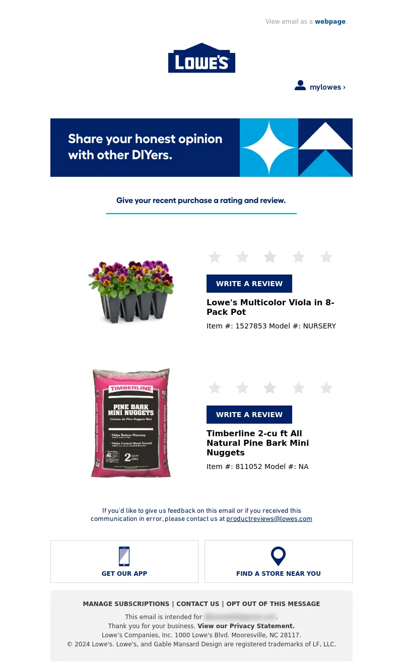
<td align="center" style="padding: 10px"><a href="https://click.e.lowes.com/u/?qs=d1cecf2c07702e6eec6cfbd17ca614ea72d89874566a366ae963c8a870c7d7a779b7e6372afb8bad87be45066dc6bbfcd9257b6085e0dd5d938ceaeb6990e95e" target="_blank"><img alt="Lowe's Multicolor Viola in 8-Pack Pot" border="0" src="https://mobileimages.lowes.com/productimages/e360a83c-9ae5-41e4-abbc-e74aac71d402/45679044.jpg" style="display:block; width: 200px;" width="200"></a></td>
</tr>
</table></th>
<th class="drop-center" width="50%" valign="middle"> <table border="0" cellpadding="0" cellspacing="0" class="container">
<tr>
<td style="padding: 10px" class="drop-center" align="left"><a href="https://click.e.lowes.com/u/?qs=d1cecf2c07702e6eec6cfbd17ca614ea72d89874566a366ae963c8a870c7d7a779b7e6372afb8bad87be45066dc6bbfcd9257b6085e0dd5d938ceaeb6990e95e" style="color:#FFFFFF;text-decoration:none;" target="_blank" title=""><img src="https://image.e.lowes.com/lib/fe9515707364027471/m/59/d3daace2-0875-4527-81e1-578e4d249421.png" alt="stars" width="257" height="29" style="display: inline-block; " border="0"></a></td>
</tr>
<tr>
<td style="padding: 10px" class="drop-center" align="left"><table border="0" cellpadding="0" cellspacing="0" width="170" style="display: inline-block">
<tr>
<td bgcolor="#012169" style="-webkit-text-size-adjust:none; vertical-align:center; font-family:Helvetica, Arial, sans-serif; text-align:center; text-decoration: none;padding-top:10px; padding-bottom: 10px; padding-right:10px; padding-left:10px; font-size: 14px; color: #FFFFFF; font-weight:bold;" valign="top" width="170"><a href="https://click.e.lowes.com/u/?qs=d1cecf2c07702e6eec6cfbd17ca614ea72d89874566a366ae963c8a870c7d7a779b7e6372afb8bad87be45066dc6bbfcd9257b6085e0dd5d938ceaeb6990e95e" style="color:#FFFFFF;text-decoration:none;" target="_blank" title=""><span style="color:#FFFFFF">WRITE A REVIEW</span></a></td>
</tr>
</table></td>
</tr>
<tr>
<td style="padding:0px 10px;font-family:Helvetica, Arial, sans-serif; font-size:16px; color:#000000;" valign="top" class="drop-center" align="left"><a href="https://click.e.lowes.com/u/?qs=d1cecf2c07702e6eec6cfbd17ca614ea72d89874566a366ae963c8a870c7d7a779b7e6372afb8bad87be45066dc6bbfcd9257b6085e0dd5d938ceaeb6990e95e" style="text-decoration:none; color:#000000;"><strong>Lowe's Multicolor Viola in 8-Pack Pot</strong></a></td>
</tr>
<tr>
<td style="padding:10px 10px 0px 10px;font-family:Helvetica, Arial, sans-serif; font-size:14px; color:#000000; font-weight: 200;" valign="top" class="drop-center" align="left"> Item #: 1527853 Model #: NURSERY</td>
</tr>
</table></th>
</tr>
</table></td>
</tr>
</table>
<table align="center" border="0" cellpadding="0" cellspacing="0" class="container" width="100%">
<tr>
<td align="center" style="padding: 10px 20px"><table align="center" border="0" cellpadding="0" cellspacing="0" class="container" width="100%">
<tr>
<th class="drop-center" width="50%" valign="middle"> <table align="center" border="0" cellpadding="0" cellspacing="0" class="container">
<tr>
<td align="center" style="padding: 10px"><a href="https://click.e.lowes.com/u/?qs=ed5ba031cf8e997bcf3ba8382a7fc269d67e6e2eb2eb396ecba8fd8aa6da8c1efca48a8369ec056ea610eaa9b48c747729b1de02ab3fd2645056e0eeb5a45a28" target="_blank"><img alt="Timberline 2-cu ft All Natural Pine Bark Mini Nuggets" border="0" src="https://mobileimages.lowes.com/productimages/fd15a3d2-5141-40f0-bd0e-34eeb8f6f182/07678398.jpg" style="display:block; width: 200px;" width="200"></a></td>
</tr>
</table></th>
<th class="drop-center" width="50%" valign="middle"> <table border="0" cellpadding="0" cellspacing="0" class="container">
<tr>
<td style="padding: 10px" class="drop-center" align="left"><a href="https://click.e.lowes.com/u/?qs=ed5ba031cf8e997bcf3ba8382a7fc269d67e6e2eb2eb396ecba8fd8aa6da8c1efca48a8369ec056ea610eaa9b48c747729b1de02ab3fd2645056e0eeb5a45a28" style="color:#FFFFFF;text-decoration:none;" target="_blank" title=""><img src="https://image.e.lowes.com/lib/fe9515707364027471/m/59/d3daace2-0875-4527-81e1-578e4d249421.png" alt="stars" width="257" height="29" style="display: inline-block; " border="0"></a></td>
</tr>
<tr>
<td style="padding: 10px" class="drop-center" align="left"><table border="0" cellpadding="0" cellspacing="0" width="170" style="display: inline-block">
<tr>
<td bgcolor="#012169" style="-webkit-text-size-adjust:none; vertical-align:center; font-family:Helvetica, Arial, sans-serif; text-align:center; text-decoration: none;padding-top:10px; padding-bottom: 10px; padding-right:10px; padding-left:10px; font-size: 14px; color: #FFFFFF; font-weight:bold;" valign="top" width="170"><a href="https://click.e.lowes.com/u/?qs=ed5ba031cf8e997bcf3ba8382a7fc269d67e6e2eb2eb396ecba8fd8aa6da8c1efca48a8369ec056ea610eaa9b48c747729b1de02ab3fd2645056e0eeb5a45a28" style="color:#FFFFFF;text-decoration:none;" target="_blank" title=""><span style="color:#FFFFFF">WRITE A REVIEW</span></a></td>
</tr>
</table></td>
</tr>
<tr>
<td style="padding:0px 10px;font-family:Helvetica, Arial, sans-serif; font-size:16px; color:#000000;" valign="top" class="drop-center" align="left"><a href="https://click.e.lowes.com/u/?qs=ed5ba031cf8e997bcf3ba8382a7fc269d67e6e2eb2eb396ecba8fd8aa6da8c1efca48a8369ec056ea610eaa9b48c747729b1de02ab3fd2645056e0eeb5a45a28" style="text-decoration:none; color:#000000;"><strong>Timberline 2-cu ft All Natural Pine Bark Mini Nuggets</strong></a></td>
</tr>
<tr>
<td style="padding:10px 10px 0px 10px;font-family:Helvetica, Arial, sans-serif; font-size:14px; color:#000000; font-weight: 200;" valign="top" class="drop-center" align="left">Item #: 811052 Model #: NA</td>
</tr>
</table></th>
</tr>
</table></td>
</tr>
</table>
</td></tr></table>
</td></tr></table>
<table border="0" cellpadding="0" cellspacing="0" class="container" width="100%" bgcolor="#ffffff" align="center">
<tr>
<td>
<table border="0" cellpadding="0" cellspacing="0" width="80%" align="center" bgcolor="#ffffff">
<tr>
<td valign="bottom" align="center" style="color: #012169; font-family: 'DIN Next', Helvetica, Arial; padding-top: 15px; padding-bottom: 20px; font-size: 14px; font-weight: normal;">If you'd like to give us feedback on this email or if you received this communication in error, please contact us at <a href="mailto:productreviews@lowes.com" target="_blank" alias="liv_email" style="text-decoration: underline; color: #012169;">productreviews@lowes.com</a></td>
</tr>
</table>
</td>
</tr>
</table>
<div style="display:none;">
</div><table align="center" border="0" cellpadding="0" cellspacing="0" class="container" width="100%">
<tr>
<td align="center" style="padding-top:15px; padding-bottom: 15px;">
<table align="center" border="0" cellpadding="0" cellspacing="0" class="container" width="100%">
<tr>
<th class="drop-center" style="border: 1px solid #dad8d8;" width="49%">
<table align="center" border="0" cellpadding="0" cellspacing="0" class="container">
<tr>
<td align="center" style="padding-top: 6px; padding-bottom: 3px;">
<a href="https://click.e.lowes.com/u/?qs=381b2da81d39a008d9332dd0a89812cefd865835f913514d418d7b13a79bde574d6fc0070b2ed421a185a26ece7ee2d8aecd52d036c23b2ab4df79c3079a7ac8" style="font-family: Arial, Helvetica, sans-serif; font-size: 12px; text-decoration: none; color: #012169; font-weight: bold;" target="_blank" title="GET OUR APP"><img alt="GET OUR APP" border="0" src="https://image.e.lowes.com/lib/fe9515707364027471/m/59/dcb1516a-f0f2-4e80-932b-d7d022e79d83.png" style="display:block;" width="54"></a></td></tr><tr>
<td align="center" style="padding-bottom: 10px;">
<a href="https://click.e.lowes.com/u/?qs=381b2da81d39a008d9332dd0a89812cefd865835f913514d418d7b13a79bde574d6fc0070b2ed421a185a26ece7ee2d8aecd52d036c23b2ab4df79c3079a7ac8" style="font-family: Arial, Helvetica, sans-serif; font-size: 12px; text-decoration: none; color: #012169; font-weight: bold;" target="_blank" title="GET OUR APP">GET OUR APP</a></td></tr></table></th><th class="drop-center" style="padding-top:15px;" width="2%">
</th><th class="drop-center" style="border: 1px solid #dad8d8;" width="49%">
<table align="center" border="0" cellpadding="0" cellspacing="0" class="container">
<tr>
<td align="center" style="padding-top: 6px; padding-bottom: 3px;">
<a href="https://click.e.lowes.com/u/?qs=6fed9a1ece896cbefbd7b62e35a6b3ce878afc9f0b2d9371224d50860ec8b213a4a9ad6c7c5f9b595cd8ce2d8c6fa3dc33f6b3029dafe69a1e9aaa32499b313a" style="font-family: Arial, Helvetica, sans-serif; font-size: 12px; text-decoration: none; color: #012169; font-weight: bold;" target="_blank" title="FIND A STORE NEAR YOU"><img alt="FIND A STORE NEAR YOU" border="0" src="https://image.e.lowes.com/lib/fe9515707364027471/m/59/8f617116-3025-446c-9dd1-04141bfea93e.png" style="display:block;" width="54"></a></td></tr><tr>
<td align="center" style="padding-bottom: 10px;">
<a href="https://click.e.lowes.com/u/?qs=6fed9a1ece896cbefbd7b62e35a6b3ce878afc9f0b2d9371224d50860ec8b213a4a9ad6c7c5f9b595cd8ce2d8c6fa3dc33f6b3029dafe69a1e9aaa32499b313a" style="font-family: Arial, Helvetica, sans-serif; font-size: 12px; text-decoration: none; color: #012169; font-weight: bold;" target="_blank" title="FIND A STORE NEAR YOU">FIND A STORE NEAR YOU</a></td></tr></table></th></tr></table></td></tr></table><table align="center" bgcolor="#f2f2f2" border="0" cellpadding="0" cellspacing="0" class="container" width="100%">
<tr>
<td style="padding-top:10px;padding-bottom:10px;">
<table bgcolor="#f2f2f2" border="0" cellpadding="0" cellspacing="0" class="container" width="100%">
<tr>
<td align="center" style="padding-bottom:10px;">
<table align="center" bgcolor="#f2f2f2" border="0" cellpadding="0" cellspacing="0" class="container">
<tr>
<!----><th bgcolor="#f2f2f2" class="drop-center" style="padding-top:10px;">
<a href="https://click.e.lowes.com/u/?qs=601e448a4be9fa7a1600e75010db9f4124f2eb2cc0cfd8c59b84f6cdfb93fb05493b819fb8b2d3584862bc55db33a895370459cd11aecbba89133cdfe810cd10" style="text-decoration: none; color: #333333; font-family: Arial, Helvetica, sans-serif; font-size: 12px; font-weight: bold;" target="_blank" title="MANAGE SUBSCRIPTIONS">MANAGE SUBSCRIPTIONS</a></th><th align="center" bgcolor="#f2f2f2" class="mobile-hidden" style="color: #333333; font-size:12px; padding-top:10px;" valign="middle" width="14">
|</th><!----><th bgcolor="#f2f2f2" class="drop-center" style="padding-top:10px;">
<a href="https://click.e.lowes.com/u/?qs=00b5af72f7c6f9254202a7dd0491de24630099871185ab8b15970f6eafabf1b2a200975eb78e9373451ae3747e1443c5e774fbf69629d06a871ac47b7b75392b" style="text-decoration: none; color: #333333; font-family: Arial, Helvetica, sans-serif; font-size: 12px; font-weight: bold;" target="_blank" title="CONTACT US">CONTACT US</a></th><th align="center" bgcolor="#f2f2f2" class="mobile-hidden" style="color: #333333; font-size:12px; padding-top:10px;" valign="middle" width="14">
|</th><!----><th bgcolor="#f2f2f2" class="drop-center" style="padding-top:10px;">
<a href="https://click.e.lowes.com/u/?qs=9eb4219cb63beacc3b1f420a1b5f2f798831d532cfd911947838e40841e77e87bffc4e4731e21bf98039017fe8a44fab0f26f88a2303f2ef026977b2fced93b4" style="text-decoration: none; color: #333333; font-family: Arial, Helvetica, sans-serif; font-size: 12px; font-weight: bold;" target="_blank" title="OPT OUT OF THIS MESSAGE">OPT OUT OF THIS MESSAGE</a></th></tr></table></td></tr><tr>
<td align="center" style="-webkit-text-size-adjust:none; vertical-align:top; font-family:Helvetica, Arial, sans-serif; font-size:12px; color: #333333; text-decoration: none; line-height: 18px; font-weight:normal; padding-left: 10px; padding-right: 10px;">
This email is intended for <a href="#" style="color:#333333; text-decoration:none;">james.bond007@mi6.co.uk</a>.<br>
Thank you for your business. <a href="https://click.e.lowes.com/u/?qs=6cca6d9b83b47da8e00865dffeb47f27b220d758d5e8f43e04b841f038fa9c85494387684caf83ef280b93456d2029dd840ab1b5f44ddcfec2fb43d68a0ff0c3" style="font-weight: bold; color: #333333; text-decoration: none;" target="_blank" title="View our Privacy Statement.">View our Privacy Statement.</a><br>
Lowe’s Companies, Inc. 1000 Lowe's Blvd. Mooresville, NC 28117.<br>
© 2024 Lowe's. Lowe's, and Gable Mansard Design are registered trademarks of LF, LLC.</td></tr><!----><tr>
<td style="-webkit-text-size-adjust:none; vertical-align:top; font-family:Helvetica, Arial, sans-serif; font-size:12px; color: #333333; text-decoration: none; text-align: left; line-height: 18px; font-weight:normal; padding-top: 5px; padding-bottom: 10px;">
</td></tr></table></td></tr></table>
</td>
</tr>
</table>
</td>
</tr>
</table>
<img src="https://click.e.lowes.com/open.aspx?ffcb10-febc177972650375-fe341770776c067b701471-fe9515707364027471-ff9d1670-fe2715727c650c7f761c76-fee912777c6c0c&d=40139&bmt=0" width="1" height="1" alt="">
</div>
</body>
</html>