<!DOCTYPE html PUBLIC"-//W3C//DTD XHTML 1.0 Transitional//EN" "https://www.w3.org/TR/xhtml1/DTD/xhtml1-transitional.dtd">
<html xmlns="https://www.w3.org/1999/xhtml">
<head>
<meta http-equiv="Content-Type" content="text/html; charset=UTF-8" />
<meta name="viewport" content="width=device-width, initial-scale=1.0" />
<meta name="x-apple-disable-message-reformatting" />
<!--[if !mso]><!-->
<style type="text/css">
@font-face {
font-family: 'Fellix Regular';
src: local('Fellix Regular'), local('Fellix Regular'), url('https://www.lowescdn.com/sffonts/Fellix-Regular.woff') format('woff');
}
@font-face {
font-family: 'Fellix Medium';
src: local('Fellix Medium'), local('Fellix Medium'), url('https://www.lowescdn.com/sffonts/Fellix-Medium.woff') format('woff');
}
@font-face {
font-family: 'Fellix Bold';
src: local('Fellix Bold'), local('Fellix Bold'), url('https://www.lowescdn.com/sffonts/Fellix-Bold.woff') format('woff');
}
</style>
<!--<![endif]-->
<!--[if !mso]><!-->
<style type="text/css">
@font-face {
font-family: 'DIN Next';
src: local('DIN Next'), local('DIN Next'), url('https://www.lowescdn.com/scaffold/1.4.4/fonts/din/din-next.woff') format('woff');
}
@font-face {
font-family: 'DIN Next Bold';
src: local('DIN Next Bold'), local('DIN Next Bold'), url('https://www.lowescdn.com/scaffold/1.2.0/fonts/din/din-next-bold.woff') format('woff');
}
@font-face {
font-family: 'DIN Next Black';
src: local('DIN Next Black'), local('DIN Next Black'), url('https://www.lowescdn.com/scaffold/1.2.0/fonts/din/din-next-black.woff') format('woff');
}
</style>
<!--<![endif]-->
<style type="text/css">
.ReadMsgBody{
width: 100%;
}
/* Forces Hotmail to display emails at full width */
.ExternalClass {
width: 100%;
}
/*Hotmail table centering fix*/
.ExternalClass, .ExternalClass p, .ExternalClass span, .ExternalClass font, .ExternalClass td, .ExternalClass div {
line-height: 100%;
}
/* Forces Hotmail to display normal line spacing*/
.ExternalClass * {
line-height: 100%}
p {
margin: 1em 0;
}
/*Yahoo paragraph fix*/
table td {
border-collapse: collapse;
}
/*This resolves the Outlook 07, 10, and Gmail td padding issue fix*/
/*This resolves the issue when iphone puts links on dates, etc.*/
a[x-apple-data-detectors] {
color: inherit !important;
text-decoration: none !important;
font-size: inherit !important;
font-family: inherit !important;
font-weight: inherit !important;
line-height: inherit !important;
}
a.mobileshow, .mobilehide {
display: none;
color: #fff;
/*for Gmail */
}
</style>
<style type="text/css">
@media screen and (min-width: 375px) and (max-width: 600px) and (-webkit-min-device-pixel-ratio:0) {
.mobile-hidden {
display: none !important;
}
.no-padding {
padding: 0px !important;
}
.mobile-only {
display: block !important;
max-height: none !important;
}
.container {
width: 100% !important;
}
.navcontainer tbody{
width: 100% !important;
display: table !important;
}
.drop {
width: 100% !important;
display: block !important;
}
.drop-center {
width: 100% !important;
display: block !important;
text-align: center !important;
}
.photo {
width: 100% !important;
height: auto !important;
}
}
</style>
<style type="text/css">
/* Media query triggers alternate styles when the file is displayed on a device with a maximum width lower than the assigned pixel dimension. The default max width setting for max-width should be 480px to trigger on mobile devices. */
@media only screen and (max-width: 480px) {
html,body {
width: 100% !important;
min-width:100% !important;
max-width: 480px !important;
overflow-x: hidden !important;
margin:0 auto !important;
}
.mobile-hidden, .tablet-hidden {
display:none !important;
}
.mobile-photo {
width:100% !important;
max-width: 450px !important;
height:auto !important;
}
.no-padding {
padding:0px !important;
}
.mobile-only {
display: block !important;
max-height: none !important;
}
.container {
width:100% !important;
max-width:480px !important;
}
.photo {
width:100% !important;
max-width:480px !important;
height:auto !important;
}
.managesubs {
width:83% !important;
height:auto !important;
}
.photo390 {
display: block !important;
height: auto !important;
max-width: 390px !important;
width: 100% !important;
}
body[data-outlook-cycle] .oa {
width: 100% !important;
max-width: 480px !important;
text-align: center !important;
overflow-x: hidden !important;
display:block !important;
}
.drop {
width: 100% !important;
max-width: 480px !important;
display: block !important;
}
.drop-social {
width:100% !important;
max-width: 480px !important;
display:block !important;
text-align:center !important;
padding:0px !important;
}
.center {
text-align:center !important;
}
.center50 {
width:50% !important;
padding-right:10px !important;
padding-left:10px !important;
}
.drop-center {
width:100% !important;
max-width: 480px !important;
display:block !important;
text-align:center !important;
}
.Full100 {
width:100% !important;
max-width: 480px !important;
height:auto!important;
line-height:normal!important;
}
.pad10 {
padding-left:10px !important;
padding-right: 10px !important;
}
.sub_nav {
border-bottom:2px solid #ffffff;
display: table-cell !important;
width: auto !important;
height: auto !important;
float: none !important;
overflow: auto !important;
line-height:normal !important;
font-size:15px !important;
background-color: #15b5e5 !important;
}
.sub_nav_bottom {
border-bottom:2px solid #ffffff;
display: table-cell !important;
width: auto !important;
height: auto !important;
float: none !important;
overflow: auto !important;
line-height:normal !important;
font-size:15px !important;
}
.sub_nav_top {
display: table-cell !important;
width: auto !important;
height: auto !important;
float: none !important;
overflow: auto !important;
font-size:18px !important;
line-height:30px !important;
}
.tablet-only {
display: block !important;
max-height: none !important;
}
.Width70 {
width: 60% !important;
text-align: center !important;
}
.Width90 {
width: 90% !important;
text-align: center !important;
}
.container1 {
width: 100% !important;
max-width: 316px !important;
}
.mobile-only1 {
display: inline-block !important;
}
.mobile-left-image {
width: 67px !important;
max-width: 67px !important;
padding-left: 0px !important;
}
.mobile-middle-table {
width: 316px !important;
}
}
</style>
<style type="text/css">
@media only screen and (max-width: 619px) {
.tablet-only {
display: block !important;
max-height: none !important;
}
}
</style>
<style type="text/css">
@media only screen and (max-width: 414px) {
.mobile-hidden, .tablet-hidden {
display:none !important;
}
.mobile-photo {
width:100% !important;
max-width: 414px !important;
height:auto !important;
}
.no-padding {
padding:0px !important;
}
.mobile-only {
display: block !important;
max-height: none !important;
}
.container {
width:100% !important;
max-width:414px !important;
}
.photo {
width:100% !important;
max-width:414px !important;
height:auto !important;
}
.managesubs {
width:83% !important;
height:auto !important;
}
.photo390 {
display: block !important;
height: auto !important;
max-width: 390px !important;
width: 100% !important;
}
body[data-outlook-cycle] .oa {
width: 100% !important;
max-width: 414px !important;
text-align: center !important;
overflow-x: hidden !important;
display:block !important;
}
.drop {
width: 100% !important;
max-width: 414px !important;
display: block !important;
}
.drop-center {
width:100% !important;
max-width: 414px !important;
display:block !important;
text-align:center !important;
}
.Width70 {
width: 60% !important;
max-width: 380px !important;
text-align: center !important;
}
.Width90 {
width: 90% !important;
max-width: 400px !important;
text-align: center !important;
}
.container1 {
width: 100% !important;
max-width: 286px !important;
}
.mobile-left-image {
width: 64px !important;
padding-left: 0px !important;
}
.mobile-middle-table {
width: 286px !important;
}
.mobile-only1 {
display: inline-block !important;
}
}
</style>
<style type="text/css">
@media only screen and (max-width: 375px) {
.mobile-hidden {
display:none !important;
}
.mobile-photo {
width:100% !important;
max-width: 375px !important;
height:auto !important;
}
.no-padding {
padding:0px !important;
}
.mobile-only {
display: block !important;
max-height: none !important;
}
.container {
width:100% !important;
max-width:375px !important;
}
.photo {
width:100% !important;
max-width:375px !important;
height:auto !important;
}
.managesubs {
width:83% !important;
height:auto !important;
}
.photo390 {
display: block !important;
height: auto !important;
max-width: 390px !important;
width: 100% !important;
}
body[data-outlook-cycle] .oa {
width: 100% !important;
max-width: 375px !important;
text-align: center !important;
overflow-x: hidden !important;
display:block !important;
}
.drop {
width: 100% !important;
max-width: 375px !important;
display: block !important;
}
.drop-center {
width:100% !important;
max-width: 375px !important;
display:block !important;
text-align:center !important;
}
.Width70 {
width: 60% !important;
max-width: 300px !important;
text-align: center !important;
}
.Width90 {
width: 90% !important;
max-width: 320px !important;
text-align: center !important;
}
.container1 {
width: 100% !important;
max-width: 247px !important;
}
.mobile-left-image {
width: 56px !important;
max-width: 56px !important;
padding-left: 3px !important;
}
.mobile-middle-table {
width: 265px !important;
}
.mobile-only1 {
display: inline-block !important;
}
}
}
</style>
<style type="text/css">
/*Liveclicker responsive video styles*/
/*Android devices*/
@media only screen and (max-device-width: 480px) {
div.lc-video{
width:100%;
height:auto;
}
}
/* iPhone 5 - Portrait */
@media only screen and (device-width: 320px) {
div.lc-video {
width: 320px;
min-width: 320px;
height: 180px;
}
}
/* iPhone 6 - Portrait */
@media only screen and (device-width: 375px) {
div.lc-video {
width: 375px;
min-width: 375px;
height: 211px;
}
}
/* iPhone 6+ - Portrait */
@media only screen and (device-width: 414px) {
div.lc-video {
width: 414px;
min-width: 414px;
height: 233px;
}
}
/* iPhone 5 - Landscape */
@media only screen and (width: 568px) {
div.lc-video {
width: 568px;
min-width: 586px;
height: 320px;
}
}
/* iPhone 6 - Landscape */
@media only screen and (width: 667px) {
div.lc-video {
width: 600px;
min-width: 600px;
height: 338px;
}
}
/* iPhone 6+ - Landscape */
@media only screen and (width: 736px) {
div.lc-video {
width: 600px;
min-width: 600px;
height: 338px;
}
}
</style>
<title>Lowe's Email
</title>
<script type="application/ld+json">
[{
"@context": "https://schema.org/",
"@type": "Organization",
"name": "Lowe’s",
"logo": "https://image.e.lowes.com/lib/fe9515707364027471/m/1/e1a48cd0-46a4-4daa-a850-8575e22b0981.jpg"
},{
"@context": "https://schema.org/",
"@type": "DiscountOffer",
"description": "",
"availabilityStarts": "",
"availabilityEnds": ""
},{
"@context": "https://schema.org/",
"@type": "PromotionCard",
"image": ""
}]
</script>
</head>
<body bgcolor="#ffffff" style="margin: 0; padding:0; -ms-text-size-adjust: none; mso-line-height-rule: exactly;" yahoo="fix">
<div class="oa" align="center">
<!-- Table used to center email -->
<table border="0" cellpadding="0" cellspacing="0" width="100%" class="container">
<tr>
<td>
<!-- Table used to set width of email -->
<table width="600" class="container" border="0" align="center" cellpadding="0" cellspacing="0" style="font-family:Arial, Helvetica, sans-serif">
<tr>
<td>
<table cellpadding="0" cellspacing="0" width="100%" role="presentation" style="min-width: 100%; " class="stylingblock-content-wrapper"><tr><td class="stylingblock-content-wrapper camarker-inner"><table border="0" cellpadding="0" cellspacing="0" class="container" width="100%">
<tr>
<td align="left" bgcolor="#ffffff" style="font-family:Arial, Helvetica, sans-serif; font-size:12px; color:#666666; padding-top:10px; padding-bottom:10px; padding-left:10px;" valign="top">
<table align="left" border="0" cellpadding="0" cellspacing="0" class="Width90" width="100%">
<tr>
<td align="left" bgcolor="#ffffff" class="drop no-padding" style="font-family: Arial, Helvetica, sans-serif; font-size:12px; color:#666666; padding-left:10px; padding-top:10px; padding-bottom:10px;" valign="top">
<!--Preheader Link Starts here--><a href="https://click.e.lowes.com/u/?qs=d3d2e27714c653df9ca9e20a75da86983e9a1683c30fa6ddfc32465684a6edbb0d5a6adf8246b273558d16f310fbe3e52def933fec0005a8d7628acd0f29607a" style="color:#666666; text-decoration:none;" target="_blank"><span style="color:#666666; text-decoration:none;" title="Use it right now on items $5 and under, like cleaning supplies, pet faves, and more.">Use it right now on items $5 and under, like cleaning supplies, pet faves, and more.</span></a> <!--Preheader Link Ends here--></td><td align="right" bgcolor="#ffffff" class="mobile-hidden" style="font-family: Arial, Helvetica, sans-serif; font-size:12px; color:#999999; padding-right:10px; padding-left:0px; padding-top:10px; padding-bottom:10px;" valign="top" width="175">
<!---->View email as a <a href="https://view.e.lowes.com/?qs=b60914338d27782787cc1bac6c8b11110f0dc07fc320cd193640ab8557e487046ff572e405e020c345eb62df3d695b01baba17335b2086f064ce717e8c6e253a9473e0a06e493e6652ba7593bdfa8a31" style=" text-decoration:none; color:#012169; font-weight:bold;" target="_blank" title="webpage">webpage</a>.<!----></td></tr></table></td></tr><tr>
<td align="center" height="5" style="padding-top:10px; padding-bottom: 10px;">
</td></tr><tr>
<td align="center" style="padding-top:10px; padding-bottom:10px;" valign="middle"><table align="center" border="0" cellpadding="0" cellspacing="0" width="100%">
<tr>
<td align="left" bgcolor="#ffffff" style="font-family:Arial, Helvetica, sans-serif; font-size:12px; color:#666666; padding-left:22px;" valign="top">
<a href="https://click.e.lowes.com/u/?qs=d3d2e27714c653df3ff8eed48d366795f5fb05d2db4d35f1b1f02d9ade62c5b2702490c1b5b0bfe7d955bc09361492ecf1ae23920dee026d91e1018a61145be8" target="_blank" title="Lowe's"><img alt="Lowe's" border="0" src="https://image.e.lowes.com/lib/fe9515707364027471/m/1/adf97c39-c713-4d39-8291-047818ac4942.png" style="display:block;" width="120"></a></td><td align="right" bgcolor="#ffffff" style="font-family: Helvetica, Arial, sans-serif; font-size:12px; color:#999999; padding-right:18px; padding-bottom:5px; line-height: 36px;" valign="bottom"><a href="https://click.e.lowes.com/u/?qs=d3d2e27714c653dff5c900298a9cabac3f8fb26a21710f3971695ba816242f984a0919ad599da621db18fb393f4572b36b5c3ca219e6b2249cc7f2e065df0ac4" target="_blank" title="MyLowe's Login">
<img alt="MyLowe's Login" border="0" src="https://image.e.lowes.com/lib/fe9515707364027471/m/1/05471734-6966-489e-97e2-7ba9619333c2.png" style="display:block;" width="168" height="28"></a></td></tr></table>
</td></tr><tr>
<td align="center" style="font-size: 0px;">
<table bgcolor="#033a1" border="0" cellpadding="0" cellspacing="0" class="container" width="100%">
<tr>
<td style="font-size: 0px;" valign="top">
<img alt="" border="0" class="photo" src="https://image.e.lowes.com/lib/fe9515707364027471/m/1/a22207c1-63c7-47c0-9e00-61227828e1fe.jpg" style="display:block;" width="100%"></td></tr></table></td></tr></table></td></tr></table>
<table cellpadding="0" cellspacing="0" width="100%" role="presentation" style="min-width: 100%; " class="stylingblock-content-wrapper"><tr><td class="stylingblock-content-wrapper camarker-inner"></td></tr></table><table cellpadding="0" cellspacing="0" width="100%" role="presentation" style="min-width: 100%; " class="stylingblock-content-wrapper"><tr><td class="stylingblock-content-wrapper camarker-inner"><table align="center" border="0" cellpadding="0" cellspacing="0" class="container" style="border: collapse;" width="600">
<tr>
<td>
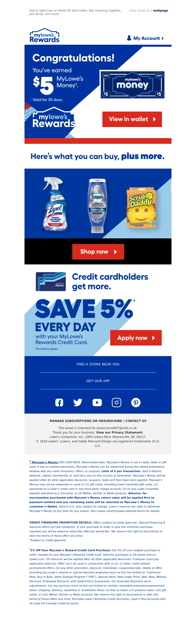
<a data-linkto="https://" href="https://click.e.lowes.com/u/?qs=d3d2e27714c653df4b6dd9b1dd810190f252761d3058e7495acbbeba72b664030e882dc609ebfe878937b1a93a78a0721e27b909b6d9b4540c4ace98ede01d97" style="border: none;" target="_blank" title=""><img alt="Congratulations! You've earned $5 MyLowe's Money. View in wallet." data-assetid="76872" src="https://image.e.lowes.com/lib/fe9515707364027471/m/1/3e2ee4c5-fb06-411e-99d8-8a104c4b1461.jpg" style="display: block; width: 100%; padding: 0px; text-align: center; height: auto; border: none;" width="600"></a></td></tr></table></td></tr></table><table cellpadding="0" cellspacing="0" width="100%" role="presentation" style="min-width: 100%; " class="stylingblock-content-wrapper"><tr><td class="stylingblock-content-wrapper camarker-inner"><table align="center" border="0" cellpadding="0" cellspacing="0" class="container" width="600">
<tr>
<td>
<a alias="" conversion="false" data-linkto="other" href="" target="_blank" title=""><img alt="" data-assetid="74687" height="101" src="https://image.e.lowes.com/lib/fe9515707364027471/m/1/a48f8d9a-f915-4dd3-b679-69ac6e96cc02.jpg" style="display: block; width: 100%; padding: 0px; text-align: center; height: auto;" width="600"></a></td></tr></table></td></tr></table><table cellpadding="0" cellspacing="0" width="100%" role="presentation" style="min-width: 100%; " class="stylingblock-content-wrapper"><tr><td class="stylingblock-content-wrapper camarker-inner"><table align="center" border="0" cellpadding="0" cellspacing="0" class="container" width="600">
<tr>
<td>
<a data-linkto="https://" href="https://click.e.lowes.com/u/?qs=d3d2e27714c653dff9a2071db31d393b2d54e0b546b5db0efcc7d4fe0a22207d7c59d8eb10fd4910679a66d7916be0b4d4bfb029baec85a44e04de14cdf46b71" target="_blank" title=""><img alt="Shop products under $5 now" data-assetid="74689" height="284" src="https://image.e.lowes.com/lib/fe9515707364027471/m/1/68ba33c2-2b6b-45dd-8514-3995cf7f1c92.gif" style="display: block; width: 100%; padding: 0px; text-align: center; height: auto;" width="600"></a></td></tr></table></td></tr></table><table cellpadding="0" cellspacing="0" width="100%" role="presentation" style="min-width: 100%; " class="stylingblock-content-wrapper"><tr><td class="stylingblock-content-wrapper camarker-inner"><table align="center" border="0" cellpadding="0" cellspacing="0" class="container" width="600">
<tr>
<td>
<a data-linkto="https://" href="https://click.e.lowes.com/u/?qs=d3d2e27714c653df54c7efca2dc78d9c9db6554d5b5b3f2592847a65c00261024caff1ad0135649448bc59be3a1f72a26fc1b76a3d8d90840d277e5bd21feb5a" target="_blank" title=""><img alt="Show now" data-assetid="74686" height="106" src="https://image.e.lowes.com/lib/fe9515707364027471/m/1/c33b6944-26bd-4a22-b8b4-8fde38d41927.jpg" style="display: block; width: 100%; padding: 0px; text-align: center; height: auto;" width="600"></a></td></tr></table></td></tr></table>
<table cellpadding="0" cellspacing="0" width="100%" role="presentation" style="min-width: 100%; " class="stylingblock-content-wrapper"><tr><td class="stylingblock-content-wrapper camarker-inner">
<table align="center" border="0" cellpadding="0" cellspacing="0" class="container" width="600">
<tr>
<td>
<a data-linkto="https://" href="https://click.e.lowes.com/u/?qs=d3d2e27714c653dfcbb48a7336b2f475ac272c1538f2b5c8016b78e4a7c51afaec26b741e3f4a97ab517385ae2fb933e1d58b66119560c7d55ee3d302aac3e13" target="_blank" title=""><img alt="Credit cardholders get more." data-assetid="74684" src="https://image.e.lowes.com/lib/fe9515707364027471/m/1/2b4211d9-9a98-428b-a1a1-82fd578e5493.jpg" style="display: block; width: 100%; padding: 0px; height: auto;" width="600"></a>
</td>
</tr>
</table>
</td></tr></table>
<!---->
<table align="center" border="0" cellpadding="0" cellspacing="0" class="container" style="width: 600px; border-collapse: collapse;" width="100%">
<tr>
<td align="center" bgcolor="#0033a1" style="font-family: 'Fellix Regular', Arial, Helvetica, sans-serif; font-size:12px; color:#666666; padding-bottom: 16px;padding-top:8px;" valign="top">
<table align="center" border="0" cellpadding="0" cellspacing="0" class="container" width="476">
<!--[if !mso]><!-- -->
<tr>
<td align="center" style="font-size: 14px; line-height: 22px; mso-line-height-rule: exactly; padding-top: 8px; display:none;" valign="middle" class="mobile-only"></td></tr><!--<![endif]-->
<tr>
<td align="center" style="font-size: 14px; line-height: 22px; mso-line-height-rule: exactly; padding-top: 14px;PADDING-BOTTOM: 14px;" valign="middle">
<a href="https://click.e.lowes.com/u/?qs=d3d2e27714c653df8ee05338c8bb233285a56fa1d383b2a03357de4cb974c4199a4ba301808bf3baa4fc368ceb41b9385151224e1d8122fe02070e62bb42c429" style="color: #ffffff; font-family: Helvetica, Arial, sans-serif; font-size: 14px; line-height: 22px; text-decoration: none;" target="_blank" title="Find a store near you">FIND A STORE NEAR YOU</a></td></tr><tr>
<td align="center" style="padding-top: 8px; padding-bottom: 8px; font-size: 0px; line-height: 6px; mso-line-height-rule: exactly;" valign="top"><hr color='#00a3e0'></td></tr><tr>
<td align="center" style="font-size: 14px; line-height: 22px; mso-line-height-rule: exactly; padding-top: 14px;PADDING-BOTTOM: 14px;" valign="middle">
<a href="https://click.e.lowes.com/u/?qs=d3d2e27714c653dfa24318526f12143ff8fbcea86f340578fc64437d2c06756f92a49f306cdb980ee95767959da26cf2ac5ca71461439ef0a401b18501cac2e1" style="color: #ffffff; font-family: Helvetica, Arial, sans-serif; font-size: 14px; line-height: 22px; text-decoration: none;" target="_blank" title="GET OUR APP">GET OUR APP</a></td></tr><tr>
<td align="center" style="padding-top: 8px;padding-bottom: 18px; font-size: 0px; line-height: 6px; mso-line-height-rule: exactly;" valign="top">
<hr color='#00a3e0'></td></tr></table></td></tr><tr>
<td align="center" bgcolor="#0033a1" style="font-family:Arial, Helvetica, sans-serif; font-size:12px; color:#666666; padding-bottom: 26px;" valign="top">
<table bgcolor="#0033a1" border="0" cellpadding="0" cellspacing="0">
<tr>
<td style="padding-left: 20px;padding-right:20px;">
<a href="https://click.e.lowes.com/u/?qs=d3d2e27714c653df163f5cbce0d06960ef19f68a9dd48857404c1e7a5d07b2132f089be74c132bd02b9d8de4f22a4140e8f6a88232a39918fd09f5347a10e737" target="_blank" title="Facebook"><img alt="Facebook" border="0" src="https://image.e.lowes.com/lib/fe9515707364027471/m/1/c7d84279-404c-43c5-a5e9-b21df2257ad4.png" style="display:block;" ></a></td><td style="padding-left: 20px;padding-right:20px;">
<a href="https://click.e.lowes.com/u/?qs=d3d2e27714c653dfdbcf283b02532dc840321de9ed71de4919768ae90f8b6798a288935dea27d4d1d7d1b790b54731773e6c19298725a76a71edee57d4023b2e" target="_blank" title="Twitter"><img alt="Twitter" border="0" src="https://image.e.lowes.com/lib/fe9515707364027471/m/1/68bc8369-0743-4984-bc92-48a831eeaaa7.png" style="display:block;" ></a></td><td style="padding-left: 20px;padding-right:20px;">
<a href="https://click.e.lowes.com/u/?qs=d3d2e27714c653df9242692e7f1bec5d18601eee3e5fbcaeff68acae067ae3a1532f687cb380557d530ba9ff3a724ab10ff8eb3da6fee89662de66bd664e32d6" target="_blank" title="YouTube"><img alt="YouTube" border="0" src="https://image.e.lowes.com/lib/fe9515707364027471/m/1/1f97d4ce-e837-4d8d-a265-92633b0a7fbb.png" style="display:block;" ></a></td><td style="padding-left: 20px;padding-right:20px;">
<a href="https://click.e.lowes.com/u/?qs=d3d2e27714c653dffe5313213e183e752695fcd661d1e02a006717b5d196a016bd098af2faaeda99d255102c86d3b7f3829a7e901cf470dd2d4253f4f07fa764" target="_blank" title="Instagram"><img alt="Instagram" border="0" src="https://image.e.lowes.com/lib/fe9515707364027471/m/1/99c67806-02b1-4da4-86e1-dbb73808c97c.png" style="display:block;" ></a></td><td style="padding-left: 20px;padding-right:20px;">
<a href="https://click.e.lowes.com/u/?qs=d3d2e27714c653df0d2693ef28fbe7bc693b7f12dcda2db9adb78ceed68be43a1919bcaaf7d7e9adce9f8a6551af0f93653b1f03e262bc1dee89edb34717d41c" target="_blank" title="Pinterest"><img alt="Pinterest" border="0" src="https://image.e.lowes.com/lib/fe9515707364027471/m/1/74f317b2-22f1-48ad-9060-55e67f3ea32c.png" style="display:block;" ></a></td></tr></table></td></tr></table>
<table align="center" bgcolor="#f2f2f2" border="0" cellpadding="0" cellspacing="0" class="container" style="width: 600px; border-collapse: collapse;" width="100%">
<tr>
<td align="center" style="padding-top:10px;padding-bottom:10px;">
<table align="center" bgcolor="#f2f2f2" border="0" cellpadding="0" cellspacing="0" class="container" width="90%">
<tr>
<td align="center" style="padding-top:10px;padding-bottom:10px;">
<table align="center" bgcolor="#f2f2f2" border="0" cellpadding="0" cellspacing="0" class="Width90">
<tr>
<!----><th align="center" bgcolor="#f2f2f2" class="drop-center" style="font-family: Arial, Helvetica, sans-serif; font-size: 12px; line-height: 20px;" valign="middle">
<a href="https://click.e.lowes.com/u/?qs=d3d2e27714c653df63616e77576470042763200e8d70d2b760f7f8be2eaffb2da1b7cb1d432c5e89a68077c5a2ea3a710c14b7f2d4e819cdc2542dfdfa053f81" style="text-decoration: none; color: #333333; font-weight: bold;" target="_blank" title=">MANAGE SUBSCRIPTIONS OR UNSUBSCRIBE">MANAGE SUBSCRIPTIONS OR UNSUBSCRIBE</a></th><!----><th align="center" bgcolor="#f2f2f2" class="mobile-hidden" style="color: #333333; font-size:12px; padding-left:5px; padding-right:5px; line-height: 20px;" valign="middle">
|</th><th align="center" bgcolor="#f2f2f2" class="drop-center" style="font-family: Arial, Helvetica, sans-serif; font-size: 12px; line-height: 20px;" valign="middle">
<a href="https://click.e.lowes.com/u/?qs=d3d2e27714c653df90abbe4c4426bea2e717c768a42b350d5efd8318a12183cc8f52c1eed6437e96d2a654b8f114ab0b78c4d5ff271818207aa4faa28c27c0f1" style="text-decoration: none; color: #333333; font-weight: bold;" target="_blank" title="CONTACT US">CONTACT US</a></th></tr></table></td></tr><tr>
<td align="center" style="-webkit-text-size-adjust:none; vertical-align:top; font-family: Helvetica, Arial, sans-serif; font-size:12px; color: #333333; text-decoration: none; line-height: 18px; font-weight:normal; padding-left: 10px; padding-right: 10px;">
This email is intended for <a href="#" style="color:#333333; text-decoration:none;">james.bond007@mi6.co.uk</a>.<br>
Thank you for your business. <a href="https://click.e.lowes.com/u/?qs=d3d2e27714c653dffa1b430c4ad1d000a8989da5f43e783968b2ede21c56cde2d59e85b5524c0a0457381f06534ee50fbaf3b4d2d3e6bd4f344074721884bbe6" style="font-weight: bold; color: #333333; text-decoration: none;" target="_blank" title="View our Privacy Statement.">View our Privacy Statement.</a><br>
Lowe’s Companies, Inc. 1000 Lowe's Blvd. Mooresville, NC 28117.<br>
© 2024 Lowe's. Lowe's, and Gable Mansard Design are registered trademarks of LF, LLC.</td></tr><tr>
<td style="-webkit-text-size-adjust:none; vertical-align:top; font-family:Helvetica, Arial, sans-serif; font-size:12px; color: #333333; text-decoration: none; text-align: left; line-height: 18px; font-weight:normal; padding-top: 5px; padding-bottom: 10px;">
</td></tr></table></td></tr><!----><tr bgcolor="white">
<td align="left" style="-webkit-text-size-adjust:none; vertical-align:top; font-family:Helvetica, Arial, sans-serif; font-size:11px; color: #0033a1; text-decoration: none; line-height: 18px; font-weight:normal; padding: 20px;">
<strong><u><sup>1</sup> MyLowe’s Money:</u></strong> NO CASH BACK. Nontransferrable. MyLowe’s Money is not a
credit, debit or gift card; it has no implied warranties. MyLowe’s Money can be
redeemed during the stated redemption window with any other discounts, offers, or
coupons. <strong>Limit of 5 per transaction.</strong> Void if altered, defaced, copied, transferred, or
sold (thru any on-line auction or otherwise). MyLowe’s Money will be applied after all
other applicable discounts, coupons, taxes and fees have been applied. MyLowe’s
Money may not be redeemed or used on (1) gift cards, including Lowe’s-branded gift
cards; (2) payments to a Lowe’s credit card or any third-party charge account; (3) on
any Lowe’s branded website operated by a 3rd party; or (4) Weber, Kichler or Miele
products. <strong>Returns: for merchandise purchased with MyLowe’s Money return value will
be applied first to payment method and any remaining value will be returned as
MyLowe’s Money to customer’s Wallet.</strong> Valid in U.S. only. Subject to change. Lowe’s
reserves the right to withdraw MyLowe’s Money at any time for any reason. See
Lowes.com/mylowes-rewards-terms for details.<p><BR><strong>CREDIT FINANCING PROMOTION DETAILS:</strong> Offers subject to credit approval. Special Financing & discount offers can’t be combined. If your purchase or order is over the minimum purchase required, you will be asked to select the offer you would like. We reserve the right to discontinue or alter the terms of these offers any time.<br>
*Subject to credit approval. <br><br><sup>†</sup><strong>5% Off Your MyLowe’s Reward Credit Card Purchase:
</strong> Get 5% off your eligible purchase or order charged to your MyLowe’s Rewards Credit Card. Valid for purchases in US stores and on Lowes.com. 5% discount will be applied after all other applicable discounts. Customer must pay applicable sales tax. Offer can’t be used in conjunction with or on: (i) other credit-related promotional offers; (ii) any other promotion, discount, markdown, coupon/barcode, rebate or offer, including any Lowe’s volume or special discount programs (such as but not limited to, Contractor Pack, Buy in Bulk, Value Savings Program (“VSP”), Special Value, New Lower Price, Was: Now, Military Discount, Employee Discount, and Lowest Price Guarantee); (iii) associate
discretion price adjustments; (iv) any services (such as but not limited to, rentals; extended protection/replacement plans; shipping, delivery, assembly or installation fees); (v) fees or taxes; (vi) previous sales; (vii) gift cards; or (viii) Weber, Kichler or Miele products. We reserve the right to discontinue or alter the terms of these offers any time. Excludes Lowe’s Business Credit Accounts, Lowe’s Visa Accounts and all Lowe’s® Canada Credit Accounts.</td></tr><!----></table>
</td>
</tr>
</table>
</td>
</tr>
</table>
<img src="https://pixel.inbox.exacttarget.com/pixel.gif?r=3cee957cf4045be5bdd97f3d45b56bc1d2d850ec" width="1" height="1" />
<img src="https://click.e.lowes.com/open.aspx?ffcb10-fec1107173670c75-fe341770776c067b701471-fe9515707364027471-ff9d1670-fe2715727c650c7f761c76-febe1778716d037f&d=40145&bmt=0" width="1" height="1" alt="">
</div>
</body>
</html>