38
Average Subject Line Characters
22
Total Recieved
22
Monthly Average
8
Weekly Average
> 1
Daily Average
Parent Domain:
crateandbarrel.com
Subdomains:
crateandbarrel@mail.crateandbarrel.com
crateandkids@mail.crateandbarrel.com
From Names:
Crate & Kids
Crate & Barrel
Crate And Barrel
From: Crate & Barrel
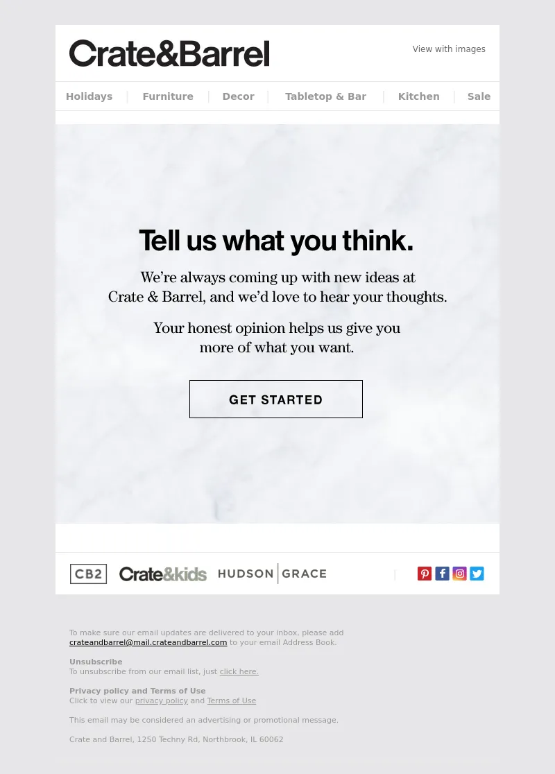
Subject Line: Got an opinion? We want to hear it.
<!DOCTYPE html PUBLIC "-//W3C//DTD XHTML 1.0 Transitional//EN" "http://www.w3.org/TR/xhtml1/DTD/xhtml1-transitional.dtd">
<html>
<head>
<meta http-equiv="Content-type" content="text/html; charset=utf-8" />
<meta name="viewport" content="width=device-width, initial-scale=1, maximum-scale=1" />
<meta http-equiv="X-UA-Compatible" content="IE=edge" />
<meta name="format-detection" content="date=no" />
<meta name="format-detection" content="address=no" />
<meta name="format-detection" content="telephone=no" />
<table cellpadding="0" cellspacing="0" width="100%" role="presentation" style="min-width: 100%; " class="stylingblock-content-wrapper"><tr><td class="stylingblock-content-wrapper camarker-inner"><!-- desktop css -->
<style type="text/css">
html {-webkit-text-size-adjust: none;
-webkit-font-smoothing: antialiased;}
a {outline: 0;}
img {display: block;}
.outlookFix {text-decoration: underline;}
table,
tr,
td {border-spacing: 0em;}
table td {border-collapse: collapse;}
.ReadMsgBody {width: 100%;}
.yshortcuts,
.yshortcuts a,
.yshortcuts a:link,
.yshortcuts a:visited,
.yshortcuts a:hover,
.yshortcuts a span {color: black;
text-decoration: none !important;
border-bottom: none !important;
background: none !important;}
.ExternalClass * {line-height: 100%}
.ExternalClass {width: 100%}
.ExternalClass .ecxhm {display: none}
.ExternalClass .ecxhm2 {display: inline !important;
font-size: 11px !important;
color: #666 !important;}
a[x-apple-data-detectors] {color: inherit !important;
text-decoration: none !important;
font-size: inherit !important;
font-family: inherit !important;
font-weight: inherit !important;
line-height: inherit !important;}
body {-webkit-text-size-adjust: 100%;
-ms-text-size-adjust: 100%;
margin: 0 !important;}
table td {border-collapse: collapse;}
img {outline: 0}
a img {border: 0}
body {
padding: 0 !important;
margin: 0 !important;
display: block !important;
min-width: 100% !important;
width: 100% !important;
background: #e6e7e8;
-webkit-text-size-adjust: none;}
th {font-weight: normal !important;
padding: 0 !important;}
img {border: 0 !important;}
.appleLinksBlack a {
color: #989898 !important;
text-decoration: none}
.appleLinksWhite a {
color: #fff !important;
text-decoration: none}
.appleLinksGray a {
color: #989898 !important;
text-decoration: none}
.nobr {white-space: nowrap !important;}
.sup {
font-size: .6em !important;
line-height: .8em !important;}
</style>
<!-- container sizes -->
<style type="text/css">
@media only screen and (max-device-width:460px),
only screen and (max-width:460px) {
.bodyShell {width: 100% !important; }
.container {width: 100% !important;}
.container95 {width: 95% !important;}
.container90 {width: 90% !important;}
.container85 {width: 85% !important;}
.container80 {width: 80% !important;}
.container75 {width: 75% !important;}
.container70 {width: 70% !important;}
.container65 {width: 65% !important;}
.container60 {width: 60% !important;}
.container55 {width: 55% !important;}
.container50 {width: 50% !important;}
.container45 {width: 45% !important;}
.container40 {width: 40% !important;}
.container30 {width: 30% !important;}
.container20 {width: 20% !important;}
.container10 {width: 10% !important;}
}
</style>
<!-- bottom padding -->
<style type="text/css">
@media only screen and (max-device-width:460px),
only screen and (max-width:460px) {
.tPad-10 {padding-top: 10px !important;}
.bPad-0 {padding-bottom: 0 !important;}
.bPad-5 {padding-bottom: 5px !important;}
.bPad-10 {padding-bottom: 10px !important;}
.bPad-15 {padding-bottom: 15px !important;}
.bPad-20 {padding-bottom: 20px !important;}
.bPad-25 {padding-bottom: 25px !important;}
.bPad-30 {padding-bottom: 30px !important;}
.bPad-35 {padding-bottom: 35px !important;}
.bPad-40 {padding-bottom: 40px !important;}
.bPad-45 {padding-bottom: 45px !important;}
.bPad-50 {padding-bottom: 50px !important;}
.bPad-55 {padding-bottom: 55px !important;}
.bPad-60 {padding-bottom: 60px !important;}
.bPad-65 {padding-bottom: 65px !important;}
.bPad-70 {padding-bottom: 70px !important;}
.bPad-75 {padding-bottom: 75px !important;}
.bPad-80 {padding-bottom: 80px !important;}
.bPad-85 {padding-bottom: 85px !important;}
.bPad-90 {padding-bottom: 90px !important;}
.bPad-95 {padding-bottom: 95px !important;}
.bPad-100 {padding-bottom: 100px !important;}
}
</style>
<!-- left padding -->
<style type="text/css">
@media only screen and (max-device-width:460px),
only screen and (max-width:460px) {
.lPad-0 {padding-left: 0 !important;}
.lPad-5 {padding-left: 5px !important;}
.lPad-10 {padding-left: 10px !important;}
.lPad-15 {padding-left: 15px !important;}
.lPad-20 {padding-left: 20px !important;}
.lPad-25 {padding-left: 25px !important;}
.lPad-30 {padding-left: 30px !important;}
.lPad-35 {padding-left: 35px !important;}
.lPad-40 {padding-left: 40px !important;}
.lPad-auto {padding-left: auto !important;}
.rPad-20 {padding-right: 20px !important;}
}
</style>
<!-- mobile heights/spacers -->
<style type="text/css">
@media only screen and (max-device-width:460px),
only screen and (max-width:460px) {.mobile-br-no,
.mobile-br-0 {height: 0 !important; display: none !important;}
.mobile-br-5 {height: 5px !important;}
.mobile-br-10 {height: 10px !important;}
.mobile-br-15 {height: 15px !important;}
.mobile-br-20 {height: 20px !important;}
.mobile-br-25 {height: 25px !important;}
.mobile-br-30 {height: 30px !important;}
.mobile-br-35 {height: 35px !important;}
.mobile-br-40 {height: 40px !important;}
.mobile-br-45 {height: 45px !important;}
.mobile-br-50 {height: 50px !important;}
.mobile-br-55 {height: 55px !important;}
.mobile-br-60 {height: 60px !important;}
.mobile-br-65 {height: 65px !important;}
.mobile-br-70 {height: 70px !important;}
.mobile-br-75 {height: 75px !important;}
.mobile-br-80 {height: 80px !important;}
.mobile-br-85 {height: 85px !important;}
.mobile-br-90 {height: 90px !important;}
.mobile-br-95 {height: 95px !important;}
.mobile-br-100 {height: 100px !important;}
.mobile-br-auto {height: auto !important;}
}
</style>
<!-- mobile widths/spacers -->
<style type="text/css">
@media only screen and (max-device-width:460px),
only screen and (max-width:460px) {
.mobile-width-10 {width: 10px !important;}
.mobile-width-15 {width: 15px !important;}
.mobile-width-20, .content-spacing {width: 20px !important;}
.mobile-width-25 {width: 25px !important;}
.mobile-width-30 {width: 30px !important;}
.mobile-width-45 {width: 45px !important;}
.mobile-width-60 {width: 60px !important;}
.mobile-width-90 {width: 90px !important;}
.mobile-width-165 {width: 165px !important;}
.mobile-width-180 {width: 180px !important;}
.mobile-width-190 {width: 190px !important;}
.mobile-width-205 {width: 210px !important;}
.mobile-width-220 {width: 220px !important;}
.mobile-width-300 {width: 300px !important;}
.mobile-width-auto {width: auto !important;}}
</style>
<!-- responsive css -->
<style type="text/css">
@media only screen and (max-device-width:460px),
only screen and (max-width:460px) {
.textLeft {text-align: left !important;}
.textCenter,
.center {text-align: center !important;}
.textRight {text-align: right !important;}
.floatLeft {float: left!important;}
.floatCenter {margin: auto!important;}
.floatRight {float: right!important;}
.contentCenter {margin: 0 auto !important;}
.responsive-td {
width: 100% !important;
display: block !important;
padding: 0 !important;}
.column,
.columnStack {
display: block !important;
width: 100% !important;
float: left;
clear: both}
.drop {display: block!important;}
.fluid-img img,
.photo img {
width: 100% !important;
max-width: 100% !important;
height: auto !important;}
.hide-for-desktop,
.mobileShow {
display: block !important;
max-width: 100% !important;
max-height: 100% !important;
visibility: visible !important;
opacity: 1 !important;
width: auto !important;
height: auto !important;}
.mobileShowFlex {
display: flex !important;
max-width: 100% !important;
max-height: 100% !important;
visibility: visible !important;
opacity: 1 !important;
width: auto !important;
height: auto !important;}
.hide-for-mobile,
.mobileHide,
.mobile-hidden {display: none !important;
width: 0 !important;
height: 0 !important;
font-size: 0 !important;
line-height: 0 !important;
min-height: 0 !important;}
.bottomPromo {
padding: 10px 0px !important;
text-align: center !important;
border-top: solid 1px #e9e8e8 !important;
border-left: solid 1px #e9e8e8 !important;
border-right: solid 1px #e9e8e8 !important;}
.bottomPromo table, .bottomPromo td {width: 100%!important;
padding: 0px 20px;}
}
</style>
<!-- font css - renew only -->
<style type="text/css">
@media only screen and (max-device-width:460px),
only screen and (max-width:460px) {
.fontSize12_cta {font-size: 12px !important;
line-height: 12px !important;}
.fontSize12 {font-size: 12px !important;
line-height: 15px !important;}
.fontSize15 {font-size: 15px !important;
line-height: 18px !important;}
.fontSize16 {font-size: 16px !important;
line-height: 20px !important;}
.fontSize18 {font-size: 18px !important;
line-height: 28px !important;}
.fontSize19 {font-size: 19px !important;
line-height: 22px !important;}
.fontSize20 {font-size: 20px !important;
line-height: 24px !important;}
.fontSize28 {font-size: 28px !important;
line-height: 30px !important;}
.fontSize32 {font-size: 32px !important;
line-height: 36px !important;}
.fontSize42 {font-size: 42px !important;
line-height: 46px !important;}
.resetWrap {white-space: normal !important;}
.resetWrapAddHyphen {white-space: normal !important;
hyphens: auto;}
}
</style>
<!-- padding css -->
<style type="text/css">
@media only screen and (max-device-width:460px),
only screen and (max-width:460px) {.nullPad {padding: 0 !important;}
.mobilePad {padding-right: 20px !important; padding-left: 20px !important;}
.tp20 {padding-top: 20px !important;}
.contentCenter {margin: 0 auto !important;}
.textCenter {text-align: center !important;}
.bottomBorder,
.bottomBorderCBHead {border-bottom: solid 1px #e9e8e8 !important;}
.mobileAutoSize {width: auto !important; height: auto !important;}
}
</style>
<!-- Renew Only CSS -->
<style type="text/css">
@media only screen and (max-device-width:460px),
only screen and (max-width:460px) {
.container03 {width: 3.125% !important;}
.mobileContainBG {background-size: contain !important;}
.mobileCoverBG {background-size: cover !important;}
.mobileStretchBG {background-size: 100% auto !important;
background-position: top center !important;}
.mobileS20 {background-position: 60px 20px !important;}
.mobileTransparentBG {background-color: transparent !important;}
.mobile-br-180 {height: 180px !important;}
.mobile-br-width-205 {height: 205px !important;
width: 205 !important;}
.mobile-br-370 {height: 370px !important;}
.tPad-05 {padding-top: 5px !important;}
@supports (-webkit-overflow-scrolling:touch) and (color:#ffff) {
.iosHide { display: none !important;
width: 0 !important;
height: 0 !important;
font-size: 0 !important;
line-height: 0 !important;
min-height: 0 !important;}
.iosShow {display: block !important;
max-width: 100% !important;
max-height: 100% !important;
visibility: visible !important;
opacity: 1 !important;
width: auto !important;
height: auto !important;}
}
[class^="apple-mail"] .iosHide {
display: none !important;
width: 0 !important;
height: 0 !important;
font-size: 0 !important;
line-height: 0 !important;
min-height: 0 !important;}
[class^="apple-mail"] .iosShow {display: block !important;
max-width: 100% !important;
max-height: 100% !important;
visibility: visible !important;
opacity: 1 !important;
width: auto !important;
height: auto !important;}
@supports (-webkit-overflow-scrolling:touch) and (aspect-ratio: 1 / 1) {
.iosHide { display: none !important;
width: 0 !important;
height: 0 !important;
font-size: 0 !important;
line-height: 0 !important;
min-height: 0 !important;}
.iosShow {display: block !important;
max-width: 100% !important;
max-height: 100% !important;
visibility: visible !important;
opacity: 1 !important;
width: auto !important;
height: auto !important;}
}
}
</style></td></tr></table>
<title>Furniture, Home Decor and Wedding Registry | Crate and Barrel
</title>
</head>
<body style="margin: 0px; -webkit-text-size-adjust:none; background-color: #E6E7E8; font-family: Arial, helvetica, sans-serif; line-height : 100%; font-size: 16px; color: #000000; padding: 0px;" yahoo="fix"><style type="text/css">
div.preheader
{ display: none !important; }
</style>
<div class="preheader" style="font-size: 1px; display: none !important;">Your feedback helps us give you more of exactly what you want.</div>
<!-- Insert ‌ hack after hidden preview text -->
<div style="display: none; max-height: 0px; overflow: hidden;">
‌ ‌ ‌ ‌ ‌ ‌ ‌ ‌ ‌ ‌ ‌ ‌ ‌ ‌ ‌ ‌ ‌ ‌ ‌ ‌ ‌ ‌ ‌ ‌ ‌ ‌ ‌ ‌ ‌ ‌ ‌ ‌ ‌ ‌ ‌ ‌ ‌ ‌ ‌ ‌ ‌ ‌ ‌ ‌ ‌ ‌ ‌ ‌ ‌ ‌ ‌ ‌ ‌ ‌ ‌ ‌ ‌ ‌ ‌ ‌ ‌ ‌ ‌ ‌ ‌ ‌
‌ ‌ ‌ ‌ ‌ ‌ ‌ ‌ ‌ ‌ ‌ ‌ ‌ ‌ ‌ ‌ ‌ ‌ ‌ ‌ ‌ ‌ ‌ ‌ ‌ ‌ ‌ ‌ ‌ ‌ ‌ ‌ ‌ ‌ ‌ ‌ ‌ ‌ ‌ ‌ ‌ ‌ ‌ ‌ ‌ ‌ ‌ ‌ ‌ ‌ ‌ ‌ ‌ ‌ ‌ ‌ ‌ ‌ ‌ ‌ ‌ ‌ ‌ ‌ ‌ ‌
‌ ‌ ‌ ‌ ‌ ‌ ‌ ‌ ‌ ‌ ‌ ‌ ‌ ‌ ‌ ‌ ‌ ‌ ‌ ‌ ‌ ‌ ‌ ‌ ‌ ‌ ‌ ‌ ‌ ‌ ‌ ‌ ‌ ‌ ‌ ‌ ‌ ‌ ‌ ‌ ‌ ‌ ‌ ‌ ‌ ‌ ‌ ‌ ‌ ‌ ‌ ‌ ‌ ‌ ‌ ‌ ‌ ‌ ‌ ‌ ‌ ‌ ‌ ‌ ‌ ‌
‌ ‌ ‌ ‌ ‌ ‌ ‌ ‌ ‌ ‌ ‌ ‌ ‌ ‌ ‌ ‌ ‌ ‌ ‌ ‌ ‌ ‌ ‌ ‌ ‌ ‌ ‌ ‌ ‌ ‌ ‌ ‌ ‌ ‌ ‌ ‌ ‌ ‌ ‌ ‌ ‌ ‌ ‌ ‌ ‌ ‌ ‌ ‌ ‌ ‌ ‌ ‌ ‌ ‌ ‌ ‌ ‌ ‌ ‌ ‌ ‌ ‌ ‌ ‌ ‌ ‌
‌ ‌ ‌ ‌ ‌ ‌ ‌ ‌ ‌ ‌ ‌ ‌ ‌ ‌ ‌ ‌ ‌ ‌ ‌ ‌ ‌ ‌ ‌ ‌ ‌ ‌ ‌ ‌ ‌ ‌ ‌ ‌ ‌ ‌ ‌ ‌ ‌ ‌ ‌ ‌ ‌ ‌ ‌ ‌ ‌ ‌ ‌ ‌
</div>
<table border="0" cellpadding="0" cellspacing="0" align="center" width="640" style="width: 640px; max-width: 640px; margin: auto;" class="mobileAutoSize">
<tr>
<td align="center" valign="top" width="640" style="width: 640px; max-width: 640px; margin: auto;" class="responsive-td mobileAutoSize">
<table cellspacing="0" cellpadding="0" bgcolor="#ffffff" width="640" style="width: 640px; max-width: 640px; margin: auto;" class="mobileAutoSize">
<tr>
<td class="responsive-td" align="center" valign="top" style="background-color: #ffffff">
<table cellpadding="0" cellspacing="0" width="100%" role="presentation" style="min-width: 100%; " class="stylingblock-content-wrapper"><tr><td class="stylingblock-content-wrapper camarker-inner"></td></tr></table>
</td>
</tr>
<tr>
<td class="responsive-td" align="center" valign="top" style="background-color: #ffffff">
<table cellpadding="0" cellspacing="0" width="100%" role="presentation" style="background-color: transparent; border: 0px; min-width: 100%; " class="stylingblock-content-wrapper"><tr><td style="padding: 0px; " class="stylingblock-content-wrapper camarker-inner"><!-- Start of: Header -->
<table cellpadding="0" cellspacing="0" border="0" width="100%" bgcolor="#e6e7e8" style="background:#e6e7e9;" class="container bottomBorderCBHead">
<tr>
<td bgcolor="#e6e7e9">
<table width="420" cellspacing="0" cellpadding="0" height="20" class="mobile-br-15 mobileHide360_2">
<tr>
<td align="center" style="font-size:4px !important; line-height:4px!important;">
<img src="https://image.mail.crateandbarrel.com/lib/fe9013727564027a7c/m/47/bbf6f9d4-86cc-437a-aa80-391067b74306.png">
</td>
</tr>
</table>
</td>
</tr>
<tr>
<td bgcolor="#ffffff">
<div align="center" class="mobileHide">
<table width="100%" border="0" cellspacing="0" cellpadding="0" class="container">
<!-- Start of: Logo -->
<tr>
<td width="20">
</td>
<td align="left" valign="middle" style="padding:20px 0px 20px 0;" class="tp20 bp20">
<a href="https://click.mail.crateandbarrel.com/?qs=f2d732c83ce59144997f951d55adfdf7f57419a737224cdba0ce7f11846073efcfcc3310784d950a5a5f6b4da0f8b66ec365a9a3748b10de263ccacfc4189221" target="_blank" title="Crate&Barrel" ><img alt="Crate&Barrel" src="https://image.mail.crateandbarrel.com/lib/fe9013727564027a7c/m/28/7a76a415-ac44-44ed-9ed9-50271a1772bd.jpg" width="288" height="41" border="0" style="font-family: 'Arial', sans-serif; font-size: 40px; color: #e78300; display: block;" class="contentCenter"></a>
</td>
<td align="right" valign="top" style="font-family: 'Helvetica', 'Arial', sans-serif; font-size: 12px; color: #989898; -webkit-text-size-adjust:none; padding-top: 0px;" class="mobileHide">
<br>
<br>
<!--[if !mso]><!-->
<div class="mobileHide" style="display:none; width:0px; max-height:0px; overflow:hidden;">
<a class="mobileHide" style="color:#666666; text-decoration:none;" href="https://click.mail.crateandbarrel.com/?qs=f2d732c83ce59144d29105d811bc1597f040c40e4563692d791b3d66fd06a48738be869ae24ecf49ee9056498f4b09bf9035730ad1c35868" title="View with Images" target="_blank" >View with images</a>
</div>
<!--<![endif]-->
<a class="graylink" style="color:#666666; text-decoration:none;" href="https://view.mail.crateandbarrel.com/?qs=d64da0481700b711bb0f19257521efade884a80eee7f5b7d3c63b1f588093e3d0505572224d856ce01881a87750a797bcb4123a9556b8b04e52bf60846322a44e2e67365b0424c612f17bdbade8e3d94" title="View with Images" target="_blank" >View with images</a>
</td>
<td width="20">
</td>
</tr>
</table>
</div>
<!--[if !mso]><!-->
<div align="center" class="mobileShow" style="font-size:0pt; line-height:0pt; display:none; max-height:0; max-width:0; visibility:hidden; opacity:0; mso-hide:all; overflow:hidden; width:0; height:0">
<a href="https://click.mail.crateandbarrel.com/?qs=f2d732c83ce59144997f951d55adfdf7f57419a737224cdba0ce7f11846073efcfcc3310784d950a5a5f6b4da0f8b66ec365a9a3748b10de263ccacfc4189221" target="_blank" title="Crate&Barrel" ><img alt="Crate&Barrel" src="https://image.mail.crateandbarrel.com/lib/fe9013727564027a7c/m/44/f3767775-7367-4117-ae92-90741c68f38e.png" border="0" style="font-family: 'Arial', sans-serif; font-size: 40px; color: #e78300; display: block; margin: auto!important;" class="responsive-td"></a>
</div>
<!--<![endif]-->
</td>
</tr>
</table>
<!-- End of: Header --></td></tr></table><table cellpadding="0" cellspacing="0" width="100%" role="presentation" style="min-width: 100%; " class="stylingblock-content-wrapper"><tr><td class="stylingblock-content-wrapper camarker-inner"><!-- Start of: Top Navigation -->
<table width="100%" border="0" cellspacing="0" cellpadding="0" class="container mobileHide">
<!-- Start of: Top Navigation -->
<tr>
<td style="border-top: solid 1px #e9e8e8; border-bottom: solid 1px #e9e8e8; padding: 10px 10px; font-family: 'HelveticaNeue-Light', 'Helvetica Neue Light', 'Helvetica Neue', Helvetica, Arial, 'Lucida Grande', sans-serif;" class="mobileHide">
<table width="100%" border="0" cellspacing="0" cellpadding="0" style="font-family: 'HelveticaNeue-Light', 'Helvetica Neue Light', 'Helvetica Neue', Helvetica, Arial, 'Lucida Grande', sans-serif;">
<tr>
<td align="center" style="font-family: 'HelveticaNeue-Light', 'Helvetica Neue Light', 'Helvetica Neue', Helvetica, Arial, 'Lucida Grande', sans-serif; font-size: 14px; color: #989898; font-weight: bold;">
<a href="https://click.mail.crateandbarrel.com/?qs=f2d732c83ce59144f109c915b93bf1efa0678a8aeec3413da26f4ebefc94cb2661ea6e144e3e86082c53eb3abac33399c82f0eb0c18584a14dc5bbee84f41ab5" target="_blank" style="text-decoration: none; color: #989898;">Holidays</a>
</td>
<td align="center" style="font-family: 'HelveticaNeue-Light', 'Helvetica Neue Light', 'Helvetica Neue', Helvetica, Arial, 'Lucida Grande', sans-serif; font-size: 18px; color: #e9e8e8;"> |
</td>
<td align="center" style="font-family: 'HelveticaNeue-Light', 'Helvetica Neue Light', 'Helvetica Neue', Helvetica, Arial, 'Lucida Grande', sans-serif; font-size: 14px; color: #989898; font-weight: bold;">
<a href="https://click.mail.crateandbarrel.com/?qs=f2d732c83ce591442e4732dbab915d5345aac1088ab2a0fb493a97c164e256e77635088889e687c5d72c3a515aa1a7372cbe17507044d6c333d103c0232d8f3d" target="_blank" style="text-decoration: none; color: #989898;">Furniture</a>
</td>
<td align="center" style="font-family: 'HelveticaNeue-Light', 'Helvetica Neue Light', 'Helvetica Neue', Helvetica, Arial, 'Lucida Grande', sans-serif; font-size: 18px; color: #e9e8e8;"> |
</td>
<td align="center" style="font-family: 'HelveticaNeue-Light', 'Helvetica Neue Light', 'Helvetica Neue', Helvetica, Arial, 'Lucida Grande', sans-serif; font-size: 14px; color: #989898; font-weight: bold;">
<a href="https://click.mail.crateandbarrel.com/?qs=909104544c6d3802774b030f28cf99caa9104d7af87a0653164162986457461e2156851b673e77a95ed4391816a0fd22c000ca5d77be682593a2a6836a481dda" target="_blank" style="text-decoration: none; color: #989898;">Decor</a>
</td>
<td align="center" style="font-family: 'HelveticaNeue-Light', 'Helvetica Neue Light', 'Helvetica Neue', Helvetica, Arial, 'Lucida Grande', sans-serif; font-size: 18px; color: #e9e8e8;"> |
</td>
<td align="center" style="font-family: 'HelveticaNeue-Light', 'Helvetica Neue Light', 'Helvetica Neue', Helvetica, Arial, 'Lucida Grande', sans-serif; font-size: 14px; color: #989898; font-weight: bold;">
<a href="https://click.mail.crateandbarrel.com/?qs=909104544c6d3802bbc40567d7b693c55d9733e104cd711182b78732e13468f8d2a87f2ab704ac179e49687d8791ca2db4cb4a529e3ba8a370abed35c783d528" target="_blank" style="text-decoration: none; color: #989898;">Tabletop & Bar</a>
</td>
<td align="center" style="font-family: 'HelveticaNeue-Light', 'Helvetica Neue Light', 'Helvetica Neue', Helvetica, Arial, 'Lucida Grande', sans-serif; font-size: 18px; color: #e9e8e8;"> |
</td>
<td align="center" style="font-family: 'HelveticaNeue-Light', 'Helvetica Neue Light', 'Helvetica Neue', Helvetica, Arial, 'Lucida Grande', sans-serif; font-size: 14px; color: #989898; font-weight: bold;">
<a href="https://click.mail.crateandbarrel.com/?qs=909104544c6d3802552c87e524a909ea658921768129e96702a5ab0b6e5954bc7a13ed2336ba8a8a84b276acaee504fb3cb21623a21da675370c045bbdbd18f4" target="_blank" style="text-decoration: none; color: #989898;">Kitchen</a>
</td>
<td align="center" style="font-family: 'HelveticaNeue-Light', 'Helvetica Neue Light', 'Helvetica Neue', Helvetica, Arial, 'Lucida Grande', sans-serif; font-size: 18px; color: #e9e8e8;"> |
</td>
<td align="center" style="font-family: 'HelveticaNeue-Light', 'Helvetica Neue Light', 'Helvetica Neue', Helvetica, Arial, 'Lucida Grande', sans-serif; font-size: 14px; color: #989898; font-weight: bold;">
<a href="https://click.mail.crateandbarrel.com/?qs=909104544c6d380200457c694511bc658eb9c66269ea6cd62a1cc82e72dd1ea50600712e9db850ad227ac8a0a335d1005534488b27ad2807f0830da734706795" target="_blank" style="text-decoration: none; color: #989898;">Sale</a>
</td>
</tr>
</table>
</td>
</tr>
<!-- End of: Top Navigation -->
</table>
<!-- End of: Top Navigation --></td></tr></table>
</td>
</tr>
<tr>
<td class="responsive-td" align="center" valign="top" style="background-color: #ffffff">
<table cellpadding="0" cellspacing="0" width="100%" role="presentation" style="min-width: 100%; " class="stylingblock-content-wrapper"><tr><td class="stylingblock-content-wrapper camarker-inner"><table width="100%" cellspacing="0" cellpadding="0" role="presentation"><tr><td align="center"><a href="https://click.mail.crateandbarrel.com/?qs=909104544c6d38026b934b64c70ac001d08e11f447c48663b904e5d22ea5e5d593a9379d86705e4d231e41b108ef8fd08b48befff97c6c430a519abea98bb268" title="Tell us what you think." data-linkto="https://"><img data-assetid="39045" src="https://image.mail.crateandbarrel.com/lib/fe9013727564027a7c/m/45/478a2395-0a88-455a-8a86-35fbfe4b1a6e.gif" alt="Tell us what you think." width="640" style="display: block; padding: 0px; text-align: center; height: auto; width: 100%; border: 0px;"></a></td></tr></table></td></tr></table>
</td>
</tr>
<tr>
<td class="responsive-td" align="center" valign="top" style="background-color: #ffffff">
</td>
</tr>
<tr>
<td class="responsive-td" align="center" valign="top" style="background-color: #ffffff">
<table cellpadding="0" cellspacing="0" width="100%" role="presentation" style="min-width: 100%; " class="stylingblock-content-wrapper"><tr><td class="stylingblock-content-wrapper camarker-inner"><!-- -->
<!-- --></td></tr></table><table cellpadding="0" cellspacing="0" width="100%" role="presentation" style="min-width: 100%; " class="stylingblock-content-wrapper"><tr><td class="stylingblock-content-wrapper camarker-inner"></td></tr></table>
</td>
</tr>
<tr>
<td class="responsive-td" align="center" valign="top" style="background-color: #ffffff">
<table cellpadding="0" cellspacing="0" width="100%" role="presentation" style="background-color: transparent; min-width: 100%; " class="stylingblock-content-wrapper"><tr><td style="padding: 0px; " class="stylingblock-content-wrapper camarker-inner"><!---->
<!-- END DYNAMIC STORE LOCATOR --> </td></tr></table><table cellpadding="0" cellspacing="0" width="100%" role="presentation" style="background-color: transparent; min-width: 100%; " class="stylingblock-content-wrapper"><tr><td style="padding: 0px; " class="stylingblock-content-wrapper camarker-inner"><div class="mobileHide">
<table width="100%" border="0" cellspacing="0" cellpadding="0" class="container" style="color:#e9e8e8; border-top: 1px solid #e9e8e8; border-bottom: 1px solid #e9e8e8;">
<tr>
<td width="20" style="width: 20px;">
<!-- 20 -->
</td>
<td width="370">
<!-- 20 + 54 + 20 + 124 + 20 + 152 = 390 -->
<table border="0" cellspacing="0" cellpadding="0" style="color:#e9e8e8; width: 370px;">
<tr>
<td align="left" valign="middle" class="photo2" width="54" height="60">
<a href="https://click.mail.crateandbarrel.com/?qs=909104544c6d3802de42590759e8565b87306ed503ac4ea7b5891a86820e1c48f2af6eae97867f944d61da58c4205bf5ae7bf40a7339108ee86857572930c320" target="_blank" title="">
<img src="https://image.mail.crateandbarrel.com/lib/fe9013727564027a7c/m/44/ed0f6c2f-8af5-4f02-86cd-4232b4b4da8c.png" width="55" height="31" alt="" border="0" style="display: block;" class="light-img">
<!--[if !mso]><! -->
<div class="dark-img" style="display:none; overflow:hidden; float:left; width:0px; max-height:0px; max-width:0px; line-height:0px; visibility:hidden;">
<img src="https://image.mail.crateandbarrel.com/lib/fe9013727564027a7c/m/44/36f861f2-a0af-41a6-b4d2-5a0e16cbe2c8.png" width="55" height="31" alt="" border="0" style="display: block;">
</div>
<!--<![endif]-->
</a>
</td>
<td width="20" style="width: 20px;">
<!-- 20 -->
</td>
<td align="left" valign="middle" class="photo2" width="124" height="60">
<a href="https://click.mail.crateandbarrel.com/?qs=909104544c6d38024502a49268dfad69ce47420905d2cc64e618e00ae913656d07c6a8ecd222244def55bb6656a135e03af5d83891bed0275cc64c7308f43eec" target="_blank" title="">
<img src="https://image.mail.crateandbarrel.com/lib/fe9013727564027a7c/m/44/015eb7aa-21fc-48d1-858e-16b155884a0c.png" width="126" height="21" alt="" border="0" style="display: block;" class="light-img">
<!--[if !mso]><! -->
<div class="dark-img" style="display:none; overflow:hidden; float:left; width:0px; max-height:0px; max-width:0px; line-height:0px; visibility:hidden;">
<img src="https://image.mail.crateandbarrel.com/lib/fe9013727564027a7c/m/44/5952fe91-e241-4930-9954-fbe10f9a95b2.png" width="126" height="21" alt="" border="0" style="display: block;">
</div>
<!--<![endif]-->
</a>
</td>
<td width="20" style="width: 20px;">
<!-- 20 -->
</td>
<td align="left" valign="middle" class="photo2" width="152" height="60">
<a href="https://click.mail.crateandbarrel.com/?qs=909104544c6d3802ec8448937c6b9257cb1e3171d4510d3ac33591c43510f6cd5e4baaac2617ebe4c37fb62312558d2e13de512a704ec7ab29ad5700a2d02bae" target="_blank" title="">
<img src="https://image.mail.crateandbarrel.com/lib/fe9013727564027a7c/m/44/c5297b0a-ed1c-43b2-869d-f9c41b1900bd.png" width="155" height="30" alt="" border="0" style="display: block;" class="light-img">
<!--[if !mso]><! -->
<div class="dark-img" style="display:none; overflow:hidden; float:left; width:0px; max-height:0px; max-width:0px; line-height:0px; visibility:hidden;">
<img src="https://image.mail.crateandbarrel.com/lib/fe9013727564027a7c/m/44/ad8c0cfe-9c69-4fd0-8e21-048fe02dfde2.png" width="155" height="30" alt="" border="0" style="display: block;">
</div>
<!--<![endif]-->
</a>
</td>
</tr>
</table>
</td>
<td style="color: #e9e8e8; font-weight: 200; text-align: left; align: center;" width="98" height="60">
<!-- 20 + 54 + 20 + 124 + 20 + 152 + 98 = 484 -->
</td>
<td style="color: #e9e8e8; font-weight: 200; text-align: left; align: center;" width="14" height="60">
<!-- 20 + 54 + 20 + 124 + 20 + 152 + 98 + 14 = 502 -->
|
</td>
<td width="20">
<!-- 20 + 54 + 20 + 124 + 20 + 152 + 98 + 14 + 20 = 522 -->
</td>
<td width="98" align="center" valign="middle" class="photo2">
<!-- 20 + 54 + 20 + 124 + 20 + 152 + 97 + 14 + 20 + 98 = 620 -->
<table width="100" border="0" cellspacing="0" cellpadding="0" style="color:#e9e8e8;">
<tr>
<td align="center" valign="middle" class="photo2" height="60">
<a href="https://click.mail.crateandbarrel.com/?qs=909104544c6d3802eed180a454b73a1cf9e88f3682890d2b1bf60cc9a1c6079a837c739ffb16fbc953aad380181ae62fce2383a4e60d9a3b50606df238a0f637" target="_blank" title="">
<img src="https://image.mail.crateandbarrel.com/lib/fe9013727564027a7c/m/30/8edcef16-0e32-4977-bf52-8c78f3319002.png" width="21" height="20" alt="" border="0" style="display: block;"></a>
</td>
<td align="center" valign="middle" class="photo2">
<a href="https://click.mail.crateandbarrel.com/?qs=909104544c6d380225ed20783fae25680a81d1167dbb90a5dfad172a48eb5ef801c1299d5905dd84758ecd82633ffd90708589638e397e7fc7c2768c7b3c124d" target="_blank" title="">
<img src="https://image.mail.crateandbarrel.com/lib/fe9013727564027a7c/m/30/8060ce04-f9e0-4d23-9cff-cdfdf5b67fbd.png" width="21" height="20" alt="" border="0" style="display: block;"></a>
</td>
<td align="center" valign="middle" class="photo2">
<a href="https://click.mail.crateandbarrel.com/?qs=8baf0ab48b076b8cb4a16cee6e8f5452f8d2787c2e0702b86a5630e543badffd2ef03d622eb10512f87146f182ac2b5de6b3700c46c1a3dfce8634d9911cbb04" target="_blank" title="">
<img src="https://image.mail.crateandbarrel.com/lib/fe9013727564027a7c/m/30/b7717557-ffb9-426c-b455-41dc4ea3e02f.png" width="21" height="20" alt="" border="0" style="display: block;"></a>
</td>
<td align="center" valign="middle" class="photo2">
<a href="https://click.mail.crateandbarrel.com/?qs=8baf0ab48b076b8c6cbe06a2106f16f8552de666d079e126699ff737569e41fe8ea5b257770e2ecd462dba4a6c472184cb38a1d7315d2a55b954db74c0d16a0e" target="_blank" title="">
<img src="https://image.mail.crateandbarrel.com/lib/fe9013727564027a7c/m/30/ee0150ff-f905-4335-adc5-4b7da7f988f9.png" width="21" height="20" alt="" border="0" style="display: block;"></a>
</td>
</tr>
</table>
</td>
<td width="20">
<!-- 20 + 54 + 20 + 124 + 20 + 152 + 97 + 14 + 20 + 98 + 20 = 640 -->
</td>
</tr>
</table>
</div>
<!--[if !mso]><!-->
<div class="mobileShow" style="display:none; width:0px; max-height:0px; overflow:hidden;">
<table width="100%" border="0" cellspacing="0" cellpadding="0" class="container" style="color:#e9e8e8;">
<tr>
<td class="photo3" height="20" style="border-top: solid 1px #e9e8e8;">
</td>
</tr>
<tr>
<td align="center" valign="middle" style="" height="">
<table width="130" border="0" cellspacing="0" cellpadding="0" class="" style="color:#e9e8e8;">
<tr>
<td align="center" valign="middle" class="photo2" style="width: 20%;" height="">
<a href="https://click.mail.crateandbarrel.com/?qs=8baf0ab48b076b8cc7418dc2b56a5969b69ad5ee4c48f12f58c56039e28b527091d21b7097422987dec290eaa52afd4b66a9fd2e507ec1b0e369ae77114d35b6" target="_blank" title="">
<img src="https://image.mail.crateandbarrel.com/lib/fe9013727564027a7c/m/30/b7717557-ffb9-426c-b455-41dc4ea3e02f.png" width="21" height="20" alt="" border="0" style="display: block;"></a>
</td>
<td align="center" valign="middle" class="photo2" style="width: 20%;" height="">
<a href="https://click.mail.crateandbarrel.com/?qs=8baf0ab48b076b8c34bcca2dff212d75cea42cfd389bd494a463dbce81253b249036d3eb3ce0375016b18de2314fc4e1a18307c29447ab1126edba9cdb50a019" target="_blank" title="">
<img src="https://image.mail.crateandbarrel.com/lib/fe9013727564027a7c/m/30/8edcef16-0e32-4977-bf52-8c78f3319002.png" width="21" height="20" alt="" border="0" style="display: block;"></a>
</td>
<td align="center" valign="middle" class="photo2" style="width: 20%;" height="">
<a href="https://click.mail.crateandbarrel.com/?qs=8baf0ab48b076b8c2d204ddb06bbe796f91580c90c83bcdd62f0425bb9e69b15244927f6406149e4c55360de35f7c1c8f87be5deeb17cfb1fffe7a971f8d88e7" target="_blank" title="">
<img src="https://image.mail.crateandbarrel.com/lib/fe9013727564027a7c/m/30/8060ce04-f9e0-4d23-9cff-cdfdf5b67fbd.png" width="21" height="20" alt="" border="0" style="display: block;"></a>
</td>
<td align="center" valign="middle" class="photo2" style="width: 20%;" height="">
<a href="https://click.mail.crateandbarrel.com/?qs=8baf0ab48b076b8c8cac815ab12dc966c8e2d3b58d0118d11534952394f3c718e6f32fa6ba5dc3e793c525f9b54d7f25ba9571f8d86e7065ecd7b20f8ba67315" target="_blank" title="">
<img src="https://image.mail.crateandbarrel.com/lib/fe9013727564027a7c/m/30/ee0150ff-f905-4335-adc5-4b7da7f988f9.png" width="21" height="20" alt="" border="0" style="display: block;"></a>
</td>
</tr>
</table>
</td>
</tr>
<tr>
<td class="photo3" height="20">
</td>
</tr>
<tr>
<td class="photo3" height="20" style="border-top: solid 1px #e9e8e8;">
</td>
</tr>
<tr>
<td align="center" valign="middle" class="photo3" style="" height="">
<a href="https://click.mail.crateandbarrel.com/?qs=8baf0ab48b076b8c42cb1a563740af250e2df1436cb24970f00358386b95c62ff26daa0136ca73c2673237dbad8c409f8b138440e4760d208b2a2c3f20990d00" title="CB2" target="_blank">
<img src="https://image.mail.crateandbarrel.com/lib/fe9013727564027a7c/m/44/ed0f6c2f-8af5-4f02-86cd-4232b4b4da8c.png" width="55" height="31" alt="" border="0" style="display: block;" class="light-img">
<!--[if !mso]><! -->
<div class="dark-img" style="display:none; overflow:hidden; float:left; width:0px; max-height:0px; max-width:0px; line-height:0px; visibility:hidden;">
<img src="https://image.mail.crateandbarrel.com/lib/fe9013727564027a7c/m/44/36f861f2-a0af-41a6-b4d2-5a0e16cbe2c8.png" width="55" height="31" alt="" border="0" style="display: block;">
</div>
<!--<![endif]-->
</a>
</td>
</tr>
<tr>
<td class="photo3" height="15">
</td>
</tr>
<tr>
<td align="center" valign="middle" class="photo3" style="" height="">
<a href="https://click.mail.crateandbarrel.com/?qs=8baf0ab48b076b8cc84926fb424b641a299aafe4e9c770de2358db4ebd86c5b18ab241ecad3115e3cfe93d27ac399ca11449e34a3ee42dc0365d0a650b279f02" target="_blank" title="">
<img src="https://image.mail.crateandbarrel.com/lib/fe9013727564027a7c/m/44/015eb7aa-21fc-48d1-858e-16b155884a0c.png" width="126" height="21" alt="" border="0" style="display: block;" class="light-img">
<!--[if !mso]><! -->
<div class="dark-img" style="display:none; overflow:hidden; float:left; width:0px; max-height:0px; max-width:0px; line-height:0px; visibility:hidden;">
<img src="https://image.mail.crateandbarrel.com/lib/fe9013727564027a7c/m/44/5952fe91-e241-4930-9954-fbe10f9a95b2.png" width="126" height="21" alt="" border="0" style="display: block;">
</div>
<!--<![endif]-->
</a>
</td>
</tr>
<tr>
<td class="photo3" height="15">
</td>
</tr>
<tr>
<td align="center" valign="middle" class="photo3" style="" height="">
<a href="https://click.mail.crateandbarrel.com/?qs=a391f031eed031c45140253bac6c377e04f91675d95158bd989b369f079c25b8cefa28672315c65db0d8078c287ab95978f291310d998e989d71681df83d44ff" target="_blank" title="">
<img src="https://image.mail.crateandbarrel.com/lib/fe9013727564027a7c/m/44/c5297b0a-ed1c-43b2-869d-f9c41b1900bd.png" width="155" height="30" alt="" border="0" style="display: block;" class="light-img">
<!--[if !mso]><! -->
<div class="dark-img" style="display:none; overflow:hidden; float:left; width:0px; max-height:0px; max-width:0px; line-height:0px; visibility:hidden;">
<img src="https://image.mail.crateandbarrel.com/lib/fe9013727564027a7c/m/44/ad8c0cfe-9c69-4fd0-8e21-048fe02dfde2.png" width="155" height="30" alt="" border="0" style="display: block;">
</div>
<!--<![endif]-->
</a>
</td>
</tr>
<tr>
<td class="photo3" height="20">
</td>
</tr>
</table>
</div>
<!--<![endif]--></td></tr></table>
</td>
</tr>
<tr>
<td class="responsive-td" align="center" valign="top" style="background-color: #ffffff">
<table cellpadding="0" cellspacing="0" width="100%" role="presentation" style="min-width: 100%; " class="stylingblock-content-wrapper"><tr><td class="stylingblock-content-wrapper camarker-inner"><!-- Start of: Mobile Nav -->
<!--[if !mso]><!-->
<div class="mobileShow" style="display:none; width:0px; max-height:0px; overflow:hidden;">
<table class="container" border="0" cellspacing="0" cellpadding="0" style="width: 100%;">
<tr>
<td align="center" valign="middle" style="border-bottom: solid 1px #e9e8e8; border-top: solid 1px #e9e8e8; width: 50%;">
<table class="container" border="0" cellspacing="0" cellpadding="0">
<tr>
<td align="center" valign="middle" style="font-family: 'HelveticaNeue-Light', 'Helvetica Neue Light', 'Helvetica Neue', Helvetica, Arial, 'Lucida Grande', sans-serif; font-size: 16px; font-weight: bold; color: #999999; -webkit-text-size-adjust:none; padding: 15px 0px;">
<a href="https://click.mail.crateandbarrel.com/?qs=f2d732c83ce59144f109c915b93bf1efa0678a8aeec3413da26f4ebefc94cb2661ea6e144e3e86082c53eb3abac33399c82f0eb0c18584a14dc5bbee84f41ab5" target="_blank" style="text-decoration: none; color: #999999;">Holidays ▸</a>
</td>
</tr>
</table>
</td>
<td align="center" valign="middle" style="border-bottom: solid 1px #e9e8e8; border-top: solid 1px #e9e8e8; width: 50%;">
<table class="container" border="0" cellspacing="0" cellpadding="0">
<tr>
<td align="center" valign="middle" style="font-family: 'HelveticaNeue-Light', 'Helvetica Neue Light', 'Helvetica Neue', Helvetica, Arial, 'Lucida Grande', sans-serif; font-size: 16px; font-weight: bold; color: #999999; -webkit-text-size-adjust:none; padding: 15px 0px;">
<a href="https://click.mail.crateandbarrel.com/?qs=f2d732c83ce591442e4732dbab915d5345aac1088ab2a0fb493a97c164e256e77635088889e687c5d72c3a515aa1a7372cbe17507044d6c333d103c0232d8f3d" target="_blank" style="text-decoration: none; color: #999999;">Furniture ▸</a>
</td>
</tr>
</table>
</td>
</tr>
<tr>
<td align="center" valign="middle" style="border-bottom: solid 1px #e9e8e8; width: 50%;">
<table class="container" border="0" cellspacing="0" cellpadding="0">
<tr>
<td align="center" valign="middle" style="font-family: 'HelveticaNeue-Light', 'Helvetica Neue Light', 'Helvetica Neue', Helvetica, Arial, 'Lucida Grande', sans-serif; font-size: 16px; font-weight: bold; color: #999999; -webkit-text-size-adjust:none; padding: 15px 0px;">
<a href="https://click.mail.crateandbarrel.com/?qs=a391f031eed031c4c600084cc84c02560a70afc72616970944a154e71c67baecb80400a0a2ccad4d08b06d4111fc70c32eba2b8abea908ed096485f3b91dd2e3" target="_blank" style="text-decoration: none; color: #999999;">Decor ▸</a>
</td>
</tr>
</table>
</td>
<td align="center" valign="middle" style="border-bottom: solid 1px #e9e8e8; width: 50%;">
<table class="container" border="0" cellspacing="0" cellpadding="0">
<tr>
<td align="center" valign="middle" style="font-family: 'HelveticaNeue-Light', 'Helvetica Neue Light', 'Helvetica Neue', Helvetica, Arial, 'Lucida Grande', sans-serif; font-size: 16px; font-weight: bold; color: #999999; -webkit-text-size-adjust:none; padding: 15px 0px;">
<a href="https://click.mail.crateandbarrel.com/?qs=a391f031eed031c43ff437ee799ccaf8d467d039b6ee1b40c1a4df73a4fb866c9e92920c471c917102da04d78d06920ba4ae39b112cffdac5e89937c5ca22e94" target="_blank" style="text-decoration: none; color: #999999;">Tabletop & Bar ▸</a>
</td>
</tr>
</table>
</td>
</tr>
<tr>
<td align="center" valign="middle" style="border-bottom: solid 1px #e9e8e8; width: 50%;">
<table class="container" border="0" cellspacing="0" cellpadding="0">
<tr>
<td align="center" valign="middle" style="font-family: 'HelveticaNeue-Light', 'Helvetica Neue Light', 'Helvetica Neue', Helvetica, Arial, 'Lucida Grande', sans-serif; font-size: 16px; font-weight: bold; color: #999999; -webkit-text-size-adjust:none; padding: 15px 0px;">
<a href="https://click.mail.crateandbarrel.com/?qs=909104544c6d3802552c87e524a909ea658921768129e96702a5ab0b6e5954bc7a13ed2336ba8a8a84b276acaee504fb3cb21623a21da675370c045bbdbd18f4" target="_blank" style="text-decoration: none; color: #999999;">Kitchen ▸</a>
</td>
</tr>
</table>
</td>
<td align="center" valign="middle" style="border-bottom: solid 1px #e9e8e8; width: 50%;">
<table class="container" border="0" cellspacing="0" cellpadding="0">
<tr>
<td align="center" valign="middle" style="font-family: 'HelveticaNeue-Light', 'Helvetica Neue Light', 'Helvetica Neue', Helvetica, Arial, 'Lucida Grande', sans-serif; font-size: 16px; color: #999999; -webkit-text-size-adjust:none; font-weight: bold; padding: 15px 0px;">
<a href="https://click.mail.crateandbarrel.com/?qs=909104544c6d380200457c694511bc658eb9c66269ea6cd62a1cc82e72dd1ea50600712e9db850ad227ac8a0a335d1005534488b27ad2807f0830da734706795" target="_blank" style="text-decoration: none; color: #999999;">Sale ▸</a>
</td>
</tr>
</table>
</td>
</tr>
</table>
</div>
<!--<![endif]-->
<!-- End of: Mobile Nav --></td></tr></table>
</td>
</tr>
<tr>
<td class="responsive-td" align="center" valign="top" style="background-color: #ffffff">
<table cellpadding="0" cellspacing="0" width="100%" style="background-color: #E6E7E8; min-width: 100%; " class="stylingblock-content-wrapper"><tr><td style="padding: 0px; " class="stylingblock-content-wrapper camarker-inner"><!-- Start of: Footer -->
<table width="100%" class="container" border="0" cellspacing="0" cellpadding="0">
<tr>
<td align="left" style="font-family: 'HelveticaNeue-Light', 'Helvetica Neue Light', 'Helvetica Neue', Helvetica, Arial, 'Lucida Grande', sans-serif; font-size: 11px; line-height: 14px; color: #989898!important; padding: 20px;" class="mobilePadding" id="footerDiv">
<!-- PLACE BUILD SPECIFIC DISCLAIMERS BELOW -->
<br>
<br>
<!-- PLACE BUILD SPECIFIC DISCLAIMERS ABOVE -->
<!-- STANDARD DISCLAIMERS BELOW no need to adjust change or add to these -->
To make sure our email updates are delivered to your inbox, please add
<a href="mailto:crateandbarrel@mail.crateandbarrel.com" style="color:#000000; text-decoration:underline;">crateandbarrel@mail.crateandbarrel.com</a> to your email Address Book.
<br>
<br>
<strong>Unsubscribe</strong>
<br>
To unsubscribe from our email list, just
<a href="https://click.mail.crateandbarrel.com/?qs=a391f031eed031c4b655af7c629bfd0ebcf3901a40237bfc5561c21769ee4c49fecbe9c2f7c5987cb1999ab5b2e6b71dbc3911b5e4221df78e996d04b0a7baa9" target="_blank" style="color:#989898;">click here.</a>
<br>
<br>
<strong>Privacy policy and Terms of Use</strong>
<br>
Click to view our
<a href="https://click.mail.crateandbarrel.com/?qs=a391f031eed031c4c9e279b6b6956e82935c1d7cc2388a03a915dabe44cb977056c3a7bc8c8b0cf1b8c7d70af4ff63a704958fe2384aa0cb668f65a038c0db1f" target="_blank" style="color:#989898;">privacy policy</a> and
<a href="https://click.mail.crateandbarrel.com/?qs=a391f031eed031c4bec47daae136c85b0ba1d00bc14ff735effabffa0b75b784ab204fa1e28003a1f2851d25f7227cfbf71025185dbc1302bb79e31b4a86068a" target="_blank" style="color:#989898;">Terms of Use</a>
<br>
<br>
This email may be considered an advertising or promotional message.
<br>
<br>
Crate and Barrel, 1250 Techny Rd, Northbrook, IL 60062
</td>
</tr>
</table>
<!-- End of: Footer --></td></tr></table><table cellpadding="0" cellspacing="0" width="100%" role="presentation" style="background-color: #E9E8E8; min-width: 100%; " class="stylingblock-content-wrapper"><tr><td style="padding: 0px; " class="stylingblock-content-wrapper camarker-inner"><!-- Tracking Pixels for All Templates -->
<!-- LiveRamp Tracking Pixel -->
<img border="0" hspace="0" vspace="0" width="1" height="1" src="https://sr.rlcdn.com/448796.gif?s=ed288a60fef0d429a6e67d2d71af1392792076007be48ca2ecc94afc5c372498&n=1">
<img border="0" hspace="0" vspace="0" width="1" height="1" src="https://sr.rlcdn.com/448796.gif?s=ed288a60fef0d429a6e67d2d71af1392792076007be48ca2ecc94afc5c372498&n=2">
<img border="0" hspace="0" vspace="0" width="1" height="1" src="https://sr.rlcdn.com/448796.gif?s=ed288a60fef0d429a6e67d2d71af1392792076007be48ca2ecc94afc5c372498&n=3">
<img border="0" hspace="0" vspace="0" width="1" height="1" src="https://sr.rlcdn.com/448796.gif?s=ed288a60fef0d429a6e67d2d71af1392792076007be48ca2ecc94afc5c372498&n=4">
<img border="0" hspace="0" vspace="0" width="1" height="1" src="https://sr.rlcdn.com/448796.gif?s=ed288a60fef0d429a6e67d2d71af1392792076007be48ca2ecc94afc5c372498&n=5">
</td></tr></table>
</td>
</tr>
</table>
</td>
</tr>
</table>
<img src="https://click.mail.crateandbarrel.com/open.aspx?ffcb10-fe9715757463017974-fe641375776406757715-fe9013727564027a7c-ff971676-fe611278706704787715-ff071770756500&d=70172&bmt=0" width="1" height="1" alt="">
</body>
</html>