<!DOCTYPE HTML PUBLIC "-//W3C//DTD HTML 4.01 Transitional//EN" "http://www.w3.org/TR/html4/loose.dtd">
<html>
<!-- Delta Air Lines Email Template -->
<!-- Approved Version 08.12.19 -->
<!-- Footer nav and logo updates 03.03.20 -->
<head>
<meta http-equiv="Content-Type" content="text/html; charset=UTF-8"/>
<meta name="format-detection" content="telephone=no">
<meta name="viewport" content="width=device-width; initial-scale=1.0; maximum-scale=1.0;">
<meta name="x-apple-disable-message-reformatting">
<meta http-equiv="X-UA-Compatible" content="IE=9; IE=8; IE=7; IE=EDGE" />
<title>Delta Air Lines</title>
<style type="text/css">
ReadMsgBody {
width: 100%;
}
.ExternalClass {
width: 100%;
}
.ExternalClass, .ExternalClass p, .ExternalClass span, .ExternalClass font, .ExternalClass td, .ExternalClass div {
line-height: 100%;
}
#outlook a {
padding: 0;
}
body {
-webkit-text-size-adjust:100%;
-ms-text-size-adjust:100%;
margin:0 !important;
padding: 0 !important;
line-height:normal;
}
h1 {
font-family: Arial, Helvetica, sans-serif;
font-size: 26px !important;
line-height: normal !important;
color:#0B1F66 !important;
margin: 0px !important;
font-weight: normal !important;
}
h2 {
font-family: Arial, Helvetica, sans-serif;
font-size: 18px !important;
line-height: normal !important;
color:#0B1F66 !important;
margin: 0px !important;
font-weight: bold !important;
}
h3 {
font-family: Arial, Helvetica, sans-serif;
font-size: 16px !important;
line-height: normal !important;
color:#0B1F66 !important;
margin: 0px !important;
font-weight: normal !important;
}
p {
margin: 1em 0;
}
table td {
border-collapse: collapse;
}
img {
outline:0;
display: block;
border: 0;
text-decoration: none;
}
a {
font-size: 16px;
font-weight: bold;
color: #4470C3;
text-decoration: none;
}
#Greeting a {
font-size: 14px;
font-weight: normal;
color: #0B1F66;
}
#Terms a {
font-size: 12px;
font-weight: normal;
color: #4470C3;
text-decoration: none;
}
a img {
border:none;
}
sup, sub {
font-size: 0.6em !important;
line-height: 100% !important;
}
sup {
vertical-align: text-top !important;
}
sub {
vertical-align: text-bottom !important;
}
</style>
<!--[if (mso 12) | (mso 14) | (mso 15) | (mso 16)]> <style type="text/css"> sup, sub { font-size: 100% !important; } </style> <![endif]-->
<!-- Break styles into groups to prevent Gmail ignore -->
<style type="text/css">
/* Browser-specific workarounds */
@-ms-viewport {
width: device-width;
}
/* Stops email clients resizing small text. */
*{
-ms-text-size-adjust: 100%;
-webkit-text-size-adjust: 100%;
}
/* Centers email on Android 4.4 */
div[style*="margin: 16px 0"] {
margin:0 !important;
}
/* Prevents Email Clients & Outlook from adding extra spacing to tables. */
table,td {
border-spacing: 0 !important;
border-collapse: collapse !important;
mso-table-lspace: 0pt !important;
mso-table-rspace: 0pt !important;
}
/* Uses a better rendering method when resizing images in IE. */
img {
-ms-interpolation-mode:bicubic;
}
/* A work-around for iOS meddling in triggered links. */
*[x-apple-data-detectors] {
color: inherit !important;
text-decoration: none !important;
font-size: inherit !important;
font-family: inherit !important;
font-weight: inherit !important;
line-height: inherit !important;
}
/* A work-around for Gmail meddling in triggered links. */
.x-gmail-data-detectors, .x-gmail-data-detectors *, .aBn {
border-bottom: 0 !important;
cursor: default !important;
}
/* A work-around for Samsung Mail meddling in triggered links. */
#MessageViewBody a {
color: inherit;
text-decoration: none;
font-size: inherit;
font-family: inherit;
font-weight: inherit;
line-height: inherit;
}
/* Prevents Gmail from displaying an download button on large, non-linked images. */
.a6S {
display: none !important;
opacity: 0.01 !important;
}
/* Prevents Gmail from displaying large, open spaces when images are not loaded. */
td[class=em_hide], table[class=em_hide], span[class=em_hide], br[class=em_hide] {
display:none !important;
}
/* Prevents underlining the button text in Windows 10 */
.button-link {
text-decoration: none !important;
}
/* End Browser-specific workarounds */
</style>
<!-- MOBILE GLOBAL STYLES -->
<style type="text/css">
@media only screen and (max-width: 600px) {
.container {
width: 100% !important;
}
.mobile-hidden {
display:none !important;
}
.desktop-hidden {
display:inline !important;
}
.responsive-td {
width:100% !important;
display:block !important;
padding:0 !important;
}
body {
padding: 0px !important;
font-size: 14px !important;
}
h1 {
font-size: 20px !important;
font-weight: normal !important;
}
h2 {
font-size: 16px !important;
font-weight: bold !important;
}
h3 {
font-size: 14px !important;
font-weight: normal !important;
}
.buttonstyles {
font-size:14px !important;
line-height:16px !important;
padding-left:20px !important;
padding-right:20px !important;
}
.copy {
font-size:14px !important;
line-height: normal !important;
padding:0 !important;
}
.banner-txt{
font-size:14px !important;
line-height: normal !important;
}
.module-mobile-spacer {
height:30px !important;
}
.header_logo {
height:24px !important;
width: 140px !important;
margin-top:0px !important;
}
.header_jvlogo {
height:21px !important;
width: auto !important;
margin-top:0px !important;
}
#Greeting a {
font-size: 12px !important;
font-weight: normal !important;
}
.SMInfo {
font-size: 12px !important;
line-height: normal !important;
padding-top: 15px !important;
text-align:center !important;
}
.footer_logo {
padding-bottom:20px !important;
}
.navigation_stack {
width:100% !important;
display:block !important;
padding:0.5em 0 !important;
}
.navigation_divider {
width:100% !important;
border-style:none !important;
border-width:0 !important;
padding-bottom:0px !important;
}
td[class=social_icons] {
padding-top:15px !important;
padding-bottom:20px !important;
}
/* Added on 10/4/19 by Evan Vega as very helpful responsive class */
.devicewidth {
width:100% !important;
}
/* Added on 9/30/2019 by Tony Rogers to address poll choices in 2 column layout */
td[class=poll_option] {
line-height: normal !important;
padding: 10px 20px 10px 0;
width: 20% !imporatant;
}
img[class=social_icons] {
height:30px !important;
width: 30px !important;
}
.multi_purpose_txt_width {
line-height: normal !important;
margin: auto !important;
width: 256px !important;
text-align: left !important;
}
.multi_purpose_alt_title {
font-weight:normal !important;
font-size:14px !important;
}
.multi_purpose_alt_price {
font-size:18px !important;
font-weight:bold !important;
line-height: normal !important;
}
.multi_purpose_cta_width {
font-size:14px !important;
line-height: normal !important;
margin: auto !important;
width: 256px !important;
text-align: left !important;
}
.icon_list_sxs_txt_width {
font-size:14px !important;
line-height: normal !important;
width: auto !important;
text-align: left !important;
}
.icon_list_sxs_txt {
font-size:14px !important;
line-height: normal !important;
}
.icon_list_txt_width {
font-size:14px !important;
line-height: normal !important;
margin: auto !important;
width: 175px !important;
text-align: center !important;
}
/* Added on 9/27/2019 by Tony Rogers to address Thumbs Up/Down image resizing issues on mobile */
img[class=poll_thumbs] {
height: 18px !important;
width: 18px !important;
}
img[class=poll_thumbs_2] {
height: 28px !important;
width: 60px !important;
}
/* Added on 9/30/2019 by Tony Rogers to address Flight Info resizing issues on mobile */
.itinerary {
line-height: normal !important;
text-align: center !important;
font-size:18px !important;
width: auto !important;
}
.flight_info {
line-height: normal !important;
text-align: center !important;
font-size:10px !important;
width: auto !important;
}
/* Prevents Gmail App from increasing the font sizes on some mobile devices */
*[class="gmail-fix"] {
width: 100% !important;
min-width: 320px !important;
height: 1px !important;
}
.gmail-fix {
width: 100% !important;
min-width: 320px !important;
height: 1px !important;
}
}
</style>
<!-- END MOBILE GLOBAL STYLES -->
<!--[if mso]> <style type="text/css"> /* Begin Outlook Font Fix */ body, div, table, td { font-family: Arial, Helvetica, sans-serif ; font-size:12px; color:#7C828A; line-height:14px; } /* End Outlook Font Fix */ </style> <![endif]-->
</head>
<body bgcolor="#ffffff" text="#0B1F66" style="background-color: #ffffff; color: #0B1F66; padding: 0px; -webkit-text-size-adjust:none; font-size: 14px; font-family:arial,helvetica,sans-serif;">
<div style="font-size:0px; line-height:1px;">
<img src="https://click.o.delta.com/open.aspx?ffcb10-fed1157274650d7d-fe5a12797664007b7612-fe5815707c6201787313-ff9a1574-fe5b1075736603787214-ff3815717666&d=10124" width="1" height="1">
<!-- BEGIN CONTENT BLOCK LINK TABLE LOOKUP SCRIPT -->
<table style="min-width: 100%; " class="stylingblock-content-wrapper" width="100%" cellspacing="0" cellpadding="0"><tr><td class="stylingblock-content-wrapper camarker-inner"></td></tr></table>
<!-- END CONTENT BLOCK LINK TABLE LOOKUP SCRIPT -->
</div>
<!-- BEGIN OUTER TABLE WITH 100% WIDTH -->
<table width="100%" border="0" cellpadding="0" cellspacing="0" align="center" role="presentation">
<tr>
<td width="100%" align="center" style="background-color:#ffffff;" bgcolor="#ffffff">
<!-- BEGIN CONTAINER TABLE FOR EMAIL BODY -->
<table width="600" class="container" align="center" border="0" cellpadding="0" cellspacing="0" style="margin: 0 auto; padding: 0;" role="presentation">
<!-- BEGIN FIX TO PREVENT GMAIL APP FROM INCREASING THE FONT SIZES ON SOME MOBILE DEVICES -->
<tr>
<td>
<table class="gmail-fix" cellpadding="0" cellspacing="0" border="0" align="center" width="600" role="presentation">
<tr>
<td class="gmail-fix" style="line-height: 1px; mso-line-height-rule: exactly; min-width: 600px;">
<img class="gmail-fix" src="http://image.o.delta.com/lib/fe5815707c6201787313/m/10/3f473969-95d8-43bc-8d81-7bdb8c2d4dd8.png" width="600" height="1" style="display: block; max-height: 1px; min-height: 1px; width: 600px;"/>
</td>
</tr>
</table>
</td>
</tr>
<!-- END FIX TO PREVENT GMAIL APP FROM INCREASING THE FONT SIZES ON SOME MOBILE DEVICES -->
<tr>
<td align="center" valign="top">
<!-- BEGIN EMAIL BODY TABLE -->
<table cellspacing="0" cellpadding="0" style="width:100%" role="presentation">
<tbody>
<!-- BEGIN HEADER REGION -->
<tr><td class="mobile-hidden" style="padding-top:20px; text-align:right; font-size:10px; font-weight:normal;">
<a href="https://view.o.delta.com/?qs=8b75e66c8c0a9ef7cccb8a4b3be1e29797e013aaf720bfaaa16d0a26c868761b350b1cce21e29f325f913fee5e2071c870a2db4296fb68d57d39f6c06cdb90d50631833cc482a856c969dc9dd040f212" target="_blank" style="font-size:10px; font-weight:normal; text-decoration:underline; color:#7C828A;">View as a Web Page</a><br><br>
</td></tr>
<tr><td height="20" style="font-size:10px; line-height:10px; font-weight:normal;" bgcolor="#F5F7FA" > </td></tr>
<tr>
<td id="Header" width="100%" align="center" valign="middle" bgcolor="#FFFFFF;" style="background-color: #F5F7FA; padding-bottom:0;">
<table cellpadding="0" cellspacing="0" width="100%" style="min-width: 100%; " class="stylingblock-content-wrapper"><tr><td class="stylingblock-content-wrapper camarker-inner"><table style="background-color:#F5F7FA;" width="100%" cellspacing="0" cellpadding="0" bgcolor="#F5F7FA">
<tr><td style="padding-right:20px; padding-left:20px;">
<table width="100%" cellspacing="0" cellpadding="0">
<tr>
<td class="responsive-td" style="width: 43%; padding-right: 3px;" valign="middle" align="center"><a target="_blank" style="text-decoration:none; margin: auto 0px;" href="https://click.o.delta.com/u/?qs=cdcc6b098b7b18e44d5ef0f5b2da0dca9772bd8fadff7c530640bf84d8b27da95c013ece4793f7936e3356fd80856ff7e72c280207b14f812e5935ddeb963579" title="DELTA AIR LINES" data-linkto="other"><img data-assetid="15681" src="https://image.o.delta.com/lib/fe5815707c6201787313/m/13/a3419f86-e2e8-47f8-adde-434f169d7e9a.png" alt="DELTA" style="display: block; text-align: center; height: 38px; width: 225px; margin: 12px auto 0px auto; padding: 0px; border: 0px;" class="header_logo" width="225" height="38"></a></td>
<td class="responsive-td" style="width: 57%; padding-left: 3px;" valign="middle"><div class="SM_Info" style="font-family: Arial,Helvetica,sans-serif; text-align:right; color: #0B1F66; font-size:14px; font-weight:normal;"><table cellpadding="0" cellspacing="0" width="100%" style="background-color: transparent; min-width: 100%; " class="stylingblock-content-wrapper"><tr><td style="padding: 0px; " class="stylingblock-content-wrapper camarker-inner">
<table id="Greeting" width="100%" cellspacing="0" cellpadding="0" border="0" align="center">
<tr>
<td class="SMInfo" style="font-family:Arial, Helvetica, sans-serif; font-size:14px; line-height:1.35em; color:#0B1F66; text-align:right;"><span class="mobile-hidden"><br></span><span class="mobile-hidden"><br></span><span class="desktop-hidden" style="display:none;"> | </span><a href="https://click.o.delta.com/u/?qs=cdcc6b098b7b18e40c1b1ba5d18e590d20ec078c1793d100f2df76284b308f2f79bffc55ac60a810330a2c0acd2a2e7c23244fe63325c91227a91bafa9219445" target="_blank" style="text-decoration:none; font-weight:normal; color:#0B1F66;">0 Miles</a></td>
</tr>
</table></td></tr></table></div></td>
</tr>
</table>
</td>
</tr>
</table></td></tr></table>
</td>
</tr>
<tr>
<td height="20" style="font-size:10px; font-weight:normal; line-height:10px;" bgcolor="#F5F7FA" > </td>
</tr>
<!-- END HEADER REGION -->
<!-- BEGIN MAIN BODY REGION -->
<tr>
<td id="Body" width="100%" valign="top" bgcolor="#FFFFFF;" style="background-color: #FFFFFF;">
<table cellpadding="0" cellspacing="0" width="100%" style="min-width: 100%; " class="stylingblock-content-wrapper"><tr><td class="stylingblock-content-wrapper camarker-inner"><table width="100%" cellspacing="0" cellpadding="0"><tr><td align="center"><a href="https://click.o.delta.com/u/?qs=cdcc6b098b7b18e48874c6282e2c58f4447abf5664ab28cfa60adb93204a1de3c460e3a0becce1830ff225ee78e976bbdad700b50b709518" title="" data-linkto="https://"><img data-assetid="27177" src="https://image.o.delta.com/lib/fe5815707c6201787313/m/14/45b3b877-4341-4f2d-843f-3165f24faacd.jpg" width="600" style="display: block; padding: 0px; text-align: center; height: auto; width: 100%; border: 0px;"></a></td></tr></table></td></tr></table><table cellpadding="0" cellspacing="0" width="100%" style="background-color: transparent; min-width: 100%; " class="stylingblock-content-wrapper"><tr><td style="padding: 35px 20px 25px; " class="stylingblock-content-wrapper camarker-inner">
<div class="copy">
<p style="text-align: left; margin: 0;padding: 0 15px; color:#7c828a; font-size:16px;mso-line-height-rule: exactly;line-height: 140% !important; font-family:arial,helvetica,sans-serif;">
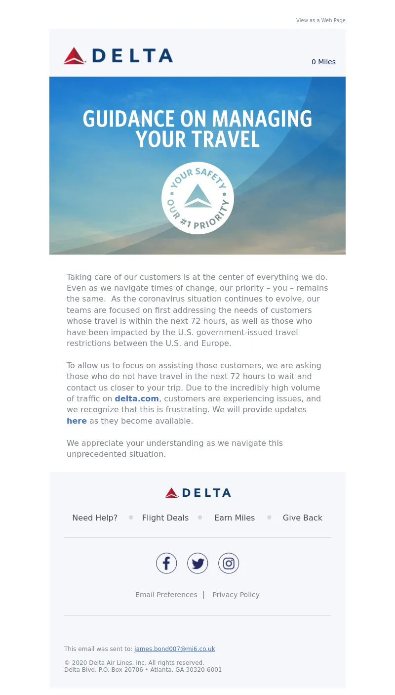
Taking care of our customers is at the center of everything we do. Even as we navigate times of change, our priority – you – remains the same. As the coronavirus situation continues to evolve, our teams are focused on first addressing the needs of customers whose travel is within the next 72 hours, as well as those who have been impacted by the U.S. government-issued travel restrictions between the U.S. and Europe.<br>
<br>
To allow us to focus on assisting those customers, we are asking those who do not have travel in the next 72 hours to wait and contact us closer to your trip. Due to the incredibly high volume of traffic on <b><a data-linkto="http://" href="https://click.o.delta.com/u/?qs=cdcc6b098b7b18e4e5c58ee65e51f7c080b1e4861c32fec48b9aead97acda59aae438f75e3cd9cd12427be4b0ab7fb712f893d06f4651aaa" style="text-decoration:none;" title="delta.com">delta.com</a></b>, customers are experiencing issues, and we recognize that this is frustrating. We will provide updates <b><a data-linkto="https://" href="https://click.o.delta.com/u/?qs=cdcc6b098b7b18e4f5142797aaf968526ed9c9bb6aeec945cd29d7b46e5392c04047ec45070bee8685d1e76a850d9a9229d4ab236c64d820" style="text-decoration:none;" title="here">here</a></b> as they become available. <br>
<br>
We appreciate your understanding as we navigate this unprecedented situation. </p></div></td></tr></table>
</td>
</tr>
<!-- END MAIN BODY REGION -->
</tbody>
</table>
<!-- END EMAIL BODY TABLE -->
</td>
</tr>
</table>
<!-- END CONTAINER TABLE FOR EMAIL BODY -->
</td>
</tr>
<tr>
<td width="100%" align="center">
<!-- BEGIN CONTAINER TABLE FOR FOOTER -->
<table width="600" class="container" align="center" border="0" cellpadding="0" cellspacing="0" style="margin: 0 auto; padding: 0; background-color:#F5F7FA;" bgcolor="#F5F7FA" role="presentation">
<tr>
<td align="center" valign="top">
<!-- BEGIN FOOTER BODY TABLE -->
<table cellspacing="0" cellpadding="0" style="width:100%" role="presentation">
<tbody>
<!-- BEGIN NAVIGATION + SOCIAL REGION -->
<tr>
<td width="100%" valign="top" bgcolor="#F5F7FA;" style="background-color: #F5F7FA;">
<table id="Navigation" border="0" cellpadding="0" cellspacing="0" width="100%">
<!-- BEGIN FOOTER LOGO REGION -->
<tr>
<td align="center" class="footer_logo" style="padding-top:30px; padding-bottom:30px;">
<img src="https://image.o.delta.com/lib/fe5815707c6201787313/m/13/a3419f86-e2e8-47f8-adde-434f169d7e9a.png" height="23" width="135" alt="DELTA" style="color:#0B1F66; font-size:1.25em; font-weight: bold; letter-spacing: 0.2em; display:block;" />
</td>
</tr>
<!-- END FOOTER LOGO REGION -->
<!-- BEGIN NAVIGATION REGION -->
<tr>
<td align="center" >
<table width="540" cellpadding="0" cellspacing="0" class="navigation_divider" style="border-bottom: 1px solid #d8d8d8; max-width: 540px; padding-bottom: 30px; margin-right: auto; margin-left: auto;" role="presentation">
<tr>
<td align="center" class="navigation_divider" style="padding-bottom:30px;">
<table width="100%" cellpadding="0" cellspacing="0" border="0" role="presentation">
<tr>
<td class="navigation_stack" width="120" valign="middle" style="font-family:arial,helvetica,sans-serif; font-size:15px; color:#4A4A4A; text-align: center;min-width: 120px">
<a href="https://click.o.delta.com/u/?qs=cdcc6b098b7b18e45204a0bc836f6e2f5779df03c90f27af94f304a1f0a3f875b5e66537dff91ec4ef0f5adac9459d9c35af785e78520f3f9ffc0e28aad1b642" title="Need Help?" target="_blank" style="text-decoration: none; color:#4A4A4A;font-weight:normal;">Need Help?</a>
</td>
<td class="mobile-hidden" width="20" valign="middle" style="font-family:arial,helvetica,sans-serif; font-size:30px; color:#d8d8d8; line-height:18px; vertical-align:middle;text-align: center;">
•
</td>
<td class="navigation_stack" width="115" valign="middle" style="font-family:arial,helvetica,sans-serif; font-size:15px; color:#4A4A4A; text-align: center; min-width: 115px">
<a href="https://click.o.delta.com/u/?qs=cdcc6b098b7b18e4f89f8ddf2bb873b954015ba6ce3296be1c7bff998ed9c831aec256300c1d0af0c05bf7ff880c7f65c763a5423d980c94257fef63f51beb5d" title="Flight Deals" target="_blank" style="text-decoration: none; color:#4A4A4A;font-weight:normal;">Flight Deals</a>
</td>
<td class="mobile-hidden" width="20" valign="middle" style="font-family:arial,helvetica,sans-serif; font-size:30px; color:#d8d8d8; line-height:18px; text-align: center;">
•
</td>
<td class="navigation_stack" width="115" valign="middle" style="font-family:arial,helvetica,sans-serif; font-size:15px; color:#4A4A4A; text-align: center;min-width: 115px">
<a href="https://click.o.delta.com/u/?qs=cdcc6b098b7b18e45839cb9e2519d6deb4f248a52a3f1bfdc55156a90b1b01a889ea626f5f81c075b483cb2626b4650772631860e80a27ec3df365d86515f8ff" title="Earn Miles" target="_blank" style="text-decoration: none; color:#4A4A4A;font-weight:normal;text-align: center;">Earn Miles</a>
</td>
<td class="mobile-hidden" width="20" valign="middle" style="font-family:arial,helvetica,sans-serif; font-size:30px; color:#d8d8d8; line-height:18px; text-align: center;">
•
</td>
<td class="navigation_stack" width="110" valign="middle" style="font-family:arial,helvetica,sans-serif; font-size:15px; color:#4A4A4A; text-align: center;min-width: 110px">
<a href="https://click.o.delta.com/u/?qs=cdcc6b098b7b18e490b3358a91155bf2f916cb6dd6b9e11e1825304929b52220b37528e035e5c02f33a94ecfd5fd3fe4e4fe1ee9f97f503159570d3fbb7a1744" title="Give Back" target="_blank" style="text-decoration: none; color:#4A4A4A; font-weight:normal;">Give Back</a>
</td>
</tr>
</table>
</td>
</tr>
</table>
</td>
</tr>
<!-- END NAVIGATION REGION -->
</table>
<table border="0" cellpadding="0" cellspacing="0" width="100%" role="presentation">
<!-- BEGIN SOCIAL REGION -->
<tr>
<td align="center">
<table id="Social" border="0" cellpadding="10" cellspacing="0" role="presentation">
<tr>
<td valign="top" class="social_icons" style="padding-top:30px; padding-bottom:30px;">
<a href="https://click.o.delta.com/u/?qs=cdcc6b098b7b18e44200d39c3567ed94d3ce8ab67f16883c87b2e2603b01e6fb3031fc337619075764a059c3f3ef206cf62d0f129d4c610f09834b13719f3246" title="Facebook" target="_blank" style="text-decoration:none;"><img src="http://image.o.delta.com/lib/fe5815707c6201787313/m/9/0650bbdc-2208-4a1d-a595-b86d76783ab2.png" alt="Facebook" height="43" width="43" class="social_icons" style="border:none; display:block; height: 43px; width:43px;" /></a>
</td>
<td valign="top" class="social_icons" style="padding-top:30px; padding-bottom:30px;">
<a href="https://click.o.delta.com/u/?qs=cdcc6b098b7b18e48a48b772398679cadabebaa281d45d20bd2f5e6fbf19ff046265ab67cb12411afce794cd40d841dd3ebebd621cd5398ceb53f8e17634031c" title="Twitter" target="_blank" style="text-decoration:none;"><img src="http://image.o.delta.com/lib/fe5815707c6201787313/m/9/8da7b1ad-90b2-4d10-9323-9264eecf6d30.png" alt="Twitter" height="43" width="43" class="social_icons" style="border:none; display:block; height: 43px; width:43px;"/></a>
</td>
<td valign="top" class="social_icons" style="padding-top:30px; padding-bottom:30px;">
<a href="https://click.o.delta.com/u/?qs=cdcc6b098b7b18e43db9d6500384d527eab1748514c32226187f7a41a4d0435f02c416f6445c35626d0e534e019f8a14cc61643b9ecbec213a3c63ed9f4c36ce" title="Instagram" target="_blank" style="text-decoration:none;"><img src="http://image.o.delta.com/lib/fe5815707c6201787313/m/9/ade8219b-eca9-442c-8301-afe4cb85261b.png" alt="Instagram" height="43" width="43" class="social_icons" style="border:none; display:block; height: 43px; width:43px;"/></a>
</td>
</tr>
</table>
</td>
</tr>
<!-- END SOCIAL REGION -->
<!-- BEGIN EMAIL PREFERECENCES, UNSUBSCRIBE, AND PRIVACY POLICY REGION -->
<tr>
<td align="center">
<table width="540" cellpadding="0" cellspacing="0" class="navigation_divider" align="center" style="border-bottom: 1px solid #d8d8d8; padding-bottom: 30px; max-width: 540px;" role="presentation"><tr><td class="navigation_divider" style="font-family:arial,helvetica,sans-serif; text-align: center; color:#7C828A; line-height: 1.5em; padding-bottom: 30px;"><a href="https://click.o.delta.com/u/?qs=cdcc6b098b7b18e4773eac0db138b66a5dd18f3193ed85e1c4aad0b55d062712daf64466029ee7131373b9c582d2a32709ff03ba2ec741bd8dff587574a97069" title="Email Preferences" target="_blank" style="font-size: 14px; font-weight: normal; text-decoration: none; color:#7C828A;">Email Preferences</a> |
<a href="https://click.o.delta.com/u/?qs=cdcc6b098b7b18e47a2766edb69cf9377404c6175494027a275ae1fcb4450cf9cdc7e0ea014517d170b930527b8ec632a0b611c392ef0d1f66ab86bc80a1fc33" title="Privacy Policy" target="_blank" style="font-size: 14px; font-weight: normal; text-decoration: none; color:#7C828A;">Privacy Policy</a></td></tr></table>
</td>
</tr>
<!-- END EMAIL PREFERECENCES, UNSUBSCRIBE, AND PRIVACY POLICY REGION -->
</table>
</td>
</tr>
<!-- END NAVIGATION + SOCIAL REGION -->
<!-- BEGIN TERMS REGION -->
<tr>
<td id="Terms" width="100%" valign="top" bgcolor="#F5F7FA;" style="background-color: #F5F7FA; font-family:arial,helvetica,sans-serif; font-size:12px; color:#7C828A; line-height:14px; padding-top:30px; padding-left:30px; padding-right:30px; padding-bottom: 0;">
</td>
</tr>
<!-- END TERMS REGION -->
<!-- BEGIN FOOTER REGION -->
<tr>
<td id="Footer" width="100%" valign="top" bgcolor="#F5F7FA;" style="font-family:arial,helvetica,sans-serif; background-color: #F5F7FA; padding:30px; font-size:12px; color:#7C828A; line-height:14px;">
This email was sent to: <a href="mailto:james.bond007@mi6.co.uk" style="font-size:12px; font-weight:normal; text-decoration: underline; color:#4470C3;">james.bond007@mi6.co.uk</a>
<br><br>
© 2020 Delta Air Lines, Inc. All rights reserved.
<br>
Delta Blvd. P.O. Box 20706 • Atlanta, GA 30320-6001
</td>
</tr>
<!-- END FOOTER REGION -->
</tbody>
</table>
<!-- END FOOTER BODY TABLE -->
</td>
</tr>
</table>
<!-- END CONTAINER TABLE FOR FOOTER -->
</td>
</tr>
</table>
<!-- END OUTER TABLE WITH 100% WIDTH -->
</body>
</html>