40
Average Subject Line Characters
258
Total Recieved
6
Monthly Average
2
Weekly Average
> 1
Daily Average
Parent Domain:
lowes.com
Subdomains:
lowes@e.lowes.com
From Names:
Lowe's Home Improvement
Mylowe's Rewards
From: Lowe's Home Improvement
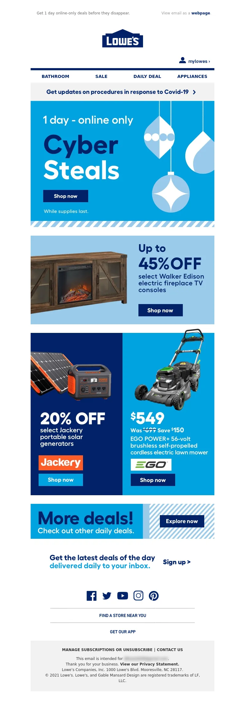
Subject Line: Cyber Steals you don't want to miss!
<!DOCTYPE html PUBLIC"-//W3C//DTD XHTML 1.0 Transitional//EN" "https://www.w3.org/TR/xhtml1/DTD/xhtml1-transitional.dtd">
<html xmlns="https://www.w3.org/1999/xhtml">
<head>
<meta http-equiv="Content-Type" content="text/html; charset=UTF-8" />
<meta name="viewport" content="width=device-width, initial-scale=1.0" />
<meta name="x-apple-disable-message-reformatting" />
<!--[if !mso]><!-->
<style type="text/css">
@font-face {
font-family: 'DIN Next';
src: local('DIN Next'), local('DIN Next'), url('https://www.lowescdn.com/scaffold/1.4.4/fonts/din/din-next.woff') format('woff');
}
@font-face {
font-family: 'DIN Next Bold';
src: local('DIN Next Bold'), local('DIN Next Bold'), url('https://www.lowescdn.com/scaffold/1.2.0/fonts/din/din-next-bold.woff') format('woff');
}
@font-face {
font-family: 'DIN Next Black';
src: local('DIN Next Black'), local('DIN Next Black'), url('https://www.lowescdn.com/scaffold/1.2.0/fonts/din/din-next-black.woff') format('woff');
}
</style>
<!--<![endif]-->
<style type="text/css">
.ReadMsgBody{
width: 100%;
}
/* Forces Hotmail to display emails at full width */
.ExternalClass {
width: 100%;
}
/*Hotmail table centering fix*/
.ExternalClass, .ExternalClass p, .ExternalClass span, .ExternalClass font, .ExternalClass td, .ExternalClass div {
line-height: 100%;
}
/* Forces Hotmail to display normal line spacing*/
.ExternalClass * {
line-height: 100%}
p {
margin: 1em 0;
}
/*Yahoo paragraph fix*/
table td {
border-collapse: collapse;
}
/*This resolves the Outlook 07, 10, and Gmail td padding issue fix*/
/*This resolves the issue when iphone puts links on dates, etc.*/
a[x-apple-data-detectors] {
color: inherit !important;
text-decoration: none !important;
font-size: inherit !important;
font-family: inherit !important;
font-weight: inherit !important;
line-height: inherit !important;
}
a.mobileshow, .mobilehide {
display: none;
color: #fff;
/*for Gmail */
}
</style>
<style type="text/css">
@media screen and (min-width: 375px) and (max-width: 600px) and (-webkit-min-device-pixel-ratio:0) {
.mobile-hidden {
display: none !important;
}
.no-padding {
padding: 0px !important;
}
.mobile-only {
display: block !important;
max-height: none !important;
}
.container {
width: 100% !important;
}
.navcontainer tbody{
width: 100% !important;
display: table !important;
}
.drop {
width: 100% !important;
display: block !important;
}
.drop-center {
width: 100% !important;
display: block !important;
text-align: center !important;
}
.photo {
width: 100% !important;
height: auto !important;
}
}
</style>
<style type="text/css">
/* Media query triggers alternate styles when the file is displayed on a device with a maximum width lower than the assigned pixel dimension. The default max width setting for max-width should be 480px to trigger on mobile devices. */
@media only screen and (max-width: 480px) {
html,body {
width: 100% !important;
min-width:100% !important;
max-width: 480px !important;
overflow-x: hidden !important;
margin:0 auto !important;
}
.mobile-hidden, .tablet-hidden {
display:none !important;
}
.mobile-photo {
width:100% !important;
max-width: 450px !important;
height:auto !important;
}
.no-padding {
padding:0px !important;
}
.mobile-only {
display: block !important;
max-height: none !important;
}
.container {
width:100% !important;
max-width:480px !important;
}
.photo {
width:100% !important;
max-width:480px !important;
height:auto !important;
}
.managesubs {
width:83% !important;
height:auto !important;
}
.photo390 {
display: block !important;
height: auto !important;
max-width: 390px !important;
width: 100% !important;
}
body[data-outlook-cycle] .oa {
width: 100% !important;
max-width: 480px !important;
text-align: center !important;
overflow-x: hidden !important;
display:block !important;
}
.drop {
width: 100% !important;
max-width: 480px !important;
display: block !important;
}
.drop-social {
width:100% !important;
max-width: 480px !important;
display:block !important;
text-align:center !important;
padding:0px !important;
}
.center {
text-align:center !important;
}
.center50 {
width:50% !important;
padding-right:10px !important;
padding-left:10px !important;
}
.drop-center {
width:100% !important;
max-width: 480px !important;
display:block !important;
text-align:center !important;
}
.Full100 {
width:100% !important;
max-width: 480px !important;
height:auto!important;
line-height:normal!important;
}
.pad10 {
padding-left:10px !important;
padding-right: 10px !important;
}
.sub_nav {
border-bottom:2px solid #ffffff;
display: table-cell !important;
width: auto !important;
height: auto !important;
float: none !important;
overflow: auto !important;
line-height:normal !important;
font-size:15px !important;
background-color: #15b5e5 !important;
}
.sub_nav_bottom {
border-bottom:2px solid #ffffff;
display: table-cell !important;
width: auto !important;
height: auto !important;
float: none !important;
overflow: auto !important;
line-height:normal !important;
font-size:15px !important;
}
.sub_nav_top {
display: table-cell !important;
width: auto !important;
height: auto !important;
float: none !important;
overflow: auto !important;
font-size:18px !important;
line-height:30px !important;
}
.tablet-only {
display: block !important;
max-height: none !important;
}
.Width70 {
width: 60% !important;
text-align: center !important;
}
.Width90 {
width: 90% !important;
text-align: center !important;
}
.container1 {
width: 100% !important;
max-width: 316px !important;
}
.mobile-only1 {
display: inline-block !important;
}
.mobile-left-image {
width: 67px !important;
max-width: 67px !important;
padding-left: 0px !important;
}
.mobile-middle-table {
width: 316px !important;
}
}
</style>
<style type="text/css">
@media only screen and (max-width: 619px) {
.tablet-only {
display: block !important;
max-height: none !important;
}
}
</style>
<style type="text/css">
@media only screen and (max-width: 414px) {
.mobile-hidden, .tablet-hidden {
display:none !important;
}
.mobile-photo {
width:100% !important;
max-width: 414px !important;
height:auto !important;
}
.no-padding {
padding:0px !important;
}
.mobile-only {
display: block !important;
max-height: none !important;
}
.container {
width:100% !important;
max-width:414px !important;
}
.photo {
width:100% !important;
max-width:414px !important;
height:auto !important;
}
.managesubs {
width:83% !important;
height:auto !important;
}
.photo390 {
display: block !important;
height: auto !important;
max-width: 390px !important;
width: 100% !important;
}
body[data-outlook-cycle] .oa {
width: 100% !important;
max-width: 414px !important;
text-align: center !important;
overflow-x: hidden !important;
display:block !important;
}
.drop {
width: 100% !important;
max-width: 414px !important;
display: block !important;
}
.drop-center {
width:100% !important;
max-width: 414px !important;
display:block !important;
text-align:center !important;
}
.Width70 {
width: 60% !important;
max-width: 380px !important;
text-align: center !important;
}
.Width90 {
width: 90% !important;
max-width: 400px !important;
text-align: center !important;
}
.container1 {
width: 100% !important;
max-width: 286px !important;
}
.mobile-left-image {
width: 64px !important;
padding-left: 0px !important;
}
.mobile-middle-table {
width: 286px !important;
}
.mobile-only1 {
display: inline-block !important;
}
}
</style>
<style type="text/css">
@media only screen and (max-width: 375px) {
.mobile-hidden {
display:none !important;
}
.mobile-photo {
width:100% !important;
max-width: 375px !important;
height:auto !important;
}
.no-padding {
padding:0px !important;
}
.mobile-only {
display: block !important;
max-height: none !important;
}
.container {
width:100% !important;
max-width:375px !important;
}
.photo {
width:100% !important;
max-width:375px !important;
height:auto !important;
}
.managesubs {
width:83% !important;
height:auto !important;
}
.photo390 {
display: block !important;
height: auto !important;
max-width: 390px !important;
width: 100% !important;
}
body[data-outlook-cycle] .oa {
width: 100% !important;
max-width: 375px !important;
text-align: center !important;
overflow-x: hidden !important;
display:block !important;
}
.drop {
width: 100% !important;
max-width: 375px !important;
display: block !important;
}
.drop-center {
width:100% !important;
max-width: 375px !important;
display:block !important;
text-align:center !important;
}
.Width70 {
width: 60% !important;
max-width: 300px !important;
text-align: center !important;
}
.Width90 {
width: 90% !important;
max-width: 320px !important;
text-align: center !important;
}
.container1 {
width: 100% !important;
max-width: 247px !important;
}
.mobile-left-image {
width: 56px !important;
max-width: 56px !important;
padding-left: 3px !important;
}
.mobile-middle-table {
width: 265px !important;
}
.mobile-only1 {
display: inline-block !important;
}
}
}
</style>
<style type="text/css">
/*Liveclicker responsive video styles*/
/*Android devices*/
@media only screen and (max-device-width: 480px) {
div.lc-video{
width:100%;
height:auto;
}
}
/* iPhone 5 - Portrait */
@media only screen and (device-width: 320px) {
div.lc-video {
width: 320px;
min-width: 320px;
height: 180px;
}
}
/* iPhone 6 - Portrait */
@media only screen and (device-width: 375px) {
div.lc-video {
width: 375px;
min-width: 375px;
height: 211px;
}
}
/* iPhone 6+ - Portrait */
@media only screen and (device-width: 414px) {
div.lc-video {
width: 414px;
min-width: 414px;
height: 233px;
}
}
/* iPhone 5 - Landscape */
@media only screen and (width: 568px) {
div.lc-video {
width: 568px;
min-width: 586px;
height: 320px;
}
}
/* iPhone 6 - Landscape */
@media only screen and (width: 667px) {
div.lc-video {
width: 600px;
min-width: 600px;
height: 338px;
}
}
/* iPhone 6+ - Landscape */
@media only screen and (width: 736px) {
div.lc-video {
width: 600px;
min-width: 600px;
height: 338px;
}
}
</style>
<title>Lowe's Email
</title>
<script type="application/ld+json">
[{
"@context": "https://schema.org/",
"@type": "Organization",
"name": "Lowe’s",
"logo": "https://i.imgur.com/AkY0dT7.jpg"
},{
"@context": "https://schema.org/",
"@type": "DiscountOffer",
"description": "",
"availabilityStarts": "",
"availabilityEnds": ""
},{
"@context": "https://schema.org/",
"@type": "PromotionCard",
"image": ""
}]
</script>
</head>
<body bgcolor="#ffffff" style="margin: 0; padding:0; -ms-text-size-adjust: none; mso-line-height-rule: exactly;" yahoo="fix">
<div class="oa" align="center">
<!-- Table used to center email -->
<table border="0" cellpadding="0" cellspacing="0" width="100%" class="container">
<tr>
<td>
<!-- Table used to set width of email -->
<table width="600" class="container" border="0" align="center" cellpadding="0" cellspacing="0" style="font-family:Arial, Helvetica, sans-serif">
<tr>
<td>
<table cellpadding="0" cellspacing="0" width="100%" role="presentation" style="min-width: 100%; " class="stylingblock-content-wrapper"><tr><td class="stylingblock-content-wrapper camarker-inner"><table border="0" cellpadding="0" cellspacing="0" class="container" width="100%">
<tr>
<td align="left" bgcolor="#ffffff" style="font-family:Arial, Helvetica, sans-serif; font-size:12px; color:#666666; padding-top:10px; padding-bottom:10px; padding-left:10px;" valign="top">
<table align="left" border="0" cellpadding="0" cellspacing="0" class="Width90" width="100%">
<tr>
<td align="left" bgcolor="#ffffff" class="drop no-padding" style="font-family:Arial, Helvetica, sans-serif; font-size:12px; color:#666666; padding-left:10px; padding-top:10px; padding-bottom:10px;" valign="top">
<!--Preheader Link Starts here--><a href="https://click.e.lowes.com/?qs=92b3d5fd73c57c86bffe713d393428699a4bea8907e5780516a044e23c3cd5dbaaa58ef0b51152b42e5175f3ab50293e842ac630ec3808e5656a534e50a226b4" style="color:#666666; text-decoration:none;" target="_blank"><span style="color:#666666; text-decoration:none;" title="Get 1 day online-only deals before they disappear.">Get 1 day online-only deals before they disappear.</span></a> <!--Preheader Link Ends here--></td><td align="right" bgcolor="#ffffff" class="mobile-hidden" style="font-family:Helvetica, Arial, sans-serif; font-size:12px; color:#999999; padding-right:10px; padding-left:0px; padding-top:10px; padding-bottom:10px;" valign="top" width="175">
<!---->View email as a <a href="https://view.e.lowes.com/?qs=faf4d14f0d55cb7e616e7af1b837c6cd5384c4a295439291287b6698cb17b601ef54d501dbaa1bf446ad1ca53add2aaba2b484a63339ebf1c57469486f82292ebb0e2194008782608d341c5f72148662" style=" text-decoration:none; color:#012169; font-weight:bold;" target="_blank" title="webpage">webpage</a>.<!----></td></tr></table></td></tr><tr>
<td align="center" height="5" style="padding-top:10px; padding-bottom: 10px;">
</td></tr><tr>
<td align="center" style="padding-bottom: 22px;" valign="bottom">
<a href="https://click.e.lowes.com/?qs=92b3d5fd73c57c86c060fc04ebcce144b909f6ff0541bd7d3f561cac68b588155c4d968a65da620da11debdde6a09456a43756ad5368cf45a0ebcd44f06767af" target="_blank" title="Lowe's"><img alt="Lowe's" border="0" src="https://image.e.lowes.com/lib/fe9515707364027471/m/59/14f6b444-13d4-4f6b-a52a-df9473ac4be2.png" style="display:block; margin-left: auto; margin-right: auto" width="141"></a></td></tr><tr>
<td align="right" style="padding-bottom: 10px; padding-right: 10px;">
<a href="https://click.e.lowes.com/?qs=92b3d5fd73c57c86c67e70d7ccbb43dea5cd0b7b8783b0328913e5b19e85685196c0aaa4e1923099fe0f51adab3ef33b3a7353e8ecc07ea904dfdeb9fc29681b" target="_blank" title="MyLowe's Login"><img alt="MyLowe's Login" border="0" src="https://image.e.lowes.com/lib/fe9515707364027471/m/59/e5a53d36-76a9-46cf-b45e-90482ed1b8b9.png" style="display:block;" width="110"></a></td></tr><tr>
<td align="center" height="1" style="font-size: 0px;">
<table bgcolor="#012169" border="0" cellpadding="0" cellspacing="0" class="container" width="100%">
<tr>
<td height="7" style="font-size: 0px;" valign="top">
<img alt="" border="0" class="photo" height="7" src="https://image.e.lowes.com/lib/fe9515707364027471/m/59/c301e24e-201b-46f9-8172-27b5acdcbf99.jpg" style="display:block;" width="100%"></td></tr></table></td></tr><tr>
<td>
<table bgcolor="#ffffff" border="0" cellpadding="0" cellspacing="0" class="mobile-hidden" width="100%">
<tr>
<th align="center" class="drop-center" height="20" valign="middle" width="1%">
</th><th align="center" class="drop-center" height="40" valign="middle" width="25%">
<!--NAV1001 Link Starts here--><a href="https://click.e.lowes.com/?qs=92b3d5fd73c57c864eeba993fc6320f9f4c64178f42d6cc5f29cfac09dbbf12d5b3e81d112980bc2bbb5c65b517ffee5d9437391f1d86588295d8ad689774ee8" style="color: #012169; text-decoration: none; font-family: Helvetica, Arial, sans-serif; font-size: 14px;" target="_blank" title="BATHROOM"><strong>BATHROOM</strong></a> <!--NAV1001 Link Ends here--></th><th align="center" class="drop-center" height="40" valign="middle" width="25%">
<!--NAV1002 Link Starts here--><a href="https://click.e.lowes.com/?qs=92b3d5fd73c57c86da92303b18b4c74438b82b2080311a1ab8b70128d7a71bfa19b903b43048b035da8f1f76094855490358eff0819684545f9ad694bf209536" style="color: #012169; text-decoration: none; font-family: Helvetica, Arial, sans-serif; font-size: 14px;" target="_blank" title="SALE"><strong>SALE</strong></a> <!--NAV1002 Link Ends here--></th><th align="center" class="drop-center" height="40" valign="middle" width="25%">
<!--NAV1003 Link Starts here--><a href="https://click.e.lowes.com/?qs=92b3d5fd73c57c86a88776c6ef112778a5f2aee29103964acef202522aa5fa6036d1be0f2934f4f2fa1d7613f69af17eafcf156021686cef9c8c8f89611b6ff7" style="color: #012169; text-decoration: none; font-family: Helvetica, Arial, sans-serif; font-size: 14px;" target="_blank" title="DAILY DEAL"><strong>DAILY DEAL</strong></a> <!--NAV1003 Link Ends here--></th><th align="center" class="drop-center" height="40" valign="middle" width="25%">
<!--NAV1004 Link Starts here--><a href="https://click.e.lowes.com/?qs=92b3d5fd73c57c86b1ce6904975b77bdd769a3e32d6408dfbe1ce5b56c9536129c49ba282f941ef51af0a0179355652394ba5227fc9b05b11a9e4fca0fc3aa6c" style="color: #012169; text-decoration: none; font-family: Helvetica, Arial, sans-serif; font-size: 14px;" target="_blank" title="APPLIANCES"><strong>APPLIANCES</strong></a> <!--NAV1004 Link Ends here--></th></tr></table></td></tr></table></td></tr></table>
<table cellpadding="0" cellspacing="0" width="100%" role="presentation" style="min-width: 100%; " class="stylingblock-content-wrapper"><tr><td class="stylingblock-content-wrapper camarker-inner"><table border="0" cellpadding="0" cellspacing="0" class="container" width="100%">
<tr>
<td>
<a data-linkto="https://" href="https://click.e.lowes.com/?qs=92b3d5fd73c57c8670e1aeb31c5a0ac2c48fb37444f2029baab328b7d09c16b6ed4af5fbeee7601a68a7c80b76c0f1ddbe61e13366511c7c0b866abe00a07d6e" target="_blank" title=""><img alt="Get updates on procedures in response to Covid-19." data-assetid="32219" src="https://image.e.lowes.com/lib/fe9515707364027471/m/61/5544222b-afa0-43ab-867c-841441c17a5a.jpg" style="display: block; width: 100%; padding: 0px; text-align: center; height: auto;" width="600"></a></td></tr></table></td></tr></table>
<table cellpadding="0" cellspacing="0" width="100%" role="presentation" style="min-width: 100%; " class="stylingblock-content-wrapper"><tr><td class="stylingblock-content-wrapper camarker-inner"><table align="center" border="0" cellpadding="0" cellspacing="0" class="container" width="600">
<tr>
<td>
<a data-linkto="https://" href="https://click.e.lowes.com/?qs=92b3d5fd73c57c86006f679fb185672d28e915011eb0636dffa4496c77c962b26b18bb5da4918e61a47daf9223bbb538685fab817f387a377208d82a56e1ba30" target="_blank" title=""><img alt="1 day - online only Cyber Steals." data-assetid="39999" src="https://image.e.lowes.com/lib/fe9515707364027471/m/64/9daf59f2-bf55-4184-b00b-66e11d6de7ba.jpg" style="display: block; width: 100%; padding: 0px; text-align: center; height: auto;" width="600"></a></td></tr></table></td></tr></table><table cellpadding="0" cellspacing="0" width="100%" role="presentation" style="min-width: 100%; " class="stylingblock-content-wrapper"><tr><td class="stylingblock-content-wrapper camarker-inner"><table align="center" border="0" cellpadding="0" cellspacing="0" class="container" width="600">
<tr>
<td>
<a data-linkto="https://" href="https://click.e.lowes.com/?qs=92b3d5fd73c57c8685d4434c6423fe1327984e68f105a1e25e841dfd8252983d8122ef087b80cb71d29d8d3ebd35ac72ea8d31f2f69b60a8d3485a12b492d447" target="_blank" title=""><img alt="Up to 45% off select Walker Edison electric fireplace TV consoles." data-assetid="39998" src="https://image.e.lowes.com/lib/fe9515707364027471/m/64/c2e3d9be-f291-41a2-8fa6-a31245dd07d4.jpg" style="display: block; width: 100%; padding: 0px; text-align: center; height: auto;" width="600"></a></td></tr></table></td></tr></table>
<table cellpadding="0" cellspacing="0" width="100%" role="presentation" style="min-width: 100%; " class="stylingblock-content-wrapper"><tr><td class="stylingblock-content-wrapper camarker-inner"><table align="center" border="0" cellpadding="0" cellspacing="0" class="container" width="600">
<tr>
<td valign="top">
<table border="0" cellpadding="0" cellspacing="0" width="100%">
<tr>
<td align="left" style="padding-right: 0px;" valign="top">
<a data-linkto="https://" href="https://click.e.lowes.com/?qs=92b3d5fd73c57c8648a8d9ad917d1e55d1fefb71159638c113527c378a7745661aefa6314bc801c2ee7a9aa3c454887f9b8fa62d873370c89afa521475fb0e16" target="_blank" title=""><img alt="20% off select Jackery portable solar generators." data-assetid="40002" src="https://image.e.lowes.com/lib/fe9515707364027471/m/64/f35405a8-909b-441d-a9a2-b0026f712054.jpg" style="display: block; width: 100%; padding: 0px; text-align: center; height: auto;" width="100%"></a></td><td align="right" style="padding-left: 0px;" valign="top">
<a data-linkto="https://" href="https://click.e.lowes.com/?qs=92b3d5fd73c57c860c748d0df054b3f2656f69a95b12185bf7915eed0ef2301b5da21c7ba3e28aeac92829654f15e297554a2e00f08d3a1ab3b8132b979ba37e" target="_blank" title=""><img alt="$549 EGO Power+ 56-volt brushless self-propelled cordless electric lawn mower. Save $150. Was $699." data-assetid="40001" src="https://image.e.lowes.com/lib/fe9515707364027471/m/64/586aa943-9e74-4651-90de-c8f474cb5c13.jpg" style="display: block; width: 100%; padding: 0px; text-align: center; height: auto;" width="100%"></a></td></tr></table></td></tr></table></td></tr></table>
<table cellpadding="0" cellspacing="0" width="100%" role="presentation" style="min-width: 100%; " class="stylingblock-content-wrapper"><tr><td class="stylingblock-content-wrapper camarker-inner"><table align="center" border="0" cellpadding="0" cellspacing="0" class="container" width="600">
<tr>
<td>
<a data-linkto="https://" href="https://click.e.lowes.com/?qs=92b3d5fd73c57c861ec20d104e655dd20d36e5e5ab1e0affd5c977462ed5abf865b0f9eb01e655a7ff2c2a4e9a6397f0a4408dbae54dbc67ded62fbb92afb9c5" target="_blank" title=""><img alt="More deals! Check out other daily deals." data-assetid="39997" src="https://image.e.lowes.com/lib/fe9515707364027471/m/64/a9cdde69-2a0a-49d9-a172-5fe4e05c1228.jpg" style="display: block; width: 100%; padding: 0px; text-align: center; height: auto;" width="600"></a></td></tr></table></td></tr></table>
<table align="center" border="0" cellpadding="0" cellspacing="0" class="container" width="600">
<tr>
<td><a href="https://click.e.lowes.com/?qs=92b3d5fd73c57c862ea3c35adad0c601ba4d92d057c562b642e23d47fc07138742b8309982383200fe1fbe978b29d5ee1f47069e388fcf36f24986c039ed4b10" target="_blank" title="Get the latest deals of the day delivered daily to your inbox. Sign up >">
<img alt="Get the latest deals of the day delivered daily to your inbox. Sign up >" src="https://image.e.lowes.com/lib/fe9515707364027471/m/62/9271c0c8-9f13-4bda-9dc9-a8fe395bee96.jpg" style="display: block;" width="600" border="0" class="photo" /></a></td>
</tr>
</table>
<table cellpadding="0" cellspacing="0" width="100%" role="presentation" style="min-width: 100%; " class="stylingblock-content-wrapper"><tr><td class="stylingblock-content-wrapper camarker-inner"><table border="0" cellpadding="0" cellspacing="0" width="100%">
<tr>
<td style="font-size:0%;">
<img alt="" border="0" height="30" src="https://image.e.lowes.com/lib/fe9515707364027471/m/32/20131010_promo_spacer.gif" style="display:block" width="1"></td></tr></table></td></tr></table>
<table cellpadding="0" cellspacing="0" width="100%" role="presentation" style="min-width: 100%; " class="stylingblock-content-wrapper"><tr><td class="stylingblock-content-wrapper camarker-inner"><!----><table align="center" border="0" cellpadding="0" cellspacing="0" class="container" width="100%">
<tr>
<td align="center" bgcolor="#ffffff" style="font-family:Arial, Helvetica, sans-serif; font-size:12px; color:#666666; padding-top:10px;" valign="top">
<!---->
<!--[if !mso]><!-- --><table align="center" bgcolor="#ffffff" border="0" cellpadding="0" cellspacing="0" class="mobile-only container" style="display: none;" width="100%">
<tr>
<td align="center" style="font-size: 0px; line-height: 1px; mso-line-height-rule: exactly;" valign="top">
<img alt="" border="0" class="photo" height="1" src="https://image.e.lowes.com/lib/fe9515707364027471/m/56/bb6af455-49ee-4acd-a650-0ef4929ac4a7.jpg" style="display:block; width: 100%; height: 1px;" width="100%"></td></tr><tr>
<td align="center" height="40" valign="middle">
<!--NAV1001 Link Starts here--><a href="https://click.e.lowes.com/?qs=92b3d5fd73c57c864eeba993fc6320f9f4c64178f42d6cc5f29cfac09dbbf12d5b3e81d112980bc2bbb5c65b517ffee5d9437391f1d86588295d8ad689774ee8" style="color: #012169; text-decoration: none; font-family: Helvetica, Arial, sans-serif; font-size: 14px;" target="_blank" title="BATHROOM"><strong>BATHROOM</strong></a> <!--NAV1001 Link Ends here--></td></tr><tr>
<td align="center" height="40" style="border-top: 1px solid #a1a1a1;" valign="middle">
<!--NAV1002 Link Starts here--><a href="https://click.e.lowes.com/?qs=92b3d5fd73c57c86da92303b18b4c74438b82b2080311a1ab8b70128d7a71bfa19b903b43048b035da8f1f76094855490358eff0819684545f9ad694bf209536" style="color: #012169; text-decoration: none; font-family: Helvetica, Arial, sans-serif; font-size: 14px;" target="_blank" title="SALE"><strong>SALE</strong></a> <!--NAV1002 Link Ends here--></td></tr><tr>
<td align="center" height="40" style="border-top: 1px solid #a1a1a1;" valign="middle">
<!--NAV1003 Link Starts here--><a href="https://click.e.lowes.com/?qs=92b3d5fd73c57c86a88776c6ef112778a5f2aee29103964acef202522aa5fa6036d1be0f2934f4f2fa1d7613f69af17eafcf156021686cef9c8c8f89611b6ff7" style="color: #012169; text-decoration: none; font-family: Helvetica, Arial, sans-serif; font-size: 14px;" target="_blank" title="DAILY DEAL"><strong>DAILY DEAL</strong></a> <!--NAV1003 Link Ends here--></td></tr><tr>
<td align="center" height="40" style="border-top: 1px solid #a1a1a1;" valign="middle">
<!--NAV1004 Link Starts here--><a href="https://click.e.lowes.com/?qs=92b3d5fd73c57c86b1ce6904975b77bdd769a3e32d6408dfbe1ce5b56c9536129c49ba282f941ef51af0a0179355652394ba5227fc9b05b11a9e4fca0fc3aa6c" style="color: #012169; text-decoration: none; font-family: Helvetica, Arial, sans-serif; font-size: 14px;" target="_blank" title="APPLIANCES"><strong>APPLIANCES</strong></a> <!--NAV1004 Link Ends here--></td></tr></table><!--<![endif]--><!----><table align="center" border="0" cellpadding="0" cellspacing="0" class="mobile-hidden container" width="100%">
<tr>
</tr><tr>
<td align="center" style="padding-bottom: 14px;">
<table border="0" cellpadding="0" cellspacing="0">
<tr>
<td>
<a href="https://click.e.lowes.com/?qs=92b3d5fd73c57c866bf58a7a45e73220e91f7ca93fe4b2cc9abc88be19ceb15f7cecbfa16202384cc2626cd088c4c9c28613992936feab1b" target="_blank" title="Facebook"><img alt="Facebook" border="0" height="49" src="https://image.e.lowes.com/lib/fe9515707364027471/m/59/c6808656-b0d8-442d-a586-6160d7fbd761.png" style="display:block;" width="49"></a></td><td>
<a href="https://click.e.lowes.com/?qs=92b3d5fd73c57c86341f48d49777817b39d3995dd4a25087deb5d964647ab8842629248bce496a5c26a9d2118e6baceac2e948c22c079069" target="_blank" title="Twitter"><img alt="Twitter" border="0" height="49" src="https://image.e.lowes.com/lib/fe9515707364027471/m/59/b315cf6b-d65a-4b3a-a7c1-5d40c83787b6.png" style="display:block;" width="47"></a></td><td>
<a href="https://click.e.lowes.com/?qs=92b3d5fd73c57c8649e3f591514c8dfac2021d5def39f03e4183affbaaab5b59db09404ac1726f9a58da6e99c7be9fb692c10a33e1101e24" target="_blank" title="YouTube"><img alt="YouTube" border="0" height="49" src="https://image.e.lowes.com/lib/fe9515707364027471/m/59/f4bc112b-d366-4497-a878-0f2ce36c4d31.png" style="display:block;" width="55"></a></td><td>
<a href="https://click.e.lowes.com/?qs=92b3d5fd73c57c86805995fcbe4cb03f7e279b51012f3be0b379b524c4cbece2c46c3741d786c8b7880241d920310bc7e7ee0e6b254d91d4" target="_blank" title="Instagram"><img alt="Instagram" border="0" height="49" src="https://image.e.lowes.com/lib/fe9515707364027471/m/59/4c4871cd-eb9a-416f-b91f-1b659c50d18d.png" style="display:block;" width="48"></a></td><td>
<a href="https://click.e.lowes.com/?qs=92b3d5fd73c57c867487420de86874fe7e0b5a94dab3925ec0b8a0dda137615245492fe5f5ba4483a2cd866cef5563413cd4888a3674dfc3" target="_blank" title="Pinterest"><img alt="Pinterest" border="0" height="49" src="https://image.e.lowes.com/lib/fe9515707364027471/m/59/c3a70af5-4e26-408f-98ca-32c55030b8b0.png" style="display:block;" width="48"></a></td></tr></table></td></tr></table><table align="center" border="0" cellpadding="0" cellspacing="0" class="container" width="473">
<tr>
<td align="center" style="padding-bottom: 12px; font-size: 0px; line-height: 1px; mso-line-height-rule: exactly;" valign="top">
<img alt="" border="0" class="photo" height="1" src="https://image.e.lowes.com/lib/fe9515707364027471/m/56/bb6af455-49ee-4acd-a650-0ef4929ac4a7.jpg" style="display:block; width: 100%; height: 1px;" width="100%"></td></tr><tr>
<td align="center" style="font-size: 14px; line-height: 22px; mso-line-height-rule: exactly;" valign="middle">
<a href="https://click.e.lowes.com/?qs=92b3d5fd73c57c86e35eef25bbbd329869ca5ff12c5d01a2b30343792c144261f088dbedda9974bcfcc03d3af14ff47df4b5c53e0dada17ea6020dfc1b9e78cd" style="color: #012169; font-family: 'DIN Next', Arial, Helvetica, sans-serif; font-size: 14px; line-height: 22px; font-weight: bold; text-decoration: none;" target="_blank" title="FIND A STORE NEAR YOU">FIND A STORE NEAR YOU</a></td></tr><tr>
<td align="center" style="padding-top: 12px; padding-bottom: 18px; font-size: 0px; line-height: 1px; mso-line-height-rule: exactly;" valign="top">
<img alt="" border="0" class="photo" height="1" src="https://image.e.lowes.com/lib/fe9515707364027471/m/56/bb6af455-49ee-4acd-a650-0ef4929ac4a7.jpg" style="display:block; width: 100%; height: 1px;" width="100%"></td></tr><tr>
<td align="center" style="font-size: 14px; line-height: 22px; mso-line-height-rule: exactly; padding-bottom: 18px;" valign="top">
<a href="https://click.e.lowes.com/?qs=92b3d5fd73c57c867da489070531330586a26468b639d4a06b4f5964c38fe9c4b5415a5a0ca426a82c2aacb0653cf11f5d1063c6f3fdc274dd147f994801dcf1" style="color: #012169; font-family: 'DIN Next', Arial, Helvetica, sans-serif; font-size: 14px; line-height: 22px; font-weight: bold; text-decoration: none;" target="_blank" title="GET OUR APP">GET OUR APP</a></td></tr></table><!--[if !mso]><!-- --><table align="center" border="0" cellpadding="0" cellspacing="0" class="mobile-only center" style="display: none; text-align: center;" width="250">
<tr>
<td align="center" style="padding-bottom: 14px; text-align: center;">
<table align="center" border="0" cellpadding="0" cellspacing="0" style="display: inline-block; text-align: center;" width="250">
<tr>
<td>
<a href="https://click.e.lowes.com/?qs=92b3d5fd73c57c866bf58a7a45e73220e91f7ca93fe4b2cc9abc88be19ceb15f7cecbfa16202384cc2626cd088c4c9c28613992936feab1b" target="_blank" title="Facebook"><img alt="Facebook" border="0" height="49" src="https://image.e.lowes.com/lib/fe9515707364027471/m/59/c6808656-b0d8-442d-a586-6160d7fbd761.png" width="49"></a></td><td>
<a href="https://click.e.lowes.com/?qs=92b3d5fd73c57c86341f48d49777817b39d3995dd4a25087deb5d964647ab8842629248bce496a5c26a9d2118e6baceac2e948c22c079069" target="_blank" title="Twitter"><img alt="Twitter" border="0" height="49" src="https://image.e.lowes.com/lib/fe9515707364027471/m/59/b315cf6b-d65a-4b3a-a7c1-5d40c83787b6.png" width="47"></a></td><td>
<a href="https://click.e.lowes.com/?qs=92b3d5fd73c57c8649e3f591514c8dfac2021d5def39f03e4183affbaaab5b59db09404ac1726f9a58da6e99c7be9fb692c10a33e1101e24" target="_blank" title="YouTube"><img alt="YouTube" border="0" height="49" src="https://image.e.lowes.com/lib/fe9515707364027471/m/59/f4bc112b-d366-4497-a878-0f2ce36c4d31.png" width="55"></a></td><td>
<a href="https://click.e.lowes.com/?qs=92b3d5fd73c57c86805995fcbe4cb03f7e279b51012f3be0b379b524c4cbece2c46c3741d786c8b7880241d920310bc7e7ee0e6b254d91d4" target="_blank" title="Instagram"><img alt="Instagram" border="0" height="49" src="https://image.e.lowes.com/lib/fe9515707364027471/m/59/4c4871cd-eb9a-416f-b91f-1b659c50d18d.png" width="48"></a></td><td>
<a href="https://click.e.lowes.com/?qs=92b3d5fd73c57c867487420de86874fe7e0b5a94dab3925ec0b8a0dda137615245492fe5f5ba4483a2cd866cef5563413cd4888a3674dfc3" target="_blank" title="Pinterest"><img alt="Pinterest" border="0" height="49" src="https://image.e.lowes.com/lib/fe9515707364027471/m/59/c3a70af5-4e26-408f-98ca-32c55030b8b0.png" width="48"></a></td></tr></table></td></tr></table><!--<![endif]--><table align="center" bgcolor="#f2f2f2" border="0" cellpadding="0" cellspacing="0" class="container" width="100%">
<tr>
<td align="center" style="padding-top:10px;padding-bottom:10px;">
<table align="center" bgcolor="#f2f2f2" border="0" cellpadding="0" cellspacing="0" class="container" width="90%">
<tr>
<td align="center" style="padding-top:10px;padding-bottom:10px;">
<table align="center" bgcolor="#f2f2f2" border="0" cellpadding="0" cellspacing="0" class="Width90">
<tr>
<!----><th align="center" bgcolor="#f2f2f2" class="drop-center" style="font-family: Arial, Helvetica, sans-serif; font-size: 12px; line-height: 20px;" valign="middle">
<a href="https://click.e.lowes.com/?qs=92b3d5fd73c57c8662c733ba1b0a3323723d3a543ae232d25479efce9c0d2572c5aac2a69b8a4b1214391374fe732852d14b359bdd6299a99c31e9d867cfe4f0" style="text-decoration: none; color: #333333; font-weight: bold;" target="_blank" title=">MANAGE SUBSCRIPTIONS OR UNSUBSCRIBE">MANAGE SUBSCRIPTIONS OR UNSUBSCRIBE</a></th><!----><th align="center" bgcolor="#f2f2f2" class="mobile-hidden" style="color: #333333; font-size:12px; padding-left:5px; padding-right:5px; line-height: 20px;" valign="middle">
|</th><th align="center" bgcolor="#f2f2f2" class="drop-center" style="font-family: Arial, Helvetica, sans-serif; font-size: 12px; line-height: 20px;" valign="middle">
<a href="https://click.e.lowes.com/?qs=92b3d5fd73c57c862590a3ca07f652255db40367c7c48684ce97a8e3e62a62d420a1ced83020e7e866e67448b57ff15410c0cc3d27f15e67fbde8f31a75efa66" style="text-decoration: none; color: #333333; font-weight: bold;" target="_blank" title="CONTACT US">CONTACT US</a></th></tr></table></td></tr><tr>
<td align="center" style="-webkit-text-size-adjust:none; vertical-align:top; font-family:Helvetica, Arial, sans-serif; font-size:12px; color: #333333; text-decoration: none; line-height: 18px; font-weight:normal; padding-left: 10px; padding-right: 10px;">
This email is intended for <a href="#" style="color:#333333; text-decoration:none;">james.bond007@mi6.co.uk</a>.<br>
Thank you for your business. <a href="https://click.e.lowes.com/?qs=92b3d5fd73c57c865790f14e4c8b6a4d05f7daf020fb04bb45259edf9ba53a1cc4eec7283fa24e9648ef6e5feef7cac494f8a0aa3846b9812028460698dbda9b" style="font-weight: bold; color: #333333; text-decoration: none;" target="_blank" title="View our Privacy Statement.">View our Privacy Statement.</a><br>
Lowe’s Companies, Inc. 1000 Lowe's Blvd. Mooresville, NC 28117.<br>
© 2021 Lowe's. Lowe's, and Gable Mansard Design are registered trademarks of LF, LLC.</td></tr><!----><tr>
<td style="-webkit-text-size-adjust:none; vertical-align:top; font-family:Helvetica, Arial, sans-serif; font-size:12px; color: #333333; text-decoration: none; text-align: left; line-height: 18px; font-weight:normal; padding-top: 5px; padding-bottom: 10px;">
</td></tr></table></td></tr></table></td></tr></table></td></tr></table>
</td>
</tr>
</table>
</td>
</tr>
</table>
<img src="https://pixel.inbox.exacttarget.com/pixel.gif?r=3cee957cf4045be5bdd97f3d45b56bc1d2d850ec" width="1" height="1" />
<img src="https://beacon.krxd.net/1x1_usermatch.gif?partner=LYMUCbth_sfmc_1060694_sha256&partner_uid=ed288a60fef0d429a6e67d2d71af1392792076007be48ca2ecc94afc5c372498" width=0 height=0 style="display:none" />
<img src="https://beacon.krxd.net/1x1_usermatch.gif?partner=LYMUCbth_sfmc_1060694_subid&partner_uid=129182386" width=0 height=0 style="display:none" />
<img src="https://beacon.krxd.net/1x1_ad_impression.gif?confid=r3dodf9im&advertiserid=1060694&campaignid=20211110_DIY_Enterprise_1SL1" width=0 height=0 style="display:none;" />
<img src="https://click.e.lowes.com/open.aspx?ffcb10-fec3177172610075-fe201770776d0c747d1272-fe9515707364027471-ff991773-fe2715727c650c7f761c76-ff031573766104&d=40121&bmt=0" width="1" height="1" alt="">
</div>
</body>
</html>