40
Average Subject Line Characters
258
Total Recieved
6
Monthly Average
2
Weekly Average
> 1
Daily Average
Parent Domain:
lowes.com
Subdomains:
lowes@e.lowes.com
From Names:
Lowe's Home Improvement
Mylowe's Rewards
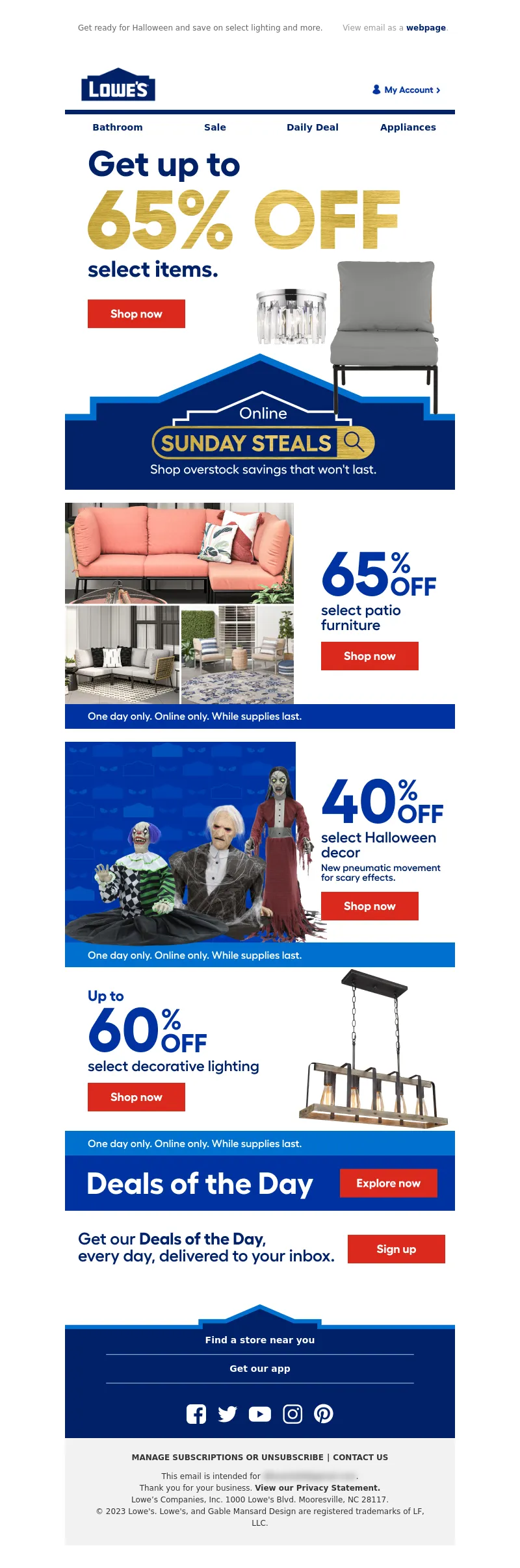
From: Lowe's Home Improvement
Subject Line: SUNDAY STEALS: Up to 65% OFF, today only.
<!DOCTYPE html PUBLIC"-//W3C//DTD XHTML 1.0 Transitional//EN" "https://www.w3.org/TR/xhtml1/DTD/xhtml1-transitional.dtd">
<html xmlns="https://www.w3.org/1999/xhtml">
<head>
<meta http-equiv="Content-Type" content="text/html; charset=UTF-8" />
<meta name="viewport" content="width=device-width, initial-scale=1.0" />
<meta name="x-apple-disable-message-reformatting" />
<!--[if !mso]><!-->
<style type="text/css">
@font-face {
font-family: 'Fellix Regular';
src: local('Fellix Regular'), local('Fellix Regular'), url('https://www.lowescdn.com/sffonts/Fellix-Regular.woff') format('woff');
}
@font-face {
font-family: 'Fellix Medium';
src: local('Fellix Medium'), local('Fellix Medium'), url('https://www.lowescdn.com/sffonts/Fellix-Medium.woff') format('woff');
}
@font-face {
font-family: 'Fellix Bold';
src: local('Fellix Bold'), local('Fellix Bold'), url('https://www.lowescdn.com/sffonts/Fellix-Bold.woff') format('woff');
}
</style>
<!--<![endif]-->
<!--[if !mso]><!-->
<style type="text/css">
@font-face {
font-family: 'DIN Next';
src: local('DIN Next'), local('DIN Next'), url('https://www.lowescdn.com/scaffold/1.4.4/fonts/din/din-next.woff') format('woff');
}
@font-face {
font-family: 'DIN Next Bold';
src: local('DIN Next Bold'), local('DIN Next Bold'), url('https://www.lowescdn.com/scaffold/1.2.0/fonts/din/din-next-bold.woff') format('woff');
}
@font-face {
font-family: 'DIN Next Black';
src: local('DIN Next Black'), local('DIN Next Black'), url('https://www.lowescdn.com/scaffold/1.2.0/fonts/din/din-next-black.woff') format('woff');
}
</style>
<!--<![endif]-->
<style type="text/css">
.ReadMsgBody{
width: 100%;
}
/* Forces Hotmail to display emails at full width */
.ExternalClass {
width: 100%;
}
/*Hotmail table centering fix*/
.ExternalClass, .ExternalClass p, .ExternalClass span, .ExternalClass font, .ExternalClass td, .ExternalClass div {
line-height: 100%;
}
/* Forces Hotmail to display normal line spacing*/
.ExternalClass * {
line-height: 100%}
p {
margin: 1em 0;
}
/*Yahoo paragraph fix*/
table td {
border-collapse: collapse;
}
/*This resolves the Outlook 07, 10, and Gmail td padding issue fix*/
/*This resolves the issue when iphone puts links on dates, etc.*/
a[x-apple-data-detectors] {
color: inherit !important;
text-decoration: none !important;
font-size: inherit !important;
font-family: inherit !important;
font-weight: inherit !important;
line-height: inherit !important;
}
a.mobileshow, .mobilehide {
display: none;
color: #fff;
/*for Gmail */
}
</style>
<style type="text/css">
@media screen and (min-width: 375px) and (max-width: 600px) and (-webkit-min-device-pixel-ratio:0) {
.mobile-hidden {
display: none !important;
}
.no-padding {
padding: 0px !important;
}
.mobile-only {
display: block !important;
max-height: none !important;
}
.container {
width: 100% !important;
}
.navcontainer tbody{
width: 100% !important;
display: table !important;
}
.drop {
width: 100% !important;
display: block !important;
}
.drop-center {
width: 100% !important;
display: block !important;
text-align: center !important;
}
.photo {
width: 100% !important;
height: auto !important;
}
}
</style>
<style type="text/css">
/* Media query triggers alternate styles when the file is displayed on a device with a maximum width lower than the assigned pixel dimension. The default max width setting for max-width should be 480px to trigger on mobile devices. */
@media only screen and (max-width: 480px) {
html,body {
width: 100% !important;
min-width:100% !important;
max-width: 480px !important;
overflow-x: hidden !important;
margin:0 auto !important;
}
.mobile-hidden, .tablet-hidden {
display:none !important;
}
.mobile-photo {
width:100% !important;
max-width: 450px !important;
height:auto !important;
}
.no-padding {
padding:0px !important;
}
.mobile-only {
display: block !important;
max-height: none !important;
}
.container {
width:100% !important;
max-width:480px !important;
}
.photo {
width:100% !important;
max-width:480px !important;
height:auto !important;
}
.managesubs {
width:83% !important;
height:auto !important;
}
.photo390 {
display: block !important;
height: auto !important;
max-width: 390px !important;
width: 100% !important;
}
body[data-outlook-cycle] .oa {
width: 100% !important;
max-width: 480px !important;
text-align: center !important;
overflow-x: hidden !important;
display:block !important;
}
.drop {
width: 100% !important;
max-width: 480px !important;
display: block !important;
}
.drop-social {
width:100% !important;
max-width: 480px !important;
display:block !important;
text-align:center !important;
padding:0px !important;
}
.center {
text-align:center !important;
}
.center50 {
width:50% !important;
padding-right:10px !important;
padding-left:10px !important;
}
.drop-center {
width:100% !important;
max-width: 480px !important;
display:block !important;
text-align:center !important;
}
.Full100 {
width:100% !important;
max-width: 480px !important;
height:auto!important;
line-height:normal!important;
}
.pad10 {
padding-left:10px !important;
padding-right: 10px !important;
}
.sub_nav {
border-bottom:2px solid #ffffff;
display: table-cell !important;
width: auto !important;
height: auto !important;
float: none !important;
overflow: auto !important;
line-height:normal !important;
font-size:15px !important;
background-color: #15b5e5 !important;
}
.sub_nav_bottom {
border-bottom:2px solid #ffffff;
display: table-cell !important;
width: auto !important;
height: auto !important;
float: none !important;
overflow: auto !important;
line-height:normal !important;
font-size:15px !important;
}
.sub_nav_top {
display: table-cell !important;
width: auto !important;
height: auto !important;
float: none !important;
overflow: auto !important;
font-size:18px !important;
line-height:30px !important;
}
.tablet-only {
display: block !important;
max-height: none !important;
}
.Width70 {
width: 60% !important;
text-align: center !important;
}
.Width90 {
width: 90% !important;
text-align: center !important;
}
.container1 {
width: 100% !important;
max-width: 316px !important;
}
.mobile-only1 {
display: inline-block !important;
}
.mobile-left-image {
width: 67px !important;
max-width: 67px !important;
padding-left: 0px !important;
}
.mobile-middle-table {
width: 316px !important;
}
}
</style>
<style type="text/css">
@media only screen and (max-width: 619px) {
.tablet-only {
display: block !important;
max-height: none !important;
}
}
</style>
<style type="text/css">
@media only screen and (max-width: 414px) {
.mobile-hidden, .tablet-hidden {
display:none !important;
}
.mobile-photo {
width:100% !important;
max-width: 414px !important;
height:auto !important;
}
.no-padding {
padding:0px !important;
}
.mobile-only {
display: block !important;
max-height: none !important;
}
.container {
width:100% !important;
max-width:414px !important;
}
.photo {
width:100% !important;
max-width:414px !important;
height:auto !important;
}
.managesubs {
width:83% !important;
height:auto !important;
}
.photo390 {
display: block !important;
height: auto !important;
max-width: 390px !important;
width: 100% !important;
}
body[data-outlook-cycle] .oa {
width: 100% !important;
max-width: 414px !important;
text-align: center !important;
overflow-x: hidden !important;
display:block !important;
}
.drop {
width: 100% !important;
max-width: 414px !important;
display: block !important;
}
.drop-center {
width:100% !important;
max-width: 414px !important;
display:block !important;
text-align:center !important;
}
.Width70 {
width: 60% !important;
max-width: 380px !important;
text-align: center !important;
}
.Width90 {
width: 90% !important;
max-width: 400px !important;
text-align: center !important;
}
.container1 {
width: 100% !important;
max-width: 286px !important;
}
.mobile-left-image {
width: 64px !important;
padding-left: 0px !important;
}
.mobile-middle-table {
width: 286px !important;
}
.mobile-only1 {
display: inline-block !important;
}
}
</style>
<style type="text/css">
@media only screen and (max-width: 375px) {
.mobile-hidden {
display:none !important;
}
.mobile-photo {
width:100% !important;
max-width: 375px !important;
height:auto !important;
}
.no-padding {
padding:0px !important;
}
.mobile-only {
display: block !important;
max-height: none !important;
}
.container {
width:100% !important;
max-width:375px !important;
}
.photo {
width:100% !important;
max-width:375px !important;
height:auto !important;
}
.managesubs {
width:83% !important;
height:auto !important;
}
.photo390 {
display: block !important;
height: auto !important;
max-width: 390px !important;
width: 100% !important;
}
body[data-outlook-cycle] .oa {
width: 100% !important;
max-width: 375px !important;
text-align: center !important;
overflow-x: hidden !important;
display:block !important;
}
.drop {
width: 100% !important;
max-width: 375px !important;
display: block !important;
}
.drop-center {
width:100% !important;
max-width: 375px !important;
display:block !important;
text-align:center !important;
}
.Width70 {
width: 60% !important;
max-width: 300px !important;
text-align: center !important;
}
.Width90 {
width: 90% !important;
max-width: 320px !important;
text-align: center !important;
}
.container1 {
width: 100% !important;
max-width: 247px !important;
}
.mobile-left-image {
width: 56px !important;
max-width: 56px !important;
padding-left: 3px !important;
}
.mobile-middle-table {
width: 265px !important;
}
.mobile-only1 {
display: inline-block !important;
}
}
}
</style>
<style type="text/css">
/*Liveclicker responsive video styles*/
/*Android devices*/
@media only screen and (max-device-width: 480px) {
div.lc-video{
width:100%;
height:auto;
}
}
/* iPhone 5 - Portrait */
@media only screen and (device-width: 320px) {
div.lc-video {
width: 320px;
min-width: 320px;
height: 180px;
}
}
/* iPhone 6 - Portrait */
@media only screen and (device-width: 375px) {
div.lc-video {
width: 375px;
min-width: 375px;
height: 211px;
}
}
/* iPhone 6+ - Portrait */
@media only screen and (device-width: 414px) {
div.lc-video {
width: 414px;
min-width: 414px;
height: 233px;
}
}
/* iPhone 5 - Landscape */
@media only screen and (width: 568px) {
div.lc-video {
width: 568px;
min-width: 586px;
height: 320px;
}
}
/* iPhone 6 - Landscape */
@media only screen and (width: 667px) {
div.lc-video {
width: 600px;
min-width: 600px;
height: 338px;
}
}
/* iPhone 6+ - Landscape */
@media only screen and (width: 736px) {
div.lc-video {
width: 600px;
min-width: 600px;
height: 338px;
}
}
</style>
<title>Lowe's Email
</title>
<script type="application/ld+json">
[{
"@context": "https://schema.org/",
"@type": "Organization",
"name": "Lowe’s",
"logo": "https://i.imgur.com/AkY0dT7.jpg"
},{
"@context": "https://schema.org/",
"@type": "DiscountOffer",
"description": "",
"availabilityStarts": "",
"availabilityEnds": ""
},{
"@context": "https://schema.org/",
"@type": "PromotionCard",
"image": ""
}]
</script>
</head>
<body bgcolor="#ffffff" style="margin: 0; padding:0; -ms-text-size-adjust: none; mso-line-height-rule: exactly;" yahoo="fix">
<div class="oa" align="center">
<!-- Table used to center email -->
<table border="0" cellpadding="0" cellspacing="0" width="100%" class="container">
<tr>
<td>
<!-- Table used to set width of email -->
<table width="600" class="container" border="0" align="center" cellpadding="0" cellspacing="0" style="font-family:Arial, Helvetica, sans-serif">
<tr>
<td>
<table cellpadding="0" cellspacing="0" width="100%" role="presentation" style="min-width: 100%; " class="stylingblock-content-wrapper"><tr><td class="stylingblock-content-wrapper camarker-inner"><table border="0" cellpadding="0" cellspacing="0" class="container" width="100%">
<tr>
<td align="left" bgcolor="#ffffff" style="font-family:Arial, Helvetica, sans-serif; font-size:12px; color:#666666; padding-top:10px; padding-bottom:10px; padding-left:10px;" valign="top">
<table align="left" border="0" cellpadding="0" cellspacing="0" class="Width90" width="100%">
<tr>
<td align="left" bgcolor="#ffffff" class="drop no-padding" style="font-family: Arial, Helvetica, sans-serif; font-size:12px; color:#666666; padding-left:10px; padding-top:10px; padding-bottom:10px;" valign="top">
<!--Preheader Link Starts here--><a href="https://click.e.lowes.com/u/?qs=4b3653eca23e8f8b07b3281cfb23c7e1dc2cf519f8bb322d01aed09d69609cee946b4ad365e83bda954148da112e36fbdb4c78efc5012bab6fef38c0172482b3" style="color:#666666; text-decoration:none;" target="_blank"><span style="color:#666666; text-decoration:none;" title="Get ready for Halloween and save on select lighting and more.">Get ready for Halloween and save on select lighting and more.</span></a> <!--Preheader Link Ends here--></td><td align="right" bgcolor="#ffffff" class="mobile-hidden" style="font-family: Arial, Helvetica, sans-serif; font-size:12px; color:#999999; padding-right:10px; padding-left:0px; padding-top:10px; padding-bottom:10px;" valign="top" width="175">
<!---->View email as a <a href="https://view.e.lowes.com/?qs=b874aee44c196e1679beed3771281304e75beb8a9459c9321acfdaa0640d19c29b73364505917f1fce986c274a32969d5bc91d5414a802d3515be455db8e23f87d599f06aeaa68ae5aef9d63267396f4" style=" text-decoration:none; color:#012169; font-weight:bold;" target="_blank" title="webpage">webpage</a>.<!----></td></tr></table></td></tr><tr>
<td align="center" height="5" style="padding-top:10px; padding-bottom: 10px;">
</td></tr><tr>
<td align="center" style="padding-top:10px; padding-bottom:10px;" valign="middle"><table align="center" border="0" cellpadding="0" cellspacing="0" width="100%">
<tr>
<td align="left" bgcolor="#ffffff" style="font-family:Arial, Helvetica, sans-serif; font-size:12px; color:#666666; padding-left:22px;" valign="top">
<a href="https://click.e.lowes.com/u/?qs=4b3653eca23e8f8bf936852a538a367d8dfb550cf3ae452ac7ef4cfc98f6b5604e92bdf9f44544c2bbf5011de93efa21b8085c3654f8ac4168fab91a3f37ad23" target="_blank" title="Lowe's"><img alt="Lowe's" border="0" src="https://image.e.lowes.com/lib/fe9515707364027471/m/59/14f6b444-13d4-4f6b-a52a-df9473ac4be2.png" style="display:block;" width="120"></a></td><td align="right" bgcolor="#ffffff" style="font-family: Helvetica, Arial, sans-serif; font-size:12px; color:#999999; padding-right:22px; padding-bottom:5px; line-height: 36px;" valign="bottom"><a href="https://click.e.lowes.com/u/?qs=4b3653eca23e8f8b820842e384b5f0e66abe6f7cac59217a3bab58e6646b878ec1d79875b2e1a4c31b7471ab4dc03cf403cb84b6dff6cff6827df7018ee5b498" target="_blank" title="MyLowe's Login">
<img alt="MyLowe's Login" border="0" src="https://image.e.lowes.com/lib/fe9515707364027471/m/71/62690a78-f84d-4700-8c0b-c6a33b9b324b.png" style="display:block;" width="106" height="34"></a></td></tr></table>
</td></tr><tr>
<td align="center" height="1" style="font-size: 0px;">
<table bgcolor="#012169" border="0" cellpadding="0" cellspacing="0" class="container" width="100%">
<tr>
<td height="7" style="font-size: 0px;" valign="top">
<img alt="" border="0" class="photo" height="7" src="https://image.e.lowes.com/lib/fe9515707364027471/m/59/c301e24e-201b-46f9-8172-27b5acdcbf99.jpg" style="display:block;" width="100%"></td></tr></table></td></tr><tr>
<td>
<table bgcolor="#ffffff" border="0" cellpadding="0" cellspacing="0" class="mobile-hidden" width="100%">
<tr>
<th align="center" class="drop-center" height="20" valign="middle" width="1%">
</th><th align="center" class="drop-center" height="40" valign="middle" width="25%">
<!--NAV1001 Link Starts here--><a href="https://click.e.lowes.com/u/?qs=4b3653eca23e8f8b0df095870de0dd3a8444827fe64bffec1461548697c8d4486d6777e48f9ed49bc1ebcc41178042b638873515bdc0456ae6cde44d8dbb7505" style="color: #012169; text-decoration: none; font-family: Arial, Helvetica, sans-serif; font-size: 14px;" target="_blank" title="Bathroom"><strong>Bathroom</strong></a> <!--NAV1001 Link Ends here--></th><th align="center" class="drop-center" height="40" valign="middle" width="25%">
<!--NAV1002 Link Starts here--><a href="https://click.e.lowes.com/u/?qs=4b3653eca23e8f8bf3e17270d9b690267ae2edab038d693d4b3e22c4726f8176fb58f1313290beb46a868d2ea72638eb2db22922c1a7df1bf0f48146e9c3e2eb" style="color: #012169; text-decoration: none; font-family: Arial, Helvetica, sans-serif; font-size: 14px;" target="_blank" title="Sale"><strong>Sale</strong></a> <!--NAV1002 Link Ends here--></th><th align="center" class="drop-center" height="40" valign="middle" width="25%">
<!--NAV1003 Link Starts here--><a href="https://click.e.lowes.com/u/?qs=4b3653eca23e8f8b2668c071b71c243bfef365951f8abb844a2575699fba18bb099a09b62a7e404d1532aedaef4d82fab607216268ef15ae608d193d800e200c" style="color: #012169; text-decoration: none; font-family: Arial, Helvetica, sans-serif; font-size: 14px;" target="_blank" title="Daily Deal"><strong>Daily Deal</strong></a> <!--NAV1003 Link Ends here--></th><th align="center" class="drop-center" height="40" valign="middle" width="25%">
<!--NAV1004 Link Starts here--><a href="https://click.e.lowes.com/u/?qs=4b3653eca23e8f8b23586797524588b7792e40f81e886ceb84a8f7aaa72c7d2564e8cdc2a84d50eba2b8930c6d9c73bbb15a1a387df28e3fc992dc3ecd2e0e9c" style="color: #012169; text-decoration: none; font-family: Arial, Helvetica, sans-serif; font-size: 14px;" target="_blank" title="Appliances"><strong>Appliances</strong></a> <!--NAV1004 Link Ends here--></th></tr></table></td></tr></table></td></tr></table>
<table cellpadding="0" cellspacing="0" width="100%" role="presentation" style="min-width: 100%; " class="stylingblock-content-wrapper"><tr><td class="stylingblock-content-wrapper camarker-inner"><table align="center" border="0" cellpadding="0" cellspacing="0" class="container" width="600">
<tr>
<td>
<a data-linkto="https://" href="https://click.e.lowes.com/u/?qs=4b3653eca23e8f8bdacb35fd827e149ff3e7da0de7342d708fbd6b95355cc1a439f3c9ae3ee3535411b87b7f64fd02fb48ae1d5b1843eb7e44db70ea7916e18c" target="_blank" title=""><img alt="Get up to 65% OFF select items. Online Sunday Steals. Shop overstock savings that won't last." data-assetid="70730" src="https://image.e.lowes.com/lib/fe9515707364027471/m/1/4e15da52-a4c0-4994-ad1e-f581b4e39765.jpg" style="display: block; width: 100%; padding: 0px; text-align: center; height: auto;" width="600"></a></td></tr></table></td></tr></table>
<table cellpadding="0" cellspacing="0" width="100%" role="presentation" style="min-width: 100%; " class="stylingblock-content-wrapper"><tr><td class="stylingblock-content-wrapper camarker-inner"><table align="center" border="0" cellpadding="0" cellspacing="0" class="container" width="600">
<tr>
<td>
<a data-linkto="https://" href="https://click.e.lowes.com/u/?qs=4b3653eca23e8f8ba467a752b5d289bd5fb432adf7f1cb743c36c935d2f41217d4593590fd1a73b2765684e1aef02a27fd5702758d2239b98576bd8e811cc955" target="_blank" title=""><img alt="65% OFF select patio furniture. One day only. Online only. While Supplies last." data-assetid="70743" src="https://image.e.lowes.com/lib/fe9515707364027471/m/1/1d62d86d-0350-4a97-871f-11960b4949f7.jpg" style="display: block; width: 100%; padding: 0px; text-align: center; height: auto;" width="600"></a></td></tr></table></td></tr></table>
<table cellpadding="0" cellspacing="0" width="100%" role="presentation" style="min-width: 100%; " class="stylingblock-content-wrapper"><tr><td class="stylingblock-content-wrapper camarker-inner"><table align="center" border="0" cellpadding="0" cellspacing="0" class="container" width="600">
<tr>
<td>
<a data-linkto="https://" href="https://click.e.lowes.com/u/?qs=4b3653eca23e8f8b0de499eaa8efd477529ebb6f2faccfaccfaee04635a0fee1b14069943cee39785cf0277c31f8dafcd4c082a0c24d87f13c9f2f3b55f20f01" target="_blank" title=""><img alt="40% OFF select Halloween decor." data-assetid="70742" src="https://image.e.lowes.com/lib/fe9515707364027471/m/1/b70ed318-258c-4e92-b75d-446a3c4590ec.jpg" style="display: block; width: 100%; padding: 0px; text-align: center; height: auto;" width="600"></a></td></tr></table></td></tr></table>
<table cellpadding="0" cellspacing="0" width="100%" role="presentation" style="min-width: 100%; " class="stylingblock-content-wrapper"><tr><td class="stylingblock-content-wrapper camarker-inner"><table align="center" border="0" cellpadding="0" cellspacing="0" class="container" width="600">
<tr>
<td>
<a data-linkto="https://" href="https://click.e.lowes.com/u/?qs=4b3653eca23e8f8be7f291fbf9e8d21c58860d9c72a32f14f560cd0b0b70965329f48becdb1225002438cd3b9356f84551c4623d476cb54fc7ddd9dd7abcb787" target="_blank" title=""><img alt="Up to 60% OFF select decorative lighting. One day only. Online only. While supplies last." data-assetid="70741" src="https://image.e.lowes.com/lib/fe9515707364027471/m/1/d945540c-c8c3-4e45-8e36-6ead8229cc04.jpg" style="display: block; width: 100%; padding: 0px; text-align: center; height: auto;" width="600"></a></td></tr></table></td></tr></table>
<table cellpadding="0" cellspacing="0" width="100%" role="presentation" style="min-width: 100%; " class="stylingblock-content-wrapper"><tr><td class="stylingblock-content-wrapper camarker-inner"><table align="center" border="0" cellpadding="0" cellspacing="0" class="container" width="600">
<tr>
<td>
<a data-linkto="https://" href="https://click.e.lowes.com/u/?qs=4b3653eca23e8f8be688e919f16c1d4bbf8b853dba6d019e42dc5ada124f6dd3bc0350f7f6906763ca223e8b766b5f5b8b2e7e64fb8231b0de2749b0bf981b45" target="_blank" title=""><img alt="Deals of the Day." data-assetid="70728" src="https://image.e.lowes.com/lib/fe9515707364027471/m/1/a4b54e12-bac9-4641-88a1-c0f93e6345d8.jpg" style="display: block; width: 100%; padding: 0px; text-align: center; height: auto;" width="600"></a></td></tr></table></td></tr></table>
<table cellpadding="0" cellspacing="0" width="100%" role="presentation" style="min-width: 100%; " class="stylingblock-content-wrapper"><tr><td class="stylingblock-content-wrapper camarker-inner"><table align="center" border="0" cellpadding="0" cellspacing="0" class="container" width="600">
<tr>
<td>
<a href="https://click.e.lowes.com/u/?qs=4b3653eca23e8f8b170793ae592dd1912ef880343719ccc45b467ff189a168b22cfcfba1e5b34b9d16f106e46df2d4b1fefe665ea947f73c6cccd337d7b313c9" target="_blank" title="DOTD"><img alt="DOTD" border="0" class="photo" src="https://image.e.lowes.com/lib/fe9515707364027471/m/72/20a17fc2-3d2e-4516-8f85-037699eea50b.jpg" style="display: block;" width="600"></a></td></tr></table> </td></tr></table>
<table cellpadding="0" cellspacing="0" width="100%" role="presentation" style="min-width: 100%; " class="stylingblock-content-wrapper"><tr><td class="stylingblock-content-wrapper camarker-inner"><table border="0" cellpadding="0" cellspacing="0" width="100%">
<tr>
<td style="font-size:0%;">
<img alt="" border="0" height="30" src="https://image.e.lowes.com/lib/fe9515707364027471/m/32/20131010_promo_spacer.gif" style="display:block" width="1"></td></tr></table></td></tr></table>
<!---->
<table align="center" border="0" cellpadding="0" cellspacing="0" class="container" style="width: 600px; border-collapse: collapse;" width="100%">
<tr>
<td align="center" bgcolor="#ffffff" style="font-family: Arial, Helvetica, sans-serif; font-size:0px; color:#666666; padding: 0px; border-bottom: 2px solid #012169;" valign="bottom">
<img alt="Lowe's" border="0" class="photo" src="https://image.e.lowes.com/lib/fe9515707364027471/m/71/fb17fb6a-e05f-4a5e-8990-24cabe14e1e6.png" width="600" height="46"></td></tr>
<!----><!--[if !mso]><!-- -->
<tr>
<td align="center" bgcolor="#012169" style="font-family: 'Fellix Regular', Arial, Helvetica, sans-serif; font-size:12px; color:#666666;" valign="top">
<table align="center" bgcolor="#012169" border="0" cellpadding="0" cellspacing="0" class="mobile-only container" style="display: none;" width="100%">
<tr>
<td align="center" height="40" valign="middle">
<!--NAV1001 Link Starts here--><a href="https://click.e.lowes.com/u/?qs=4b3653eca23e8f8b0df095870de0dd3a8444827fe64bffec1461548697c8d4486d6777e48f9ed49bc1ebcc41178042b638873515bdc0456ae6cde44d8dbb7505" style="color: #ffffff; text-decoration: none; font-family: Helvetica, Arial, sans-serif; font-size: 14px;" target="_blank" title="Bathroom"><strong>Bathroom</strong></a> <!--NAV1001 Link Ends here--></td></tr><tr>
<td align="center" height="40" style="border-top: 1px solid #79a8d1;" valign="middle">
<!--NAV1002 Link Starts here--><a href="https://click.e.lowes.com/u/?qs=4b3653eca23e8f8bf3e17270d9b690267ae2edab038d693d4b3e22c4726f8176fb58f1313290beb46a868d2ea72638eb2db22922c1a7df1bf0f48146e9c3e2eb" style="color: #ffffff; text-decoration: none; font-family: Helvetica, Arial, sans-serif; font-size: 14px;" target="_blank" title="Sale"><strong>Sale</strong></a> <!--NAV1002 Link Ends here--></td></tr><tr>
<td align="center" height="40" style="border-top: 1px solid #79a8d1;" valign="middle">
<!--NAV1003 Link Starts here--><a href="https://click.e.lowes.com/u/?qs=4b3653eca23e8f8b2668c071b71c243bfef365951f8abb844a2575699fba18bb099a09b62a7e404d1532aedaef4d82fab607216268ef15ae608d193d800e200c" style="color: #ffffff; text-decoration: none; font-family: Helvetica, Arial, sans-serif; font-size: 14px;" target="_blank" title="Daily Deal"><strong>Daily Deal</strong></a> <!--NAV1003 Link Ends here--></td></tr><tr>
<td align="center" height="40" style="border-top: 1px solid #79a8d1;" valign="middle">
<!--NAV1004 Link Starts here--><a href="https://click.e.lowes.com/u/?qs=4b3653eca23e8f8b23586797524588b7792e40f81e886ceb84a8f7aaa72c7d2564e8cdc2a84d50eba2b8930c6d9c73bbb15a1a387df28e3fc992dc3ecd2e0e9c" style="color: #ffffff; text-decoration: none; font-family: Helvetica, Arial, sans-serif; font-size: 14px;" target="_blank" title="Appliances"><strong>Appliances</strong></a> <!--NAV1004 Link Ends here--></td></tr><tr>
<td align="center" style="font-size: 0px; line-height: 6px; mso-line-height-rule: exactly;" valign="top">
<img alt="" border="0" class="photo" height="6" src="https://image.e.lowes.com/lib/fe9515707364027471/m/71/ad569dc5-361d-4d7d-8bc0-1ae6ec389f05.png" style="display:block; width: 100%; height: 6px;" width="100%"></td></tr></table>
</td></tr>
<!--<![endif]--><!---->
<tr>
<td align="center" bgcolor="#012169" style="font-family: 'Fellix Regular', Arial, Helvetica, sans-serif; font-size:12px; color:#666666; padding-bottom: 16px;" valign="top">
<table align="center" border="0" cellpadding="0" cellspacing="0" class="container" width="476">
<!--[if !mso]><!-- -->
<tr>
<td align="center" style="font-size: 14px; line-height: 22px; mso-line-height-rule: exactly; padding-top: 8px; display:none;" valign="middle" class="mobile-only"></td></tr><!--<![endif]-->
<tr>
<td align="center" style="font-size: 14px; line-height: 22px; mso-line-height-rule: exactly; padding-top: 0px;" valign="middle">
<a href="https://click.e.lowes.com/u/?qs=4b3653eca23e8f8b26672feaef4f96fbbace11e5ae498b7fa6c098d86abe348f691413ca42532339765f38c96840177fc5494605ad21ef2e8e8f00625462f55f" style="color: #ffffff; font-family: Helvetica, Arial, sans-serif; font-size: 14px; line-height: 22px; font-weight: bold; text-decoration: none;" target="_blank" title="Find a store near you">Find a store near you</a></td></tr><tr>
<td align="center" style="padding-top: 8px; padding-bottom: 8px; font-size: 0px; line-height: 6px; mso-line-height-rule: exactly;" valign="top">
<img alt="" border="0" class="photo" height="6" src="https://image.e.lowes.com/lib/fe9515707364027471/m/71/ad569dc5-361d-4d7d-8bc0-1ae6ec389f05.png" style="display:block; width: 100%; height: 6px;" width="100%"></td></tr><tr>
<td align="center" style="font-size: 14px; line-height: 22px; mso-line-height-rule: exactly; padding-bottom: 8px;" valign="middle">
<a href="https://click.e.lowes.com/u/?qs=4b3653eca23e8f8b449525857d85a594d54520e308a14858acf4df0e5f9405feb2b37db648ac1f38195b73979d3e8ab45265574f947452bdac837d0ac8ba4556" style="color: #ffffff; font-family: Helvetica, Arial, sans-serif; font-size: 14px; line-height: 22px; font-weight: bold; text-decoration: none;" target="_blank" title="GET OUR APP">Get our app</a></td></tr><tr>
<td align="center" style="padding-bottom: 12px; font-size: 0px; line-height: 6px; mso-line-height-rule: exactly;" valign="top">
<img alt="" border="0" class="photo" height="6" src="https://image.e.lowes.com/lib/fe9515707364027471/m/71/ad569dc5-361d-4d7d-8bc0-1ae6ec389f05.png" style="display:block; width: 100%; height: 6px;" width="100%"></td></tr></table></td></tr><tr>
<td align="center" bgcolor="#012169" style="font-family:Arial, Helvetica, sans-serif; font-size:12px; color:#666666; padding-bottom: 20px;" valign="top">
<table bgcolor="#012169" border="0" cellpadding="0" cellspacing="0">
<tr>
<td style="padding-right: 14px;">
<a href="https://click.e.lowes.com/u/?qs=4b3653eca23e8f8b728b8183e960cafc657be3a527e8c0e89ac16088996e2f3c17363f89aae4c639da777f58ed3b2214a38a0bd150dec77d" target="_blank" title="Facebook"><img alt="Facebook" border="0" height="34" src="https://image.e.lowes.com/lib/fe9515707364027471/m/71/34159e50-d8f2-4797-ab5f-ce3d49ab0acf.png" style="display:block;" width="34"></a></td><td>
<a href="https://click.e.lowes.com/u/?qs=4b3653eca23e8f8b63487440e0773c403481baed27ec8cab7dfe9dcbb5afbbbb0ca93790f49b8a80d81e0fb2634f0f23f0faa29bb2f7ba8d" target="_blank" title="Twitter"><img alt="Twitter" border="0" height="34" src="https://image.e.lowes.com/lib/fe9515707364027471/m/71/3c26dcdd-70c7-42ee-ae07-20fda5b6e929.png" style="display:block;" width="34"></a></td><td style="padding-left: 14px; padding-right: 14px;">
<a href="https://click.e.lowes.com/u/?qs=4b3653eca23e8f8b3a4e1d971e431995fc205d3d61ea684f7a756cc9b05c56a3e4bda62c50fc5c7379c780676fa777f1aa45c61a7d5631ba" target="_blank" title="YouTube"><img alt="YouTube" border="0" height="34" src="https://image.e.lowes.com/lib/fe9515707364027471/m/71/a455d08e-6178-40e6-966c-b515f6bbe656.png" style="display:block;" width="38"></a></td><td>
<a href="https://click.e.lowes.com/u/?qs=4b3653eca23e8f8ba5c2ab098cfa84fc958635254a09a2332f4bfd32ea4f67b606dc9e35312cbac3611b1216cacbfc09696074f4b3b36b86" target="_blank" title="Instagram"><img alt="Instagram" border="0" height="34" src="https://image.e.lowes.com/lib/fe9515707364027471/m/71/5b978eef-757f-4094-8108-724c8e072c6b.png" style="display:block;" width="34"></a></td><td style="padding-left: 14px;">
<a href="https://click.e.lowes.com/u/?qs=4b3653eca23e8f8beee52da1dddda1b3df7bd6eaaaa919030e5bc1cc442b54cc65333a2d2ac9973c19006db208975f35474099503d005b0a" target="_blank" title="Pinterest"><img alt="Pinterest" border="0" height="34" src="https://image.e.lowes.com/lib/fe9515707364027471/m/71/a497073f-6626-4e7b-97d3-775bb3cca507.png" style="display:block;" width="34"></a></td></tr></table></td></tr></table>
<table align="center" bgcolor="#f2f2f2" border="0" cellpadding="0" cellspacing="0" class="container" style="width: 600px; border-collapse: collapse;" width="100%">
<tr>
<td align="center" style="padding-top:10px;padding-bottom:10px;">
<table align="center" bgcolor="#f2f2f2" border="0" cellpadding="0" cellspacing="0" class="container" width="90%">
<tr>
<td align="center" style="padding-top:10px;padding-bottom:10px;">
<table align="center" bgcolor="#f2f2f2" border="0" cellpadding="0" cellspacing="0" class="Width90">
<tr>
<!----><th align="center" bgcolor="#f2f2f2" class="drop-center" style="font-family: Arial, Helvetica, sans-serif; font-size: 12px; line-height: 20px;" valign="middle">
<a href="https://click.e.lowes.com/u/?qs=4b3653eca23e8f8b3282d5b920052faa0bbb1d6a507e7797eca6074a034b1a7803130fb0bd1cc98ac1aa5718f0dbb805bce77506058b85ef7c62bf4952b9d09e" style="text-decoration: none; color: #333333; font-weight: bold;" target="_blank" title=">MANAGE SUBSCRIPTIONS OR UNSUBSCRIBE">MANAGE SUBSCRIPTIONS OR UNSUBSCRIBE</a></th><!----><th align="center" bgcolor="#f2f2f2" class="mobile-hidden" style="color: #333333; font-size:12px; padding-left:5px; padding-right:5px; line-height: 20px;" valign="middle">
|</th><th align="center" bgcolor="#f2f2f2" class="drop-center" style="font-family: Arial, Helvetica, sans-serif; font-size: 12px; line-height: 20px;" valign="middle">
<a href="https://click.e.lowes.com/u/?qs=4b3653eca23e8f8bc77f779d92f580b6533bf3d3aaaa547d063a3e2070a30b1be3bc50d3c7145d7cca52477a3359f6dc463cb69f4ff55b194cad23135ffe5d78" style="text-decoration: none; color: #333333; font-weight: bold;" target="_blank" title="CONTACT US">CONTACT US</a></th></tr></table></td></tr><tr>
<td align="center" style="-webkit-text-size-adjust:none; vertical-align:top; font-family: Helvetica, Arial, sans-serif; font-size:12px; color: #333333; text-decoration: none; line-height: 18px; font-weight:normal; padding-left: 10px; padding-right: 10px;">
This email is intended for <a href="#" style="color:#333333; text-decoration:none;">james.bond007@mi6.co.uk</a>.<br>
Thank you for your business. <a href="https://click.e.lowes.com/u/?qs=4b3653eca23e8f8bb8826893021e1e96eda2ce375a1ed1b92d7d5f8efdbe382e81ac3392bfa00e6ba6aa7c7f50369b30bc99603fee4700f02bb3ffba60b2c0ed" style="font-weight: bold; color: #333333; text-decoration: none;" target="_blank" title="View our Privacy Statement.">View our Privacy Statement.</a><br>
Lowe’s Companies, Inc. 1000 Lowe's Blvd. Mooresville, NC 28117.<br>
© 2023 Lowe's. Lowe's, and Gable Mansard Design are registered trademarks of LF, LLC.</td></tr><!----><tr>
<td style="-webkit-text-size-adjust:none; vertical-align:top; font-family:Helvetica, Arial, sans-serif; font-size:12px; color: #333333; text-decoration: none; text-align: left; line-height: 18px; font-weight:normal; padding-top: 5px; padding-bottom: 10px;">
</td></tr></table></td></tr></table>
</td>
</tr>
</table>
</td>
</tr>
</table>
<img src="https://pixel.inbox.exacttarget.com/pixel.gif?r=3cee957cf4045be5bdd97f3d45b56bc1d2d850ec" width="1" height="1" />
<img src="https://click.e.lowes.com/open.aspx?ffcb10-fec0177872600c7c-fe201770776d0c747d1272-fe9515707364027471-ff991773-fe2715727c650c7f761c76-fefd177076600c&d=40126&bmt=0" width="1" height="1" alt="">
</div>
</body>
</html>