<!DOCTYPE html PUBLIC"-//W3C//DTD XHTML 1.0 Transitional//EN" "https://www.w3.org/TR/xhtml1/DTD/xhtml1-transitional.dtd">
<html xmlns="https://www.w3.org/1999/xhtml">
<head>
<meta http-equiv="Content-Type" content="text/html; charset=UTF-8" />
<meta name="viewport" content="width=device-width, initial-scale=1.0" />
<meta name="x-apple-disable-message-reformatting" />
<!--[if !mso]><!-->
<style type="text/css">
@font-face {
font-family: 'Fellix Regular';
src: local('Fellix Regular'), local('Fellix Regular'), url('https://www.lowescdn.com/sffonts/Fellix-Regular.woff') format('woff');
}
@font-face {
font-family: 'Fellix Medium';
src: local('Fellix Medium'), local('Fellix Medium'), url('https://www.lowescdn.com/sffonts/Fellix-Medium.woff') format('woff');
}
@font-face {
font-family: 'Fellix Bold';
src: local('Fellix Bold'), local('Fellix Bold'), url('https://www.lowescdn.com/sffonts/Fellix-Bold.woff') format('woff');
}
</style>
<!--<![endif]-->
<!--[if !mso]><!-->
<style type="text/css">
@font-face {
font-family: 'DIN Next';
src: local('DIN Next'), local('DIN Next'), url('https://www.lowescdn.com/scaffold/1.4.4/fonts/din/din-next.woff') format('woff');
}
@font-face {
font-family: 'DIN Next Bold';
src: local('DIN Next Bold'), local('DIN Next Bold'), url('https://www.lowescdn.com/scaffold/1.2.0/fonts/din/din-next-bold.woff') format('woff');
}
@font-face {
font-family: 'DIN Next Black';
src: local('DIN Next Black'), local('DIN Next Black'), url('https://www.lowescdn.com/scaffold/1.2.0/fonts/din/din-next-black.woff') format('woff');
}
</style>
<!--<![endif]-->
<style type="text/css">
.ReadMsgBody{
width: 100%;
}
/* Forces Hotmail to display emails at full width */
.ExternalClass {
width: 100%;
}
/*Hotmail table centering fix*/
.ExternalClass, .ExternalClass p, .ExternalClass span, .ExternalClass font, .ExternalClass td, .ExternalClass div {
line-height: 100%;
}
/* Forces Hotmail to display normal line spacing*/
.ExternalClass * {
line-height: 100%}
p {
margin: 1em 0;
}
/*Yahoo paragraph fix*/
table td {
border-collapse: collapse;
}
/*This resolves the Outlook 07, 10, and Gmail td padding issue fix*/
/*This resolves the issue when iphone puts links on dates, etc.*/
a[x-apple-data-detectors] {
color: inherit !important;
text-decoration: none !important;
font-size: inherit !important;
font-family: inherit !important;
font-weight: inherit !important;
line-height: inherit !important;
}
a.mobileshow, .mobilehide {
display: none;
color: #fff;
/*for Gmail */
}
</style>
<style type="text/css">
@media screen and (min-width: 375px) and (max-width: 600px) and (-webkit-min-device-pixel-ratio:0) {
.mobile-hidden {
display: none !important;
}
.no-padding {
padding: 0px !important;
}
.mobile-only {
display: block !important;
max-height: none !important;
}
.container {
width: 100% !important;
}
.navcontainer tbody{
width: 100% !important;
display: table !important;
}
.drop {
width: 100% !important;
display: block !important;
}
.drop-center {
width: 100% !important;
display: block !important;
text-align: center !important;
}
.photo {
width: 100% !important;
height: auto !important;
}
}
</style>
<style type="text/css">
/* Media query triggers alternate styles when the file is displayed on a device with a maximum width lower than the assigned pixel dimension. The default max width setting for max-width should be 480px to trigger on mobile devices. */
@media only screen and (max-width: 480px) {
html,body {
width: 100% !important;
min-width:100% !important;
max-width: 480px !important;
overflow-x: hidden !important;
margin:0 auto !important;
}
.mobile-hidden, .tablet-hidden {
display:none !important;
}
.mobile-photo {
width:100% !important;
max-width: 450px !important;
height:auto !important;
}
.no-padding {
padding:0px !important;
}
.mobile-only {
display: block !important;
max-height: none !important;
}
.container {
width:100% !important;
max-width:480px !important;
}
.photo {
width:100% !important;
max-width:480px !important;
height:auto !important;
}
.managesubs {
width:83% !important;
height:auto !important;
}
.photo390 {
display: block !important;
height: auto !important;
max-width: 390px !important;
width: 100% !important;
}
body[data-outlook-cycle] .oa {
width: 100% !important;
max-width: 480px !important;
text-align: center !important;
overflow-x: hidden !important;
display:block !important;
}
.drop {
width: 100% !important;
max-width: 480px !important;
display: block !important;
}
.drop-social {
width:100% !important;
max-width: 480px !important;
display:block !important;
text-align:center !important;
padding:0px !important;
}
.center {
text-align:center !important;
}
.center50 {
width:50% !important;
padding-right:10px !important;
padding-left:10px !important;
}
.drop-center {
width:100% !important;
max-width: 480px !important;
display:block !important;
text-align:center !important;
}
.Full100 {
width:100% !important;
max-width: 480px !important;
height:auto!important;
line-height:normal!important;
}
.pad10 {
padding-left:10px !important;
padding-right: 10px !important;
}
.sub_nav {
border-bottom:2px solid #ffffff;
display: table-cell !important;
width: auto !important;
height: auto !important;
float: none !important;
overflow: auto !important;
line-height:normal !important;
font-size:15px !important;
background-color: #15b5e5 !important;
}
.sub_nav_bottom {
border-bottom:2px solid #ffffff;
display: table-cell !important;
width: auto !important;
height: auto !important;
float: none !important;
overflow: auto !important;
line-height:normal !important;
font-size:15px !important;
}
.sub_nav_top {
display: table-cell !important;
width: auto !important;
height: auto !important;
float: none !important;
overflow: auto !important;
font-size:18px !important;
line-height:30px !important;
}
.tablet-only {
display: block !important;
max-height: none !important;
}
.Width70 {
width: 60% !important;
text-align: center !important;
}
.Width90 {
width: 90% !important;
text-align: center !important;
}
.container1 {
width: 100% !important;
max-width: 316px !important;
}
.mobile-only1 {
display: inline-block !important;
}
.mobile-left-image {
width: 67px !important;
max-width: 67px !important;
padding-left: 0px !important;
}
.mobile-middle-table {
width: 316px !important;
}
}
</style>
<style type="text/css">
@media only screen and (max-width: 619px) {
.tablet-only {
display: block !important;
max-height: none !important;
}
}
</style>
<style type="text/css">
@media only screen and (max-width: 414px) {
.mobile-hidden, .tablet-hidden {
display:none !important;
}
.mobile-photo {
width:100% !important;
max-width: 414px !important;
height:auto !important;
}
.no-padding {
padding:0px !important;
}
.mobile-only {
display: block !important;
max-height: none !important;
}
.container {
width:100% !important;
max-width:414px !important;
}
.photo {
width:100% !important;
max-width:414px !important;
height:auto !important;
}
.managesubs {
width:83% !important;
height:auto !important;
}
.photo390 {
display: block !important;
height: auto !important;
max-width: 390px !important;
width: 100% !important;
}
body[data-outlook-cycle] .oa {
width: 100% !important;
max-width: 414px !important;
text-align: center !important;
overflow-x: hidden !important;
display:block !important;
}
.drop {
width: 100% !important;
max-width: 414px !important;
display: block !important;
}
.drop-center {
width:100% !important;
max-width: 414px !important;
display:block !important;
text-align:center !important;
}
.Width70 {
width: 60% !important;
max-width: 380px !important;
text-align: center !important;
}
.Width90 {
width: 90% !important;
max-width: 400px !important;
text-align: center !important;
}
.container1 {
width: 100% !important;
max-width: 286px !important;
}
.mobile-left-image {
width: 64px !important;
padding-left: 0px !important;
}
.mobile-middle-table {
width: 286px !important;
}
.mobile-only1 {
display: inline-block !important;
}
}
</style>
<style type="text/css">
@media only screen and (max-width: 375px) {
.mobile-hidden {
display:none !important;
}
.mobile-photo {
width:100% !important;
max-width: 375px !important;
height:auto !important;
}
.no-padding {
padding:0px !important;
}
.mobile-only {
display: block !important;
max-height: none !important;
}
.container {
width:100% !important;
max-width:375px !important;
}
.photo {
width:100% !important;
max-width:375px !important;
height:auto !important;
}
.managesubs {
width:83% !important;
height:auto !important;
}
.photo390 {
display: block !important;
height: auto !important;
max-width: 390px !important;
width: 100% !important;
}
body[data-outlook-cycle] .oa {
width: 100% !important;
max-width: 375px !important;
text-align: center !important;
overflow-x: hidden !important;
display:block !important;
}
.drop {
width: 100% !important;
max-width: 375px !important;
display: block !important;
}
.drop-center {
width:100% !important;
max-width: 375px !important;
display:block !important;
text-align:center !important;
}
.Width70 {
width: 60% !important;
max-width: 300px !important;
text-align: center !important;
}
.Width90 {
width: 90% !important;
max-width: 320px !important;
text-align: center !important;
}
.container1 {
width: 100% !important;
max-width: 247px !important;
}
.mobile-left-image {
width: 56px !important;
max-width: 56px !important;
padding-left: 3px !important;
}
.mobile-middle-table {
width: 265px !important;
}
.mobile-only1 {
display: inline-block !important;
}
}
}
</style>
<style type="text/css">
/*Liveclicker responsive video styles*/
/*Android devices*/
@media only screen and (max-device-width: 480px) {
div.lc-video{
width:100%;
height:auto;
}
}
/* iPhone 5 - Portrait */
@media only screen and (device-width: 320px) {
div.lc-video {
width: 320px;
min-width: 320px;
height: 180px;
}
}
/* iPhone 6 - Portrait */
@media only screen and (device-width: 375px) {
div.lc-video {
width: 375px;
min-width: 375px;
height: 211px;
}
}
/* iPhone 6+ - Portrait */
@media only screen and (device-width: 414px) {
div.lc-video {
width: 414px;
min-width: 414px;
height: 233px;
}
}
/* iPhone 5 - Landscape */
@media only screen and (width: 568px) {
div.lc-video {
width: 568px;
min-width: 586px;
height: 320px;
}
}
/* iPhone 6 - Landscape */
@media only screen and (width: 667px) {
div.lc-video {
width: 600px;
min-width: 600px;
height: 338px;
}
}
/* iPhone 6+ - Landscape */
@media only screen and (width: 736px) {
div.lc-video {
width: 600px;
min-width: 600px;
height: 338px;
}
}
</style>
<title>Lowe's Email
</title>
<script type="application/ld+json">
[{
"@context": "https://schema.org/",
"@type": "Organization",
"name": "Lowe’s",
"logo": "https://image.e.lowes.com/lib/fe9515707364027471/m/1/e1a48cd0-46a4-4daa-a850-8575e22b0981.jpg"
},{
"@context": "https://schema.org/",
"@type": "DiscountOffer",
"description": "",
"availabilityStarts": "",
"availabilityEnds": ""
},{
"@context": "https://schema.org/",
"@type": "PromotionCard",
"image": ""
}]
</script>
</head>
<body bgcolor="#ffffff" style="margin: 0; padding:0; -ms-text-size-adjust: none; mso-line-height-rule: exactly;" yahoo="fix">
<div class="oa" align="center">
<!-- Table used to center email -->
<table border="0" cellpadding="0" cellspacing="0" width="100%" class="container">
<tr>
<td>
<!-- Table used to set width of email -->
<table width="600" class="container" border="0" align="center" cellpadding="0" cellspacing="0" style="font-family:Arial, Helvetica, sans-serif">
<tr>
<td>
<table cellpadding="0" cellspacing="0" width="100%" role="presentation" style="min-width: 100%; " class="stylingblock-content-wrapper"><tr><td class="stylingblock-content-wrapper camarker-inner"><table border="0" cellpadding="0" cellspacing="0" class="container" width="100%">
<tr>
<td align="left" bgcolor="#ffffff" style="font-family:Arial, Helvetica, sans-serif; font-size:12px; color:#666666; padding-top:10px; padding-bottom:10px; padding-left:10px;" valign="top">
<table align="left" border="0" cellpadding="0" cellspacing="0" class="Width90" width="100%">
<tr>
<td align="left" bgcolor="#ffffff" class="drop no-padding" style="font-family: Arial, Helvetica, sans-serif; font-size:12px; color:#666666; padding-left:10px; padding-top:10px; padding-bottom:10px;" valign="top">
<!--Preheader Link Starts here--><a href="https://click.e.lowes.com/u/?qs=48308aba47b6f27d40e16088ac68681cbd8769277423428c633ba8f4258edc8a3a83b4f9e9617ca3c53cb41d8836222bfc71738651102b4c9923519bac6f8ed0" style="color:#666666; text-decoration:none;" target="_blank"><span style="color:#666666; text-decoration:none;" title="MyLowe’s Rewards Silver Key status is almost yours!">MyLowe’s Rewards Silver Key status is almost yours!</span></a> <!--Preheader Link Ends here--></td><td align="right" bgcolor="#ffffff" class="mobile-hidden" style="font-family: Arial, Helvetica, sans-serif; font-size:12px; color:#999999; padding-right:10px; padding-left:0px; padding-top:10px; padding-bottom:10px;" valign="top" width="175">
<!---->View email as a <a href="https://view.e.lowes.com/?qs=165a54c2511061c9a099fb53fd19239aafc27ef0c4453927fcecbb9dc2eb6c870e3be38b026ce9953498a7ce688c16fa0f61b2ff62ef088674387e7447fb264c2f9c1005ed3bdfed8e986617d8d26f5a" style=" text-decoration:none; color:#012169; font-weight:bold;" target="_blank" title="webpage">webpage</a>.<!----></td></tr></table></td></tr><tr>
<td align="center" height="5" style="padding-top:10px; padding-bottom: 10px;">
</td></tr><tr>
<td align="center" style="padding-top:10px; padding-bottom:10px;" valign="middle"><table align="center" border="0" cellpadding="0" cellspacing="0" width="100%">
<tr>
<td align="left" bgcolor="#ffffff" style="font-family:Arial, Helvetica, sans-serif; font-size:12px; color:#666666; padding-left:22px;" valign="top">
<a href="https://click.e.lowes.com/u/?qs=010ca3e35348145f75be44471ea0aa7106f0c5987f6e908b5c957e99ae717b57a58817c094021bbbd866ca1a965c996359273f4af70f9a26e8dd487c636730df" target="_blank" title="Lowe's"><img alt="Lowe's" border="0" src="https://image.e.lowes.com/lib/fe9515707364027471/m/1/adf97c39-c713-4d39-8291-047818ac4942.png" style="display:block;" width="120"></a></td><td align="right" bgcolor="#ffffff" style="font-family: Helvetica, Arial, sans-serif; font-size:12px; color:#999999; padding-right:18px; padding-bottom:5px; line-height: 36px;" valign="bottom"><a href="https://click.e.lowes.com/u/?qs=010ca3e35348145fd5bb6f7c3b635e09315c74a84e34347c32d25262ae69c8d835889f97d2b8ab9c88055f19072e3057b39f2bdbc1359a5aa1f208e9ed668073" target="_blank" title="MyLowe's Login">
<img alt="MyLowe's Login" border="0" src="https://image.e.lowes.com/lib/fe9515707364027471/m/1/05471734-6966-489e-97e2-7ba9619333c2.png" style="display:block;" width="168" height="28"></a></td></tr></table>
</td></tr><tr>
<td align="center" style="font-size: 0px;">
<table bgcolor="#033a1" border="0" cellpadding="0" cellspacing="0" class="container" width="100%">
<tr>
<td style="font-size: 0px;" valign="top">
<img alt="" border="0" class="photo" src="https://image.e.lowes.com/lib/fe9515707364027471/m/1/a22207c1-63c7-47c0-9e00-61227828e1fe.jpg" style="display:block;" width="100%"></td></tr></table></td></tr></table></td></tr></table>
<table cellpadding="0" cellspacing="0" width="100%" role="presentation" style="min-width: 100%; " class="stylingblock-content-wrapper"><tr><td class="stylingblock-content-wrapper camarker-inner"><table align="center" border="0" cellpadding="0" cellspacing="0" class="container" width="600">
<tr>
<td>
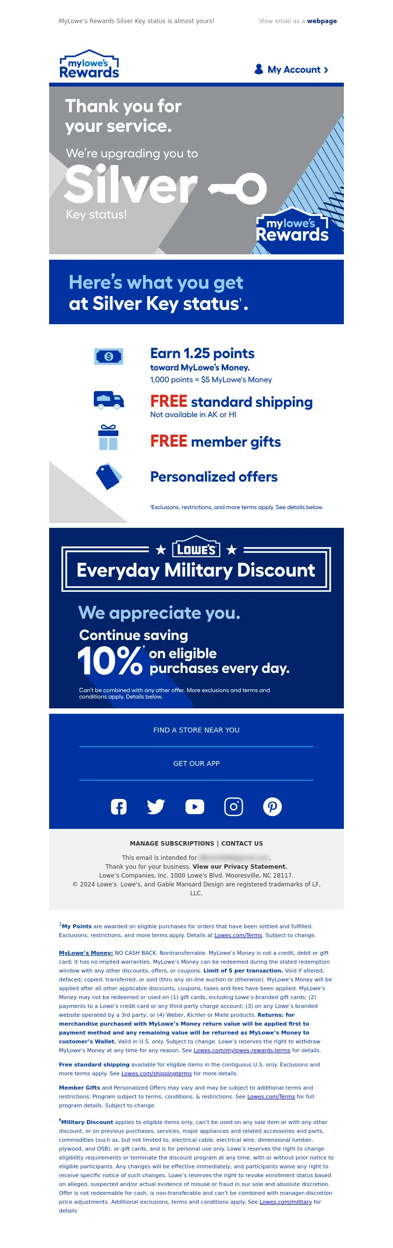
<a data-linkto="https://" href="https://click.e.lowes.com/u/?qs=010ca3e35348145fefcad3511590f51526e0fcbcbf0ace5ba1c7c2957fbaf2878f1933db34f5b3c17ed54cf4e62372e52f0eaedbefb782200ce2456cb652f97e" target="_blank" title=""><img alt="Now, you're Silver Key status" data-assetid="78244" src="https://image.e.lowes.com/lib/fe9515707364027471/m/1/4fc47aa0-b49d-4e38-af39-79838a26173c.jpg" style="display: block; width: 100%; padding: 0px; height: auto; text-align: center;" width="600"></a></td></tr></table></td></tr></table><table cellpadding="0" cellspacing="0" width="100%" role="presentation" style="min-width: 100%; " class="stylingblock-content-wrapper"><tr><td class="stylingblock-content-wrapper camarker-inner"><table align="center" border="0" cellpadding="0" cellspacing="0" class="container" width="600">
<tr>
<td>
<a data-linkto="https://" href="https://click.e.lowes.com/u/?qs=010ca3e35348145f5a679229deed0e5defef5d28e9c8fc0036678865f234b8be914a4def6875cd708cc9d731d3e7772a5a20fb0fe288effc876951152b0a012b" target="_blank" title=""><img alt="Here's what you get at Silver Key status." data-assetid="78243" src="https://image.e.lowes.com/lib/fe9515707364027471/m/1/32e978a8-e499-4931-8fbf-305e3c3e8c62.jpg" style="display: block; width: 100%; padding: 0px; text-align: center; height: auto;" width="600"></a></td></tr></table></td></tr></table><table cellpadding="0" cellspacing="0" width="100%" role="presentation" class="stylingblock-content-wrapper" style="min-width: 100%; "><tr><td class="stylingblock-content-margin-cell" style="padding: 10px 0px 0px; "><table cellpadding="0" cellspacing="0" width="100%" role="presentation" style="background-color: transparent; min-width: 100%; " class="stylingblock-content-wrapper"><tr>
<td style="padding: 0px; " class="stylingblock-content-wrapper camarker-inner"><table align="center" border="0" cellpadding="0" cellspacing="0" class="container" width="600">
<tr>
<td>
<a data-linkto="https://" href="https://click.e.lowes.com/u/?qs=010ca3e35348145fa8c6724afcd57bc83b6c10f8f044eaf54f7a97c9af4f267c0daee9e609b968e31eba10a050fc20356038e9f8c3dc3dc0" title=""><img alt="Everyday Military Discount | We appreciate you." data-assetid="78242" src="https://image.e.lowes.com/lib/fe9515707364027471/m/1/05c04d64-66ed-4ed4-b971-96646e22594b.jpg" style="display: block; width: 100%; padding: 0px; text-align: center; height: auto;" width="600"></a></td></tr></table></td></tr></table></td></tr></table>
<!---->
<table align="center" border="0" cellpadding="0" cellspacing="0" class="container" style="width: 600px; border-collapse: collapse;" width="100%">
<tr>
<td align="center" bgcolor="#0033a1" style="font-family: 'Fellix Regular', Arial, Helvetica, sans-serif; font-size:12px; color:#666666; padding-bottom: 16px;padding-top:8px;" valign="top">
<table align="center" border="0" cellpadding="0" cellspacing="0" class="container" width="476">
<!--[if !mso]><!-- -->
<tr>
<td align="center" style="font-size: 14px; line-height: 22px; mso-line-height-rule: exactly; padding-top: 8px; display:none;" valign="middle" class="mobile-only"></td></tr><!--<![endif]-->
<tr>
<td align="center" style="font-size: 14px; line-height: 22px; mso-line-height-rule: exactly; padding-top: 14px;PADDING-BOTTOM: 14px;" valign="middle">
<a href="https://click.e.lowes.com/u/?qs=010ca3e35348145f996ce9d201046e115e691c6cece0db9991bce51451384a149c140de1be83474f56b908d589238b707a356de6092b253863ba2ff9d8cad0ae" style="color: #ffffff; font-family: Helvetica, Arial, sans-serif; font-size: 14px; line-height: 22px; text-decoration: none;" target="_blank" title="Find a store near you">FIND A STORE NEAR YOU</a></td></tr><tr>
<td align="center" style="padding-top: 8px; padding-bottom: 8px; font-size: 0px; line-height: 6px; mso-line-height-rule: exactly;" valign="top"><hr color='#00a3e0'></td></tr><tr>
<td align="center" style="font-size: 14px; line-height: 22px; mso-line-height-rule: exactly; padding-top: 14px;PADDING-BOTTOM: 14px;" valign="middle">
<a href="https://click.e.lowes.com/u/?qs=5f595f7a06dcf92027569d6eb8a7b5eedbab3a8ae651a1f5ff04dd819d3c58eea3a8556528f11db434fcb507c9b8bc64aa8d6622dbfd85c4886b814173f6027e" style="color: #ffffff; font-family: Helvetica, Arial, sans-serif; font-size: 14px; line-height: 22px; text-decoration: none;" target="_blank" title="GET OUR APP">GET OUR APP</a></td></tr><tr>
<td align="center" style="padding-top: 8px;padding-bottom: 18px; font-size: 0px; line-height: 6px; mso-line-height-rule: exactly;" valign="top">
<hr color='#00a3e0'></td></tr></table></td></tr><tr>
<td align="center" bgcolor="#0033a1" style="font-family:Arial, Helvetica, sans-serif; font-size:12px; color:#666666; padding-bottom: 26px;" valign="top">
<table bgcolor="#0033a1" border="0" cellpadding="0" cellspacing="0">
<tr>
<td style="padding-left: 20px;padding-right:20px;">
<a href="https://click.e.lowes.com/u/?qs=5f595f7a06dcf920cb9576798d7d28fcb6a1b07101ba4b13e94bae6573fb6763740a40d5e6eb81a83bddab269da73530f1f9d58a437cd324" target="_blank" title="Facebook"><img alt="Facebook" border="0" src="https://image.e.lowes.com/lib/fe9515707364027471/m/1/c7d84279-404c-43c5-a5e9-b21df2257ad4.png" style="display:block;" ></a></td><td style="padding-left: 20px;padding-right:20px;">
<a href="https://click.e.lowes.com/u/?qs=5f595f7a06dcf920ef5d8c6fda9220f1d652b8f2ebaf1085ffe74a888375d2702a069524c7d91f2c2cdb9f632d668962db6a0c83a0017700" target="_blank" title="Twitter"><img alt="Twitter" border="0" src="https://image.e.lowes.com/lib/fe9515707364027471/m/1/68bc8369-0743-4984-bc92-48a831eeaaa7.png" style="display:block;" ></a></td><td style="padding-left: 20px;padding-right:20px;">
<a href="https://click.e.lowes.com/u/?qs=5f595f7a06dcf920168dfcbaaeeab0d973895602d23a176f55da6d46479f90b816da6cd513ad2b404712a3bf098de6f7c9ecc484a1c589b4" target="_blank" title="YouTube"><img alt="YouTube" border="0" src="https://image.e.lowes.com/lib/fe9515707364027471/m/1/1f97d4ce-e837-4d8d-a265-92633b0a7fbb.png" style="display:block;" ></a></td><td style="padding-left: 20px;padding-right:20px;">
<a href="https://click.e.lowes.com/u/?qs=5f595f7a06dcf920a70642b586e0864409632ca41f636d7626901a1ba663b2711c8efcc5f209b3e70eb66b391e3c36fa60c05727930b1f65" target="_blank" title="Instagram"><img alt="Instagram" border="0" src="https://image.e.lowes.com/lib/fe9515707364027471/m/1/99c67806-02b1-4da4-86e1-dbb73808c97c.png" style="display:block;" ></a></td><td style="padding-left: 20px;padding-right:20px;">
<a href="https://click.e.lowes.com/u/?qs=5f595f7a06dcf92005193b4c2c157acc3105647e2557ef8a95cd4748c6f51d0b458d62d07276bf31c067994e311ef1ab4d894ff28392c6bb" target="_blank" title="Pinterest"><img alt="Pinterest" border="0" src="https://image.e.lowes.com/lib/fe9515707364027471/m/1/74f317b2-22f1-48ad-9060-55e67f3ea32c.png" style="display:block;" ></a></td></tr></table></td></tr></table>
<table align="center" bgcolor="#f2f2f2" border="0" cellpadding="0" cellspacing="0" class="container" style="width: 600px; border-collapse: collapse;" width="100%">
<tr>
<td align="center" style="padding-top:10px;padding-bottom:10px;">
<table align="center" bgcolor="#f2f2f2" border="0" cellpadding="0" cellspacing="0" class="container" width="90%">
<tr>
<td align="center" style="padding-top:10px;padding-bottom:10px;">
<table align="center" bgcolor="#f2f2f2" border="0" cellpadding="0" cellspacing="0" class="Width90">
<tr>
<!----><th align="center" bgcolor="#f2f2f2" class="drop-center" style="font-family: Arial, Helvetica, sans-serif; font-size: 12px; line-height: 20px;" valign="middle">
<a href="https://click.e.lowes.com/u/?qs=5f595f7a06dcf92009229f0f7a7ba0b7e949d5545096535055025d578308b456b526b15a17efa508d205380e410de5a2369cb6278edb2b1a2e4ed007df4b94f1" style="text-decoration: none; color: #333333; font-weight: bold;" target="_blank" title="MANAGE SUBSCRIPTIONS">MANAGE SUBSCRIPTIONS</a></th><!----><th align="center" bgcolor="#f2f2f2" class="mobile-hidden" style="color: #333333; font-size:12px; padding-left:5px; padding-right:5px; line-height: 20px;" valign="middle">
|</th><th align="center" bgcolor="#f2f2f2" class="drop-center" style="font-family: Arial, Helvetica, sans-serif; font-size: 12px; line-height: 20px;" valign="middle">
<a href="https://click.e.lowes.com/u/?qs=5f595f7a06dcf920ee20c61812b24b21e55a1fb75c7c32dc53bf704efc8316ffc07c91263ca77fa1f96f15ecefc9bcc5e8fc75b13f739c8409d0103cee128bd9" style="text-decoration: none; color: #333333; font-weight: bold;" target="_blank" title="CONTACT US">CONTACT US</a></th></tr></table></td></tr><tr>
<td align="center" style="-webkit-text-size-adjust:none; vertical-align:top; font-family: Helvetica, Arial, sans-serif; font-size:12px; color: #333333; text-decoration: none; line-height: 18px; font-weight:normal; padding-left: 10px; padding-right: 10px;">
This email is intended for <a href="#" style="color:#333333; text-decoration:none;">james.bond007@mi6.co.uk</a>.<br>
Thank you for your business. <a href="https://click.e.lowes.com/u/?qs=5f595f7a06dcf9200f384dce2f1f31a019cc718a33fcc916f8608dac2c2116b33b013cabff312f96c854be21a4066e619e9e162e307b8356eaf2ccc2e0bbddf3" style="font-weight: bold; color: #333333; text-decoration: none;" target="_blank" title="View our Privacy Statement.">View our Privacy Statement.</a><br>
Lowe’s Companies, Inc. 1000 Lowe's Blvd. Mooresville, NC 28117.<br>
© 2024 Lowe's. Lowe's, and Gable Mansard Design are registered trademarks of LF, LLC.</td></tr><tr>
<td style="-webkit-text-size-adjust:none; vertical-align:top; font-family:Helvetica, Arial, sans-serif; font-size:12px; color: #333333; text-decoration: none; text-align: left; line-height: 18px; font-weight:normal; padding-top: 5px; padding-bottom: 10px;">
</td></tr></table></td></tr><!----><tr bgcolor="white">
<td align="left" style="-webkit-text-size-adjust:none; vertical-align:top; font-family:Helvetica, Arial, sans-serif; font-size:11px; color: #0033a1; text-decoration: none; line-height: 18px; font-weight:normal; padding: 20px;">
<sup>1</sup><strong>My Points</strong> are awarded on eligible purchases for orders that have been settled and fulfilled. Exclusions, restrictions, and more terms apply. Details at <a href="https://lowes.com/Terms">Lowes.com/Terms</a>. Subject to change.
<BR><BR><strong><u>MyLowe’s Money:</u></strong> NO CASH BACK. Nontransferrable. MyLowe’s Money is not a
credit, debit or gift card; it has no implied warranties. MyLowe’s Money can be redeemed during the stated redemption window with any other discounts, offers, or coupons. <strong>Limit of 5 per transaction.</strong> Void if altered, defaced, copied, transferred, or sold (thru any on-line auction or otherwise). MyLowe’s Money will be applied after all other applicable discounts, coupons, taxes and fees have been applied. MyLowe’s Money may not be redeemed or used on (1) gift cards, including Lowe’s-branded gift cards; (2) payments to a Lowe’s credit card or any third-party charge account; (3) on any Lowe’s branded website operated by a 3rd party; or (4) Weber, Kichler or Miele products.
<strong>Returns: for merchandise purchased with MyLowe’s Money return value will be applied first to payment method and any remaining value will be returned as MyLowe’s Money to customer’s Wallet.</strong> Valid in U.S. only. Subject to change. Lowe’s reserves the right to withdraw MyLowe’s Money at any time for any reason. See <a href="https://Lowes.com/mylowes-rewards-terms">Lowes.com/mylowes-rewards-terms</a> for details.<p>
<strong>Free standard shipping</strong> available for eligible items in the contiguous U.S. only. Exclusions and more terms apply. See <a href="https://www.lowes.com/shippingterms">Lowes.com/shippingterms</a> for more details.<p>
<strong>Member Gifts</strong> and Personalized Offers may vary and may be subject to additional terms and restrictions. Program
subject to terms, conditions, & restrictions. See <a href="https://lowes.com/Terms">Lowes.com/Terms</a> for full program details. Subject to change.<p>
<strong><sup>†</sup>Military Discount</strong> applies to eligible items only, can’t be used on any sale item or with any other discount, or on previous purchases, services, major appliances and related accessories and parts, commodities (such as, but not limited to, electrical cable, electrical wire, dimensional lumber, plywood, and OSB), or gift cards, and is for personal use only. Lowe’s reserves the right to change eligibility requirements or terminate the discount program at any time, with or without prior notice to eligible participants. Any changes will be effective immediately, and participants
waive any right to receive specific notice of such changes. Lowe’s reserves the right to revoke enrollment status
based on alleged, suspected and/or actual evidence of misuse or fraud in our sole and absolute discretion. Offer is
not redeemable for cash, is non-transferable and can’t be combined with manager-discretion price adjustments.
Additional exclusions, terms and conditions apply. See <a href="https://lowes.com/military">Lowes.com/military</a> for details</td></tr><!----></table>
</td>
</tr>
</table>
</td>
</tr>
</table>
<img src="https://pixel.inbox.exacttarget.com/pixel.gif?r=3cee957cf4045be5bdd97f3d45b56bc1d2d850ec" width="1" height="1" />
<img src="https://click.e.lowes.com/open.aspx?ffcb10-feca107075630d7c-fe341770776c067b701471-fe9515707364027471-ff9d1670-fe2715727c650c7f761c76-fef81775776c01&d=40143&bmt=0" width="1" height="1" alt="">
</div>
</body>
</html>