40
Average Subject Line Characters
258
Total Recieved
6
Monthly Average
2
Weekly Average
> 1
Daily Average
Parent Domain:
lowes.com
Subdomains:
lowes@e.lowes.com
From Names:
Lowe's Home Improvement
Mylowe's Rewards
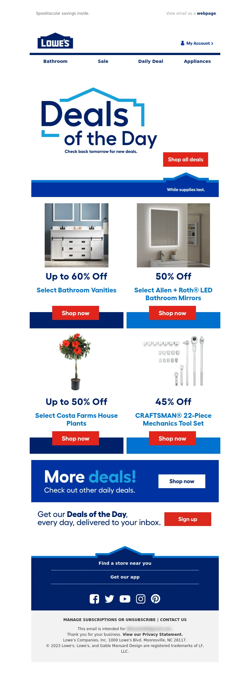
From: Lowe's Home Improvement
Subject Line: Up to 50% OFF! Today only.
<!DOCTYPE html PUBLIC"-//W3C//DTD XHTML 1.0 Transitional//EN" "https://www.w3.org/TR/xhtml1/DTD/xhtml1-transitional.dtd">
<html xmlns="https://www.w3.org/1999/xhtml">
<head>
<meta http-equiv="Content-Type" content="text/html; charset=UTF-8" />
<meta name="viewport" content="width=device-width, initial-scale=1.0" />
<meta name="x-apple-disable-message-reformatting" />
<!--[if !mso]><!-->
<style type="text/css">
@font-face {
font-family: 'Fellix Regular';
src: local('Fellix Regular'), local('Fellix Regular'), url('https://www.lowescdn.com/sffonts/Fellix-Regular.woff') format('woff');
}
@font-face {
font-family: 'Fellix Medium';
src: local('Fellix Medium'), local('Fellix Medium'), url('https://www.lowescdn.com/sffonts/Fellix-Medium.woff') format('woff');
}
@font-face {
font-family: 'Fellix Bold';
src: local('Fellix Bold'), local('Fellix Bold'), url('https://www.lowescdn.com/sffonts/Fellix-Bold.woff') format('woff');
}
</style>
<!--<![endif]-->
<!--[if !mso]><!-->
<style type="text/css">
@font-face {
font-family: 'DIN Next';
src: local('DIN Next'), local('DIN Next'), url('https://www.lowescdn.com/scaffold/1.4.4/fonts/din/din-next.woff') format('woff');
}
@font-face {
font-family: 'DIN Next Bold';
src: local('DIN Next Bold'), local('DIN Next Bold'), url('https://www.lowescdn.com/scaffold/1.2.0/fonts/din/din-next-bold.woff') format('woff');
}
@font-face {
font-family: 'DIN Next Black';
src: local('DIN Next Black'), local('DIN Next Black'), url('https://www.lowescdn.com/scaffold/1.2.0/fonts/din/din-next-black.woff') format('woff');
}
</style>
<!--<![endif]-->
<style type="text/css">
.ReadMsgBody{
width: 100%;
}
/* Forces Hotmail to display emails at full width */
.ExternalClass {
width: 100%;
}
/*Hotmail table centering fix*/
.ExternalClass, .ExternalClass p, .ExternalClass span, .ExternalClass font, .ExternalClass td, .ExternalClass div {
line-height: 100%;
}
/* Forces Hotmail to display normal line spacing*/
.ExternalClass * {
line-height: 100%}
p {
margin: 1em 0;
}
/*Yahoo paragraph fix*/
table td {
border-collapse: collapse;
}
/*This resolves the Outlook 07, 10, and Gmail td padding issue fix*/
/*This resolves the issue when iphone puts links on dates, etc.*/
a[x-apple-data-detectors] {
color: inherit !important;
text-decoration: none !important;
font-size: inherit !important;
font-family: inherit !important;
font-weight: inherit !important;
line-height: inherit !important;
}
a.mobileshow, .mobilehide {
display: none;
color: #fff;
/*for Gmail */
}
</style>
<style type="text/css">
@media screen and (min-width: 375px) and (max-width: 600px) and (-webkit-min-device-pixel-ratio:0) {
.mobile-hidden {
display: none !important;
}
.no-padding {
padding: 0px !important;
}
.mobile-only {
display: block !important;
max-height: none !important;
}
.container {
width: 100% !important;
}
.navcontainer tbody{
width: 100% !important;
display: table !important;
}
.drop {
width: 100% !important;
display: block !important;
}
.drop-center {
width: 100% !important;
display: block !important;
text-align: center !important;
}
.photo {
width: 100% !important;
height: auto !important;
}
}
</style>
<style type="text/css">
/* Media query triggers alternate styles when the file is displayed on a device with a maximum width lower than the assigned pixel dimension. The default max width setting for max-width should be 480px to trigger on mobile devices. */
@media only screen and (max-width: 480px) {
html,body {
width: 100% !important;
min-width:100% !important;
max-width: 480px !important;
overflow-x: hidden !important;
margin:0 auto !important;
}
.mobile-hidden, .tablet-hidden {
display:none !important;
}
.mobile-photo {
width:100% !important;
max-width: 450px !important;
height:auto !important;
}
.no-padding {
padding:0px !important;
}
.mobile-only {
display: block !important;
max-height: none !important;
}
.container {
width:100% !important;
max-width:480px !important;
}
.photo {
width:100% !important;
max-width:480px !important;
height:auto !important;
}
.managesubs {
width:83% !important;
height:auto !important;
}
.photo390 {
display: block !important;
height: auto !important;
max-width: 390px !important;
width: 100% !important;
}
body[data-outlook-cycle] .oa {
width: 100% !important;
max-width: 480px !important;
text-align: center !important;
overflow-x: hidden !important;
display:block !important;
}
.drop {
width: 100% !important;
max-width: 480px !important;
display: block !important;
}
.drop-social {
width:100% !important;
max-width: 480px !important;
display:block !important;
text-align:center !important;
padding:0px !important;
}
.center {
text-align:center !important;
}
.center50 {
width:50% !important;
padding-right:10px !important;
padding-left:10px !important;
}
.drop-center {
width:100% !important;
max-width: 480px !important;
display:block !important;
text-align:center !important;
}
.Full100 {
width:100% !important;
max-width: 480px !important;
height:auto!important;
line-height:normal!important;
}
.pad10 {
padding-left:10px !important;
padding-right: 10px !important;
}
.sub_nav {
border-bottom:2px solid #ffffff;
display: table-cell !important;
width: auto !important;
height: auto !important;
float: none !important;
overflow: auto !important;
line-height:normal !important;
font-size:15px !important;
background-color: #15b5e5 !important;
}
.sub_nav_bottom {
border-bottom:2px solid #ffffff;
display: table-cell !important;
width: auto !important;
height: auto !important;
float: none !important;
overflow: auto !important;
line-height:normal !important;
font-size:15px !important;
}
.sub_nav_top {
display: table-cell !important;
width: auto !important;
height: auto !important;
float: none !important;
overflow: auto !important;
font-size:18px !important;
line-height:30px !important;
}
.tablet-only {
display: block !important;
max-height: none !important;
}
.Width70 {
width: 60% !important;
text-align: center !important;
}
.Width90 {
width: 90% !important;
text-align: center !important;
}
.container1 {
width: 100% !important;
max-width: 316px !important;
}
.mobile-only1 {
display: inline-block !important;
}
.mobile-left-image {
width: 67px !important;
max-width: 67px !important;
padding-left: 0px !important;
}
.mobile-middle-table {
width: 316px !important;
}
}
</style>
<style type="text/css">
@media only screen and (max-width: 619px) {
.tablet-only {
display: block !important;
max-height: none !important;
}
}
</style>
<style type="text/css">
@media only screen and (max-width: 414px) {
.mobile-hidden, .tablet-hidden {
display:none !important;
}
.mobile-photo {
width:100% !important;
max-width: 414px !important;
height:auto !important;
}
.no-padding {
padding:0px !important;
}
.mobile-only {
display: block !important;
max-height: none !important;
}
.container {
width:100% !important;
max-width:414px !important;
}
.photo {
width:100% !important;
max-width:414px !important;
height:auto !important;
}
.managesubs {
width:83% !important;
height:auto !important;
}
.photo390 {
display: block !important;
height: auto !important;
max-width: 390px !important;
width: 100% !important;
}
body[data-outlook-cycle] .oa {
width: 100% !important;
max-width: 414px !important;
text-align: center !important;
overflow-x: hidden !important;
display:block !important;
}
.drop {
width: 100% !important;
max-width: 414px !important;
display: block !important;
}
.drop-center {
width:100% !important;
max-width: 414px !important;
display:block !important;
text-align:center !important;
}
.Width70 {
width: 60% !important;
max-width: 380px !important;
text-align: center !important;
}
.Width90 {
width: 90% !important;
max-width: 400px !important;
text-align: center !important;
}
.container1 {
width: 100% !important;
max-width: 286px !important;
}
.mobile-left-image {
width: 64px !important;
padding-left: 0px !important;
}
.mobile-middle-table {
width: 286px !important;
}
.mobile-only1 {
display: inline-block !important;
}
}
</style>
<style type="text/css">
@media only screen and (max-width: 375px) {
.mobile-hidden {
display:none !important;
}
.mobile-photo {
width:100% !important;
max-width: 375px !important;
height:auto !important;
}
.no-padding {
padding:0px !important;
}
.mobile-only {
display: block !important;
max-height: none !important;
}
.container {
width:100% !important;
max-width:375px !important;
}
.photo {
width:100% !important;
max-width:375px !important;
height:auto !important;
}
.managesubs {
width:83% !important;
height:auto !important;
}
.photo390 {
display: block !important;
height: auto !important;
max-width: 390px !important;
width: 100% !important;
}
body[data-outlook-cycle] .oa {
width: 100% !important;
max-width: 375px !important;
text-align: center !important;
overflow-x: hidden !important;
display:block !important;
}
.drop {
width: 100% !important;
max-width: 375px !important;
display: block !important;
}
.drop-center {
width:100% !important;
max-width: 375px !important;
display:block !important;
text-align:center !important;
}
.Width70 {
width: 60% !important;
max-width: 300px !important;
text-align: center !important;
}
.Width90 {
width: 90% !important;
max-width: 320px !important;
text-align: center !important;
}
.container1 {
width: 100% !important;
max-width: 247px !important;
}
.mobile-left-image {
width: 56px !important;
max-width: 56px !important;
padding-left: 3px !important;
}
.mobile-middle-table {
width: 265px !important;
}
.mobile-only1 {
display: inline-block !important;
}
}
}
</style>
<style type="text/css">
/*Liveclicker responsive video styles*/
/*Android devices*/
@media only screen and (max-device-width: 480px) {
div.lc-video{
width:100%;
height:auto;
}
}
/* iPhone 5 - Portrait */
@media only screen and (device-width: 320px) {
div.lc-video {
width: 320px;
min-width: 320px;
height: 180px;
}
}
/* iPhone 6 - Portrait */
@media only screen and (device-width: 375px) {
div.lc-video {
width: 375px;
min-width: 375px;
height: 211px;
}
}
/* iPhone 6+ - Portrait */
@media only screen and (device-width: 414px) {
div.lc-video {
width: 414px;
min-width: 414px;
height: 233px;
}
}
/* iPhone 5 - Landscape */
@media only screen and (width: 568px) {
div.lc-video {
width: 568px;
min-width: 586px;
height: 320px;
}
}
/* iPhone 6 - Landscape */
@media only screen and (width: 667px) {
div.lc-video {
width: 600px;
min-width: 600px;
height: 338px;
}
}
/* iPhone 6+ - Landscape */
@media only screen and (width: 736px) {
div.lc-video {
width: 600px;
min-width: 600px;
height: 338px;
}
}
</style>
<title>Lowe's Email
</title>
<script type="application/ld+json">
[{
"@context": "https://schema.org/",
"@type": "Organization",
"name": "Lowe’s",
"logo": "https://i.imgur.com/AkY0dT7.jpg"
},{
"@context": "https://schema.org/",
"@type": "DiscountOffer",
"description": "",
"availabilityStarts": "",
"availabilityEnds": ""
},{
"@context": "https://schema.org/",
"@type": "PromotionCard",
"image": ""
}]
</script>
</head>
<body bgcolor="#ffffff" style="margin: 0; padding:0; -ms-text-size-adjust: none; mso-line-height-rule: exactly;" yahoo="fix"><style type="text/css">
div.preheader
{ display: none !important; }
</style>
<div class="preheader" style="font-size: 1px; display: none !important;">Spooktacular savings inside.</div>
<div class="oa" align="center">
<!-- Table used to center email -->
<table border="0" cellpadding="0" cellspacing="0" width="100%" class="container">
<tr>
<td>
<!-- Table used to set width of email -->
<table width="600" class="container" border="0" align="center" cellpadding="0" cellspacing="0" style="font-family:Arial, Helvetica, sans-serif">
<tr>
<td>
<table cellpadding="0" cellspacing="0" width="100%" role="presentation" style="min-width: 100%; " class="stylingblock-content-wrapper"><tr><td class="stylingblock-content-wrapper camarker-inner"><table border="0" cellpadding="0" cellspacing="0" class="container" width="100%">
<tr>
<td align="left" bgcolor="#ffffff" style="font-family:Arial, Helvetica, sans-serif; font-size:12px; color:#666666; padding-top:10px; padding-bottom:10px; padding-left:10px;" valign="top">
<table align="left" border="0" cellpadding="0" cellspacing="0" class="Width90" width="100%">
<tr>
<td align="left" bgcolor="#ffffff" class="drop no-padding" style="font-family: Arial, Helvetica, sans-serif; font-size:12px; color:#666666; padding-left:10px; padding-top:10px; padding-bottom:10px;" valign="top">
<!--Preheader Link Starts here--><a href="https://click.e.lowes.com/u/?qs=8fb420cf69b896a77afb166ac708440c1fa08de4964d9c85c17ea83f5344aefd866268d67862a22e550d97515e675685f883170109be6d35b315d6ff7111f355" style="color:#666666; text-decoration:none;" target="_blank"><span style="color:#666666; text-decoration:none;" title="Spooktacular savings inside.">Spooktacular savings inside.</span></a> <!--Preheader Link Ends here--></td><td align="right" bgcolor="#ffffff" class="mobile-hidden" style="font-family: Arial, Helvetica, sans-serif; font-size:12px; color:#999999; padding-right:10px; padding-left:0px; padding-top:10px; padding-bottom:10px;" valign="top" width="175">
<!---->View email as a <a href="https://view.e.lowes.com/?qs=3b8807cebea72283774fbd018e4eee627093281d8229c4944145000239ba704d6835740464f1240f088d01e3620715e7a7db8d1a42210c12966e483e0286732fe4c57a306eeb8598a69c1f5be054953a" style=" text-decoration:none; color:#012169; font-weight:bold;" target="_blank" title="webpage">webpage</a>.<!----></td></tr></table></td></tr><tr>
<td align="center" height="5" style="padding-top:10px; padding-bottom: 10px;">
</td></tr><tr>
<td align="center" style="padding-top:10px; padding-bottom:10px;" valign="middle"><table align="center" border="0" cellpadding="0" cellspacing="0" width="100%">
<tr>
<td align="left" bgcolor="#ffffff" style="font-family:Arial, Helvetica, sans-serif; font-size:12px; color:#666666; padding-left:22px;" valign="top">
<a href="https://click.e.lowes.com/u/?qs=8fb420cf69b896a78e14cdd18ccb98687542148f3434b7d2e3234d796dbbe5521ce6962bd650dc2b2661d056b61052c4c3fad3ef38089af435d38105bf02d028" target="_blank" title="Lowe's"><img alt="Lowe's" border="0" src="https://image.e.lowes.com/lib/fe9515707364027471/m/59/14f6b444-13d4-4f6b-a52a-df9473ac4be2.png" style="display:block;" width="120"></a></td><td align="right" bgcolor="#ffffff" style="font-family: Helvetica, Arial, sans-serif; font-size:12px; color:#999999; padding-right:22px; padding-bottom:5px; line-height: 36px;" valign="bottom"><a href="https://click.e.lowes.com/u/?qs=8fb420cf69b896a7829322c910a1d9858c759b562561f763757eb74cf704749365195ad5ba43582bc2b3e69ee8c0d75029e3bd2bf9c7316d0dbca09a448a91df" target="_blank" title="MyLowe's Login">
<img alt="MyLowe's Login" border="0" src="https://image.e.lowes.com/lib/fe9515707364027471/m/71/62690a78-f84d-4700-8c0b-c6a33b9b324b.png" style="display:block;" width="106" height="34"></a></td></tr></table>
</td></tr><tr>
<td align="center" height="1" style="font-size: 0px;">
<table bgcolor="#012169" border="0" cellpadding="0" cellspacing="0" class="container" width="100%">
<tr>
<td height="7" style="font-size: 0px;" valign="top">
<img alt="" border="0" class="photo" height="7" src="https://image.e.lowes.com/lib/fe9515707364027471/m/59/c301e24e-201b-46f9-8172-27b5acdcbf99.jpg" style="display:block;" width="100%"></td></tr></table></td></tr><tr>
<td>
<table bgcolor="#ffffff" border="0" cellpadding="0" cellspacing="0" class="mobile-hidden" width="100%">
<tr>
<th align="center" class="drop-center" height="20" valign="middle" width="1%">
</th><th align="center" class="drop-center" height="40" valign="middle" width="25%">
<!--NAV1001 Link Starts here--><a href="https://click.e.lowes.com/u/?qs=8fb420cf69b896a7643d5ea464eddb1434d85d7299722b688814e49ed63861dcc87a828f81cf3bf827bb0a72811157610844952475003e4d39dfe0f338892302" style="color: #012169; text-decoration: none; font-family: Arial, Helvetica, sans-serif; font-size: 14px;" target="_blank" title="Bathroom"><strong>Bathroom</strong></a> <!--NAV1001 Link Ends here--></th><th align="center" class="drop-center" height="40" valign="middle" width="25%">
<!--NAV1002 Link Starts here--><a href="https://click.e.lowes.com/u/?qs=8fb420cf69b896a792dab81f28fd854de00bb5a652c60fbfbe5acd0ea00303ea7b413ff361ad47e28aba391a8b2eba548a2fe5858516c4601a17287502dc9db6" style="color: #012169; text-decoration: none; font-family: Arial, Helvetica, sans-serif; font-size: 14px;" target="_blank" title="Sale"><strong>Sale</strong></a> <!--NAV1002 Link Ends here--></th><th align="center" class="drop-center" height="40" valign="middle" width="25%">
<!--NAV1003 Link Starts here--><a href="https://click.e.lowes.com/u/?qs=8fb420cf69b896a7ba13738d6e3864b0a681ba5fa36997b4753d56d8164f2555e212a5c8cc70944fa921a7630c004e2ab0f5e4384f4fc9904181c4bc088b76ab" style="color: #012169; text-decoration: none; font-family: Arial, Helvetica, sans-serif; font-size: 14px;" target="_blank" title="Daily Deal"><strong>Daily Deal</strong></a> <!--NAV1003 Link Ends here--></th><th align="center" class="drop-center" height="40" valign="middle" width="25%">
<!--NAV1004 Link Starts here--><a href="https://click.e.lowes.com/u/?qs=8fb420cf69b896a74c8ac67683016ae1b74535bc0e5d4e9bb8e441a4998ffbb13be0b7d6b82b2d0a7091dfcd9aa5d1124414b83ff8ca18af8578d714299d0aec" style="color: #012169; text-decoration: none; font-family: Arial, Helvetica, sans-serif; font-size: 14px;" target="_blank" title="Appliances"><strong>Appliances</strong></a> <!--NAV1004 Link Ends here--></th></tr></table></td></tr></table></td></tr></table>
<table cellpadding="0" cellspacing="0" width="100%" role="presentation" style="background-color: transparent; min-width: 100%; " class="stylingblock-content-wrapper"><tr><td style="padding: 0px 0px 20px; " class="stylingblock-content-wrapper camarker-inner"><table align="center" border="0" cellpadding="0" cellspacing="0" class="container" width="600">
<tr>
<td>
<a data-linkto="https://" href="https://click.e.lowes.com/u/?qs=8fb420cf69b896a72ba322d4f0e356993038e9c3f217356814d9f85e7bf8edd7c33c432a6952175d1babb2709ed900937c5b3c14bd2d6e86f9d6de8bb6f3b6a3" target="_blank" title=""><img alt="1 day-online only Deals of the Day. While supplies last." data-assetid="60750" src="https://image.e.lowes.com/lib/fe9515707364027471/m/71/9b8291b6-1c11-4ca0-82fc-e59da23e9eff.jpg" style="display: block; width: 100%; padding: 0px; text-align: center; height: auto;" width="600"></a></td></tr></table></td></tr></table>
<table cellpadding="0" cellspacing="0" width="100%" role="presentation" style="min-width: 100%; " class="stylingblock-content-wrapper"><tr><td class="stylingblock-content-wrapper camarker-inner"><table border="0" cellpadding="0" cellspacing="0" width="100%">
<tr>
<td>
<table align="center" border="0" cellpadding="0" cellspacing="0" class="container" width="600">
<tr>
<th align="center" class="drop" style="font-weight: normal; mso-line-height-rule: exactly;" valign="top">
<a href="https://click.e.lowes.com/u/?qs=8fb420cf69b896a72a1551b88e70d48c5a29e4167cd8b6209a3fb8c5d013847c3b4b327b25018169d0bd2726c3b7d3e195a1bae8c954d431d7b621029fca89fb" style="display: block"><img alt="Display images to show real-time content" style="border: 0; display: block;" border="0" src="https://mi.lowes.com/p/rp/ee9df033951b597e.png?mi_u=129182386&cm_mmc=em-_-c-_-ent-_-mdv-_-gdy-_-all-_-152-_-lm_388952-_-0-_-20231031&mi_coreDate=20231031__img_50_TV_mounts" width="auto"></a></th><th align="center" class="drop" style="font-weight: normal; height:auto; mso-line-height-rule: exactly;" valign="top">
<img alt="" border="0" height="10" src="https://image.e.lowes.com/lib/fe9515707364027471/m/37/spacer_20140709.gif" style="display:block;" width="10"></th><th align="center" class="drop" style="font-weight: normal; mso-line-height-rule: exactly;" valign="top">
<a href="https://click.e.lowes.com/u/?qs=8fb420cf69b896a7e778b840294eed3c854532272c247245e12701200944c0d3e4d75b0d58d9c14a3761be604d3c245663d9805efe7ad7bbfe907cd75a36d0c1" style="display: block"><img alt="Display images to show real-time content" style="border: 0; display: block;" border="0" src="https://mi.lowes.com/p/rp/a29cfcf69255a88c.png?mi_u=129182386&cm_mmc=em-_-c-_-ent-_-mdv-_-gdy-_-all-_-152-_-lm_388952-_-0-_-20231031&mi_coreDate=20231031__img_10_shark_cordless_vaccum" width="auto"></a></th></tr></table></td></tr></table>
<!-- LiveClicker Tracking Pixel goes here --><table width="1" height="1" cellpadding="0" cellspacing="0" border="0">
<tr><td style="font-size:0px; line-height:0px;">
<img src="https://mi.lowes.com/p/cp/20af9ac4a7b6f5a4/o.gif?mi_u=129182386" width="1" height="1" alt="" aria-hidden="true">
</td></tr>
</table>
<!-- End LiveClicker Tracking Pixel --></td></tr></table>
<table cellpadding="0" cellspacing="0" width="100%" role="presentation" style="min-width: 100%; " class="stylingblock-content-wrapper"><tr><td class="stylingblock-content-wrapper camarker-inner"><table border="0" cellpadding="0" cellspacing="0" width="100%">
<tr>
<td>
<table align="center" border="0" cellpadding="0" cellspacing="0" class="container" width="600">
<tr>
<th align="center" class="drop" style="font-weight: normal; mso-line-height-rule: exactly;" valign="top">
<a href="https://click.e.lowes.com/u/?qs=8fb420cf69b896a74fd3a925ed34e448f6f8a0a732850c97810f15605e578a1fe93d7804aa2dcd37f2122b3f2dfc65b1cb2931f8f46a4f9f24ffb1fe883d58a3" style="display: block"><img alt="Display images to show real-time content" style="border: 0; display: block;" border="0" src="https://mi.lowes.com/p/rp/51f151de0884cc5b.png?mi_u=129182386&cm_mmc=em-_-c-_-ent-_-mdv-_-gdy-_-all-_-152-_-lm_388952-_-0-_-20231031&mi_coreDate=20231031_img_kitchen_and_dining" width="auto"></a></th><th align="center" class="drop" style="font-weight: normal; height:auto; mso-line-height-rule: exactly;" valign="top">
<img alt="" border="0" height="10" src="https://image.e.lowes.com/lib/fe9515707364027471/m/37/spacer_20140709.gif" style="display:block;" width="10"></th><th align="center" class="drop" style="font-weight: normal; mso-line-height-rule: exactly;" valign="top">
<a href="https://click.e.lowes.com/u/?qs=8fb420cf69b896a7c22e3e8bc44bd91d20daa9412633895791e98f427c109b226f478d25011b2d88208b155116005a900c68a6596dbe3cab8081c8a1696efd2c" style="display: block"><img alt="Display images to show real-time content" style="border: 0; display: block;" border="0" src="https://mi.lowes.com/p/rp/50e07583c4765079.png?mi_u=129182386&cm_mmc=em-_-c-_-ent-_-mdv-_-gdy-_-all-_-152-_-lm_388952-_-0-_-20231031&mi_coreDate=20231031_img_home decor" width="auto"></a></th></tr></table></td></tr></table>
</td></tr></table>
<table cellpadding="0" cellspacing="0" width="100%" role="presentation" style="background-color: transparent; min-width: 100%; " class="stylingblock-content-wrapper"><tr><td style="padding: 20px 0px 0px; " class="stylingblock-content-wrapper camarker-inner"><table align="center" border="0" cellpadding="0" cellspacing="0" class="container" width="600">
<tr>
<td>
<a data-linkto="https://" href="https://click.e.lowes.com/u/?qs=8fb420cf69b896a7912bbb4761c6921080b12e7d6db1d26c9a66653f9a72c8240cd9c9921db58f650a103a6fdd7205f6b50ebde7d1bee195aa01eaf3242b6a82" target="_blank" title=""><img alt="More deals! Check out other daily deals." data-assetid="61414" src="https://image.e.lowes.com/lib/fe9515707364027471/m/71/d3b80eca-ec31-4282-ae2c-d03f5345e693.jpg" style="display: block; width: 100%; padding: 0px; height: auto;" width="600"></a></td></tr></table></td></tr></table>
<table cellpadding="0" cellspacing="0" width="100%" role="presentation" style="min-width: 100%; " class="stylingblock-content-wrapper"><tr><td class="stylingblock-content-wrapper camarker-inner"><table align="center" border="0" cellpadding="0" cellspacing="0" class="container" width="600">
<tr>
<td>
<a href="https://click.e.lowes.com/u/?qs=8fb420cf69b896a7c8e6b7b9338dd2d33e10f261e6a3a7c89ffc4d1980dfb798c5361903aa43ef2957328fd4d9ebafb2c56285f98088aa3dcfacc938a4cce99a" target="_blank" title="DOTD"><img alt="DOTD" border="0" class="photo" src="https://image.e.lowes.com/lib/fe9515707364027471/m/71/6b4818bc-9282-4021-86fd-f1a4a67d7ca2.jpg" style="display: block;" width="600"></a></td></tr></table> </td></tr></table>
<table cellpadding="0" cellspacing="0" width="100%" role="presentation" style="min-width: 100%; " class="stylingblock-content-wrapper"><tr><td class="stylingblock-content-wrapper camarker-inner"><table border="0" cellpadding="0" cellspacing="0" width="100%">
<tr>
<td style="font-size:0%;">
<img alt="" border="0" height="30" src="https://image.e.lowes.com/lib/fe9515707364027471/m/32/20131010_promo_spacer.gif" style="display:block" width="1"></td></tr></table></td></tr></table>
<!---->
<table align="center" border="0" cellpadding="0" cellspacing="0" class="container" style="width: 600px; border-collapse: collapse;" width="100%">
<tr>
<td align="center" bgcolor="#ffffff" style="font-family: Arial, Helvetica, sans-serif; font-size:0px; color:#666666; padding: 0px; border-bottom: 2px solid #012169;" valign="bottom">
<img alt="Lowe's" border="0" class="photo" src="https://image.e.lowes.com/lib/fe9515707364027471/m/71/fb17fb6a-e05f-4a5e-8990-24cabe14e1e6.png" width="600" height="46"></td></tr>
<!----><!--[if !mso]><!-- -->
<tr>
<td align="center" bgcolor="#012169" style="font-family: 'Fellix Regular', Arial, Helvetica, sans-serif; font-size:12px; color:#666666;" valign="top">
<table align="center" bgcolor="#012169" border="0" cellpadding="0" cellspacing="0" class="mobile-only container" style="display: none;" width="100%">
<tr>
<td align="center" height="40" valign="middle">
<!--NAV1001 Link Starts here--><a href="https://click.e.lowes.com/u/?qs=8fb420cf69b896a7643d5ea464eddb1434d85d7299722b688814e49ed63861dcc87a828f81cf3bf827bb0a72811157610844952475003e4d39dfe0f338892302" style="color: #ffffff; text-decoration: none; font-family: Helvetica, Arial, sans-serif; font-size: 14px;" target="_blank" title="Bathroom"><strong>Bathroom</strong></a> <!--NAV1001 Link Ends here--></td></tr><tr>
<td align="center" height="40" style="border-top: 1px solid #79a8d1;" valign="middle">
<!--NAV1002 Link Starts here--><a href="https://click.e.lowes.com/u/?qs=8fb420cf69b896a792dab81f28fd854de00bb5a652c60fbfbe5acd0ea00303ea7b413ff361ad47e28aba391a8b2eba548a2fe5858516c4601a17287502dc9db6" style="color: #ffffff; text-decoration: none; font-family: Helvetica, Arial, sans-serif; font-size: 14px;" target="_blank" title="Sale"><strong>Sale</strong></a> <!--NAV1002 Link Ends here--></td></tr><tr>
<td align="center" height="40" style="border-top: 1px solid #79a8d1;" valign="middle">
<!--NAV1003 Link Starts here--><a href="https://click.e.lowes.com/u/?qs=8fb420cf69b896a7ba13738d6e3864b0a681ba5fa36997b4753d56d8164f2555e212a5c8cc70944fa921a7630c004e2ab0f5e4384f4fc9904181c4bc088b76ab" style="color: #ffffff; text-decoration: none; font-family: Helvetica, Arial, sans-serif; font-size: 14px;" target="_blank" title="Daily Deal"><strong>Daily Deal</strong></a> <!--NAV1003 Link Ends here--></td></tr><tr>
<td align="center" height="40" style="border-top: 1px solid #79a8d1;" valign="middle">
<!--NAV1004 Link Starts here--><a href="https://click.e.lowes.com/u/?qs=8fb420cf69b896a74c8ac67683016ae1b74535bc0e5d4e9bb8e441a4998ffbb13be0b7d6b82b2d0a7091dfcd9aa5d1124414b83ff8ca18af8578d714299d0aec" style="color: #ffffff; text-decoration: none; font-family: Helvetica, Arial, sans-serif; font-size: 14px;" target="_blank" title="Appliances"><strong>Appliances</strong></a> <!--NAV1004 Link Ends here--></td></tr><tr>
<td align="center" style="font-size: 0px; line-height: 6px; mso-line-height-rule: exactly;" valign="top">
<img alt="" border="0" class="photo" height="6" src="https://image.e.lowes.com/lib/fe9515707364027471/m/71/ad569dc5-361d-4d7d-8bc0-1ae6ec389f05.png" style="display:block; width: 100%; height: 6px;" width="100%"></td></tr></table>
</td></tr>
<!--<![endif]--><!---->
<tr>
<td align="center" bgcolor="#012169" style="font-family: 'Fellix Regular', Arial, Helvetica, sans-serif; font-size:12px; color:#666666; padding-bottom: 16px;" valign="top">
<table align="center" border="0" cellpadding="0" cellspacing="0" class="container" width="476">
<!--[if !mso]><!-- -->
<tr>
<td align="center" style="font-size: 14px; line-height: 22px; mso-line-height-rule: exactly; padding-top: 8px; display:none;" valign="middle" class="mobile-only"></td></tr><!--<![endif]-->
<tr>
<td align="center" style="font-size: 14px; line-height: 22px; mso-line-height-rule: exactly; padding-top: 0px;" valign="middle">
<a href="https://click.e.lowes.com/u/?qs=8fb420cf69b896a78c6ebe01b162a1e6df7ec66bc640b1798277ed1c9a428b2d4d27453a925148a59d7d097351a4e4e1c3ef4a413a0fb14f657033b9fd975be4" style="color: #ffffff; font-family: Helvetica, Arial, sans-serif; font-size: 14px; line-height: 22px; font-weight: bold; text-decoration: none;" target="_blank" title="Find a store near you">Find a store near you</a></td></tr><tr>
<td align="center" style="padding-top: 8px; padding-bottom: 8px; font-size: 0px; line-height: 6px; mso-line-height-rule: exactly;" valign="top">
<img alt="" border="0" class="photo" height="6" src="https://image.e.lowes.com/lib/fe9515707364027471/m/71/ad569dc5-361d-4d7d-8bc0-1ae6ec389f05.png" style="display:block; width: 100%; height: 6px;" width="100%"></td></tr><tr>
<td align="center" style="font-size: 14px; line-height: 22px; mso-line-height-rule: exactly; padding-bottom: 8px;" valign="middle">
<a href="https://click.e.lowes.com/u/?qs=8fb420cf69b896a7b7074191c9937e4f45743ea2dd8e299082ae60b1ebb00122e42141ad8d51dce770b3bbaac56321206e3d519d7a9023bab4706cbcf4639f75" style="color: #ffffff; font-family: Helvetica, Arial, sans-serif; font-size: 14px; line-height: 22px; font-weight: bold; text-decoration: none;" target="_blank" title="GET OUR APP">Get our app</a></td></tr><tr>
<td align="center" style="padding-bottom: 12px; font-size: 0px; line-height: 6px; mso-line-height-rule: exactly;" valign="top">
<img alt="" border="0" class="photo" height="6" src="https://image.e.lowes.com/lib/fe9515707364027471/m/71/ad569dc5-361d-4d7d-8bc0-1ae6ec389f05.png" style="display:block; width: 100%; height: 6px;" width="100%"></td></tr></table></td></tr><tr>
<td align="center" bgcolor="#012169" style="font-family:Arial, Helvetica, sans-serif; font-size:12px; color:#666666; padding-bottom: 20px;" valign="top">
<table bgcolor="#012169" border="0" cellpadding="0" cellspacing="0">
<tr>
<td style="padding-right: 14px;">
<a href="https://click.e.lowes.com/u/?qs=8fb420cf69b896a79106e0abfb8c5126a012a222e5fc7d1db90941b7acdeee1fe554e461f00cb979e916d5529171584d83ca3a2bd28932fb" target="_blank" title="Facebook"><img alt="Facebook" border="0" height="34" src="https://image.e.lowes.com/lib/fe9515707364027471/m/71/34159e50-d8f2-4797-ab5f-ce3d49ab0acf.png" style="display:block;" width="34"></a></td><td>
<a href="https://click.e.lowes.com/u/?qs=8fb420cf69b896a72c3e6c6a1536017f58e98cab68740566510d20a05004b6a037fff0529911490abb980e84937e0dee18086980bbca16fa" target="_blank" title="Twitter"><img alt="Twitter" border="0" height="34" src="https://image.e.lowes.com/lib/fe9515707364027471/m/71/3c26dcdd-70c7-42ee-ae07-20fda5b6e929.png" style="display:block;" width="34"></a></td><td style="padding-left: 14px; padding-right: 14px;">
<a href="https://click.e.lowes.com/u/?qs=8fb420cf69b896a75b14d892ca41f2d756b0ce548359735c9dff9a201f5a372cd5e6c6bf911e68930e8339b87812ea1a22cf4a9943d0b753" target="_blank" title="YouTube"><img alt="YouTube" border="0" height="34" src="https://image.e.lowes.com/lib/fe9515707364027471/m/71/a455d08e-6178-40e6-966c-b515f6bbe656.png" style="display:block;" width="38"></a></td><td>
<a href="https://click.e.lowes.com/u/?qs=8fb420cf69b896a733fb4894ae40da16aa2988e1ca486d198d17f1ef825c62ac5ed11d6bd4da0082cabab9507e6bfe6cc9856b90616b3cf1" target="_blank" title="Instagram"><img alt="Instagram" border="0" height="34" src="https://image.e.lowes.com/lib/fe9515707364027471/m/71/5b978eef-757f-4094-8108-724c8e072c6b.png" style="display:block;" width="34"></a></td><td style="padding-left: 14px;">
<a href="https://click.e.lowes.com/u/?qs=8fb420cf69b896a74e23f53da1f9c9287459583e98392f4a1724acceac1cf4fc4b068f625c1ab1c71e30822bea0eacb7cc872dd2cab0930d" target="_blank" title="Pinterest"><img alt="Pinterest" border="0" height="34" src="https://image.e.lowes.com/lib/fe9515707364027471/m/71/a497073f-6626-4e7b-97d3-775bb3cca507.png" style="display:block;" width="34"></a></td></tr></table></td></tr></table>
<table align="center" bgcolor="#f2f2f2" border="0" cellpadding="0" cellspacing="0" class="container" style="width: 600px; border-collapse: collapse;" width="100%">
<tr>
<td align="center" style="padding-top:10px;padding-bottom:10px;">
<table align="center" bgcolor="#f2f2f2" border="0" cellpadding="0" cellspacing="0" class="container" width="90%">
<tr>
<td align="center" style="padding-top:10px;padding-bottom:10px;">
<table align="center" bgcolor="#f2f2f2" border="0" cellpadding="0" cellspacing="0" class="Width90">
<tr>
<!----><th align="center" bgcolor="#f2f2f2" class="drop-center" style="font-family: Arial, Helvetica, sans-serif; font-size: 12px; line-height: 20px;" valign="middle">
<a href="https://click.e.lowes.com/u/?qs=8fb420cf69b896a76d309899810b10a57fd10fd3b092303b9de774d67a2a975018ff74628782f885e36f430a890bc5df8f077f1d2d342525c7baaeec337b558c" style="text-decoration: none; color: #333333; font-weight: bold;" target="_blank" title=">MANAGE SUBSCRIPTIONS OR UNSUBSCRIBE">MANAGE SUBSCRIPTIONS OR UNSUBSCRIBE</a></th><!----><th align="center" bgcolor="#f2f2f2" class="mobile-hidden" style="color: #333333; font-size:12px; padding-left:5px; padding-right:5px; line-height: 20px;" valign="middle">
|</th><th align="center" bgcolor="#f2f2f2" class="drop-center" style="font-family: Arial, Helvetica, sans-serif; font-size: 12px; line-height: 20px;" valign="middle">
<a href="https://click.e.lowes.com/u/?qs=8fb420cf69b896a71e1eae247df091cd4bfd9609ca1fb11bc21ef04a7172a6b075ea83a2a3774724cff172ace90b386bc8eb3f238aaad27fcf5282225b8274d1" style="text-decoration: none; color: #333333; font-weight: bold;" target="_blank" title="CONTACT US">CONTACT US</a></th></tr></table></td></tr><tr>
<td align="center" style="-webkit-text-size-adjust:none; vertical-align:top; font-family: Helvetica, Arial, sans-serif; font-size:12px; color: #333333; text-decoration: none; line-height: 18px; font-weight:normal; padding-left: 10px; padding-right: 10px;">
This email is intended for <a href="#" style="color:#333333; text-decoration:none;">james.bond007@mi6.co.uk</a>.<br>
Thank you for your business. <a href="https://click.e.lowes.com/u/?qs=8fb420cf69b896a730565a58fd02627047e3b7ab9b1ba7044185fbfe263381bf7183e8c0b33781c2b05ad83304a0be4fd7d8aa9babfd1809c55c1427534d4434" style="font-weight: bold; color: #333333; text-decoration: none;" target="_blank" title="View our Privacy Statement.">View our Privacy Statement.</a><br>
Lowe’s Companies, Inc. 1000 Lowe's Blvd. Mooresville, NC 28117.<br>
© 2023 Lowe's. Lowe's, and Gable Mansard Design are registered trademarks of LF, LLC.</td></tr><!----><tr>
<td style="-webkit-text-size-adjust:none; vertical-align:top; font-family:Helvetica, Arial, sans-serif; font-size:12px; color: #333333; text-decoration: none; text-align: left; line-height: 18px; font-weight:normal; padding-top: 5px; padding-bottom: 10px;">
</td></tr></table></td></tr></table>
</td>
</tr>
</table>
</td>
</tr>
</table>
<img src="https://pixel.inbox.exacttarget.com/pixel.gif?r=3cee957cf4045be5bdd97f3d45b56bc1d2d850ec" width="1" height="1" />
<img src="https://click.e.lowes.com/open.aspx?ffcb10-febc17787d6d017f-fe201770776d0c747d1272-fe9515707364027471-ff991773-fe2715727c650c7f761c76-fefb1575746203&d=40129&bmt=0" width="1" height="1" alt="">
</div>
</body>
</html>