40
Average Subject Line Characters
258
Total Recieved
6
Monthly Average
2
Weekly Average
> 1
Daily Average
Parent Domain:
lowes.com
Subdomains:
lowes@e.lowes.com
From Names:
Lowe's Home Improvement
Mylowe's Rewards
From: Lowe's Home Improvement
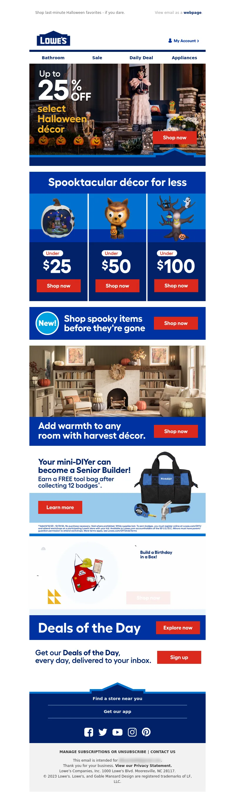
Subject Line: Up to 25% OFF select Halloween Decor.
<!DOCTYPE html PUBLIC"-//W3C//DTD XHTML 1.0 Transitional//EN" "https://www.w3.org/TR/xhtml1/DTD/xhtml1-transitional.dtd">
<html xmlns="https://www.w3.org/1999/xhtml">
<head>
<meta http-equiv="Content-Type" content="text/html; charset=UTF-8" />
<meta name="viewport" content="width=device-width, initial-scale=1.0" />
<meta name="x-apple-disable-message-reformatting" />
<!--[if !mso]><!-->
<style type="text/css">
@font-face {
font-family: 'Fellix Regular';
src: local('Fellix Regular'), local('Fellix Regular'), url('https://www.lowescdn.com/sffonts/Fellix-Regular.woff') format('woff');
}
@font-face {
font-family: 'Fellix Medium';
src: local('Fellix Medium'), local('Fellix Medium'), url('https://www.lowescdn.com/sffonts/Fellix-Medium.woff') format('woff');
}
@font-face {
font-family: 'Fellix Bold';
src: local('Fellix Bold'), local('Fellix Bold'), url('https://www.lowescdn.com/sffonts/Fellix-Bold.woff') format('woff');
}
</style>
<!--<![endif]-->
<!--[if !mso]><!-->
<style type="text/css">
@font-face {
font-family: 'DIN Next';
src: local('DIN Next'), local('DIN Next'), url('https://www.lowescdn.com/scaffold/1.4.4/fonts/din/din-next.woff') format('woff');
}
@font-face {
font-family: 'DIN Next Bold';
src: local('DIN Next Bold'), local('DIN Next Bold'), url('https://www.lowescdn.com/scaffold/1.2.0/fonts/din/din-next-bold.woff') format('woff');
}
@font-face {
font-family: 'DIN Next Black';
src: local('DIN Next Black'), local('DIN Next Black'), url('https://www.lowescdn.com/scaffold/1.2.0/fonts/din/din-next-black.woff') format('woff');
}
</style>
<!--<![endif]-->
<style type="text/css">
.ReadMsgBody{
width: 100%;
}
/* Forces Hotmail to display emails at full width */
.ExternalClass {
width: 100%;
}
/*Hotmail table centering fix*/
.ExternalClass, .ExternalClass p, .ExternalClass span, .ExternalClass font, .ExternalClass td, .ExternalClass div {
line-height: 100%;
}
/* Forces Hotmail to display normal line spacing*/
.ExternalClass * {
line-height: 100%}
p {
margin: 1em 0;
}
/*Yahoo paragraph fix*/
table td {
border-collapse: collapse;
}
/*This resolves the Outlook 07, 10, and Gmail td padding issue fix*/
/*This resolves the issue when iphone puts links on dates, etc.*/
a[x-apple-data-detectors] {
color: inherit !important;
text-decoration: none !important;
font-size: inherit !important;
font-family: inherit !important;
font-weight: inherit !important;
line-height: inherit !important;
}
a.mobileshow, .mobilehide {
display: none;
color: #fff;
/*for Gmail */
}
</style>
<style type="text/css">
@media screen and (min-width: 375px) and (max-width: 600px) and (-webkit-min-device-pixel-ratio:0) {
.mobile-hidden {
display: none !important;
}
.no-padding {
padding: 0px !important;
}
.mobile-only {
display: block !important;
max-height: none !important;
}
.container {
width: 100% !important;
}
.navcontainer tbody{
width: 100% !important;
display: table !important;
}
.drop {
width: 100% !important;
display: block !important;
}
.drop-center {
width: 100% !important;
display: block !important;
text-align: center !important;
}
.photo {
width: 100% !important;
height: auto !important;
}
}
</style>
<style type="text/css">
/* Media query triggers alternate styles when the file is displayed on a device with a maximum width lower than the assigned pixel dimension. The default max width setting for max-width should be 480px to trigger on mobile devices. */
@media only screen and (max-width: 480px) {
html,body {
width: 100% !important;
min-width:100% !important;
max-width: 480px !important;
overflow-x: hidden !important;
margin:0 auto !important;
}
.mobile-hidden, .tablet-hidden {
display:none !important;
}
.mobile-photo {
width:100% !important;
max-width: 450px !important;
height:auto !important;
}
.no-padding {
padding:0px !important;
}
.mobile-only {
display: block !important;
max-height: none !important;
}
.container {
width:100% !important;
max-width:480px !important;
}
.photo {
width:100% !important;
max-width:480px !important;
height:auto !important;
}
.managesubs {
width:83% !important;
height:auto !important;
}
.photo390 {
display: block !important;
height: auto !important;
max-width: 390px !important;
width: 100% !important;
}
body[data-outlook-cycle] .oa {
width: 100% !important;
max-width: 480px !important;
text-align: center !important;
overflow-x: hidden !important;
display:block !important;
}
.drop {
width: 100% !important;
max-width: 480px !important;
display: block !important;
}
.drop-social {
width:100% !important;
max-width: 480px !important;
display:block !important;
text-align:center !important;
padding:0px !important;
}
.center {
text-align:center !important;
}
.center50 {
width:50% !important;
padding-right:10px !important;
padding-left:10px !important;
}
.drop-center {
width:100% !important;
max-width: 480px !important;
display:block !important;
text-align:center !important;
}
.Full100 {
width:100% !important;
max-width: 480px !important;
height:auto!important;
line-height:normal!important;
}
.pad10 {
padding-left:10px !important;
padding-right: 10px !important;
}
.sub_nav {
border-bottom:2px solid #ffffff;
display: table-cell !important;
width: auto !important;
height: auto !important;
float: none !important;
overflow: auto !important;
line-height:normal !important;
font-size:15px !important;
background-color: #15b5e5 !important;
}
.sub_nav_bottom {
border-bottom:2px solid #ffffff;
display: table-cell !important;
width: auto !important;
height: auto !important;
float: none !important;
overflow: auto !important;
line-height:normal !important;
font-size:15px !important;
}
.sub_nav_top {
display: table-cell !important;
width: auto !important;
height: auto !important;
float: none !important;
overflow: auto !important;
font-size:18px !important;
line-height:30px !important;
}
.tablet-only {
display: block !important;
max-height: none !important;
}
.Width70 {
width: 60% !important;
text-align: center !important;
}
.Width90 {
width: 90% !important;
text-align: center !important;
}
.container1 {
width: 100% !important;
max-width: 316px !important;
}
.mobile-only1 {
display: inline-block !important;
}
.mobile-left-image {
width: 67px !important;
max-width: 67px !important;
padding-left: 0px !important;
}
.mobile-middle-table {
width: 316px !important;
}
}
</style>
<style type="text/css">
@media only screen and (max-width: 619px) {
.tablet-only {
display: block !important;
max-height: none !important;
}
}
</style>
<style type="text/css">
@media only screen and (max-width: 414px) {
.mobile-hidden, .tablet-hidden {
display:none !important;
}
.mobile-photo {
width:100% !important;
max-width: 414px !important;
height:auto !important;
}
.no-padding {
padding:0px !important;
}
.mobile-only {
display: block !important;
max-height: none !important;
}
.container {
width:100% !important;
max-width:414px !important;
}
.photo {
width:100% !important;
max-width:414px !important;
height:auto !important;
}
.managesubs {
width:83% !important;
height:auto !important;
}
.photo390 {
display: block !important;
height: auto !important;
max-width: 390px !important;
width: 100% !important;
}
body[data-outlook-cycle] .oa {
width: 100% !important;
max-width: 414px !important;
text-align: center !important;
overflow-x: hidden !important;
display:block !important;
}
.drop {
width: 100% !important;
max-width: 414px !important;
display: block !important;
}
.drop-center {
width:100% !important;
max-width: 414px !important;
display:block !important;
text-align:center !important;
}
.Width70 {
width: 60% !important;
max-width: 380px !important;
text-align: center !important;
}
.Width90 {
width: 90% !important;
max-width: 400px !important;
text-align: center !important;
}
.container1 {
width: 100% !important;
max-width: 286px !important;
}
.mobile-left-image {
width: 64px !important;
padding-left: 0px !important;
}
.mobile-middle-table {
width: 286px !important;
}
.mobile-only1 {
display: inline-block !important;
}
}
</style>
<style type="text/css">
@media only screen and (max-width: 375px) {
.mobile-hidden {
display:none !important;
}
.mobile-photo {
width:100% !important;
max-width: 375px !important;
height:auto !important;
}
.no-padding {
padding:0px !important;
}
.mobile-only {
display: block !important;
max-height: none !important;
}
.container {
width:100% !important;
max-width:375px !important;
}
.photo {
width:100% !important;
max-width:375px !important;
height:auto !important;
}
.managesubs {
width:83% !important;
height:auto !important;
}
.photo390 {
display: block !important;
height: auto !important;
max-width: 390px !important;
width: 100% !important;
}
body[data-outlook-cycle] .oa {
width: 100% !important;
max-width: 375px !important;
text-align: center !important;
overflow-x: hidden !important;
display:block !important;
}
.drop {
width: 100% !important;
max-width: 375px !important;
display: block !important;
}
.drop-center {
width:100% !important;
max-width: 375px !important;
display:block !important;
text-align:center !important;
}
.Width70 {
width: 60% !important;
max-width: 300px !important;
text-align: center !important;
}
.Width90 {
width: 90% !important;
max-width: 320px !important;
text-align: center !important;
}
.container1 {
width: 100% !important;
max-width: 247px !important;
}
.mobile-left-image {
width: 56px !important;
max-width: 56px !important;
padding-left: 3px !important;
}
.mobile-middle-table {
width: 265px !important;
}
.mobile-only1 {
display: inline-block !important;
}
}
}
</style>
<style type="text/css">
/*Liveclicker responsive video styles*/
/*Android devices*/
@media only screen and (max-device-width: 480px) {
div.lc-video{
width:100%;
height:auto;
}
}
/* iPhone 5 - Portrait */
@media only screen and (device-width: 320px) {
div.lc-video {
width: 320px;
min-width: 320px;
height: 180px;
}
}
/* iPhone 6 - Portrait */
@media only screen and (device-width: 375px) {
div.lc-video {
width: 375px;
min-width: 375px;
height: 211px;
}
}
/* iPhone 6+ - Portrait */
@media only screen and (device-width: 414px) {
div.lc-video {
width: 414px;
min-width: 414px;
height: 233px;
}
}
/* iPhone 5 - Landscape */
@media only screen and (width: 568px) {
div.lc-video {
width: 568px;
min-width: 586px;
height: 320px;
}
}
/* iPhone 6 - Landscape */
@media only screen and (width: 667px) {
div.lc-video {
width: 600px;
min-width: 600px;
height: 338px;
}
}
/* iPhone 6+ - Landscape */
@media only screen and (width: 736px) {
div.lc-video {
width: 600px;
min-width: 600px;
height: 338px;
}
}
</style>
<title>Lowe's Email
</title>
<script type="application/ld+json">
[{
"@context": "https://schema.org/",
"@type": "Organization",
"name": "Lowe’s",
"logo": "https://i.imgur.com/AkY0dT7.jpg"
},{
"@context": "https://schema.org/",
"@type": "DiscountOffer",
"description": "",
"availabilityStarts": "",
"availabilityEnds": ""
},{
"@context": "https://schema.org/",
"@type": "PromotionCard",
"image": ""
}]
</script>
</head>
<body bgcolor="#ffffff" style="margin: 0; padding:0; -ms-text-size-adjust: none; mso-line-height-rule: exactly;" yahoo="fix">
<div class="oa" align="center">
<!-- Table used to center email -->
<table border="0" cellpadding="0" cellspacing="0" width="100%" class="container">
<tr>
<td>
<!-- Table used to set width of email -->
<table width="600" class="container" border="0" align="center" cellpadding="0" cellspacing="0" style="font-family:Arial, Helvetica, sans-serif">
<tr>
<td>
<table cellpadding="0" cellspacing="0" width="100%" role="presentation" style="min-width: 100%; " class="stylingblock-content-wrapper"><tr><td class="stylingblock-content-wrapper camarker-inner"><table border="0" cellpadding="0" cellspacing="0" class="container" width="100%">
<tr>
<td align="left" bgcolor="#ffffff" style="font-family:Arial, Helvetica, sans-serif; font-size:12px; color:#666666; padding-top:10px; padding-bottom:10px; padding-left:10px;" valign="top">
<table align="left" border="0" cellpadding="0" cellspacing="0" class="Width90" width="100%">
<tr>
<td align="left" bgcolor="#ffffff" class="drop no-padding" style="font-family: Arial, Helvetica, sans-serif; font-size:12px; color:#666666; padding-left:10px; padding-top:10px; padding-bottom:10px;" valign="top">
<!--Preheader Link Starts here--><a href="https://click.e.lowes.com/u/?qs=17a29e418c87c5bdda49ea0aa1c7ef7c79657b5a6b0337dc0fed6f7c9a07ec6dcf7a900740937ff9c7e8797e493ccd3f8485f8dc8353e5a33df50f63c602b91f" style="color:#666666; text-decoration:none;" target="_blank"><span style="color:#666666; text-decoration:none;" title="Shop last-minute Halloween favorites - if you dare.">Shop last-minute Halloween favorites - if you dare.</span></a> <!--Preheader Link Ends here--></td><td align="right" bgcolor="#ffffff" class="mobile-hidden" style="font-family: Arial, Helvetica, sans-serif; font-size:12px; color:#999999; padding-right:10px; padding-left:0px; padding-top:10px; padding-bottom:10px;" valign="top" width="175">
<!---->View email as a <a href="https://view.e.lowes.com/?qs=fcb9af38ba8dd9b8ddd05d03572404516240236c55451d6861fcc927ceacf1d8bb7b8e1d8adb126e52d0d7cd31ff0b81058e262a367bd8bc894a281abd6fdd319a18adf2e3da9b6bbf6ace89cf1a6f9e" style=" text-decoration:none; color:#012169; font-weight:bold;" target="_blank" title="webpage">webpage</a>.<!----></td></tr></table></td></tr><tr>
<td align="center" height="5" style="padding-top:10px; padding-bottom: 10px;">
</td></tr><tr>
<td align="center" style="padding-top:10px; padding-bottom:10px;" valign="middle"><table align="center" border="0" cellpadding="0" cellspacing="0" width="100%">
<tr>
<td align="left" bgcolor="#ffffff" style="font-family:Arial, Helvetica, sans-serif; font-size:12px; color:#666666; padding-left:22px;" valign="top">
<a href="https://click.e.lowes.com/u/?qs=17a29e418c87c5bd69be30c37dcf6f19d8759247a3427590a1f14b1113487efae5a64045d6f025ef6107515346312bcaf48cc1463e48f5ac4f6c869e12629aae" target="_blank" title="Lowe's"><img alt="Lowe's" border="0" src="https://image.e.lowes.com/lib/fe9515707364027471/m/59/14f6b444-13d4-4f6b-a52a-df9473ac4be2.png" style="display:block;" width="120"></a></td><td align="right" bgcolor="#ffffff" style="font-family: Helvetica, Arial, sans-serif; font-size:12px; color:#999999; padding-right:22px; padding-bottom:5px; line-height: 36px;" valign="bottom"><a href="https://click.e.lowes.com/u/?qs=17a29e418c87c5bd5bb03621b92cc9e669eec6cd966bdbd06eb423d021bfe051b24a79186bca30def318b9fc5075adda2e2225dd62256385af4ed959bdd97ba4" target="_blank" title="MyLowe's Login">
<img alt="MyLowe's Login" border="0" src="https://image.e.lowes.com/lib/fe9515707364027471/m/71/62690a78-f84d-4700-8c0b-c6a33b9b324b.png" style="display:block;" width="106" height="34"></a></td></tr></table>
</td></tr><tr>
<td align="center" height="1" style="font-size: 0px;">
<table bgcolor="#012169" border="0" cellpadding="0" cellspacing="0" class="container" width="100%">
<tr>
<td height="7" style="font-size: 0px;" valign="top">
<img alt="" border="0" class="photo" height="7" src="https://image.e.lowes.com/lib/fe9515707364027471/m/59/c301e24e-201b-46f9-8172-27b5acdcbf99.jpg" style="display:block;" width="100%"></td></tr></table></td></tr><tr>
<td>
<table bgcolor="#ffffff" border="0" cellpadding="0" cellspacing="0" class="mobile-hidden" width="100%">
<tr>
<th align="center" class="drop-center" height="20" valign="middle" width="1%">
</th><th align="center" class="drop-center" height="40" valign="middle" width="25%">
<!--NAV1001 Link Starts here--><a href="https://click.e.lowes.com/u/?qs=17a29e418c87c5bdc54a069310a7ccaf57e4d9549680279d1ca7da2156c1656190cf0a706e4f813f4045f7204a85be8c9252aec40df990b0ba07860683c167ed" style="color: #012169; text-decoration: none; font-family: Arial, Helvetica, sans-serif; font-size: 14px;" target="_blank" title="Bathroom"><strong>Bathroom</strong></a> <!--NAV1001 Link Ends here--></th><th align="center" class="drop-center" height="40" valign="middle" width="25%">
<!--NAV1002 Link Starts here--><a href="https://click.e.lowes.com/u/?qs=17a29e418c87c5bd21e4ffac4d5ee2cf5e38e22874fd7831c554f5d51d20e67969494ab83f46681cee7cee4135be36de8d180a5b6285b8caeda2f79b6798ace5" style="color: #012169; text-decoration: none; font-family: Arial, Helvetica, sans-serif; font-size: 14px;" target="_blank" title="Sale"><strong>Sale</strong></a> <!--NAV1002 Link Ends here--></th><th align="center" class="drop-center" height="40" valign="middle" width="25%">
<!--NAV1003 Link Starts here--><a href="https://click.e.lowes.com/u/?qs=17a29e418c87c5bd5ade89dce951be8c830ff1cc53f8535cd139eb349fbea6c4160f8dab680030b446e52f2f4560d0036fccd6354e38bf3d23bbaab26c09dffe" style="color: #012169; text-decoration: none; font-family: Arial, Helvetica, sans-serif; font-size: 14px;" target="_blank" title="Daily Deal"><strong>Daily Deal</strong></a> <!--NAV1003 Link Ends here--></th><th align="center" class="drop-center" height="40" valign="middle" width="25%">
<!--NAV1004 Link Starts here--><a href="https://click.e.lowes.com/u/?qs=17a29e418c87c5bdb0a3329c54fb3b59f6765ee929b7ad3d55f9dd76a4dbf5a59ac7c4f106aaa95d2fd1df932ac66f7f14ead12b33c0034601eb7b59b5cb8bfd" style="color: #012169; text-decoration: none; font-family: Arial, Helvetica, sans-serif; font-size: 14px;" target="_blank" title="Appliances"><strong>Appliances</strong></a> <!--NAV1004 Link Ends here--></th></tr></table></td></tr></table></td></tr></table>
<table cellpadding="0" cellspacing="0" width="100%" role="presentation" style="min-width: 100%; " class="stylingblock-content-wrapper"><tr><td class="stylingblock-content-wrapper camarker-inner"><table align="center" border="0" cellpadding="0" cellspacing="0" class="container" width="600">
<tr>
<td>
<a data-linkto="https://" href="https://click.e.lowes.com/u/?qs=17a29e418c87c5bd19d5bda3f5a99b1ba95420849692591120dbc64219d1e103f914eee298cd73eacd06aa608dc294517721f3a03a9cf7159420e417121a9806" target="_blank" title=""><img alt="Get last-minute Halloween decor before it's gone." data-assetid="70989" src="https://image.e.lowes.com/lib/fe9515707364027471/m/1/3a3b8bc1-68fb-4131-96ac-567630f61b54.jpg" style="display: block; width: 100%; padding: 0px; text-align: center; height: auto;" width="600"></a></td></tr></table></td></tr></table>
<table cellpadding="0" cellspacing="0" width="100%" role="presentation" style="min-width: 100%; " class="stylingblock-content-wrapper"><tr><td class="stylingblock-content-wrapper camarker-inner"><table align="center" border="0" cellpadding="0" cellspacing="0" class="container" width="600">
<tr>
<td>
<img alt="Spooktacular decor for less" border="0" class="photo" data-assetid="70980" src="https://image.e.lowes.com/lib/fe9515707364027471/m/1/f4035712-bbe2-4fee-960a-8fca6f5364a3.jpg" style="display: block; width: 100%; padding: 0px; text-align: center; height: auto;" width="600"></td></tr></table></td></tr></table>
<table cellpadding="0" cellspacing="0" width="100%" role="presentation" style="min-width: 100%; " class="stylingblock-content-wrapper"><tr><td class="stylingblock-content-wrapper camarker-inner"><table align="center" bgcolor="#808080" border="0" cellpadding="0" cellspacing="0" class="container" width="600">
<tr>
<td valign="top">
<a data-linkto="https://" href="https://click.e.lowes.com/u/?qs=17a29e418c87c5bdf57d4438c6ddd7f6643cd896eb9e542865f0ce07fdffcf0379a1e6dcc53fb1916fd239292ebecdd24bc37395eaf6cd23a5b4e8573bd44646" target="_blank" title=""><img alt="Under $25" data-assetid="70987" src="https://image.e.lowes.com/lib/fe9515707364027471/m/1/cd67a6f6-e6f1-43dc-a73d-15cc6fa8d18f.jpg" style="display: block; padding: 0px; text-align: center; height: auto; width: 100%;" width="200"></a></td><td valign="top">
<a data-linkto="https://" href="https://click.e.lowes.com/u/?qs=17a29e418c87c5bdd6186a984f80fd8f79ba376e80c4c935ecbfb94e3ada5b145e8af9d6714f85b6cf0a1618e397c338e61932883855e606d91d0dc8c8c2dabb" target="_blank" title=""><img alt="Under $50" data-assetid="70988" src="https://image.e.lowes.com/lib/fe9515707364027471/m/1/f1eaa1ec-66de-4b24-a834-e69a1a470e0d.jpg" style="display: block; padding: 0px; text-align: center; height: auto; width: 100%;" width="200"></a></td><td valign="top">
<a data-linkto="https://" href="https://click.e.lowes.com/u/?qs=17a29e418c87c5bd3ddeeeafe83713460c36a5f02686579a85de5d325364c43fd4e6d3ccb8a072f77c102aa2f0198c6e2edde79cf0e09d5025df4275af6af3e5" target="_blank" title=""><img alt="Under $100" data-assetid="70986" src="https://image.e.lowes.com/lib/fe9515707364027471/m/1/e3bdcfbd-6e96-4fd5-af4e-e6902720487d.jpg" style="display: block; padding: 0px; text-align: center; height: auto; width: 100%;" width="200"></a></td></tr></table></td></tr></table>
<table cellpadding="0" cellspacing="0" width="100%" role="presentation" style="min-width: 100%; " class="stylingblock-content-wrapper"><tr><td class="stylingblock-content-wrapper camarker-inner"><table align="center" border="0" cellpadding="0" cellspacing="0" class="container" width="600">
<tr>
<td>
<a data-linkto="https://" href="https://click.e.lowes.com/u/?qs=17a29e418c87c5bdeecb568ad283f4d4e280d15cb6f94ad609257d0eaa79a1d3299b113216549e740e4aa7680eeb3b09b73ec7c54000df91ae08c048eb8477d2" target="_blank" title=""><img alt="New! Shop spooky items before they're gone" data-assetid="70982" src="https://image.e.lowes.com/lib/fe9515707364027471/m/1/6bff0aad-4e19-4823-9587-0372c15774ae.jpg" style="display: block; width: 100%; padding: 0px; text-align: center; height: auto;" width="600"></a></td></tr></table></td></tr></table>
<table cellpadding="0" cellspacing="0" width="100%" role="presentation" style="min-width: 100%; " class="stylingblock-content-wrapper"><tr><td class="stylingblock-content-wrapper camarker-inner"><table align="center" border="0" cellpadding="0" cellspacing="0" class="container" width="600">
<tr>
<td>
<a data-linkto="https://" href="https://click.e.lowes.com/u/?qs=17a29e418c87c5bd555c9e81208e1f71e2e03ef49eb752608766f6942ec3b89f8755d48ca8f8a8ba5e079f01da9cbdfef18018420710348266b893439dc8438a" target="_blank" title=""><img alt="Add warmth to any room with harvest decor." data-assetid="70984" src="https://image.e.lowes.com/lib/fe9515707364027471/m/1/b07c9eca-159b-4624-bee9-8250d751a323.jpg" style="display: block; width: 100%; padding: 0px; text-align: center; height: auto;" width="600"></a></td></tr></table></td></tr></table><table cellpadding="0" cellspacing="0" width="100%" role="presentation" style="min-width: 100%; " class="stylingblock-content-wrapper"><tr><td class="stylingblock-content-wrapper camarker-inner"><table align="center" border="0" cellpadding="0" cellspacing="0" class="container" width="600">
<tr>
<td>
<a data-linkto="https://" href="https://click.e.lowes.com/u/?qs=17a29e418c87c5bdd08b63ae8f9b065fca0d0cdcdc47089aead8832f6036b4a37d4371c40a48b6939a29e3c0173b1538fe6591c84ea56a3268c9e295f5bc477f" target="_blank" title="">
<img alt="Your mini-DIYer can become a Senior Builder! Earn a FREE tool bag after collecting 12 badges. Valid 8/12/23 - 12/31/24. No purchase necessary. Void where prohibited. While supplies last. To earn badges, you must register online at Lowes.com/DIYU and attend workshops at a participating Lowe’s store with your kid. Available to Lowes.com accountholders of the 50 U.S./D.C. Minors must have parent/guardian permission to attend workshops. More terms apply, see Lowes.com/DIYUkidsTerms" data-assetid="70983" src="https://image.e.lowes.com/lib/fe9515707364027471/m/1/1fb22672-c05b-4e28-ac24-8cf58d3b7ce1.jpg" style="display: block; width: 100%; padding: 0px; text-align: center; height: auto;"
width="600"></a></td></tr></table></td></tr></table>
<table cellpadding="0" cellspacing="0" width="100%" role="presentation" style="min-width: 100%; " class="stylingblock-content-wrapper"><tr><td class="stylingblock-content-wrapper camarker-inner"><table align="center" border="0" cellpadding="0" cellspacing="0" class="container" width="600">
<tr>
<td>
<a data-linkto="https://" href="https://click.e.lowes.com/u/?qs=17a29e418c87c5bd2ff2de711b2ac9696ab519e4391ca329b373b24247d5bac0f519718674099fae8cda013349895d9f03bf39b465f8fef52108df7eefad6c6c" target="_blank" title=""><img alt="Build a Birthday. Build a Birthday in a Box! Bring all of the DIY birthday fun home for a limited time." data-assetid="70985" src="https://image.e.lowes.com/lib/fe9515707364027471/m/1/8cc07f3d-bb18-4bbe-b8a9-9160732f7493.gif" style="display: block; width: 100%; padding: 0px; text-align: center; height: auto;" width="600"></a></td></tr></table></td></tr></table><table cellpadding="0" cellspacing="0" width="100%" role="presentation" style="min-width: 100%; " class="stylingblock-content-wrapper"><tr><td class="stylingblock-content-wrapper camarker-inner"><table align="center" border="0" cellpadding="0" cellspacing="0" class="container" width="600">
<tr>
<td>
<a data-linkto="https://" href="https://click.e.lowes.com/u/?qs=17a29e418c87c5bdf1ad368f39abcb479e7cc13c39de148c5a0c8a31febc9b8bf95e3d35d7e2616f28cccd03db080e0e6a93ab20fffeb16445baa07ce04772ea" target="_blank" title=""><img alt="Deals of the Day." data-assetid="70981" src="https://image.e.lowes.com/lib/fe9515707364027471/m/1/5759eb54-cc0f-41e8-85e3-112802573770.jpg" style="display: block; width: 100%; padding: 0px; text-align: center; height: auto;" width="600"></a></td></tr></table></td></tr></table><table cellpadding="0" cellspacing="0" width="100%" role="presentation" style="min-width: 100%; " class="stylingblock-content-wrapper"><tr><td class="stylingblock-content-wrapper camarker-inner"><table align="center" border="0" cellpadding="0" cellspacing="0" class="container" width="600">
<tr>
<td>
<a href="https://click.e.lowes.com/u/?qs=17a29e418c87c5bdfcde14c6fcdc754e51a263c33c9085c685a3d167b3f2fbb69f6df8e19284e9dee605404d339fe5855519466befbe4f399c28010701231652" target="_blank" title="DOTD"><img alt="DOTD" border="0" class="photo" src="https://image.e.lowes.com/lib/fe9515707364027471/m/72/20a17fc2-3d2e-4516-8f85-037699eea50b.jpg" style="display: block;" width="600"></a></td></tr></table> </td></tr></table>
<table cellpadding="0" cellspacing="0" width="100%" role="presentation" style="min-width: 100%; " class="stylingblock-content-wrapper"><tr><td class="stylingblock-content-wrapper camarker-inner"><table border="0" cellpadding="0" cellspacing="0" width="100%">
<tr>
<td style="font-size:0%;">
<img alt="" border="0" height="30" src="https://image.e.lowes.com/lib/fe9515707364027471/m/32/20131010_promo_spacer.gif" style="display:block" width="1"></td></tr></table></td></tr></table>
<!---->
<table align="center" border="0" cellpadding="0" cellspacing="0" class="container" style="width: 600px; border-collapse: collapse;" width="100%">
<tr>
<td align="center" bgcolor="#ffffff" style="font-family: Arial, Helvetica, sans-serif; font-size:0px; color:#666666; padding: 0px; border-bottom: 2px solid #012169;" valign="bottom">
<img alt="Lowe's" border="0" class="photo" src="https://image.e.lowes.com/lib/fe9515707364027471/m/71/fb17fb6a-e05f-4a5e-8990-24cabe14e1e6.png" width="600" height="46"></td></tr>
<!----><!--[if !mso]><!-- -->
<tr>
<td align="center" bgcolor="#012169" style="font-family: 'Fellix Regular', Arial, Helvetica, sans-serif; font-size:12px; color:#666666;" valign="top">
<table align="center" bgcolor="#012169" border="0" cellpadding="0" cellspacing="0" class="mobile-only container" style="display: none;" width="100%">
<tr>
<td align="center" height="40" valign="middle">
<!--NAV1001 Link Starts here--><a href="https://click.e.lowes.com/u/?qs=17a29e418c87c5bdc54a069310a7ccaf57e4d9549680279d1ca7da2156c1656190cf0a706e4f813f4045f7204a85be8c9252aec40df990b0ba07860683c167ed" style="color: #ffffff; text-decoration: none; font-family: Helvetica, Arial, sans-serif; font-size: 14px;" target="_blank" title="Bathroom"><strong>Bathroom</strong></a> <!--NAV1001 Link Ends here--></td></tr><tr>
<td align="center" height="40" style="border-top: 1px solid #79a8d1;" valign="middle">
<!--NAV1002 Link Starts here--><a href="https://click.e.lowes.com/u/?qs=17a29e418c87c5bd21e4ffac4d5ee2cf5e38e22874fd7831c554f5d51d20e67969494ab83f46681cee7cee4135be36de8d180a5b6285b8caeda2f79b6798ace5" style="color: #ffffff; text-decoration: none; font-family: Helvetica, Arial, sans-serif; font-size: 14px;" target="_blank" title="Sale"><strong>Sale</strong></a> <!--NAV1002 Link Ends here--></td></tr><tr>
<td align="center" height="40" style="border-top: 1px solid #79a8d1;" valign="middle">
<!--NAV1003 Link Starts here--><a href="https://click.e.lowes.com/u/?qs=17a29e418c87c5bd5ade89dce951be8c830ff1cc53f8535cd139eb349fbea6c4160f8dab680030b446e52f2f4560d0036fccd6354e38bf3d23bbaab26c09dffe" style="color: #ffffff; text-decoration: none; font-family: Helvetica, Arial, sans-serif; font-size: 14px;" target="_blank" title="Daily Deal"><strong>Daily Deal</strong></a> <!--NAV1003 Link Ends here--></td></tr><tr>
<td align="center" height="40" style="border-top: 1px solid #79a8d1;" valign="middle">
<!--NAV1004 Link Starts here--><a href="https://click.e.lowes.com/u/?qs=17a29e418c87c5bdb0a3329c54fb3b59f6765ee929b7ad3d55f9dd76a4dbf5a59ac7c4f106aaa95d2fd1df932ac66f7f14ead12b33c0034601eb7b59b5cb8bfd" style="color: #ffffff; text-decoration: none; font-family: Helvetica, Arial, sans-serif; font-size: 14px;" target="_blank" title="Appliances"><strong>Appliances</strong></a> <!--NAV1004 Link Ends here--></td></tr><tr>
<td align="center" style="font-size: 0px; line-height: 6px; mso-line-height-rule: exactly;" valign="top">
<img alt="" border="0" class="photo" height="6" src="https://image.e.lowes.com/lib/fe9515707364027471/m/71/ad569dc5-361d-4d7d-8bc0-1ae6ec389f05.png" style="display:block; width: 100%; height: 6px;" width="100%"></td></tr></table>
</td></tr>
<!--<![endif]--><!---->
<tr>
<td align="center" bgcolor="#012169" style="font-family: 'Fellix Regular', Arial, Helvetica, sans-serif; font-size:12px; color:#666666; padding-bottom: 16px;" valign="top">
<table align="center" border="0" cellpadding="0" cellspacing="0" class="container" width="476">
<!--[if !mso]><!-- -->
<tr>
<td align="center" style="font-size: 14px; line-height: 22px; mso-line-height-rule: exactly; padding-top: 8px; display:none;" valign="middle" class="mobile-only"></td></tr><!--<![endif]-->
<tr>
<td align="center" style="font-size: 14px; line-height: 22px; mso-line-height-rule: exactly; padding-top: 0px;" valign="middle">
<a href="https://click.e.lowes.com/u/?qs=17a29e418c87c5bdf2e036c10878fac2387ddf528d6d82b65187bbe76755433b59a1e6109199adb102d48fbdda786b4df412a35363f5e95cc24b261617f560a7" style="color: #ffffff; font-family: Helvetica, Arial, sans-serif; font-size: 14px; line-height: 22px; font-weight: bold; text-decoration: none;" target="_blank" title="Find a store near you">Find a store near you</a></td></tr><tr>
<td align="center" style="padding-top: 8px; padding-bottom: 8px; font-size: 0px; line-height: 6px; mso-line-height-rule: exactly;" valign="top">
<img alt="" border="0" class="photo" height="6" src="https://image.e.lowes.com/lib/fe9515707364027471/m/71/ad569dc5-361d-4d7d-8bc0-1ae6ec389f05.png" style="display:block; width: 100%; height: 6px;" width="100%"></td></tr><tr>
<td align="center" style="font-size: 14px; line-height: 22px; mso-line-height-rule: exactly; padding-bottom: 8px;" valign="middle">
<a href="https://click.e.lowes.com/u/?qs=17a29e418c87c5bde88cea63076a5773784a393e07cc6e1e68c8ecaaf0cba776e55d32ae7efe02ba256eb0afed8bf4c17f9753cd44bda84ebbb12dd3f0e26ebb" style="color: #ffffff; font-family: Helvetica, Arial, sans-serif; font-size: 14px; line-height: 22px; font-weight: bold; text-decoration: none;" target="_blank" title="GET OUR APP">Get our app</a></td></tr><tr>
<td align="center" style="padding-bottom: 12px; font-size: 0px; line-height: 6px; mso-line-height-rule: exactly;" valign="top">
<img alt="" border="0" class="photo" height="6" src="https://image.e.lowes.com/lib/fe9515707364027471/m/71/ad569dc5-361d-4d7d-8bc0-1ae6ec389f05.png" style="display:block; width: 100%; height: 6px;" width="100%"></td></tr></table></td></tr><tr>
<td align="center" bgcolor="#012169" style="font-family:Arial, Helvetica, sans-serif; font-size:12px; color:#666666; padding-bottom: 20px;" valign="top">
<table bgcolor="#012169" border="0" cellpadding="0" cellspacing="0">
<tr>
<td style="padding-right: 14px;">
<a href="https://click.e.lowes.com/u/?qs=17a29e418c87c5bd9bba0219e6490cf1b8977fde16f38abe0733b0ed978b16470281a0c3bfd073cda838757fc5e453c5155f366ec81ee732" target="_blank" title="Facebook"><img alt="Facebook" border="0" height="34" src="https://image.e.lowes.com/lib/fe9515707364027471/m/71/34159e50-d8f2-4797-ab5f-ce3d49ab0acf.png" style="display:block;" width="34"></a></td><td>
<a href="https://click.e.lowes.com/u/?qs=17a29e418c87c5bd59d87fc2d814fadfe6c0782b7b95cc1995ad8cae737d91ef1b5a1fe04642fcec201f3d13dd3805c1f13ff0dc85e38c68" target="_blank" title="Twitter"><img alt="Twitter" border="0" height="34" src="https://image.e.lowes.com/lib/fe9515707364027471/m/71/3c26dcdd-70c7-42ee-ae07-20fda5b6e929.png" style="display:block;" width="34"></a></td><td style="padding-left: 14px; padding-right: 14px;">
<a href="https://click.e.lowes.com/u/?qs=17a29e418c87c5bd0f382f8e93d9ef04f81ab335822dcd1e6748355f7aa68aeaaf001f4d6860dd319995e535ba259666a508de49d0065626" target="_blank" title="YouTube"><img alt="YouTube" border="0" height="34" src="https://image.e.lowes.com/lib/fe9515707364027471/m/71/a455d08e-6178-40e6-966c-b515f6bbe656.png" style="display:block;" width="38"></a></td><td>
<a href="https://click.e.lowes.com/u/?qs=17a29e418c87c5bd79cb13725444922a37794cffca80c30a8ffadebd643ab7803efa6d89d0d42dc552a972ccb832eb776627582ac23cacb4" target="_blank" title="Instagram"><img alt="Instagram" border="0" height="34" src="https://image.e.lowes.com/lib/fe9515707364027471/m/71/5b978eef-757f-4094-8108-724c8e072c6b.png" style="display:block;" width="34"></a></td><td style="padding-left: 14px;">
<a href="https://click.e.lowes.com/u/?qs=17a29e418c87c5bd7559d59a527b4779d124e515a1f3f4e5ada6a3dab396e02303985d470baded971695e3df1b5fe2aa2f2f8efdc1a542ec" target="_blank" title="Pinterest"><img alt="Pinterest" border="0" height="34" src="https://image.e.lowes.com/lib/fe9515707364027471/m/71/a497073f-6626-4e7b-97d3-775bb3cca507.png" style="display:block;" width="34"></a></td></tr></table></td></tr></table>
<table align="center" bgcolor="#f2f2f2" border="0" cellpadding="0" cellspacing="0" class="container" style="width: 600px; border-collapse: collapse;" width="100%">
<tr>
<td align="center" style="padding-top:10px;padding-bottom:10px;">
<table align="center" bgcolor="#f2f2f2" border="0" cellpadding="0" cellspacing="0" class="container" width="90%">
<tr>
<td align="center" style="padding-top:10px;padding-bottom:10px;">
<table align="center" bgcolor="#f2f2f2" border="0" cellpadding="0" cellspacing="0" class="Width90">
<tr>
<!----><th align="center" bgcolor="#f2f2f2" class="drop-center" style="font-family: Arial, Helvetica, sans-serif; font-size: 12px; line-height: 20px;" valign="middle">
<a href="https://click.e.lowes.com/u/?qs=17a29e418c87c5bd10a01ca98a81921e3e7e5a4e03f41602732c39a44a49f6e32f645cbe7222775d1cbf79daac3d37518d31be223d8a590964646e4a1ddcd724" style="text-decoration: none; color: #333333; font-weight: bold;" target="_blank" title=">MANAGE SUBSCRIPTIONS OR UNSUBSCRIBE">MANAGE SUBSCRIPTIONS OR UNSUBSCRIBE</a></th><!----><th align="center" bgcolor="#f2f2f2" class="mobile-hidden" style="color: #333333; font-size:12px; padding-left:5px; padding-right:5px; line-height: 20px;" valign="middle">
|</th><th align="center" bgcolor="#f2f2f2" class="drop-center" style="font-family: Arial, Helvetica, sans-serif; font-size: 12px; line-height: 20px;" valign="middle">
<a href="https://click.e.lowes.com/u/?qs=17a29e418c87c5bdc13d255d8072dc3651703a338b0f051d68bca64fc6285cde3f30f2844b374d387c11b25a9e597e6e7295286d513ba41b5d6b0ee55ea4486a" style="text-decoration: none; color: #333333; font-weight: bold;" target="_blank" title="CONTACT US">CONTACT US</a></th></tr></table></td></tr><tr>
<td align="center" style="-webkit-text-size-adjust:none; vertical-align:top; font-family: Helvetica, Arial, sans-serif; font-size:12px; color: #333333; text-decoration: none; line-height: 18px; font-weight:normal; padding-left: 10px; padding-right: 10px;">
This email is intended for <a href="#" style="color:#333333; text-decoration:none;">james.bond007@mi6.co.uk</a>.<br>
Thank you for your business. <a href="https://click.e.lowes.com/u/?qs=17a29e418c87c5bd852840608b3c5256029bc977a507925009d6edbc958a6c59969ed9736f948585f7f505be6a61316627583969799e691dce5a26791fbecf01" style="font-weight: bold; color: #333333; text-decoration: none;" target="_blank" title="View our Privacy Statement.">View our Privacy Statement.</a><br>
Lowe’s Companies, Inc. 1000 Lowe's Blvd. Mooresville, NC 28117.<br>
© 2023 Lowe's. Lowe's, and Gable Mansard Design are registered trademarks of LF, LLC.</td></tr><!----><tr>
<td style="-webkit-text-size-adjust:none; vertical-align:top; font-family:Helvetica, Arial, sans-serif; font-size:12px; color: #333333; text-decoration: none; text-align: left; line-height: 18px; font-weight:normal; padding-top: 5px; padding-bottom: 10px;">
</td></tr></table></td></tr></table>
</td>
</tr>
</table>
</td>
</tr>
</table>
<img src="https://pixel.inbox.exacttarget.com/pixel.gif?r=3cee957cf4045be5bdd97f3d45b56bc1d2d850ec" width="1" height="1" />
<img src="https://click.e.lowes.com/open.aspx?ffcb10-febb1778726c037e-fe201770776d0c747d1272-fe9515707364027471-ff991773-fe2715727c650c7f761c76-ff011575766005&d=40128&bmt=0" width="1" height="1" alt="">
</div>
</body>
</html>