40
Average Subject Line Characters
258
Total Recieved
6
Monthly Average
2
Weekly Average
> 1
Daily Average
Parent Domain:
lowes.com
Subdomains:
lowes@e.lowes.com
From Names:
Lowe's Home Improvement
Mylowe's Rewards
From: Lowe's Home Improvement
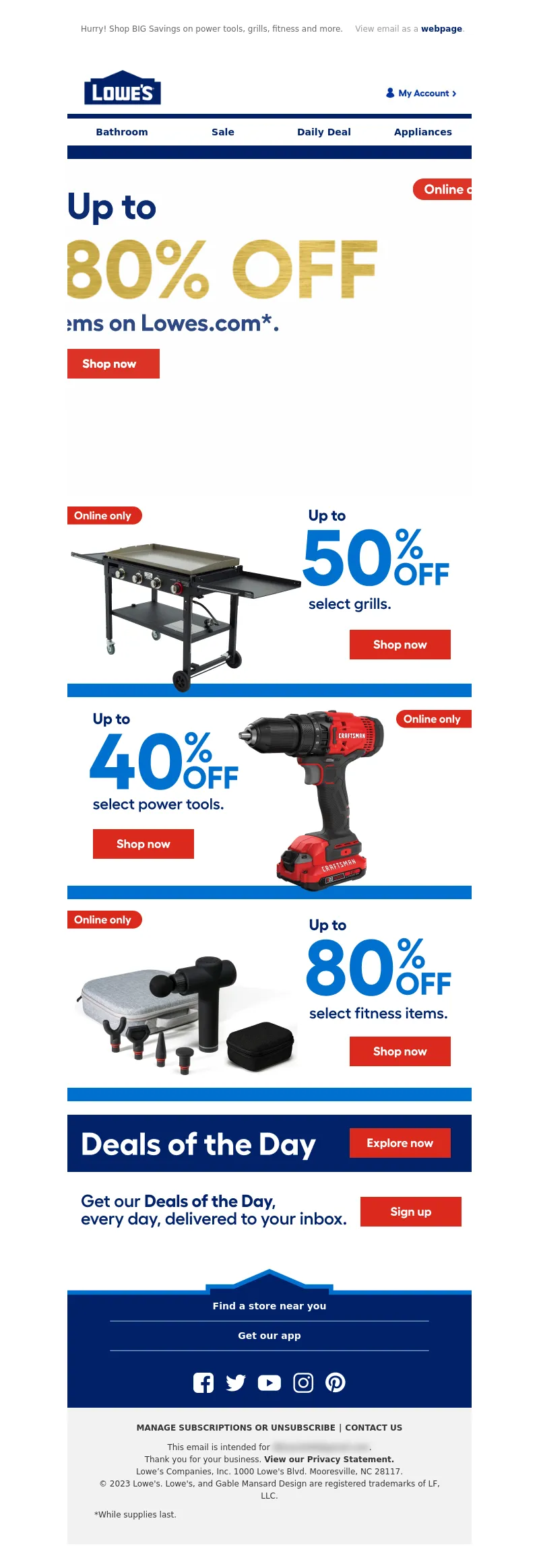
Subject Line: SUNDAY STEALS: Up to 80% OFF. Today only!
<!DOCTYPE html PUBLIC"-//W3C//DTD XHTML 1.0 Transitional//EN" "https://www.w3.org/TR/xhtml1/DTD/xhtml1-transitional.dtd">
<html xmlns="https://www.w3.org/1999/xhtml">
<head>
<meta http-equiv="Content-Type" content="text/html; charset=UTF-8" />
<meta name="viewport" content="width=device-width, initial-scale=1.0" />
<meta name="x-apple-disable-message-reformatting" />
<!--[if !mso]><!-->
<style type="text/css">
@font-face {
font-family: 'Fellix Regular';
src: local('Fellix Regular'), local('Fellix Regular'), url('https://www.lowescdn.com/sffonts/Fellix-Regular.woff') format('woff');
}
@font-face {
font-family: 'Fellix Medium';
src: local('Fellix Medium'), local('Fellix Medium'), url('https://www.lowescdn.com/sffonts/Fellix-Medium.woff') format('woff');
}
@font-face {
font-family: 'Fellix Bold';
src: local('Fellix Bold'), local('Fellix Bold'), url('https://www.lowescdn.com/sffonts/Fellix-Bold.woff') format('woff');
}
</style>
<!--<![endif]-->
<!--[if !mso]><!-->
<style type="text/css">
@font-face {
font-family: 'DIN Next';
src: local('DIN Next'), local('DIN Next'), url('https://www.lowescdn.com/scaffold/1.4.4/fonts/din/din-next.woff') format('woff');
}
@font-face {
font-family: 'DIN Next Bold';
src: local('DIN Next Bold'), local('DIN Next Bold'), url('https://www.lowescdn.com/scaffold/1.2.0/fonts/din/din-next-bold.woff') format('woff');
}
@font-face {
font-family: 'DIN Next Black';
src: local('DIN Next Black'), local('DIN Next Black'), url('https://www.lowescdn.com/scaffold/1.2.0/fonts/din/din-next-black.woff') format('woff');
}
</style>
<!--<![endif]-->
<style type="text/css">
.ReadMsgBody{
width: 100%;
}
/* Forces Hotmail to display emails at full width */
.ExternalClass {
width: 100%;
}
/*Hotmail table centering fix*/
.ExternalClass, .ExternalClass p, .ExternalClass span, .ExternalClass font, .ExternalClass td, .ExternalClass div {
line-height: 100%;
}
/* Forces Hotmail to display normal line spacing*/
.ExternalClass * {
line-height: 100%}
p {
margin: 1em 0;
}
/*Yahoo paragraph fix*/
table td {
border-collapse: collapse;
}
/*This resolves the Outlook 07, 10, and Gmail td padding issue fix*/
/*This resolves the issue when iphone puts links on dates, etc.*/
a[x-apple-data-detectors] {
color: inherit !important;
text-decoration: none !important;
font-size: inherit !important;
font-family: inherit !important;
font-weight: inherit !important;
line-height: inherit !important;
}
a.mobileshow, .mobilehide {
display: none;
color: #fff;
/*for Gmail */
}
</style>
<style type="text/css">
@media screen and (min-width: 375px) and (max-width: 600px) and (-webkit-min-device-pixel-ratio:0) {
.mobile-hidden {
display: none !important;
}
.no-padding {
padding: 0px !important;
}
.mobile-only {
display: block !important;
max-height: none !important;
}
.container {
width: 100% !important;
}
.navcontainer tbody{
width: 100% !important;
display: table !important;
}
.drop {
width: 100% !important;
display: block !important;
}
.drop-center {
width: 100% !important;
display: block !important;
text-align: center !important;
}
.photo {
width: 100% !important;
height: auto !important;
}
}
</style>
<style type="text/css">
/* Media query triggers alternate styles when the file is displayed on a device with a maximum width lower than the assigned pixel dimension. The default max width setting for max-width should be 480px to trigger on mobile devices. */
@media only screen and (max-width: 480px) {
html,body {
width: 100% !important;
min-width:100% !important;
max-width: 480px !important;
overflow-x: hidden !important;
margin:0 auto !important;
}
.mobile-hidden, .tablet-hidden {
display:none !important;
}
.mobile-photo {
width:100% !important;
max-width: 450px !important;
height:auto !important;
}
.no-padding {
padding:0px !important;
}
.mobile-only {
display: block !important;
max-height: none !important;
}
.container {
width:100% !important;
max-width:480px !important;
}
.photo {
width:100% !important;
max-width:480px !important;
height:auto !important;
}
.managesubs {
width:83% !important;
height:auto !important;
}
.photo390 {
display: block !important;
height: auto !important;
max-width: 390px !important;
width: 100% !important;
}
body[data-outlook-cycle] .oa {
width: 100% !important;
max-width: 480px !important;
text-align: center !important;
overflow-x: hidden !important;
display:block !important;
}
.drop {
width: 100% !important;
max-width: 480px !important;
display: block !important;
}
.drop-social {
width:100% !important;
max-width: 480px !important;
display:block !important;
text-align:center !important;
padding:0px !important;
}
.center {
text-align:center !important;
}
.center50 {
width:50% !important;
padding-right:10px !important;
padding-left:10px !important;
}
.drop-center {
width:100% !important;
max-width: 480px !important;
display:block !important;
text-align:center !important;
}
.Full100 {
width:100% !important;
max-width: 480px !important;
height:auto!important;
line-height:normal!important;
}
.pad10 {
padding-left:10px !important;
padding-right: 10px !important;
}
.sub_nav {
border-bottom:2px solid #ffffff;
display: table-cell !important;
width: auto !important;
height: auto !important;
float: none !important;
overflow: auto !important;
line-height:normal !important;
font-size:15px !important;
background-color: #15b5e5 !important;
}
.sub_nav_bottom {
border-bottom:2px solid #ffffff;
display: table-cell !important;
width: auto !important;
height: auto !important;
float: none !important;
overflow: auto !important;
line-height:normal !important;
font-size:15px !important;
}
.sub_nav_top {
display: table-cell !important;
width: auto !important;
height: auto !important;
float: none !important;
overflow: auto !important;
font-size:18px !important;
line-height:30px !important;
}
.tablet-only {
display: block !important;
max-height: none !important;
}
.Width70 {
width: 60% !important;
text-align: center !important;
}
.Width90 {
width: 90% !important;
text-align: center !important;
}
.container1 {
width: 100% !important;
max-width: 316px !important;
}
.mobile-only1 {
display: inline-block !important;
}
.mobile-left-image {
width: 67px !important;
max-width: 67px !important;
padding-left: 0px !important;
}
.mobile-middle-table {
width: 316px !important;
}
}
</style>
<style type="text/css">
@media only screen and (max-width: 619px) {
.tablet-only {
display: block !important;
max-height: none !important;
}
}
</style>
<style type="text/css">
@media only screen and (max-width: 414px) {
.mobile-hidden, .tablet-hidden {
display:none !important;
}
.mobile-photo {
width:100% !important;
max-width: 414px !important;
height:auto !important;
}
.no-padding {
padding:0px !important;
}
.mobile-only {
display: block !important;
max-height: none !important;
}
.container {
width:100% !important;
max-width:414px !important;
}
.photo {
width:100% !important;
max-width:414px !important;
height:auto !important;
}
.managesubs {
width:83% !important;
height:auto !important;
}
.photo390 {
display: block !important;
height: auto !important;
max-width: 390px !important;
width: 100% !important;
}
body[data-outlook-cycle] .oa {
width: 100% !important;
max-width: 414px !important;
text-align: center !important;
overflow-x: hidden !important;
display:block !important;
}
.drop {
width: 100% !important;
max-width: 414px !important;
display: block !important;
}
.drop-center {
width:100% !important;
max-width: 414px !important;
display:block !important;
text-align:center !important;
}
.Width70 {
width: 60% !important;
max-width: 380px !important;
text-align: center !important;
}
.Width90 {
width: 90% !important;
max-width: 400px !important;
text-align: center !important;
}
.container1 {
width: 100% !important;
max-width: 286px !important;
}
.mobile-left-image {
width: 64px !important;
padding-left: 0px !important;
}
.mobile-middle-table {
width: 286px !important;
}
.mobile-only1 {
display: inline-block !important;
}
}
</style>
<style type="text/css">
@media only screen and (max-width: 375px) {
.mobile-hidden {
display:none !important;
}
.mobile-photo {
width:100% !important;
max-width: 375px !important;
height:auto !important;
}
.no-padding {
padding:0px !important;
}
.mobile-only {
display: block !important;
max-height: none !important;
}
.container {
width:100% !important;
max-width:375px !important;
}
.photo {
width:100% !important;
max-width:375px !important;
height:auto !important;
}
.managesubs {
width:83% !important;
height:auto !important;
}
.photo390 {
display: block !important;
height: auto !important;
max-width: 390px !important;
width: 100% !important;
}
body[data-outlook-cycle] .oa {
width: 100% !important;
max-width: 375px !important;
text-align: center !important;
overflow-x: hidden !important;
display:block !important;
}
.drop {
width: 100% !important;
max-width: 375px !important;
display: block !important;
}
.drop-center {
width:100% !important;
max-width: 375px !important;
display:block !important;
text-align:center !important;
}
.Width70 {
width: 60% !important;
max-width: 300px !important;
text-align: center !important;
}
.Width90 {
width: 90% !important;
max-width: 320px !important;
text-align: center !important;
}
.container1 {
width: 100% !important;
max-width: 247px !important;
}
.mobile-left-image {
width: 56px !important;
max-width: 56px !important;
padding-left: 3px !important;
}
.mobile-middle-table {
width: 265px !important;
}
.mobile-only1 {
display: inline-block !important;
}
}
}
</style>
<style type="text/css">
/*Liveclicker responsive video styles*/
/*Android devices*/
@media only screen and (max-device-width: 480px) {
div.lc-video{
width:100%;
height:auto;
}
}
/* iPhone 5 - Portrait */
@media only screen and (device-width: 320px) {
div.lc-video {
width: 320px;
min-width: 320px;
height: 180px;
}
}
/* iPhone 6 - Portrait */
@media only screen and (device-width: 375px) {
div.lc-video {
width: 375px;
min-width: 375px;
height: 211px;
}
}
/* iPhone 6+ - Portrait */
@media only screen and (device-width: 414px) {
div.lc-video {
width: 414px;
min-width: 414px;
height: 233px;
}
}
/* iPhone 5 - Landscape */
@media only screen and (width: 568px) {
div.lc-video {
width: 568px;
min-width: 586px;
height: 320px;
}
}
/* iPhone 6 - Landscape */
@media only screen and (width: 667px) {
div.lc-video {
width: 600px;
min-width: 600px;
height: 338px;
}
}
/* iPhone 6+ - Landscape */
@media only screen and (width: 736px) {
div.lc-video {
width: 600px;
min-width: 600px;
height: 338px;
}
}
</style>
<title>Lowe's Email
</title>
<script type="application/ld+json">
[{
"@context": "https://schema.org/",
"@type": "Organization",
"name": "Lowe’s",
"logo": "https://i.imgur.com/AkY0dT7.jpg"
},{
"@context": "https://schema.org/",
"@type": "DiscountOffer",
"description": "",
"availabilityStarts": "",
"availabilityEnds": ""
},{
"@context": "https://schema.org/",
"@type": "PromotionCard",
"image": ""
}]
</script>
</head>
<body bgcolor="#ffffff" style="margin: 0; padding:0; -ms-text-size-adjust: none; mso-line-height-rule: exactly;" yahoo="fix"><style type="text/css">
div.preheader
{ display: none !important; }
</style>
<div class="preheader" style="font-size: 1px; display: none !important;"></div>
<div class="oa" align="center">
<!-- Table used to center email -->
<table border="0" cellpadding="0" cellspacing="0" width="100%" class="container">
<tr>
<td>
<!-- Table used to set width of email -->
<table width="600" class="container" border="0" align="center" cellpadding="0" cellspacing="0" style="font-family:Arial, Helvetica, sans-serif">
<tr>
<td>
<table cellpadding="0" cellspacing="0" width="100%" role="presentation" style="min-width: 100%; " class="stylingblock-content-wrapper"><tr><td class="stylingblock-content-wrapper camarker-inner"><table border="0" cellpadding="0" cellspacing="0" class="container" width="100%">
<tr>
<td align="left" bgcolor="#ffffff" style="font-family:Arial, Helvetica, sans-serif; font-size:12px; color:#666666; padding-top:10px; padding-bottom:10px; padding-left:10px;" valign="top">
<table align="left" border="0" cellpadding="0" cellspacing="0" class="Width90" width="100%">
<tr>
<td align="left" bgcolor="#ffffff" class="drop no-padding" style="font-family: Arial, Helvetica, sans-serif; font-size:12px; color:#666666; padding-left:10px; padding-top:10px; padding-bottom:10px;" valign="top">
<!--Preheader Link Starts here--><a href="https://click.e.lowes.com/u/?qs=89d433f0ad373820ffdcdc78f490d5aabacbcd1933e436e2b544ad442ea21573e77233d82b9d9aa8bc0a2111bdaf205d1ce8bdc06868eda4aa106c24c3cd54eb" style="color:#666666; text-decoration:none;" target="_blank"><span style="color:#666666; text-decoration:none;" title="Hurry! Shop BIG Savings on power tools, grills, fitness and more.">Hurry! Shop BIG Savings on power tools, grills, fitness and more.</span></a> <!--Preheader Link Ends here--></td><td align="right" bgcolor="#ffffff" class="mobile-hidden" style="font-family: Arial, Helvetica, sans-serif; font-size:12px; color:#999999; padding-right:10px; padding-left:0px; padding-top:10px; padding-bottom:10px;" valign="top" width="175">
<!---->View email as a <a href="https://view.e.lowes.com/?qs=b1f3166d18c6d36f88357a9bc0d5f935067f071735f03de120b3a1e81cb8af4ab0a99aaf9c64f39d45937866eafe61700c75d36da33da1a291d8e70fb1ea082a4e0bd5fcb2aa90c1029947d58a389b3c" style=" text-decoration:none; color:#012169; font-weight:bold;" target="_blank" title="webpage">webpage</a>.<!----></td></tr></table></td></tr><tr>
<td align="center" height="5" style="padding-top:10px; padding-bottom: 10px;">
</td></tr><tr>
<td align="center" style="padding-top:10px; padding-bottom:10px;" valign="middle"><table align="center" border="0" cellpadding="0" cellspacing="0" width="100%">
<tr>
<td align="left" bgcolor="#ffffff" style="font-family:Arial, Helvetica, sans-serif; font-size:12px; color:#666666; padding-left:22px;" valign="top">
<a href="https://click.e.lowes.com/u/?qs=89d433f0ad373820eeeb0084eb3f12155ca8f1d1473b809b2dd98607d760db6f629a1b764b38f005ffbeac73395d3bf187a695a26ea2371bcf363112f66013aa" target="_blank" title="Lowe's"><img alt="Lowe's" border="0" src="https://image.e.lowes.com/lib/fe9515707364027471/m/59/14f6b444-13d4-4f6b-a52a-df9473ac4be2.png" style="display:block;" width="120"></a></td><td align="right" bgcolor="#ffffff" style="font-family: Helvetica, Arial, sans-serif; font-size:12px; color:#999999; padding-right:22px; padding-bottom:5px; line-height: 36px;" valign="bottom"><a href="https://click.e.lowes.com/u/?qs=89d433f0ad373820a6a8bc5dec538d6ebfe05bcf162ae1b51f956d610796c811df0cd280f180ed4e276245bd2740625a2e9fb0113f27059fe5885c88d9b3b13f" target="_blank" title="MyLowe's Login">
<img alt="MyLowe's Login" border="0" src="https://image.e.lowes.com/lib/fe9515707364027471/m/71/62690a78-f84d-4700-8c0b-c6a33b9b324b.png" style="display:block;" width="106" height="34"></a></td></tr></table>
</td></tr><tr>
<td align="center" height="1" style="font-size: 0px;">
<table bgcolor="#012169" border="0" cellpadding="0" cellspacing="0" class="container" width="100%">
<tr>
<td height="7" style="font-size: 0px;" valign="top">
<img alt="" border="0" class="photo" height="7" src="https://image.e.lowes.com/lib/fe9515707364027471/m/59/c301e24e-201b-46f9-8172-27b5acdcbf99.jpg" style="display:block;" width="100%"></td></tr></table></td></tr><tr>
<td>
<table bgcolor="#ffffff" border="0" cellpadding="0" cellspacing="0" class="mobile-hidden" width="100%">
<tr>
<th align="center" class="drop-center" height="20" valign="middle" width="1%">
</th><th align="center" class="drop-center" height="40" valign="middle" width="25%">
<!--NAV1001 Link Starts here--><a href="https://click.e.lowes.com/u/?qs=89d433f0ad373820e68fc666c638e9dc6ab2c55e7efe2a3598d5e8e1c922c179f61aa37a95d51f99328c9a62b447dba32d5dbe8a0f906933039e4b2796af116b" style="color: #012169; text-decoration: none; font-family: Arial, Helvetica, sans-serif; font-size: 14px;" target="_blank" title="Bathroom"><strong>Bathroom</strong></a> <!--NAV1001 Link Ends here--></th><th align="center" class="drop-center" height="40" valign="middle" width="25%">
<!--NAV1002 Link Starts here--><a href="https://click.e.lowes.com/u/?qs=89d433f0ad373820026c9b6ed764d2832c329efb31b08cbd7135d7813437b40e78525dd0b82fbf444c48410dbcb18606b263610549c3269f9f089fcb25f0e153" style="color: #012169; text-decoration: none; font-family: Arial, Helvetica, sans-serif; font-size: 14px;" target="_blank" title="Sale"><strong>Sale</strong></a> <!--NAV1002 Link Ends here--></th><th align="center" class="drop-center" height="40" valign="middle" width="25%">
<!--NAV1003 Link Starts here--><a href="https://click.e.lowes.com/u/?qs=89d433f0ad373820f612529b228cf5e2172d100e0ef2475ff1debc36f63df6e4616ae807db79ba575eb9359ff28cef6d16811c2830d830f82bc99daef42652b5" style="color: #012169; text-decoration: none; font-family: Arial, Helvetica, sans-serif; font-size: 14px;" target="_blank" title="Daily Deal"><strong>Daily Deal</strong></a> <!--NAV1003 Link Ends here--></th><th align="center" class="drop-center" height="40" valign="middle" width="25%">
<!--NAV1004 Link Starts here--><a href="https://click.e.lowes.com/u/?qs=89d433f0ad37382023f8da6408ae9b2ae739288fa56fbf86cb403527bbd1ee579ac3f7f7a904e036a24a40c030af4a59e78439fa05ecf504edadfca02f31ddf1" style="color: #012169; text-decoration: none; font-family: Arial, Helvetica, sans-serif; font-size: 14px;" target="_blank" title="Appliances"><strong>Appliances</strong></a> <!--NAV1004 Link Ends here--></th></tr></table></td></tr></table></td></tr></table>
<table cellpadding="0" cellspacing="0" width="100%" role="presentation" style="min-width: 100%; " class="stylingblock-content-wrapper"><tr><td class="stylingblock-content-wrapper camarker-inner"><table align="center" border="0" cellpadding="0" cellspacing="0" class="container" width="600">
<tr>
<td>
<a data-linkto="https://" href="https://click.e.lowes.com/u/?qs=89d433f0ad3738202a5dcee11c3e96c708520a6f78e4c36fbec47cc175b5f1f7318d8df812cc2413c1f2402f35d10c6568888d7e1b91d994bb69bdc2d2d27469" target="_blank" title=""><img alt="Online only. Up to 80% OFF select items on Lowes.com. Online SUNDAY STEALS. Shop overstock savings that won't last." data-assetid="68039" src="https://image.e.lowes.com/lib/fe9515707364027471/m/1/03c63783-9c72-44c9-84c2-b0ac0809ee3f.gif" style="display: block; width: 100%; padding: 0px; text-align: center; height: auto;" width="600"></a></td></tr></table></td></tr></table>
<table cellpadding="0" cellspacing="0" width="100%" role="presentation" style="min-width: 100%; " class="stylingblock-content-wrapper"><tr><td class="stylingblock-content-wrapper camarker-inner"><table align="center" border="0" cellpadding="0" cellspacing="0" class="container" width="600">
<tr>
<td>
<a data-linkto="https://" href="https://click.e.lowes.com/u/?qs=89d433f0ad37382004ebed2227f4c6bac3426741c8bb2c59324816382873024cab7a04a4cb928324f1dfb301f0e8bef33301b4f71d5322663fdda140e725a4a0" target="_blank" title=""><img alt="Online only. Up to 55% OFF select grills." data-assetid="68036" src="https://image.e.lowes.com/lib/fe9515707364027471/m/1/1c904652-1637-46c2-ab29-ad69f3413589.jpg" style="display: block; width: 100%; padding: 0px; text-align: center; height: auto;" width="600"></a></td></tr></table></td></tr></table><table cellpadding="0" cellspacing="0" width="100%" role="presentation" style="min-width: 100%; " class="stylingblock-content-wrapper"><tr><td class="stylingblock-content-wrapper camarker-inner"><table align="center" border="0" cellpadding="0" cellspacing="0" class="container" width="600">
<tr>
<td>
<a data-linkto="https://" href="https://click.e.lowes.com/u/?qs=89d433f0ad373820fad63ca4bd43fb2ce2c41d0cce391222cfdeb329005160761509d26fd1b6925457d4d87846ee06416285f56fc14de190b3f2474fba8bd8af" target="_blank" title=""><img alt="Online only. Up to 40% OFF select power tools." data-assetid="68038" src="https://image.e.lowes.com/lib/fe9515707364027471/m/1/f2656d94-1740-42cb-a568-f5d7bda1257e.jpg" style="display: block; width: 100%; padding: 0px; text-align: center; height: auto;" width="600"></a></td></tr></table></td></tr></table>
<table cellpadding="0" cellspacing="0" width="100%" role="presentation" style="min-width: 100%; " class="stylingblock-content-wrapper"><tr><td class="stylingblock-content-wrapper camarker-inner"><table align="center" border="0" cellpadding="0" cellspacing="0" class="container" width="600">
<tr>
<td>
<a data-linkto="https://" href="https://click.e.lowes.com/u/?qs=89d433f0ad37382019da8ffadb77ba5ec8d9881444418f499f8b910bfd78599223d71603937e729c2fd364fe030b22b0bddd1166a871fc06215995e972c2811b" target="_blank" title=""><img alt="Online only. Up to 80% OFF select fitness items." data-assetid="68037" src="https://image.e.lowes.com/lib/fe9515707364027471/m/1/7475f934-9171-42e2-888f-fbc8d94c38cc.jpg" style="display: block; width: 100%; padding: 0px; text-align: center; height: auto;" width="600"></a></td></tr></table></td></tr></table>
<table cellpadding="0" cellspacing="0" width="100%" role="presentation" style="min-width: 100%; " class="stylingblock-content-wrapper"><tr><td class="stylingblock-content-wrapper camarker-inner"><table align="center" border="0" cellpadding="0" cellspacing="0" class="container" width="600">
<tr>
<td>
<a data-linkto="https://" href="https://click.e.lowes.com/u/?qs=89d433f0ad37382092bfb6ba31a41845d23fc9fd6131c2848677dcae9937e6f82bc5c15c8638f522cf9b8a63786711addbb534643569f205c93473f7c381abab" target="_blank" title=""><img alt="Deals of the Day." data-assetid="68035" src="https://image.e.lowes.com/lib/fe9515707364027471/m/1/5a4d9b64-05bc-4100-86c9-dc24f9c96a33.jpg" style="display: block; width: 100%; padding: 0px; text-align: center; height: auto;" width="600"></a></td></tr></table></td></tr></table>
<table cellpadding="0" cellspacing="0" width="100%" role="presentation" style="min-width: 100%; " class="stylingblock-content-wrapper"><tr><td class="stylingblock-content-wrapper camarker-inner"><table align="center" border="0" cellpadding="0" cellspacing="0" class="container" width="600">
<tr>
<td>
<a href="https://click.e.lowes.com/u/?qs=89d433f0ad3738204a2077cf958b7fd947a36fc06fc9b1f3981e405928b55679b0210112e0fba57c88357e928538e0e26049bd6f63ed2bb4768f63cdc7b23a12" target="_blank" title="DOTD"><img alt="DOTD" border="0" class="photo" src="https://image.e.lowes.com/lib/fe9515707364027471/m/72/20a17fc2-3d2e-4516-8f85-037699eea50b.jpg" style="display: block;" width="600"></a></td></tr></table> </td></tr></table>
<table cellpadding="0" cellspacing="0" width="100%" role="presentation" style="min-width: 100%; " class="stylingblock-content-wrapper"><tr><td class="stylingblock-content-wrapper camarker-inner"><table border="0" cellpadding="0" cellspacing="0" width="100%">
<tr>
<td style="font-size:0%;">
<img alt="" border="0" height="30" src="https://image.e.lowes.com/lib/fe9515707364027471/m/32/20131010_promo_spacer.gif" style="display:block" width="1"></td></tr></table></td></tr></table>
<!---->
<table align="center" border="0" cellpadding="0" cellspacing="0" class="container" style="width: 600px; border-collapse: collapse;" width="100%">
<tr>
<td align="center" bgcolor="#ffffff" style="font-family: Arial, Helvetica, sans-serif; font-size:0px; color:#666666; padding: 0px; border-bottom: 2px solid #012169;" valign="bottom">
<img alt="Lowe's" border="0" class="photo" src="https://image.e.lowes.com/lib/fe9515707364027471/m/71/fb17fb6a-e05f-4a5e-8990-24cabe14e1e6.png" width="600" height="46"></td></tr>
<!----><!--[if !mso]><!-- -->
<tr>
<td align="center" bgcolor="#012169" style="font-family: 'Fellix Regular', Arial, Helvetica, sans-serif; font-size:12px; color:#666666;" valign="top">
<table align="center" bgcolor="#012169" border="0" cellpadding="0" cellspacing="0" class="mobile-only container" style="display: none;" width="100%">
<tr>
<td align="center" height="40" valign="middle">
<!--NAV1001 Link Starts here--><a href="https://click.e.lowes.com/u/?qs=89d433f0ad373820e68fc666c638e9dc6ab2c55e7efe2a3598d5e8e1c922c179f61aa37a95d51f99328c9a62b447dba32d5dbe8a0f906933039e4b2796af116b" style="color: #ffffff; text-decoration: none; font-family: Helvetica, Arial, sans-serif; font-size: 14px;" target="_blank" title="Bathroom"><strong>Bathroom</strong></a> <!--NAV1001 Link Ends here--></td></tr><tr>
<td align="center" height="40" style="border-top: 1px solid #79a8d1;" valign="middle">
<!--NAV1002 Link Starts here--><a href="https://click.e.lowes.com/u/?qs=89d433f0ad373820026c9b6ed764d2832c329efb31b08cbd7135d7813437b40e78525dd0b82fbf444c48410dbcb18606b263610549c3269f9f089fcb25f0e153" style="color: #ffffff; text-decoration: none; font-family: Helvetica, Arial, sans-serif; font-size: 14px;" target="_blank" title="Sale"><strong>Sale</strong></a> <!--NAV1002 Link Ends here--></td></tr><tr>
<td align="center" height="40" style="border-top: 1px solid #79a8d1;" valign="middle">
<!--NAV1003 Link Starts here--><a href="https://click.e.lowes.com/u/?qs=89d433f0ad373820f612529b228cf5e2172d100e0ef2475ff1debc36f63df6e4616ae807db79ba575eb9359ff28cef6d16811c2830d830f82bc99daef42652b5" style="color: #ffffff; text-decoration: none; font-family: Helvetica, Arial, sans-serif; font-size: 14px;" target="_blank" title="Daily Deal"><strong>Daily Deal</strong></a> <!--NAV1003 Link Ends here--></td></tr><tr>
<td align="center" height="40" style="border-top: 1px solid #79a8d1;" valign="middle">
<!--NAV1004 Link Starts here--><a href="https://click.e.lowes.com/u/?qs=89d433f0ad37382023f8da6408ae9b2ae739288fa56fbf86cb403527bbd1ee579ac3f7f7a904e036a24a40c030af4a59e78439fa05ecf504edadfca02f31ddf1" style="color: #ffffff; text-decoration: none; font-family: Helvetica, Arial, sans-serif; font-size: 14px;" target="_blank" title="Appliances"><strong>Appliances</strong></a> <!--NAV1004 Link Ends here--></td></tr><tr>
<td align="center" style="font-size: 0px; line-height: 6px; mso-line-height-rule: exactly;" valign="top">
<img alt="" border="0" class="photo" height="6" src="https://image.e.lowes.com/lib/fe9515707364027471/m/71/ad569dc5-361d-4d7d-8bc0-1ae6ec389f05.png" style="display:block; width: 100%; height: 6px;" width="100%"></td></tr></table>
</td></tr>
<!--<![endif]--><!---->
<tr>
<td align="center" bgcolor="#012169" style="font-family: 'Fellix Regular', Arial, Helvetica, sans-serif; font-size:12px; color:#666666; padding-bottom: 16px;" valign="top">
<table align="center" border="0" cellpadding="0" cellspacing="0" class="container" width="476">
<!--[if !mso]><!-- -->
<tr>
<td align="center" style="font-size: 14px; line-height: 22px; mso-line-height-rule: exactly; padding-top: 8px; display:none;" valign="middle" class="mobile-only"></td></tr><!--<![endif]-->
<tr>
<td align="center" style="font-size: 14px; line-height: 22px; mso-line-height-rule: exactly; padding-top: 0px;" valign="middle">
<a href="https://click.e.lowes.com/u/?qs=89d433f0ad37382012f31b8ec14a93b61be4c83024e88d78fdbe6bc03fcc95209ad7ee9e138f801becc9db0d23f3b528a5cc3cacbdf15976775cba1a44bbde25" style="color: #ffffff; font-family: Helvetica, Arial, sans-serif; font-size: 14px; line-height: 22px; font-weight: bold; text-decoration: none;" target="_blank" title="Find a store near you">Find a store near you</a></td></tr><tr>
<td align="center" style="padding-top: 8px; padding-bottom: 8px; font-size: 0px; line-height: 6px; mso-line-height-rule: exactly;" valign="top">
<img alt="" border="0" class="photo" height="6" src="https://image.e.lowes.com/lib/fe9515707364027471/m/71/ad569dc5-361d-4d7d-8bc0-1ae6ec389f05.png" style="display:block; width: 100%; height: 6px;" width="100%"></td></tr><tr>
<td align="center" style="font-size: 14px; line-height: 22px; mso-line-height-rule: exactly; padding-bottom: 8px;" valign="middle">
<a href="https://click.e.lowes.com/u/?qs=89d433f0ad373820a2e4ebaf280dff95af3c49ebcd7dc61cb835bc479dffe66544a77c70f98d578d6859ac9be93916cccc67715833c4f0e1245706964609ffb5" style="color: #ffffff; font-family: Helvetica, Arial, sans-serif; font-size: 14px; line-height: 22px; font-weight: bold; text-decoration: none;" target="_blank" title="GET OUR APP">Get our app</a></td></tr><tr>
<td align="center" style="padding-bottom: 12px; font-size: 0px; line-height: 6px; mso-line-height-rule: exactly;" valign="top">
<img alt="" border="0" class="photo" height="6" src="https://image.e.lowes.com/lib/fe9515707364027471/m/71/ad569dc5-361d-4d7d-8bc0-1ae6ec389f05.png" style="display:block; width: 100%; height: 6px;" width="100%"></td></tr></table></td></tr><tr>
<td align="center" bgcolor="#012169" style="font-family:Arial, Helvetica, sans-serif; font-size:12px; color:#666666; padding-bottom: 20px;" valign="top">
<table bgcolor="#012169" border="0" cellpadding="0" cellspacing="0">
<tr>
<td style="padding-right: 14px;">
<a href="https://click.e.lowes.com/u/?qs=89d433f0ad3738203dfdfd5166bdf12aefebf9a4cb467ca5577b976adc765bc5c8eb10011410d46a280890e208610287fdc57caca06385a5" target="_blank" title="Facebook"><img alt="Facebook" border="0" height="34" src="https://image.e.lowes.com/lib/fe9515707364027471/m/71/34159e50-d8f2-4797-ab5f-ce3d49ab0acf.png" style="display:block;" width="34"></a></td><td>
<a href="https://click.e.lowes.com/u/?qs=89d433f0ad373820f841cc7373ae688bdcc5d616ad0299501f031606fbc58b58f2fa1b1fcb12d8a04f418f4ffd8d2b53070d32061552df13" target="_blank" title="Twitter"><img alt="Twitter" border="0" height="34" src="https://image.e.lowes.com/lib/fe9515707364027471/m/71/3c26dcdd-70c7-42ee-ae07-20fda5b6e929.png" style="display:block;" width="34"></a></td><td style="padding-left: 14px; padding-right: 14px;">
<a href="https://click.e.lowes.com/u/?qs=89d433f0ad3738208526346f76bbfd733f2a97fdd3a98e2574428474b55a63988ebf38ae31220e2d99b1ca64037b978271d021e48ed25391" target="_blank" title="YouTube"><img alt="YouTube" border="0" height="34" src="https://image.e.lowes.com/lib/fe9515707364027471/m/71/a455d08e-6178-40e6-966c-b515f6bbe656.png" style="display:block;" width="38"></a></td><td>
<a href="https://click.e.lowes.com/u/?qs=89d433f0ad373820a9b884fcf63e6bf5085f9ca8809707ba0fcf9e4ba04e31197a3595fdb72b69111135ed0cd3a1ee3ce993a62c118dbdfc" target="_blank" title="Instagram"><img alt="Instagram" border="0" height="34" src="https://image.e.lowes.com/lib/fe9515707364027471/m/71/5b978eef-757f-4094-8108-724c8e072c6b.png" style="display:block;" width="34"></a></td><td style="padding-left: 14px;">
<a href="https://click.e.lowes.com/u/?qs=89d433f0ad373820b506e7f8ab632100a86b1301f8d6ebcbc3b1eb7c13cbc2644dfedb19946e164e8088ae571414040988bfaf6750fbd02b" target="_blank" title="Pinterest"><img alt="Pinterest" border="0" height="34" src="https://image.e.lowes.com/lib/fe9515707364027471/m/71/a497073f-6626-4e7b-97d3-775bb3cca507.png" style="display:block;" width="34"></a></td></tr></table></td></tr></table>
<table align="center" bgcolor="#f2f2f2" border="0" cellpadding="0" cellspacing="0" class="container" style="width: 600px; border-collapse: collapse;" width="100%">
<tr>
<td align="center" style="padding-top:10px;padding-bottom:10px;">
<table align="center" bgcolor="#f2f2f2" border="0" cellpadding="0" cellspacing="0" class="container" width="90%">
<tr>
<td align="center" style="padding-top:10px;padding-bottom:10px;">
<table align="center" bgcolor="#f2f2f2" border="0" cellpadding="0" cellspacing="0" class="Width90">
<tr>
<!----><th align="center" bgcolor="#f2f2f2" class="drop-center" style="font-family: Arial, Helvetica, sans-serif; font-size: 12px; line-height: 20px;" valign="middle">
<a href="https://click.e.lowes.com/u/?qs=89d433f0ad37382040155d62b7d618820c2c5bdb28bc0e82b5e41981a3a6a6dc30409f06360f0e827dcad6520c4542ef451f82155cf9dfd025f2dce56628151f" style="text-decoration: none; color: #333333; font-weight: bold;" target="_blank" title=">MANAGE SUBSCRIPTIONS OR UNSUBSCRIBE">MANAGE SUBSCRIPTIONS OR UNSUBSCRIBE</a></th><!----><th align="center" bgcolor="#f2f2f2" class="mobile-hidden" style="color: #333333; font-size:12px; padding-left:5px; padding-right:5px; line-height: 20px;" valign="middle">
|</th><th align="center" bgcolor="#f2f2f2" class="drop-center" style="font-family: Arial, Helvetica, sans-serif; font-size: 12px; line-height: 20px;" valign="middle">
<a href="https://click.e.lowes.com/u/?qs=89d433f0ad3738205a5a8a08d87061412200eef2071551c393c3be33b21616259a4bcfc63f39dbf31629f96ee49c661884f8995caa4a92e1c499e8248589c0dc" style="text-decoration: none; color: #333333; font-weight: bold;" target="_blank" title="CONTACT US">CONTACT US</a></th></tr></table></td></tr><tr>
<td align="center" style="-webkit-text-size-adjust:none; vertical-align:top; font-family: Helvetica, Arial, sans-serif; font-size:12px; color: #333333; text-decoration: none; line-height: 18px; font-weight:normal; padding-left: 10px; padding-right: 10px;">
This email is intended for <a href="#" style="color:#333333; text-decoration:none;">james.bond007@mi6.co.uk</a>.<br>
Thank you for your business. <a href="https://click.e.lowes.com/u/?qs=89d433f0ad37382020a9234a9493b9f3704e4257f6bbb2b6f9ab0dda3836c5f4fc765eb84800c5b5cd6b50121b1da55b6005a1beb1d25fdc6c08665bc7ccefdf" style="font-weight: bold; color: #333333; text-decoration: none;" target="_blank" title="View our Privacy Statement.">View our Privacy Statement.</a><br>
Lowe’s Companies, Inc. 1000 Lowe's Blvd. Mooresville, NC 28117.<br>
© 2023 Lowe's. Lowe's, and Gable Mansard Design are registered trademarks of LF, LLC.</td></tr><!----><tr>
<td align="left" style="-webkit-text-size-adjust:none; vertical-align:top; font-family:Helvetica, Arial, sans-serif; font-size:12px; color: #333333; text-decoration: none; line-height: 18px; font-weight:normal; padding: 10px;">
*While supplies last.</td></tr><!----><tr>
<td style="-webkit-text-size-adjust:none; vertical-align:top; font-family:Helvetica, Arial, sans-serif; font-size:12px; color: #333333; text-decoration: none; text-align: left; line-height: 18px; font-weight:normal; padding-top: 5px; padding-bottom: 10px;">
</td></tr></table></td></tr></table>
</td>
</tr>
</table>
</td>
</tr>
</table>
<img src="https://pixel.inbox.exacttarget.com/pixel.gif?r=3cee957cf4045be5bdd97f3d45b56bc1d2d850ec" width="1" height="1" />
<img src="https://click.e.lowes.com/open.aspx?ffcb10-febf177876630674-fe201770776d0c747d1272-fe9515707364027471-ff991773-fe2715727c650c7f761c76-ff031570766503&d=40128&bmt=0" width="1" height="1" alt="">
</div>
</body>
</html>