40
Average Subject Line Characters
258
Total Recieved
6
Monthly Average
2
Weekly Average
> 1
Daily Average
Parent Domain:
lowes.com
Subdomains:
lowes@e.lowes.com
From Names:
Lowe's Home Improvement
Mylowe's Rewards
From: Lowe's Home Improvement
Subject Line: We're proud to honor our Veterans.
<!DOCTYPE html PUBLIC"-//W3C//DTD XHTML 1.0 Transitional//EN" "https://www.w3.org/TR/xhtml1/DTD/xhtml1-transitional.dtd">
<html xmlns="https://www.w3.org/1999/xhtml">
<head>
<meta http-equiv="Content-Type" content="text/html; charset=UTF-8" />
<meta name="viewport" content="width=device-width, initial-scale=1.0" />
<meta name="x-apple-disable-message-reformatting" />
<!--[if !mso]><!-->
<style type="text/css">
@font-face {
font-family: 'DIN Next';
src: local('DIN Next'), local('DIN Next'), url('https://www.lowescdn.com/scaffold/1.4.4/fonts/din/din-next.woff') format('woff');
}
@font-face {
font-family: 'DIN Next Bold';
src: local('DIN Next Bold'), local('DIN Next Bold'), url('https://www.lowescdn.com/scaffold/1.2.0/fonts/din/din-next-bold.woff') format('woff');
}
@font-face {
font-family: 'DIN Next Black';
src: local('DIN Next Black'), local('DIN Next Black'), url('https://www.lowescdn.com/scaffold/1.2.0/fonts/din/din-next-black.woff') format('woff');
}
</style>
<!--<![endif]-->
<style type="text/css">
.ReadMsgBody{
width: 100%;
}
/* Forces Hotmail to display emails at full width */
.ExternalClass {
width: 100%;
}
/*Hotmail table centering fix*/
.ExternalClass, .ExternalClass p, .ExternalClass span, .ExternalClass font, .ExternalClass td, .ExternalClass div {
line-height: 100%;
}
/* Forces Hotmail to display normal line spacing*/
.ExternalClass * {
line-height: 100%}
p {
margin: 1em 0;
}
/*Yahoo paragraph fix*/
table td {
border-collapse: collapse;
}
/*This resolves the Outlook 07, 10, and Gmail td padding issue fix*/
/*This resolves the issue when iphone puts links on dates, etc.*/
a[x-apple-data-detectors] {
color: inherit !important;
text-decoration: none !important;
font-size: inherit !important;
font-family: inherit !important;
font-weight: inherit !important;
line-height: inherit !important;
}
a.mobileshow, .mobilehide {
display: none;
color: #fff;
/*for Gmail */
}
</style>
<style type="text/css">
@media screen and (min-width: 375px) and (max-width: 600px) and (-webkit-min-device-pixel-ratio:0) {
.mobile-hidden {
display: none !important;
}
.no-padding {
padding: 0px !important;
}
.mobile-only {
display: block !important;
max-height: none !important;
}
.container {
width: 100% !important;
}
.navcontainer tbody{
width: 100% !important;
display: table !important;
}
.drop {
width: 100% !important;
display: block !important;
}
.drop-center {
width: 100% !important;
display: block !important;
text-align: center !important;
}
.photo {
width: 100% !important;
height: auto !important;
}
}
</style>
<style type="text/css">
/* Media query triggers alternate styles when the file is displayed on a device with a maximum width lower than the assigned pixel dimension. The default max width setting for max-width should be 480px to trigger on mobile devices. */
@media only screen and (max-width: 480px) {
html,body {
width: 100% !important;
min-width:100% !important;
max-width: 480px !important;
overflow-x: hidden !important;
margin:0 auto !important;
}
.mobile-hidden, .tablet-hidden {
display:none !important;
}
.mobile-photo {
width:100% !important;
max-width: 450px !important;
height:auto !important;
}
.no-padding {
padding:0px !important;
}
.mobile-only {
display: block !important;
max-height: none !important;
}
.container {
width:100% !important;
max-width:480px !important;
}
.photo {
width:100% !important;
max-width:480px !important;
height:auto !important;
}
.managesubs {
width:83% !important;
height:auto !important;
}
.photo390 {
display: block !important;
height: auto !important;
max-width: 390px !important;
width: 100% !important;
}
body[data-outlook-cycle] .oa {
width: 100% !important;
max-width: 480px !important;
text-align: center !important;
overflow-x: hidden !important;
display:block !important;
}
.drop {
width: 100% !important;
max-width: 480px !important;
display: block !important;
}
.drop-social {
width:100% !important;
max-width: 480px !important;
display:block !important;
text-align:center !important;
padding:0px !important;
}
.center {
text-align:center !important;
}
.center50 {
width:50% !important;
padding-right:10px !important;
padding-left:10px !important;
}
.drop-center {
width:100% !important;
max-width: 480px !important;
display:block !important;
text-align:center !important;
}
.Full100 {
width:100% !important;
max-width: 480px !important;
height:auto!important;
line-height:normal!important;
}
.pad10 {
padding-left:10px !important;
padding-right: 10px !important;
}
.sub_nav {
border-bottom:2px solid #ffffff;
display: table-cell !important;
width: auto !important;
height: auto !important;
float: none !important;
overflow: auto !important;
line-height:normal !important;
font-size:15px !important;
background-color: #15b5e5 !important;
}
.sub_nav_bottom {
border-bottom:2px solid #ffffff;
display: table-cell !important;
width: auto !important;
height: auto !important;
float: none !important;
overflow: auto !important;
line-height:normal !important;
font-size:15px !important;
}
.sub_nav_top {
display: table-cell !important;
width: auto !important;
height: auto !important;
float: none !important;
overflow: auto !important;
font-size:18px !important;
line-height:30px !important;
}
.tablet-only {
display: block !important;
max-height: none !important;
}
.Width70 {
width: 60% !important;
text-align: center !important;
}
.Width90 {
width: 90% !important;
text-align: center !important;
}
.container1 {
width: 100% !important;
max-width: 316px !important;
}
.mobile-only1 {
display: inline-block !important;
}
.mobile-left-image {
width: 67px !important;
max-width: 67px !important;
padding-left: 0px !important;
}
.mobile-middle-table {
width: 316px !important;
}
}
</style>
<style type="text/css">
@media only screen and (max-width: 619px) {
.tablet-only {
display: block !important;
max-height: none !important;
}
}
</style>
<style type="text/css">
@media only screen and (max-width: 414px) {
.mobile-hidden, .tablet-hidden {
display:none !important;
}
.mobile-photo {
width:100% !important;
max-width: 414px !important;
height:auto !important;
}
.no-padding {
padding:0px !important;
}
.mobile-only {
display: block !important;
max-height: none !important;
}
.container {
width:100% !important;
max-width:414px !important;
}
.photo {
width:100% !important;
max-width:414px !important;
height:auto !important;
}
.managesubs {
width:83% !important;
height:auto !important;
}
.photo390 {
display: block !important;
height: auto !important;
max-width: 390px !important;
width: 100% !important;
}
body[data-outlook-cycle] .oa {
width: 100% !important;
max-width: 414px !important;
text-align: center !important;
overflow-x: hidden !important;
display:block !important;
}
.drop {
width: 100% !important;
max-width: 414px !important;
display: block !important;
}
.drop-center {
width:100% !important;
max-width: 414px !important;
display:block !important;
text-align:center !important;
}
.Width70 {
width: 60% !important;
max-width: 380px !important;
text-align: center !important;
}
.Width90 {
width: 90% !important;
max-width: 400px !important;
text-align: center !important;
}
.container1 {
width: 100% !important;
max-width: 286px !important;
}
.mobile-left-image {
width: 64px !important;
padding-left: 0px !important;
}
.mobile-middle-table {
width: 286px !important;
}
.mobile-only1 {
display: inline-block !important;
}
}
</style>
<style type="text/css">
@media only screen and (max-width: 375px) {
.mobile-hidden {
display:none !important;
}
.mobile-photo {
width:100% !important;
max-width: 375px !important;
height:auto !important;
}
.no-padding {
padding:0px !important;
}
.mobile-only {
display: block !important;
max-height: none !important;
}
.container {
width:100% !important;
max-width:375px !important;
}
.photo {
width:100% !important;
max-width:375px !important;
height:auto !important;
}
.managesubs {
width:83% !important;
height:auto !important;
}
.photo390 {
display: block !important;
height: auto !important;
max-width: 390px !important;
width: 100% !important;
}
body[data-outlook-cycle] .oa {
width: 100% !important;
max-width: 375px !important;
text-align: center !important;
overflow-x: hidden !important;
display:block !important;
}
.drop {
width: 100% !important;
max-width: 375px !important;
display: block !important;
}
.drop-center {
width:100% !important;
max-width: 375px !important;
display:block !important;
text-align:center !important;
}
.Width70 {
width: 60% !important;
max-width: 300px !important;
text-align: center !important;
}
.Width90 {
width: 90% !important;
max-width: 320px !important;
text-align: center !important;
}
.container1 {
width: 100% !important;
max-width: 247px !important;
}
.mobile-left-image {
width: 56px !important;
max-width: 56px !important;
padding-left: 3px !important;
}
.mobile-middle-table {
width: 265px !important;
}
.mobile-only1 {
display: inline-block !important;
}
}
}
</style>
<style type="text/css">
/*Liveclicker responsive video styles*/
/*Android devices*/
@media only screen and (max-device-width: 480px) {
div.lc-video{
width:100%;
height:auto;
}
}
/* iPhone 5 - Portrait */
@media only screen and (device-width: 320px) {
div.lc-video {
width: 320px;
min-width: 320px;
height: 180px;
}
}
/* iPhone 6 - Portrait */
@media only screen and (device-width: 375px) {
div.lc-video {
width: 375px;
min-width: 375px;
height: 211px;
}
}
/* iPhone 6+ - Portrait */
@media only screen and (device-width: 414px) {
div.lc-video {
width: 414px;
min-width: 414px;
height: 233px;
}
}
/* iPhone 5 - Landscape */
@media only screen and (width: 568px) {
div.lc-video {
width: 568px;
min-width: 586px;
height: 320px;
}
}
/* iPhone 6 - Landscape */
@media only screen and (width: 667px) {
div.lc-video {
width: 600px;
min-width: 600px;
height: 338px;
}
}
/* iPhone 6+ - Landscape */
@media only screen and (width: 736px) {
div.lc-video {
width: 600px;
min-width: 600px;
height: 338px;
}
}
</style>
<title>Lowe's Email
</title>
<script type="application/ld+json">
[{
"@context": "https://schema.org/",
"@type": "Organization",
"name": "Lowe’s",
"logo": "https://i.imgur.com/AkY0dT7.jpg"
},{
"@context": "https://schema.org/",
"@type": "DiscountOffer",
"description": "",
"availabilityStarts": "",
"availabilityEnds": ""
},{
"@context": "https://schema.org/",
"@type": "PromotionCard",
"image": ""
}]
</script>
</head>
<body bgcolor="#ffffff" style="margin: 0; padding:0; -ms-text-size-adjust: none; mso-line-height-rule: exactly;" yahoo="fix">
<div class="oa" align="center">
<!-- Table used to center email -->
<table border="0" cellpadding="0" cellspacing="0" width="100%" class="container">
<tr>
<td>
<!-- Table used to set width of email -->
<table width="600" class="container" border="0" align="center" cellpadding="0" cellspacing="0" style="font-family:Arial, Helvetica, sans-serif">
<tr>
<td>
<table cellpadding="0" cellspacing="0" width="100%" role="presentation" style="min-width: 100%; " class="stylingblock-content-wrapper"><tr><td class="stylingblock-content-wrapper camarker-inner"><table border="0" cellpadding="0" cellspacing="0" class="container" width="100%">
<tr>
<td align="left" bgcolor="#ffffff" style="font-family:Arial, Helvetica, sans-serif; font-size:12px; color:#666666; padding-top:10px; padding-bottom:10px; padding-left:10px;" valign="top">
<table align="left" border="0" cellpadding="0" cellspacing="0" class="Width90" width="100%">
<tr>
<td align="left" bgcolor="#ffffff" class="drop no-padding" style="font-family:Arial, Helvetica, sans-serif; font-size:12px; color:#666666; padding-left:10px; padding-top:10px; padding-bottom:10px;" valign="top">
<!--Preheader Link Starts here--><a href="https://click.e.lowes.com/?qs=74d250d4d6c8cee0c876db9885cb908bba8553d85584b01d53b23928b6b578b0fc9b8fd136370dd6815182f31a7bf9f0157d20325fafd30dcd43d1e0381aa52b" style="color:#666666; text-decoration:none;" target="_blank"><span style="color:#666666; text-decoration:none;" title="Join us by creating a blue wreath to hang on your door this Veterans Day as a sign of serenity and reflection.">Join us by creating a blue wreath to hang on your door this Veterans Day as a sign of serenity and reflection.</span></a> <!--Preheader Link Ends here--></td><td align="right" bgcolor="#ffffff" class="mobile-hidden" style="font-family:Helvetica, Arial, sans-serif; font-size:12px; color:#999999; padding-right:10px; padding-left:0px; padding-top:10px; padding-bottom:10px;" valign="top" width="175">
<!---->View email as a <a href="https://view.e.lowes.com/?qs=c32c147d4a47e1b0258f88806f0f288414305a47b9a825f8a9efef5e53c5a2930ddca7a75da5490405ecd0c82eb17b556fe828111c5f5c82af6cc4f2fcd8803d44ef27fd7d652e29e3684c583434ac0a" style=" text-decoration:none; color:#012169; font-weight:bold;" target="_blank" title="webpage">webpage</a>.<!----></td></tr></table></td></tr><tr>
<td align="center" height="5" style="padding-top:10px; padding-bottom: 10px;">
</td></tr><tr>
<td align="center" style="padding-bottom: 22px;" valign="bottom">
<a href="https://click.e.lowes.com/?qs=74d250d4d6c8cee04a136dfc570c9ff1202a0d335203f33ea17c8142eb21912e0e6e13b1dc1b16f9d5b97a8dea8af99cda3922017f6e0f44f1da0892a4e3aa90" target="_blank" title="Lowe's"><img alt="Lowe's" border="0" src="https://image.e.lowes.com/lib/fe9515707364027471/m/59/14f6b444-13d4-4f6b-a52a-df9473ac4be2.png" style="display:block; margin-left: auto; margin-right: auto" width="141"></a></td></tr><tr>
<td align="right" style="padding-bottom: 10px; padding-right: 10px;">
<a href="https://click.e.lowes.com/?qs=74d250d4d6c8cee02dda5f04028e5310695cb75e73c78b3ea27d3526b5787d964771711c5e425c22cea2cf877f55ae22a4e562d4a5ae9585e7ec381a8453ccb6" target="_blank" title="MyLowe's Login"><img alt="MyLowe's Login" border="0" src="https://image.e.lowes.com/lib/fe9515707364027471/m/59/e5a53d36-76a9-46cf-b45e-90482ed1b8b9.png" style="display:block;" width="110"></a></td></tr><tr>
<td align="center" height="1" style="font-size: 0px;">
<table bgcolor="#012169" border="0" cellpadding="0" cellspacing="0" class="container" width="100%">
<tr>
<td height="7" style="font-size: 0px;" valign="top">
<img alt="" border="0" class="photo" height="7" src="https://image.e.lowes.com/lib/fe9515707364027471/m/59/c301e24e-201b-46f9-8172-27b5acdcbf99.jpg" style="display:block;" width="100%"></td></tr></table></td></tr><tr>
<td>
<table bgcolor="#ffffff" border="0" cellpadding="0" cellspacing="0" class="mobile-hidden" width="100%">
<tr>
<th align="center" class="drop-center" height="20" valign="middle" width="1%">
</th><th align="center" class="drop-center" height="40" valign="middle" width="25%">
<!--NAV1001 Link Starts here--><a href="https://click.e.lowes.com/?qs=74d250d4d6c8cee04bde651cdd38b1669ef4957dd6bd169200b462e7da4c8cf1195b844c3537e052a6573620f332f2791037fcc7aeca538aa5877488107f001c" style="color: #012169; text-decoration: none; font-family: Helvetica, Arial, sans-serif; font-size: 14px;" target="_blank" title="BATHROOM"><strong>BATHROOM</strong></a> <!--NAV1001 Link Ends here--></th><th align="center" class="drop-center" height="40" valign="middle" width="25%">
<!--NAV1002 Link Starts here--><a href="https://click.e.lowes.com/?qs=74d250d4d6c8cee0534be812133a0ca196e4852e7501e23c3b02c7aeea27b8bb91ce55bee7456786c5f011ff8a4a8efbdba6e416fa92972a27c901056aa90632" style="color: #012169; text-decoration: none; font-family: Helvetica, Arial, sans-serif; font-size: 14px;" target="_blank" title="SALE"><strong>SALE</strong></a> <!--NAV1002 Link Ends here--></th><th align="center" class="drop-center" height="40" valign="middle" width="25%">
<!--NAV1003 Link Starts here--><a href="https://click.e.lowes.com/?qs=74d250d4d6c8cee0591566852e4ba3582369c61485edcc07a1e1fd6cbb11554f06b166bad694b538bb3e49a74e5c002bb20f9123888ff3791a3abe3f3141f87c" style="color: #012169; text-decoration: none; font-family: Helvetica, Arial, sans-serif; font-size: 14px;" target="_blank" title="DAILY DEAL"><strong>DAILY DEAL</strong></a> <!--NAV1003 Link Ends here--></th><th align="center" class="drop-center" height="40" valign="middle" width="25%">
<!--NAV1004 Link Starts here--><a href="https://click.e.lowes.com/?qs=74d250d4d6c8cee011e6b890e2bc57831eb4686d59f338b04db0eb08a43b87e242e11c48e6decc41b8cfa89f257c80462122de8e34e536d9a053beae8396dc6b" style="color: #012169; text-decoration: none; font-family: Helvetica, Arial, sans-serif; font-size: 14px;" target="_blank" title="APPLIANCES"><strong>APPLIANCES</strong></a> <!--NAV1004 Link Ends here--></th></tr></table></td></tr></table></td></tr></table>
<table cellpadding="0" cellspacing="0" width="100%" role="presentation" style="min-width: 100%; " class="stylingblock-content-wrapper"><tr><td class="stylingblock-content-wrapper camarker-inner"><table border="0" cellpadding="0" cellspacing="0" class="container" width="100%">
<tr>
<td>
<a data-linkto="https://" href="https://click.e.lowes.com/?qs=74d250d4d6c8cee0368c0ed610c324cbc97161cdacf779f992fb7daca1b796e23c5a0fb50233dca3f477f49af0307d31e967013928eb86e249f2133a3f19682f" target="_blank" title=""><img alt="Get updates on procedures in response to Covid-19." data-assetid="32219" src="https://image.e.lowes.com/lib/fe9515707364027471/m/61/5544222b-afa0-43ab-867c-841441c17a5a.jpg" style="display: block; width: 100%; padding: 0px; text-align: center; height: auto;" width="600"></a></td></tr></table></td></tr></table>
<table cellpadding="0" cellspacing="0" width="100%" role="presentation" style="min-width: 100%; " class="stylingblock-content-wrapper"><tr><td class="stylingblock-content-wrapper camarker-inner"><table align="center" border="0" cellpadding="0" cellspacing="0" class="container" width="600">
<tr>
<td>
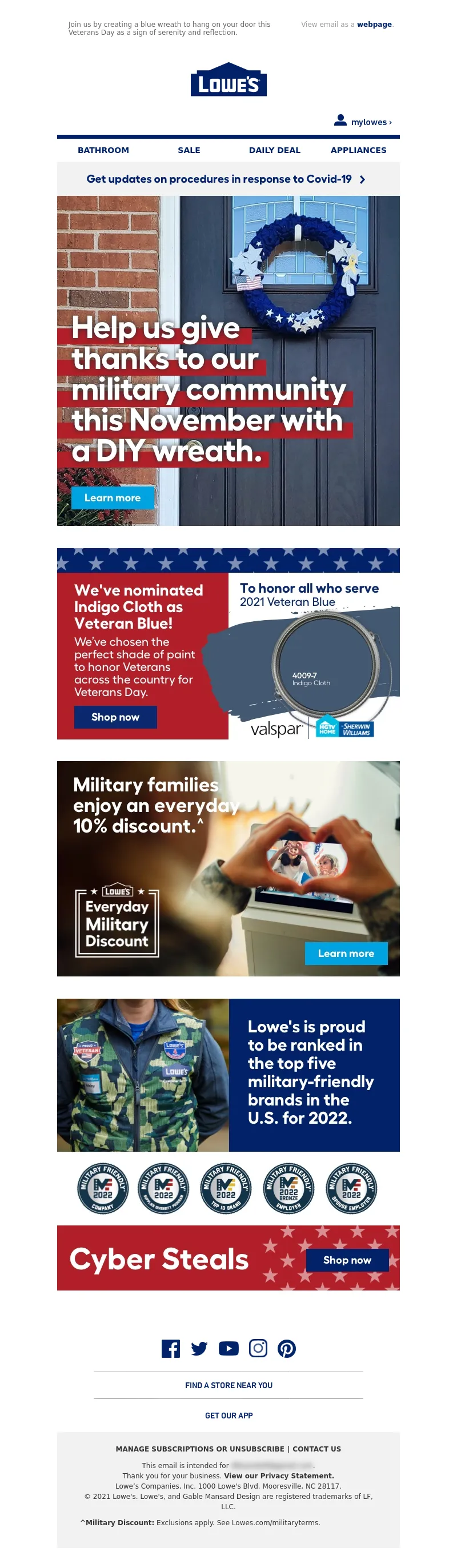
<a data-linkto="https://" href="https://click.e.lowes.com/?qs=74d250d4d6c8cee03917058394923b14473cbcb8c662c1f11e5f900318be79dae7f73e1c9ece5fe66e5400e09696034efcccbbd14f42d2a8cb2226dcde2d733e" target="_blank" title=""><img alt="Help us give thanks to our military community this November with a DIY wreath." data-assetid="40008" src="https://image.e.lowes.com/lib/fe9515707364027471/m/64/ef977d48-5f65-431f-846a-879fc8571924.jpg" style="display: block; width: 100%; padding: 0px; text-align: center; height: auto;" width="600"></a></td></tr></table></td></tr></table>
<table cellpadding="0" cellspacing="0" width="100%" role="presentation" style="min-width: 100%; " class="stylingblock-content-wrapper"><tr><td class="stylingblock-content-wrapper camarker-inner"><table align="center" border="0" cellpadding="0" cellspacing="0" class="container" width="600">
<tr>
<td>
<a data-linkto="https://" href="https://click.e.lowes.com/?qs=74d250d4d6c8cee0e6d05316a8e5a0e7719b514180fe8f61425ab1475eb03b61680dd895b87a1a14228ac04f504a93f41779c3b34d96c261c79ac3ce528e5d79" target="_blank" title=""><img alt="We've nominated Indigo Cloth as Veteran Blue! We've chosen the perfect shade of paint to honor Veterans across the country for Veterans Day." data-assetid="40043" src="https://image.e.lowes.com/lib/fe9515707364027471/m/64/5b3beed1-8737-4cb6-99ab-9ff47ca135eb.png" style="display: block; width: 100%; padding: 0px; text-align: center; height: auto;" width="600"></a></td></tr></table></td></tr></table>
<table cellpadding="0" cellspacing="0" width="100%" role="presentation" style="min-width: 100%; " class="stylingblock-content-wrapper"><tr><td class="stylingblock-content-wrapper camarker-inner"><table align="center" border="0" cellpadding="0" cellspacing="0" class="container" width="600">
<tr>
<td>
<a data-linkto="https://" href="https://click.e.lowes.com/?qs=74d250d4d6c8cee019ee1b2c0b98b87089f2191ca514965cf50cefa4786edf59d2cb15f3918eafde6ca6548d4524b57948c585a777bc2759227ea4985e6188ee" target="_blank" title=""><img alt="Military families enjoy an everyday 10% discount." data-assetid="40006" src="https://image.e.lowes.com/lib/fe9515707364027471/m/64/9c32e137-327c-4f2b-aedf-b89871a26ba3.jpg" style="display: block; width: 100%; padding: 0px; text-align: center; height: auto;" width="600"></a></td></tr></table></td></tr></table>
<table cellpadding="0" cellspacing="0" width="100%" role="presentation" style="min-width: 100%; " class="stylingblock-content-wrapper"><tr><td class="stylingblock-content-wrapper camarker-inner"><table align="center" border="0" cellpadding="0" cellspacing="0" class="container" width="600">
<tr>
<td>
<a alias="" conversion="false" data-linkto="other" href="" target="_blank" title=""><img alt="Lowe's is proud to be ranked in the top five military-friendly brands in the U.S. for 2022." data-assetid="40005" src="https://image.e.lowes.com/lib/fe9515707364027471/m/64/878a827e-9a1f-4abd-830b-8836886b3766.png" style="display: block; width: 100%; padding: 0px; text-align: center; height: auto;" width="600"></a></td></tr></table></td></tr></table><table cellpadding="0" cellspacing="0" width="100%" role="presentation" style="min-width: 100%; " class="stylingblock-content-wrapper"><tr><td class="stylingblock-content-wrapper camarker-inner"><table align="center" border="0" cellpadding="0" cellspacing="0" class="container" width="600">
<tr>
<td>
<a data-linkto="https://" href="https://click.e.lowes.com/?qs=74d250d4d6c8cee0d70a00676dac3a5ec72e72eeacb92dc41f2cbe8c646fc1f8b07d99aa018683c2bc8a7bc8fd5758fd4717cd7bac1651847bd202bc093061ef" target="_blank" title=""><img alt="Cyber Steals." data-assetid="40004" src="https://image.e.lowes.com/lib/fe9515707364027471/m/64/4d7e52bf-a8de-44c9-baea-0461803a36a5.jpg" style="display: block; width: 100%; padding: 0px; text-align: center; height: auto;" width="600"></a></td></tr></table></td></tr></table>
<table cellpadding="0" cellspacing="0" width="100%" role="presentation" style="min-width: 100%; " class="stylingblock-content-wrapper"><tr><td class="stylingblock-content-wrapper camarker-inner"><table border="0" cellpadding="0" cellspacing="0" width="100%">
<tr>
<td style="font-size:0%;">
<img alt="" border="0" height="30" src="https://image.e.lowes.com/lib/fe9515707364027471/m/32/20131010_promo_spacer.gif" style="display:block" width="1"></td></tr></table></td></tr></table>
<table cellpadding="0" cellspacing="0" width="100%" role="presentation" style="min-width: 100%; " class="stylingblock-content-wrapper"><tr><td class="stylingblock-content-wrapper camarker-inner"><!----><table align="center" border="0" cellpadding="0" cellspacing="0" class="container" width="100%">
<tr>
<td align="center" bgcolor="#ffffff" style="font-family:Arial, Helvetica, sans-serif; font-size:12px; color:#666666; padding-top:10px;" valign="top">
<!---->
<!--[if !mso]><!-- --><table align="center" bgcolor="#ffffff" border="0" cellpadding="0" cellspacing="0" class="mobile-only container" style="display: none;" width="100%">
<tr>
<td align="center" style="font-size: 0px; line-height: 1px; mso-line-height-rule: exactly;" valign="top">
<img alt="" border="0" class="photo" height="1" src="https://image.e.lowes.com/lib/fe9515707364027471/m/56/bb6af455-49ee-4acd-a650-0ef4929ac4a7.jpg" style="display:block; width: 100%; height: 1px;" width="100%"></td></tr><tr>
<td align="center" height="40" valign="middle">
<!--NAV1001 Link Starts here--><a href="https://click.e.lowes.com/?qs=74d250d4d6c8cee04bde651cdd38b1669ef4957dd6bd169200b462e7da4c8cf1195b844c3537e052a6573620f332f2791037fcc7aeca538aa5877488107f001c" style="color: #012169; text-decoration: none; font-family: Helvetica, Arial, sans-serif; font-size: 14px;" target="_blank" title="BATHROOM"><strong>BATHROOM</strong></a> <!--NAV1001 Link Ends here--></td></tr><tr>
<td align="center" height="40" style="border-top: 1px solid #a1a1a1;" valign="middle">
<!--NAV1002 Link Starts here--><a href="https://click.e.lowes.com/?qs=74d250d4d6c8cee0534be812133a0ca196e4852e7501e23c3b02c7aeea27b8bb91ce55bee7456786c5f011ff8a4a8efbdba6e416fa92972a27c901056aa90632" style="color: #012169; text-decoration: none; font-family: Helvetica, Arial, sans-serif; font-size: 14px;" target="_blank" title="SALE"><strong>SALE</strong></a> <!--NAV1002 Link Ends here--></td></tr><tr>
<td align="center" height="40" style="border-top: 1px solid #a1a1a1;" valign="middle">
<!--NAV1003 Link Starts here--><a href="https://click.e.lowes.com/?qs=74d250d4d6c8cee0591566852e4ba3582369c61485edcc07a1e1fd6cbb11554f06b166bad694b538bb3e49a74e5c002bb20f9123888ff3791a3abe3f3141f87c" style="color: #012169; text-decoration: none; font-family: Helvetica, Arial, sans-serif; font-size: 14px;" target="_blank" title="DAILY DEAL"><strong>DAILY DEAL</strong></a> <!--NAV1003 Link Ends here--></td></tr><tr>
<td align="center" height="40" style="border-top: 1px solid #a1a1a1;" valign="middle">
<!--NAV1004 Link Starts here--><a href="https://click.e.lowes.com/?qs=74d250d4d6c8cee011e6b890e2bc57831eb4686d59f338b04db0eb08a43b87e242e11c48e6decc41b8cfa89f257c80462122de8e34e536d9a053beae8396dc6b" style="color: #012169; text-decoration: none; font-family: Helvetica, Arial, sans-serif; font-size: 14px;" target="_blank" title="APPLIANCES"><strong>APPLIANCES</strong></a> <!--NAV1004 Link Ends here--></td></tr></table><!--<![endif]--><!----><table align="center" border="0" cellpadding="0" cellspacing="0" class="mobile-hidden container" width="100%">
<tr>
</tr><tr>
<td align="center" style="padding-bottom: 14px;">
<table border="0" cellpadding="0" cellspacing="0">
<tr>
<td>
<a href="https://click.e.lowes.com/?qs=74d250d4d6c8cee06c45bc9348775caa93e1cfe99955d1bc5346b87e4dfdc5c0962e1ac26245d9a2b48d5f0a7c1d3dce0f30a2f764fe0262" target="_blank" title="Facebook"><img alt="Facebook" border="0" height="49" src="https://image.e.lowes.com/lib/fe9515707364027471/m/59/c6808656-b0d8-442d-a586-6160d7fbd761.png" style="display:block;" width="49"></a></td><td>
<a href="https://click.e.lowes.com/?qs=74d250d4d6c8cee0fe7bd9f816aad9b39221e566bd6ed2a9993081c39ac84f11e9bc26210639bb2e6e699f117fc2ea10aaf3bb69edc2bb21" target="_blank" title="Twitter"><img alt="Twitter" border="0" height="49" src="https://image.e.lowes.com/lib/fe9515707364027471/m/59/b315cf6b-d65a-4b3a-a7c1-5d40c83787b6.png" style="display:block;" width="47"></a></td><td>
<a href="https://click.e.lowes.com/?qs=74d250d4d6c8cee0e7df0407f02a35c60ac0eb96d9e22be7f21e05ce6abff210b39f8afad72a714c26961ac67f86b6294a174bbaebcf281b" target="_blank" title="YouTube"><img alt="YouTube" border="0" height="49" src="https://image.e.lowes.com/lib/fe9515707364027471/m/59/f4bc112b-d366-4497-a878-0f2ce36c4d31.png" style="display:block;" width="55"></a></td><td>
<a href="https://click.e.lowes.com/?qs=74d250d4d6c8cee0ab75931c41364461951e212f92992d7137f2f2fec79b134e27468fe783b0cf4013414e5d7b2f76b5e9be34d4f8bbc61a" target="_blank" title="Instagram"><img alt="Instagram" border="0" height="49" src="https://image.e.lowes.com/lib/fe9515707364027471/m/59/4c4871cd-eb9a-416f-b91f-1b659c50d18d.png" style="display:block;" width="48"></a></td><td>
<a href="https://click.e.lowes.com/?qs=74d250d4d6c8cee0d6feeb67253992c611280c42123b74faec2043fab8695c890b7d011f5ef23274fdc8dd27e4cb8931c529ebd59524682c" target="_blank" title="Pinterest"><img alt="Pinterest" border="0" height="49" src="https://image.e.lowes.com/lib/fe9515707364027471/m/59/c3a70af5-4e26-408f-98ca-32c55030b8b0.png" style="display:block;" width="48"></a></td></tr></table></td></tr></table><table align="center" border="0" cellpadding="0" cellspacing="0" class="container" width="473">
<tr>
<td align="center" style="padding-bottom: 12px; font-size: 0px; line-height: 1px; mso-line-height-rule: exactly;" valign="top">
<img alt="" border="0" class="photo" height="1" src="https://image.e.lowes.com/lib/fe9515707364027471/m/56/bb6af455-49ee-4acd-a650-0ef4929ac4a7.jpg" style="display:block; width: 100%; height: 1px;" width="100%"></td></tr><tr>
<td align="center" style="font-size: 14px; line-height: 22px; mso-line-height-rule: exactly;" valign="middle">
<a href="https://click.e.lowes.com/?qs=74d250d4d6c8cee056082c9ba97679427c5731e914add83596791201c7f7ab00c0231db41f22d2e65ffbf0d2a5d4a66c595394c4f7bb5e851cb90f0708449d81" style="color: #012169; font-family: 'DIN Next', Arial, Helvetica, sans-serif; font-size: 14px; line-height: 22px; font-weight: bold; text-decoration: none;" target="_blank" title="FIND A STORE NEAR YOU">FIND A STORE NEAR YOU</a></td></tr><tr>
<td align="center" style="padding-top: 12px; padding-bottom: 18px; font-size: 0px; line-height: 1px; mso-line-height-rule: exactly;" valign="top">
<img alt="" border="0" class="photo" height="1" src="https://image.e.lowes.com/lib/fe9515707364027471/m/56/bb6af455-49ee-4acd-a650-0ef4929ac4a7.jpg" style="display:block; width: 100%; height: 1px;" width="100%"></td></tr><tr>
<td align="center" style="font-size: 14px; line-height: 22px; mso-line-height-rule: exactly; padding-bottom: 18px;" valign="top">
<a href="https://click.e.lowes.com/?qs=74d250d4d6c8cee0ee4dda966c8579c4e487628f6db2f597292413a8a2ea80c2719eebb2823b1350b4f523c60e2415558242aaca31b9aaa4f686d277be8641f0" style="color: #012169; font-family: 'DIN Next', Arial, Helvetica, sans-serif; font-size: 14px; line-height: 22px; font-weight: bold; text-decoration: none;" target="_blank" title="GET OUR APP">GET OUR APP</a></td></tr></table><!--[if !mso]><!-- --><table align="center" border="0" cellpadding="0" cellspacing="0" class="mobile-only center" style="display: none; text-align: center;" width="250">
<tr>
<td align="center" style="padding-bottom: 14px; text-align: center;">
<table align="center" border="0" cellpadding="0" cellspacing="0" style="display: inline-block; text-align: center;" width="250">
<tr>
<td>
<a href="https://click.e.lowes.com/?qs=74d250d4d6c8cee06c45bc9348775caa93e1cfe99955d1bc5346b87e4dfdc5c0962e1ac26245d9a2b48d5f0a7c1d3dce0f30a2f764fe0262" target="_blank" title="Facebook"><img alt="Facebook" border="0" height="49" src="https://image.e.lowes.com/lib/fe9515707364027471/m/59/c6808656-b0d8-442d-a586-6160d7fbd761.png" width="49"></a></td><td>
<a href="https://click.e.lowes.com/?qs=74d250d4d6c8cee0fe7bd9f816aad9b39221e566bd6ed2a9993081c39ac84f11e9bc26210639bb2e6e699f117fc2ea10aaf3bb69edc2bb21" target="_blank" title="Twitter"><img alt="Twitter" border="0" height="49" src="https://image.e.lowes.com/lib/fe9515707364027471/m/59/b315cf6b-d65a-4b3a-a7c1-5d40c83787b6.png" width="47"></a></td><td>
<a href="https://click.e.lowes.com/?qs=74d250d4d6c8cee0e7df0407f02a35c60ac0eb96d9e22be7f21e05ce6abff210b39f8afad72a714c26961ac67f86b6294a174bbaebcf281b" target="_blank" title="YouTube"><img alt="YouTube" border="0" height="49" src="https://image.e.lowes.com/lib/fe9515707364027471/m/59/f4bc112b-d366-4497-a878-0f2ce36c4d31.png" width="55"></a></td><td>
<a href="https://click.e.lowes.com/?qs=74d250d4d6c8cee0ab75931c41364461951e212f92992d7137f2f2fec79b134e27468fe783b0cf4013414e5d7b2f76b5e9be34d4f8bbc61a" target="_blank" title="Instagram"><img alt="Instagram" border="0" height="49" src="https://image.e.lowes.com/lib/fe9515707364027471/m/59/4c4871cd-eb9a-416f-b91f-1b659c50d18d.png" width="48"></a></td><td>
<a href="https://click.e.lowes.com/?qs=74d250d4d6c8cee0d6feeb67253992c611280c42123b74faec2043fab8695c890b7d011f5ef23274fdc8dd27e4cb8931c529ebd59524682c" target="_blank" title="Pinterest"><img alt="Pinterest" border="0" height="49" src="https://image.e.lowes.com/lib/fe9515707364027471/m/59/c3a70af5-4e26-408f-98ca-32c55030b8b0.png" width="48"></a></td></tr></table></td></tr></table><!--<![endif]--><table align="center" bgcolor="#f2f2f2" border="0" cellpadding="0" cellspacing="0" class="container" width="100%">
<tr>
<td align="center" style="padding-top:10px;padding-bottom:10px;">
<table align="center" bgcolor="#f2f2f2" border="0" cellpadding="0" cellspacing="0" class="container" width="90%">
<tr>
<td align="center" style="padding-top:10px;padding-bottom:10px;">
<table align="center" bgcolor="#f2f2f2" border="0" cellpadding="0" cellspacing="0" class="Width90">
<tr>
<!----><th align="center" bgcolor="#f2f2f2" class="drop-center" style="font-family: Arial, Helvetica, sans-serif; font-size: 12px; line-height: 20px;" valign="middle">
<a href="https://click.e.lowes.com/?qs=74d250d4d6c8cee05b91e3e1cf23e42212319dfa5243f91c730aaf30c6542b976ec9865cf40b496b92df44e22534a6a3b1373192906b29da6dfa3a6d45765980" style="text-decoration: none; color: #333333; font-weight: bold;" target="_blank" title=">MANAGE SUBSCRIPTIONS OR UNSUBSCRIBE">MANAGE SUBSCRIPTIONS OR UNSUBSCRIBE</a></th><!----><th align="center" bgcolor="#f2f2f2" class="mobile-hidden" style="color: #333333; font-size:12px; padding-left:5px; padding-right:5px; line-height: 20px;" valign="middle">
|</th><th align="center" bgcolor="#f2f2f2" class="drop-center" style="font-family: Arial, Helvetica, sans-serif; font-size: 12px; line-height: 20px;" valign="middle">
<a href="https://click.e.lowes.com/?qs=74d250d4d6c8cee0a7b475cc67d165c83ce5a4a2d9147ea64a8a9e869a06043db67dca4415fb98f89a6ef4989316e18a981ee8984d02ed3daa07fb58c447ccfa" style="text-decoration: none; color: #333333; font-weight: bold;" target="_blank" title="CONTACT US">CONTACT US</a></th></tr></table></td></tr><tr>
<td align="center" style="-webkit-text-size-adjust:none; vertical-align:top; font-family:Helvetica, Arial, sans-serif; font-size:12px; color: #333333; text-decoration: none; line-height: 18px; font-weight:normal; padding-left: 10px; padding-right: 10px;">
This email is intended for <a href="#" style="color:#333333; text-decoration:none;">james.bond007@mi6.co.uk</a>.<br>
Thank you for your business. <a href="https://click.e.lowes.com/?qs=74d250d4d6c8cee0aae7e831fd9288b9ce168204e2a67b5426062221b416c42fdb678ec1b38321f7be69fa31c2fb727dd549542d9580855bff2ef394bbc41d82" style="font-weight: bold; color: #333333; text-decoration: none;" target="_blank" title="View our Privacy Statement.">View our Privacy Statement.</a><br>
Lowe’s Companies, Inc. 1000 Lowe's Blvd. Mooresville, NC 28117.<br>
© 2021 Lowe's. Lowe's, and Gable Mansard Design are registered trademarks of LF, LLC.</td></tr><!----><tr>
<td align="left" style="-webkit-text-size-adjust:none; vertical-align:top; font-family:Helvetica, Arial, sans-serif; font-size:12px; color: #333333; text-decoration: none; line-height: 18px; font-weight:normal; padding: 10px;">
<b>^Military Discount:</b> Exclusions apply. See Lowes.com/militaryterms.</td></tr><!----><tr>
<td style="-webkit-text-size-adjust:none; vertical-align:top; font-family:Helvetica, Arial, sans-serif; font-size:12px; color: #333333; text-decoration: none; text-align: left; line-height: 18px; font-weight:normal; padding-top: 5px; padding-bottom: 10px;">
</td></tr></table></td></tr></table></td></tr></table></td></tr></table>
</td>
</tr>
</table>
</td>
</tr>
</table>
<img src="https://pixel.inbox.exacttarget.com/pixel.gif?r=3cee957cf4045be5bdd97f3d45b56bc1d2d850ec" width="1" height="1" />
<img src="https://beacon.krxd.net/1x1_usermatch.gif?partner=LYMUCbth_sfmc_1060694_sha256&partner_uid=ed288a60fef0d429a6e67d2d71af1392792076007be48ca2ecc94afc5c372498" width=0 height=0 style="display:none" />
<img src="https://beacon.krxd.net/1x1_usermatch.gif?partner=LYMUCbth_sfmc_1060694_subid&partner_uid=129182386" width=0 height=0 style="display:none" />
<img src="https://beacon.krxd.net/1x1_ad_impression.gif?confid=r3dodf9im&advertiserid=1060694&campaignid=20211111_DIY_Enterprise_1SL2" width=0 height=0 style="display:none;" />
<img src="https://click.e.lowes.com/open.aspx?ffcb10-fec5177172610d7c-fe201770776d0c747d1272-fe9515707364027471-ff991773-fe2715727c650c7f761c76-fef7177676600c&d=40121&bmt=0" width="1" height="1" alt="">
</div>
</body>
</html>