40
Average Subject Line Characters
258
Total Recieved
6
Monthly Average
2
Weekly Average
> 1
Daily Average
Parent Domain:
lowes.com
Subdomains:
lowes@e.lowes.com
From Names:
Lowe's Home Improvement
Mylowe's Rewards
From: Lowe's Home Improvement
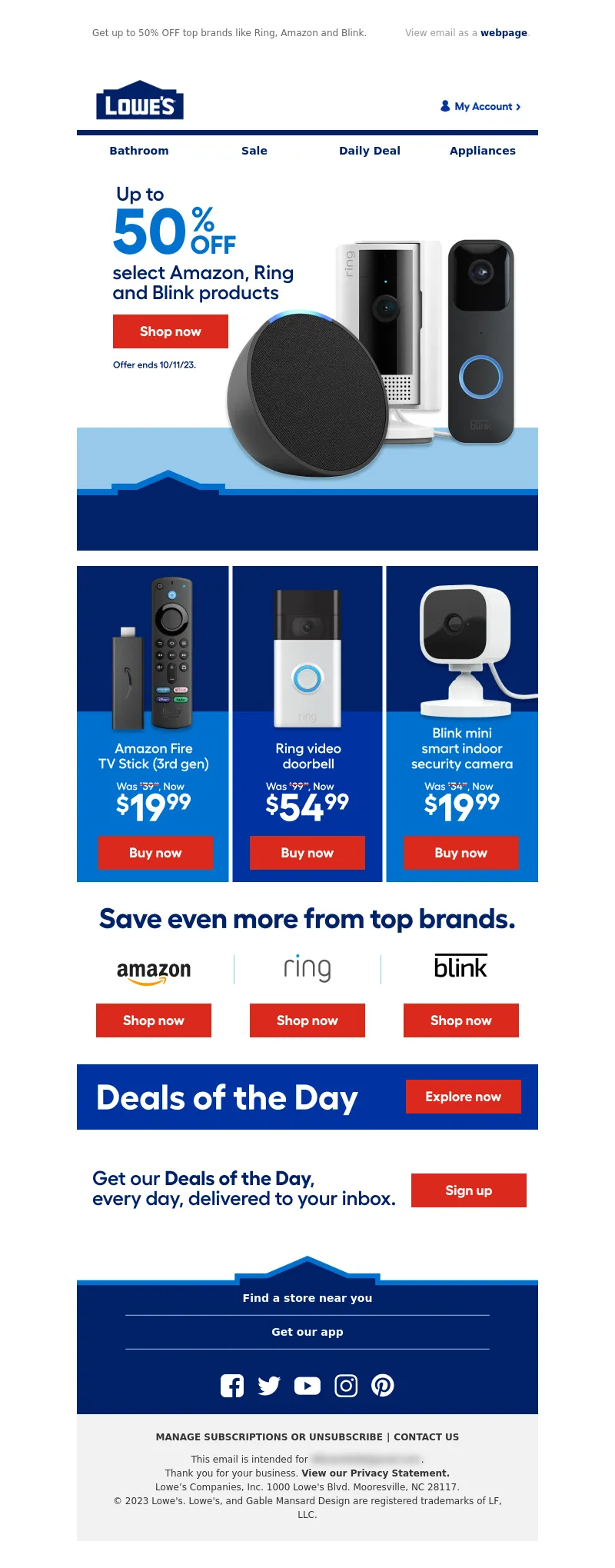
Subject Line: 72 hours of super savings on smart home.
<!DOCTYPE html PUBLIC"-//W3C//DTD XHTML 1.0 Transitional//EN" "https://www.w3.org/TR/xhtml1/DTD/xhtml1-transitional.dtd">
<html xmlns="https://www.w3.org/1999/xhtml">
<head>
<meta http-equiv="Content-Type" content="text/html; charset=UTF-8" />
<meta name="viewport" content="width=device-width, initial-scale=1.0" />
<meta name="x-apple-disable-message-reformatting" />
<!--[if !mso]><!-->
<style type="text/css">
@font-face {
font-family: 'Fellix Regular';
src: local('Fellix Regular'), local('Fellix Regular'), url('https://www.lowescdn.com/sffonts/Fellix-Regular.woff') format('woff');
}
@font-face {
font-family: 'Fellix Medium';
src: local('Fellix Medium'), local('Fellix Medium'), url('https://www.lowescdn.com/sffonts/Fellix-Medium.woff') format('woff');
}
@font-face {
font-family: 'Fellix Bold';
src: local('Fellix Bold'), local('Fellix Bold'), url('https://www.lowescdn.com/sffonts/Fellix-Bold.woff') format('woff');
}
</style>
<!--<![endif]-->
<!--[if !mso]><!-->
<style type="text/css">
@font-face {
font-family: 'DIN Next';
src: local('DIN Next'), local('DIN Next'), url('https://www.lowescdn.com/scaffold/1.4.4/fonts/din/din-next.woff') format('woff');
}
@font-face {
font-family: 'DIN Next Bold';
src: local('DIN Next Bold'), local('DIN Next Bold'), url('https://www.lowescdn.com/scaffold/1.2.0/fonts/din/din-next-bold.woff') format('woff');
}
@font-face {
font-family: 'DIN Next Black';
src: local('DIN Next Black'), local('DIN Next Black'), url('https://www.lowescdn.com/scaffold/1.2.0/fonts/din/din-next-black.woff') format('woff');
}
</style>
<!--<![endif]-->
<style type="text/css">
.ReadMsgBody{
width: 100%;
}
/* Forces Hotmail to display emails at full width */
.ExternalClass {
width: 100%;
}
/*Hotmail table centering fix*/
.ExternalClass, .ExternalClass p, .ExternalClass span, .ExternalClass font, .ExternalClass td, .ExternalClass div {
line-height: 100%;
}
/* Forces Hotmail to display normal line spacing*/
.ExternalClass * {
line-height: 100%}
p {
margin: 1em 0;
}
/*Yahoo paragraph fix*/
table td {
border-collapse: collapse;
}
/*This resolves the Outlook 07, 10, and Gmail td padding issue fix*/
/*This resolves the issue when iphone puts links on dates, etc.*/
a[x-apple-data-detectors] {
color: inherit !important;
text-decoration: none !important;
font-size: inherit !important;
font-family: inherit !important;
font-weight: inherit !important;
line-height: inherit !important;
}
a.mobileshow, .mobilehide {
display: none;
color: #fff;
/*for Gmail */
}
</style>
<style type="text/css">
@media screen and (min-width: 375px) and (max-width: 600px) and (-webkit-min-device-pixel-ratio:0) {
.mobile-hidden {
display: none !important;
}
.no-padding {
padding: 0px !important;
}
.mobile-only {
display: block !important;
max-height: none !important;
}
.container {
width: 100% !important;
}
.navcontainer tbody{
width: 100% !important;
display: table !important;
}
.drop {
width: 100% !important;
display: block !important;
}
.drop-center {
width: 100% !important;
display: block !important;
text-align: center !important;
}
.photo {
width: 100% !important;
height: auto !important;
}
}
</style>
<style type="text/css">
/* Media query triggers alternate styles when the file is displayed on a device with a maximum width lower than the assigned pixel dimension. The default max width setting for max-width should be 480px to trigger on mobile devices. */
@media only screen and (max-width: 480px) {
html,body {
width: 100% !important;
min-width:100% !important;
max-width: 480px !important;
overflow-x: hidden !important;
margin:0 auto !important;
}
.mobile-hidden, .tablet-hidden {
display:none !important;
}
.mobile-photo {
width:100% !important;
max-width: 450px !important;
height:auto !important;
}
.no-padding {
padding:0px !important;
}
.mobile-only {
display: block !important;
max-height: none !important;
}
.container {
width:100% !important;
max-width:480px !important;
}
.photo {
width:100% !important;
max-width:480px !important;
height:auto !important;
}
.managesubs {
width:83% !important;
height:auto !important;
}
.photo390 {
display: block !important;
height: auto !important;
max-width: 390px !important;
width: 100% !important;
}
body[data-outlook-cycle] .oa {
width: 100% !important;
max-width: 480px !important;
text-align: center !important;
overflow-x: hidden !important;
display:block !important;
}
.drop {
width: 100% !important;
max-width: 480px !important;
display: block !important;
}
.drop-social {
width:100% !important;
max-width: 480px !important;
display:block !important;
text-align:center !important;
padding:0px !important;
}
.center {
text-align:center !important;
}
.center50 {
width:50% !important;
padding-right:10px !important;
padding-left:10px !important;
}
.drop-center {
width:100% !important;
max-width: 480px !important;
display:block !important;
text-align:center !important;
}
.Full100 {
width:100% !important;
max-width: 480px !important;
height:auto!important;
line-height:normal!important;
}
.pad10 {
padding-left:10px !important;
padding-right: 10px !important;
}
.sub_nav {
border-bottom:2px solid #ffffff;
display: table-cell !important;
width: auto !important;
height: auto !important;
float: none !important;
overflow: auto !important;
line-height:normal !important;
font-size:15px !important;
background-color: #15b5e5 !important;
}
.sub_nav_bottom {
border-bottom:2px solid #ffffff;
display: table-cell !important;
width: auto !important;
height: auto !important;
float: none !important;
overflow: auto !important;
line-height:normal !important;
font-size:15px !important;
}
.sub_nav_top {
display: table-cell !important;
width: auto !important;
height: auto !important;
float: none !important;
overflow: auto !important;
font-size:18px !important;
line-height:30px !important;
}
.tablet-only {
display: block !important;
max-height: none !important;
}
.Width70 {
width: 60% !important;
text-align: center !important;
}
.Width90 {
width: 90% !important;
text-align: center !important;
}
.container1 {
width: 100% !important;
max-width: 316px !important;
}
.mobile-only1 {
display: inline-block !important;
}
.mobile-left-image {
width: 67px !important;
max-width: 67px !important;
padding-left: 0px !important;
}
.mobile-middle-table {
width: 316px !important;
}
}
</style>
<style type="text/css">
@media only screen and (max-width: 619px) {
.tablet-only {
display: block !important;
max-height: none !important;
}
}
</style>
<style type="text/css">
@media only screen and (max-width: 414px) {
.mobile-hidden, .tablet-hidden {
display:none !important;
}
.mobile-photo {
width:100% !important;
max-width: 414px !important;
height:auto !important;
}
.no-padding {
padding:0px !important;
}
.mobile-only {
display: block !important;
max-height: none !important;
}
.container {
width:100% !important;
max-width:414px !important;
}
.photo {
width:100% !important;
max-width:414px !important;
height:auto !important;
}
.managesubs {
width:83% !important;
height:auto !important;
}
.photo390 {
display: block !important;
height: auto !important;
max-width: 390px !important;
width: 100% !important;
}
body[data-outlook-cycle] .oa {
width: 100% !important;
max-width: 414px !important;
text-align: center !important;
overflow-x: hidden !important;
display:block !important;
}
.drop {
width: 100% !important;
max-width: 414px !important;
display: block !important;
}
.drop-center {
width:100% !important;
max-width: 414px !important;
display:block !important;
text-align:center !important;
}
.Width70 {
width: 60% !important;
max-width: 380px !important;
text-align: center !important;
}
.Width90 {
width: 90% !important;
max-width: 400px !important;
text-align: center !important;
}
.container1 {
width: 100% !important;
max-width: 286px !important;
}
.mobile-left-image {
width: 64px !important;
padding-left: 0px !important;
}
.mobile-middle-table {
width: 286px !important;
}
.mobile-only1 {
display: inline-block !important;
}
}
</style>
<style type="text/css">
@media only screen and (max-width: 375px) {
.mobile-hidden {
display:none !important;
}
.mobile-photo {
width:100% !important;
max-width: 375px !important;
height:auto !important;
}
.no-padding {
padding:0px !important;
}
.mobile-only {
display: block !important;
max-height: none !important;
}
.container {
width:100% !important;
max-width:375px !important;
}
.photo {
width:100% !important;
max-width:375px !important;
height:auto !important;
}
.managesubs {
width:83% !important;
height:auto !important;
}
.photo390 {
display: block !important;
height: auto !important;
max-width: 390px !important;
width: 100% !important;
}
body[data-outlook-cycle] .oa {
width: 100% !important;
max-width: 375px !important;
text-align: center !important;
overflow-x: hidden !important;
display:block !important;
}
.drop {
width: 100% !important;
max-width: 375px !important;
display: block !important;
}
.drop-center {
width:100% !important;
max-width: 375px !important;
display:block !important;
text-align:center !important;
}
.Width70 {
width: 60% !important;
max-width: 300px !important;
text-align: center !important;
}
.Width90 {
width: 90% !important;
max-width: 320px !important;
text-align: center !important;
}
.container1 {
width: 100% !important;
max-width: 247px !important;
}
.mobile-left-image {
width: 56px !important;
max-width: 56px !important;
padding-left: 3px !important;
}
.mobile-middle-table {
width: 265px !important;
}
.mobile-only1 {
display: inline-block !important;
}
}
}
</style>
<style type="text/css">
/*Liveclicker responsive video styles*/
/*Android devices*/
@media only screen and (max-device-width: 480px) {
div.lc-video{
width:100%;
height:auto;
}
}
/* iPhone 5 - Portrait */
@media only screen and (device-width: 320px) {
div.lc-video {
width: 320px;
min-width: 320px;
height: 180px;
}
}
/* iPhone 6 - Portrait */
@media only screen and (device-width: 375px) {
div.lc-video {
width: 375px;
min-width: 375px;
height: 211px;
}
}
/* iPhone 6+ - Portrait */
@media only screen and (device-width: 414px) {
div.lc-video {
width: 414px;
min-width: 414px;
height: 233px;
}
}
/* iPhone 5 - Landscape */
@media only screen and (width: 568px) {
div.lc-video {
width: 568px;
min-width: 586px;
height: 320px;
}
}
/* iPhone 6 - Landscape */
@media only screen and (width: 667px) {
div.lc-video {
width: 600px;
min-width: 600px;
height: 338px;
}
}
/* iPhone 6+ - Landscape */
@media only screen and (width: 736px) {
div.lc-video {
width: 600px;
min-width: 600px;
height: 338px;
}
}
</style>
<title>Lowe's Email
</title>
<script type="application/ld+json">
[{
"@context": "https://schema.org/",
"@type": "Organization",
"name": "Lowe’s",
"logo": "https://i.imgur.com/AkY0dT7.jpg"
},{
"@context": "https://schema.org/",
"@type": "DiscountOffer",
"description": "",
"availabilityStarts": "",
"availabilityEnds": ""
},{
"@context": "https://schema.org/",
"@type": "PromotionCard",
"image": ""
}]
</script>
</head>
<body bgcolor="#ffffff" style="margin: 0; padding:0; -ms-text-size-adjust: none; mso-line-height-rule: exactly;" yahoo="fix">
<div class="oa" align="center">
<!-- Table used to center email -->
<table border="0" cellpadding="0" cellspacing="0" width="100%" class="container">
<tr>
<td>
<!-- Table used to set width of email -->
<table width="600" class="container" border="0" align="center" cellpadding="0" cellspacing="0" style="font-family:Arial, Helvetica, sans-serif">
<tr>
<td>
<table cellpadding="0" cellspacing="0" width="100%" role="presentation" style="min-width: 100%; " class="stylingblock-content-wrapper"><tr><td class="stylingblock-content-wrapper camarker-inner"><table border="0" cellpadding="0" cellspacing="0" class="container" width="100%">
<tr>
<td align="left" bgcolor="#ffffff" style="font-family:Arial, Helvetica, sans-serif; font-size:12px; color:#666666; padding-top:10px; padding-bottom:10px; padding-left:10px;" valign="top">
<table align="left" border="0" cellpadding="0" cellspacing="0" class="Width90" width="100%">
<tr>
<td align="left" bgcolor="#ffffff" class="drop no-padding" style="font-family: Arial, Helvetica, sans-serif; font-size:12px; color:#666666; padding-left:10px; padding-top:10px; padding-bottom:10px;" valign="top">
<!--Preheader Link Starts here--><a href="https://click.e.lowes.com/u/?qs=ce94f896b55f8032bdd2437571ae548541f6bbbd726ce6945cea05a1508ad26697a3512c31fe69e126af15aaa1b10722aec4311a61f61d244e56c978a09594e8" style="color:#666666; text-decoration:none;" target="_blank"><span style="color:#666666; text-decoration:none;" title="Get up to 50% OFF top brands like Ring, Amazon and Blink.">Get up to 50% OFF top brands like Ring, Amazon and Blink.</span></a> <!--Preheader Link Ends here--></td><td align="right" bgcolor="#ffffff" class="mobile-hidden" style="font-family: Arial, Helvetica, sans-serif; font-size:12px; color:#999999; padding-right:10px; padding-left:0px; padding-top:10px; padding-bottom:10px;" valign="top" width="175">
<!---->View email as a <a href="https://view.e.lowes.com/?qs=3f2528cf9e629aac822374d09af755c75cd00bfe58e7be9dc379d0090de21a322d5c59d61dac0c47e403276fb3dfa9d40ee840bb857a4938bc69b79c785b0853e760fa74b51790f3d1f7b5ddf3e9733a" style=" text-decoration:none; color:#012169; font-weight:bold;" target="_blank" title="webpage">webpage</a>.<!----></td></tr></table></td></tr><tr>
<td align="center" height="5" style="padding-top:10px; padding-bottom: 10px;">
</td></tr><tr>
<td align="center" style="padding-top:10px; padding-bottom:10px;" valign="middle"><table align="center" border="0" cellpadding="0" cellspacing="0" width="100%">
<tr>
<td align="left" bgcolor="#ffffff" style="font-family:Arial, Helvetica, sans-serif; font-size:12px; color:#666666; padding-left:22px;" valign="top">
<a href="https://click.e.lowes.com/u/?qs=ce94f896b55f80321753d1fcc49cc0166e9d50864385fc03315852c5ee4ab954c72b220428a9de4846a81c60801188a9289361c1059ba34de034ede48e5ec2c4" target="_blank" title="Lowe's"><img alt="Lowe's" border="0" src="https://image.e.lowes.com/lib/fe9515707364027471/m/59/14f6b444-13d4-4f6b-a52a-df9473ac4be2.png" style="display:block;" width="120"></a></td><td align="right" bgcolor="#ffffff" style="font-family: Helvetica, Arial, sans-serif; font-size:12px; color:#999999; padding-right:22px; padding-bottom:5px; line-height: 36px;" valign="bottom"><a href="https://click.e.lowes.com/u/?qs=ce94f896b55f80321fbd501d3779d6e2e9ff420be130d34051963336027139ba5ba8a7e30413a5357de1fbfb9f8dc742060e4611263bb5997e780925c5dcdacf" target="_blank" title="MyLowe's Login">
<img alt="MyLowe's Login" border="0" src="https://image.e.lowes.com/lib/fe9515707364027471/m/71/62690a78-f84d-4700-8c0b-c6a33b9b324b.png" style="display:block;" width="106" height="34"></a></td></tr></table>
</td></tr><tr>
<td align="center" height="1" style="font-size: 0px;">
<table bgcolor="#012169" border="0" cellpadding="0" cellspacing="0" class="container" width="100%">
<tr>
<td height="7" style="font-size: 0px;" valign="top">
<img alt="" border="0" class="photo" height="7" src="https://image.e.lowes.com/lib/fe9515707364027471/m/59/c301e24e-201b-46f9-8172-27b5acdcbf99.jpg" style="display:block;" width="100%"></td></tr></table></td></tr><tr>
<td>
<table bgcolor="#ffffff" border="0" cellpadding="0" cellspacing="0" class="mobile-hidden" width="100%">
<tr>
<th align="center" class="drop-center" height="20" valign="middle" width="1%">
</th><th align="center" class="drop-center" height="40" valign="middle" width="25%">
<!--NAV1001 Link Starts here--><a href="https://click.e.lowes.com/u/?qs=ce94f896b55f8032489638610ff445b608d43ed72b60fd14510b8036329501aba99dc42360c48d738374a56eed16c557ed36e45b50943b66b3caaae5ef24f278" style="color: #012169; text-decoration: none; font-family: Arial, Helvetica, sans-serif; font-size: 14px;" target="_blank" title="Bathroom"><strong>Bathroom</strong></a> <!--NAV1001 Link Ends here--></th><th align="center" class="drop-center" height="40" valign="middle" width="25%">
<!--NAV1002 Link Starts here--><a href="https://click.e.lowes.com/u/?qs=ce94f896b55f80321d54243073fc0a4e48c2c2fa8545c6db668fc9f97acc84ba39e9e14795e1318df0148ba19da61c0b732055f41f967ccb7c2b3a47dcf13102" style="color: #012169; text-decoration: none; font-family: Arial, Helvetica, sans-serif; font-size: 14px;" target="_blank" title="Sale"><strong>Sale</strong></a> <!--NAV1002 Link Ends here--></th><th align="center" class="drop-center" height="40" valign="middle" width="25%">
<!--NAV1003 Link Starts here--><a href="https://click.e.lowes.com/u/?qs=ce94f896b55f8032fd68703865e46cb704191a606207df5c6fd7c40a3504ec37d64135a7ed9c201142cf581a339fc39b1dbc5f85ecedff453e6fbfa9358979fe" style="color: #012169; text-decoration: none; font-family: Arial, Helvetica, sans-serif; font-size: 14px;" target="_blank" title="Daily Deal"><strong>Daily Deal</strong></a> <!--NAV1003 Link Ends here--></th><th align="center" class="drop-center" height="40" valign="middle" width="25%">
<!--NAV1004 Link Starts here--><a href="https://click.e.lowes.com/u/?qs=ce94f896b55f8032c5080b3e3c1bc63a539ccc2cb687f0945a6e875c19404973a930ea2eb0b2794b748fdf44238c5d941a1bf4f7e54cbda8856f0d9e44d17dc6" style="color: #012169; text-decoration: none; font-family: Arial, Helvetica, sans-serif; font-size: 14px;" target="_blank" title="Appliances"><strong>Appliances</strong></a> <!--NAV1004 Link Ends here--></th></tr></table></td></tr></table></td></tr></table>
<table cellpadding="0" cellspacing="0" width="100%" role="presentation" style="min-width: 100%; " class="stylingblock-content-wrapper"><tr><td class="stylingblock-content-wrapper camarker-inner"><table align="center" border="0" cellpadding="0" cellspacing="0" class="container" width="600">
<tr>
<td>
<a data-linkto="https://" href="https://click.e.lowes.com/u/?qs=ce94f896b55f80326f07547e12c130afba1dbf62813f642170c37dcc1b7f3d71b6263782bc7b7d907a2d405f33677527f88dab7de69de9b7cd1ffa7396ca10de" target="_blank" title=""><img alt="Up to 50% OFF select Amazon, Ring and Blink products. Offer ends 10/11/23." data-assetid="70672" src="https://image.e.lowes.com/lib/fe9515707364027471/m/1/5ef40ec9-7eb6-446c-bfe6-c2ff67fc387d.jpg" style="display: block; width: 100%; padding: 0px; text-align: center; height: auto;" width="600"></a></td></tr></table></td></tr></table>
<table cellpadding="0" cellspacing="0" width="100%" role="presentation" style="min-width: 100%; " class="stylingblock-content-wrapper"><tr><td class="stylingblock-content-wrapper camarker-inner"><table align="center" bgcolor="#808080" border="0" cellpadding="0" cellspacing="0" class="container" width="600">
<tr>
<td valign="top">
<a data-linkto="https://" href="https://click.e.lowes.com/u/?qs=ce94f896b55f8032bae14d5cc58712c639594da7be1fcca07564bf1744bc300f472e4b2c7026fdd24e9316e67f1d4d87e5a27e4bc8a0d45f3d9012b6fd9b9244" target="_blank" title=""><img alt="Amazon Fire TV Stick (3rd gen) Was $39.99, Now $19.99" data-assetid="70669" src="https://image.e.lowes.com/lib/fe9515707364027471/m/1/d6eb06c7-7371-4eab-9acd-570f362aac3d.jpg" style="display: block; padding: 0px; text-align: center; height: auto; width: 100%;" width="200"></a></td><td valign="top">
<a data-linkto="https://" href="https://click.e.lowes.com/u/?qs=ce94f896b55f803241c22e2c8719f28c1cc4f2b3f81dd096e970b8704e39ad443d220083618f76145262c74b5160438aea66ae03a3c3c4bfe391993f9e01bce6" target="_blank" title=""><img alt="Ring video doorbell camera Was $99.99, Now $54.99" data-assetid="70668" src="https://image.e.lowes.com/lib/fe9515707364027471/m/1/b5243e96-45a7-4d9c-a377-0b87109b31fd.jpg" style="display: block; padding: 0px; text-align: center; height: auto; width: 100%;" width="200"></a></td><td valign="top">
<a data-linkto="https://" href="https://click.e.lowes.com/u/?qs=ce94f896b55f8032b870e27b4b6fea156d1a2de69f563e1dd461addcc269c70ea60de3d8de265e2b0ea278739a2588cd41499865eb6725edd52b3efc97e9efb1" target="_blank" title=""><img alt="Blink mini smart indoor security camera Was $34.99, Now $19.99" data-assetid="70670" src="https://image.e.lowes.com/lib/fe9515707364027471/m/1/f97428de-bc0d-4ad3-b62a-97c77feeaa53.jpg" style="display: block; padding: 0px; text-align: center; height: auto; width: 100%;" width="200"></a></td></tr></table></td></tr></table>
<table cellpadding="0" cellspacing="0" width="100%" role="presentation" style="min-width: 100%; " class="stylingblock-content-wrapper"><tr><td class="stylingblock-content-wrapper camarker-inner"><table align="center" border="0" cellpadding="0" cellspacing="0" class="container" width="600">
<tr>
<td>
<img alt="Save even more from top brands." border="0" class="photo" data-assetid="70667" src="https://image.e.lowes.com/lib/fe9515707364027471/m/1/bb55a256-4ec9-43a2-8b61-95114771d7b1.jpg" style="display: block; width: 100%; padding: 0px; text-align: center; height: auto;" width="600"></td></tr></table></td></tr></table>
<table cellpadding="0" cellspacing="0" width="100%" role="presentation" style="min-width: 100%; " class="stylingblock-content-wrapper"><tr><td class="stylingblock-content-wrapper camarker-inner"><table align="center" bgcolor="#808080" border="0" cellpadding="0" cellspacing="0" class="container" width="600">
<tr>
<td valign="top">
<a data-linkto="https://" href="https://click.e.lowes.com/u/?qs=ce94f896b55f803288814b615b32d7313a4ba180c4211f71ee0bfe846410ea205cb440411670ad1051ec18aa4ed9c9d11f696cd8b3df713953d6fbdf48eb10e2" title=""><img alt="amazon" data-assetid="70674" src="https://image.e.lowes.com/lib/fe9515707364027471/m/1/1c791bf5-5cbc-4a4c-9f32-8d4dd7ceadf5.jpg" style="display: block; padding: 0px; text-align: center; height: auto; width: 100%;" width="200"></a></td><td valign="top">
<a data-linkto="https://" href="https://click.e.lowes.com/u/?qs=ce94f896b55f803251a9feb41e8a3b3bdd9f39b33e2802fc31a8fa2c3f672e2c413b685263a3f8fbda6077b250f2cd98cae46fb606ee81dc4b63ea694b9c0536" title=""><img alt="ring" data-assetid="70673" src="https://image.e.lowes.com/lib/fe9515707364027471/m/1/cc27aa0f-e1ef-44f2-bf82-a1bbb0d2aadc.jpg" style="display: block; padding: 0px; text-align: center; height: auto; width: 100%;" width="200"></a></td><td valign="top">
<a data-linkto="https://" href="https://click.e.lowes.com/u/?qs=ce94f896b55f8032ac5b8d7c933bf8c5d3f06f6d57006bdd5827be10522ae6228ac610868edd758ccd2f471835e5480ee5776f278bca9aa5588b01a6067924d3" title=""><img alt="blink" data-assetid="70675" src="https://image.e.lowes.com/lib/fe9515707364027471/m/1/f62d10c4-079a-40b2-9548-fa33e4b29f69.jpg" style="display: block; padding: 0px; text-align: center; height: auto; width: 100%;" width="200"></a></td></tr></table></td></tr></table>
<table cellpadding="0" cellspacing="0" width="100%" role="presentation" style="min-width: 100%; " class="stylingblock-content-wrapper"><tr><td class="stylingblock-content-wrapper camarker-inner"><table align="center" border="0" cellpadding="0" cellspacing="0" class="container" width="600">
<tr>
<td>
<a data-linkto="https://" href="https://click.e.lowes.com/u/?qs=ce94f896b55f8032fb7e60203f8e6f4160ac22d0745042477ce5a7a6afb5d6b4f39bde150d759a4419db1dea42222ab9664348b14d151ed28cf61dbbe9239035" target="_blank" title=""><img alt="Deals of the Day." data-assetid="70671" src="https://image.e.lowes.com/lib/fe9515707364027471/m/1/6846ac3f-7927-47b2-8d95-98559ae6b6ba.jpg" style="display: block; width: 100%; padding: 0px; text-align: center; height: auto;" width="600"></a></td></tr></table></td></tr></table>
<table cellpadding="0" cellspacing="0" width="100%" role="presentation" style="min-width: 100%; " class="stylingblock-content-wrapper"><tr><td class="stylingblock-content-wrapper camarker-inner"><table align="center" border="0" cellpadding="0" cellspacing="0" class="container" width="600">
<tr>
<td>
<a href="https://click.e.lowes.com/u/?qs=ce94f896b55f80320a3f928a740c8fdcc781dc48d75967de1da6dc4149ec6a5e53bae079bcdb3540ecc73288d222736a364440745a82ca2168d530bcfb65801e" target="_blank" title="DOTD"><img alt="DOTD" border="0" class="photo" src="https://image.e.lowes.com/lib/fe9515707364027471/m/72/20a17fc2-3d2e-4516-8f85-037699eea50b.jpg" style="display: block;" width="600"></a></td></tr></table> </td></tr></table>
<table cellpadding="0" cellspacing="0" width="100%" role="presentation" style="min-width: 100%; " class="stylingblock-content-wrapper"><tr><td class="stylingblock-content-wrapper camarker-inner"><table border="0" cellpadding="0" cellspacing="0" width="100%">
<tr>
<td style="font-size:0%;">
<img alt="" border="0" height="30" src="https://image.e.lowes.com/lib/fe9515707364027471/m/32/20131010_promo_spacer.gif" style="display:block" width="1"></td></tr></table></td></tr></table>
<!---->
<table align="center" border="0" cellpadding="0" cellspacing="0" class="container" style="width: 600px; border-collapse: collapse;" width="100%">
<tr>
<td align="center" bgcolor="#ffffff" style="font-family: Arial, Helvetica, sans-serif; font-size:0px; color:#666666; padding: 0px; border-bottom: 2px solid #012169;" valign="bottom">
<img alt="Lowe's" border="0" class="photo" src="https://image.e.lowes.com/lib/fe9515707364027471/m/71/fb17fb6a-e05f-4a5e-8990-24cabe14e1e6.png" width="600" height="46"></td></tr>
<!----><!--[if !mso]><!-- -->
<tr>
<td align="center" bgcolor="#012169" style="font-family: 'Fellix Regular', Arial, Helvetica, sans-serif; font-size:12px; color:#666666;" valign="top">
<table align="center" bgcolor="#012169" border="0" cellpadding="0" cellspacing="0" class="mobile-only container" style="display: none;" width="100%">
<tr>
<td align="center" height="40" valign="middle">
<!--NAV1001 Link Starts here--><a href="https://click.e.lowes.com/u/?qs=ce94f896b55f8032489638610ff445b608d43ed72b60fd14510b8036329501aba99dc42360c48d738374a56eed16c557ed36e45b50943b66b3caaae5ef24f278" style="color: #ffffff; text-decoration: none; font-family: Helvetica, Arial, sans-serif; font-size: 14px;" target="_blank" title="Bathroom"><strong>Bathroom</strong></a> <!--NAV1001 Link Ends here--></td></tr><tr>
<td align="center" height="40" style="border-top: 1px solid #79a8d1;" valign="middle">
<!--NAV1002 Link Starts here--><a href="https://click.e.lowes.com/u/?qs=ce94f896b55f80321d54243073fc0a4e48c2c2fa8545c6db668fc9f97acc84ba39e9e14795e1318df0148ba19da61c0b732055f41f967ccb7c2b3a47dcf13102" style="color: #ffffff; text-decoration: none; font-family: Helvetica, Arial, sans-serif; font-size: 14px;" target="_blank" title="Sale"><strong>Sale</strong></a> <!--NAV1002 Link Ends here--></td></tr><tr>
<td align="center" height="40" style="border-top: 1px solid #79a8d1;" valign="middle">
<!--NAV1003 Link Starts here--><a href="https://click.e.lowes.com/u/?qs=ce94f896b55f8032fd68703865e46cb704191a606207df5c6fd7c40a3504ec37d64135a7ed9c201142cf581a339fc39b1dbc5f85ecedff453e6fbfa9358979fe" style="color: #ffffff; text-decoration: none; font-family: Helvetica, Arial, sans-serif; font-size: 14px;" target="_blank" title="Daily Deal"><strong>Daily Deal</strong></a> <!--NAV1003 Link Ends here--></td></tr><tr>
<td align="center" height="40" style="border-top: 1px solid #79a8d1;" valign="middle">
<!--NAV1004 Link Starts here--><a href="https://click.e.lowes.com/u/?qs=ce94f896b55f8032c5080b3e3c1bc63a539ccc2cb687f0945a6e875c19404973a930ea2eb0b2794b748fdf44238c5d941a1bf4f7e54cbda8856f0d9e44d17dc6" style="color: #ffffff; text-decoration: none; font-family: Helvetica, Arial, sans-serif; font-size: 14px;" target="_blank" title="Appliances"><strong>Appliances</strong></a> <!--NAV1004 Link Ends here--></td></tr><tr>
<td align="center" style="font-size: 0px; line-height: 6px; mso-line-height-rule: exactly;" valign="top">
<img alt="" border="0" class="photo" height="6" src="https://image.e.lowes.com/lib/fe9515707364027471/m/71/ad569dc5-361d-4d7d-8bc0-1ae6ec389f05.png" style="display:block; width: 100%; height: 6px;" width="100%"></td></tr></table>
</td></tr>
<!--<![endif]--><!---->
<tr>
<td align="center" bgcolor="#012169" style="font-family: 'Fellix Regular', Arial, Helvetica, sans-serif; font-size:12px; color:#666666; padding-bottom: 16px;" valign="top">
<table align="center" border="0" cellpadding="0" cellspacing="0" class="container" width="476">
<!--[if !mso]><!-- -->
<tr>
<td align="center" style="font-size: 14px; line-height: 22px; mso-line-height-rule: exactly; padding-top: 8px; display:none;" valign="middle" class="mobile-only"></td></tr><!--<![endif]-->
<tr>
<td align="center" style="font-size: 14px; line-height: 22px; mso-line-height-rule: exactly; padding-top: 0px;" valign="middle">
<a href="https://click.e.lowes.com/u/?qs=ce94f896b55f80323caf638f686918eddcec0128a7cf114f48bc33b8d139447b7d40bc94736751c6238c01cd1d48f0c116fca7b5ba6d69b010a3031c16270cb6" style="color: #ffffff; font-family: Helvetica, Arial, sans-serif; font-size: 14px; line-height: 22px; font-weight: bold; text-decoration: none;" target="_blank" title="Find a store near you">Find a store near you</a></td></tr><tr>
<td align="center" style="padding-top: 8px; padding-bottom: 8px; font-size: 0px; line-height: 6px; mso-line-height-rule: exactly;" valign="top">
<img alt="" border="0" class="photo" height="6" src="https://image.e.lowes.com/lib/fe9515707364027471/m/71/ad569dc5-361d-4d7d-8bc0-1ae6ec389f05.png" style="display:block; width: 100%; height: 6px;" width="100%"></td></tr><tr>
<td align="center" style="font-size: 14px; line-height: 22px; mso-line-height-rule: exactly; padding-bottom: 8px;" valign="middle">
<a href="https://click.e.lowes.com/u/?qs=ce94f896b55f8032485938216b95a7280e1efced139983943882f11ab2c5beb6b895564dc4458d3cc5507003d1c0a3f0e45aa03e94f20cbaaf6092a24fe40d3f" style="color: #ffffff; font-family: Helvetica, Arial, sans-serif; font-size: 14px; line-height: 22px; font-weight: bold; text-decoration: none;" target="_blank" title="GET OUR APP">Get our app</a></td></tr><tr>
<td align="center" style="padding-bottom: 12px; font-size: 0px; line-height: 6px; mso-line-height-rule: exactly;" valign="top">
<img alt="" border="0" class="photo" height="6" src="https://image.e.lowes.com/lib/fe9515707364027471/m/71/ad569dc5-361d-4d7d-8bc0-1ae6ec389f05.png" style="display:block; width: 100%; height: 6px;" width="100%"></td></tr></table></td></tr><tr>
<td align="center" bgcolor="#012169" style="font-family:Arial, Helvetica, sans-serif; font-size:12px; color:#666666; padding-bottom: 20px;" valign="top">
<table bgcolor="#012169" border="0" cellpadding="0" cellspacing="0">
<tr>
<td style="padding-right: 14px;">
<a href="https://click.e.lowes.com/u/?qs=ce94f896b55f80324760f48be4d9cb2d3b39aeffeb9c18d983acf74fe9b2e806c402b9abc370ba722c886775dee3c517c6a9ca88e6469dd1" target="_blank" title="Facebook"><img alt="Facebook" border="0" height="34" src="https://image.e.lowes.com/lib/fe9515707364027471/m/71/34159e50-d8f2-4797-ab5f-ce3d49ab0acf.png" style="display:block;" width="34"></a></td><td>
<a href="https://click.e.lowes.com/u/?qs=ce94f896b55f8032d82afd47b91251750fcf9fcea867fddcc6fb06f638fa43876c61843051138c4a23947985b83947d8e378d0ee28d9ad24" target="_blank" title="Twitter"><img alt="Twitter" border="0" height="34" src="https://image.e.lowes.com/lib/fe9515707364027471/m/71/3c26dcdd-70c7-42ee-ae07-20fda5b6e929.png" style="display:block;" width="34"></a></td><td style="padding-left: 14px; padding-right: 14px;">
<a href="https://click.e.lowes.com/u/?qs=ce94f896b55f8032547f564a43e5945ca3950d3b83d1023866a18232a4632e0dbc8152c649af25aadd2f57851ecc501f9da9650fdd40b1ba" target="_blank" title="YouTube"><img alt="YouTube" border="0" height="34" src="https://image.e.lowes.com/lib/fe9515707364027471/m/71/a455d08e-6178-40e6-966c-b515f6bbe656.png" style="display:block;" width="38"></a></td><td>
<a href="https://click.e.lowes.com/u/?qs=ce94f896b55f8032f74eb1146e15cadde8f9950ad684b87b2a33666989dbec15251b67a1986a4eb86f6d06e46b9f7b74a58306483957011c" target="_blank" title="Instagram"><img alt="Instagram" border="0" height="34" src="https://image.e.lowes.com/lib/fe9515707364027471/m/71/5b978eef-757f-4094-8108-724c8e072c6b.png" style="display:block;" width="34"></a></td><td style="padding-left: 14px;">
<a href="https://click.e.lowes.com/u/?qs=ce94f896b55f80320c6bcf25de6734086a46c2718eafbf46521ea34375e3f3bb2c15ead9e7876a8e1460b6dca5dc5a86f135a838f5680991" target="_blank" title="Pinterest"><img alt="Pinterest" border="0" height="34" src="https://image.e.lowes.com/lib/fe9515707364027471/m/71/a497073f-6626-4e7b-97d3-775bb3cca507.png" style="display:block;" width="34"></a></td></tr></table></td></tr></table>
<table align="center" bgcolor="#f2f2f2" border="0" cellpadding="0" cellspacing="0" class="container" style="width: 600px; border-collapse: collapse;" width="100%">
<tr>
<td align="center" style="padding-top:10px;padding-bottom:10px;">
<table align="center" bgcolor="#f2f2f2" border="0" cellpadding="0" cellspacing="0" class="container" width="90%">
<tr>
<td align="center" style="padding-top:10px;padding-bottom:10px;">
<table align="center" bgcolor="#f2f2f2" border="0" cellpadding="0" cellspacing="0" class="Width90">
<tr>
<!----><th align="center" bgcolor="#f2f2f2" class="drop-center" style="font-family: Arial, Helvetica, sans-serif; font-size: 12px; line-height: 20px;" valign="middle">
<a href="https://click.e.lowes.com/u/?qs=ce94f896b55f803261bcd5c7d4734b4400b3ee82ad4a9b654a7cf2fcff0fb2f1ee498b1f207c398475bf7fc6a11a526c5b6f2165be3a26de5e0600dd8f7d58ff" style="text-decoration: none; color: #333333; font-weight: bold;" target="_blank" title=">MANAGE SUBSCRIPTIONS OR UNSUBSCRIBE">MANAGE SUBSCRIPTIONS OR UNSUBSCRIBE</a></th><!----><th align="center" bgcolor="#f2f2f2" class="mobile-hidden" style="color: #333333; font-size:12px; padding-left:5px; padding-right:5px; line-height: 20px;" valign="middle">
|</th><th align="center" bgcolor="#f2f2f2" class="drop-center" style="font-family: Arial, Helvetica, sans-serif; font-size: 12px; line-height: 20px;" valign="middle">
<a href="https://click.e.lowes.com/u/?qs=ce94f896b55f8032e891476547d733e2608c080d90e3f37d20e5f1b65307658915272dd9facc7ee1723cbb2318d52d6c8e16b401664b8bdc28921cb27b1fe830" style="text-decoration: none; color: #333333; font-weight: bold;" target="_blank" title="CONTACT US">CONTACT US</a></th></tr></table></td></tr><tr>
<td align="center" style="-webkit-text-size-adjust:none; vertical-align:top; font-family: Helvetica, Arial, sans-serif; font-size:12px; color: #333333; text-decoration: none; line-height: 18px; font-weight:normal; padding-left: 10px; padding-right: 10px;">
This email is intended for <a href="#" style="color:#333333; text-decoration:none;">james.bond007@mi6.co.uk</a>.<br>
Thank you for your business. <a href="https://click.e.lowes.com/u/?qs=ce94f896b55f803207140a96f6aac753c7fc7424728ad248236147f71f2ec8fa904d8f179560c94314dd369211c6e2ddf1fbfee435c27652342b3207e7103d86" style="font-weight: bold; color: #333333; text-decoration: none;" target="_blank" title="View our Privacy Statement.">View our Privacy Statement.</a><br>
Lowe’s Companies, Inc. 1000 Lowe's Blvd. Mooresville, NC 28117.<br>
© 2023 Lowe's. Lowe's, and Gable Mansard Design are registered trademarks of LF, LLC.</td></tr><!----><tr>
<td style="-webkit-text-size-adjust:none; vertical-align:top; font-family:Helvetica, Arial, sans-serif; font-size:12px; color: #333333; text-decoration: none; text-align: left; line-height: 18px; font-weight:normal; padding-top: 5px; padding-bottom: 10px;">
</td></tr></table></td></tr></table>
</td>
</tr>
</table>
</td>
</tr>
</table>
<img src="https://pixel.inbox.exacttarget.com/pixel.gif?r=3cee957cf4045be5bdd97f3d45b56bc1d2d850ec" width="1" height="1" />
<img src="https://click.e.lowes.com/open.aspx?ffcb10-feba177872600d7b-fe201770776d0c747d1272-fe9515707364027471-ff991773-fe2715727c650c7f761c76-fefe1773766305&d=40127&bmt=0" width="1" height="1" alt="">
</div>
</body>
</html>